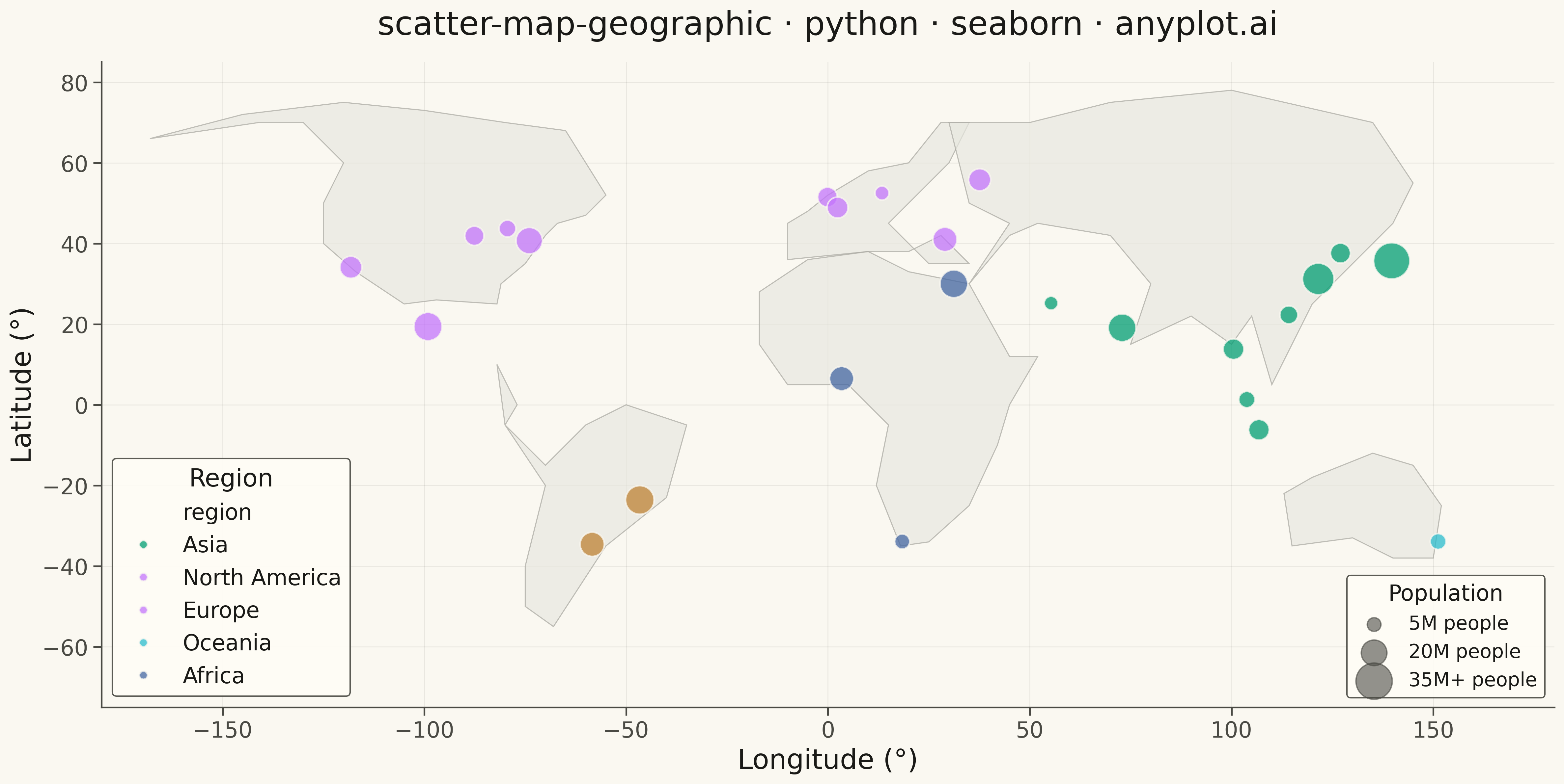
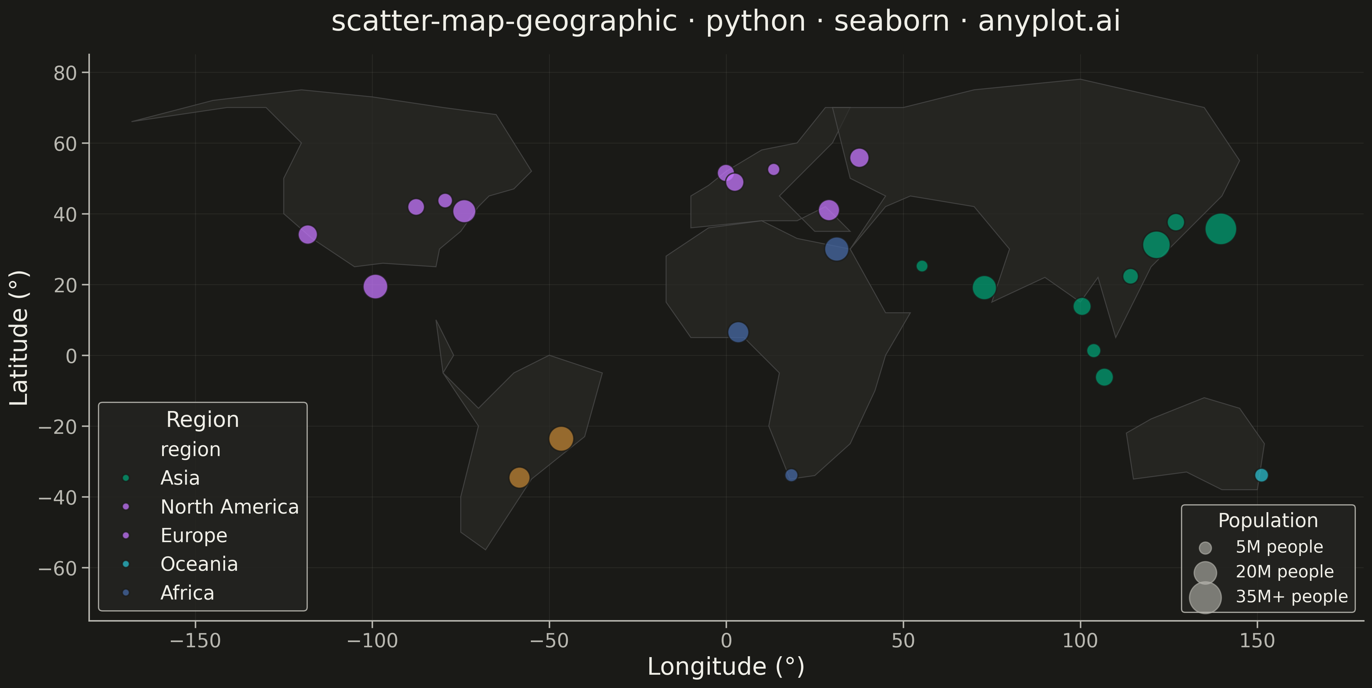
A geographic scatter plot that displays data points on a world or regional map, with each point positioned by its latitude and longitude coordinates. This visualization is ideal for showing spatial distributions of events, locations, or measurements across geographic areas. Points can optionally encode additional variables through size and color, enabling multi-dimensional geographic analysis at a glance.
""" anyplot.ai
scatter-map-geographic: Scatter Map with Geographic Points
Library: seaborn 0.13.2 | Python 3.13.13
Quality: 94/100 | Updated: 2026-05-18
"""

import os
import sys


# Work around matplotlib.py shadowing (remove script dir from path)
script_dir = os.path.dirname(os.path.abspath(__file__))
sys.path = [p for p in sys.path if os.path.abspath(p) != script_dir]

import matplotlib.pyplot as plt
import pandas as pd
import seaborn as sns


# Theme tokens
THEME = os.getenv("ANYPLOT_THEME", "light")
PAGE_BG = "#FAF8F1" if THEME == "light" else "#1A1A17"
ELEVATED_BG = "#FFFDF6" if THEME == "light" else "#242420"
INK = "#1A1A17" if THEME == "light" else "#F0EFE8"
INK_SOFT = "#4A4A44" if THEME == "light" else "#B8B7B0"

# Okabe-Ito palette (first series always brand green)
IMPRINT = ["#009E73", "#C475FD", "#4467A3", "#BD8233", "#AE3030", "#2ABCCD", "#954477"]

# Simplified world coastline polygons
WORLD_COASTLINES = [
    # North America
    [
        (-168, 66),
        (-141, 70),
        (-130, 70),
        (-120, 60),
        (-125, 50),
        (-125, 40),
        (-117, 33),
        (-105, 25),
        (-97, 26),
        (-82, 25),
        (-81, 30),
        (-75, 35),
        (-70, 42),
        (-67, 45),
        (-60, 47),
        (-55, 52),
        (-60, 60),
        (-65, 68),
        (-80, 70),
        (-100, 73),
        (-120, 75),
        (-145, 72),
        (-168, 66),
    ],
    # South America
    [
        (-82, 10),
        (-77, 0),
        (-80, -5),
        (-70, -15),
        (-60, -5),
        (-50, 0),
        (-35, -5),
        (-40, -23),
        (-55, -35),
        (-68, -55),
        (-75, -50),
        (-75, -40),
        (-70, -20),
        (-80, -5),
        (-82, 10),
    ],
    # Europe
    [
        (-10, 36),
        (-10, 45),
        (-5, 48),
        (0, 52),
        (5, 55),
        (10, 58),
        (20, 60),
        (28, 70),
        (35, 70),
        (30, 60),
        (25, 55),
        (20, 50),
        (15, 45),
        (20, 40),
        (25, 35),
        (35, 35),
        (28, 42),
        (20, 38),
        (10, 38),
        (-10, 36),
    ],
    # Africa
    [
        (-17, 15),
        (-17, 28),
        (-5, 36),
        (10, 38),
        (20, 33),
        (35, 30),
        (45, 12),
        (52, 12),
        (45, 0),
        (42, -10),
        (35, -25),
        (25, -34),
        (18, -35),
        (12, -20),
        (15, -5),
        (5, 5),
        (-10, 5),
        (-17, 15),
    ],
    # Asia
    [
        (35, 30),
        (45, 42),
        (52, 45),
        (70, 42),
        (80, 30),
        (75, 15),
        (90, 22),
        (100, 15),
        (105, 22),
        (110, 5),
        (120, 25),
        (130, 35),
        (140, 45),
        (145, 55),
        (135, 70),
        (100, 78),
        (70, 75),
        (50, 70),
        (30, 70),
        (35, 50),
        (45, 45),
        (35, 30),
    ],
    # Australia
    [
        (113, -22),
        (120, -18),
        (135, -12),
        (145, -15),
        (152, -25),
        (150, -38),
        (140, -38),
        (130, -33),
        (115, -35),
        (113, -22),
    ],
]

# Data: Major world cities with population
cities_data = {
    "city": [
        "Tokyo",
        "New York",
        "London",
        "Sydney",
        "Paris",
        "Dubai",
        "Singapore",
        "Mumbai",
        "Cairo",
        "São Paulo",
        "Toronto",
        "Shanghai",
        "Moscow",
        "Seoul",
        "Los Angeles",
        "Berlin",
        "Bangkok",
        "Jakarta",
        "Cape Town",
        "Buenos Aires",
        "Mexico City",
        "Istanbul",
        "Lagos",
        "Chicago",
        "Hong Kong",
    ],
    "latitude": [
        35.7,
        40.7,
        51.5,
        -33.9,
        48.9,
        25.2,
        1.3,
        19.1,
        30.0,
        -23.6,
        43.7,
        31.2,
        55.8,
        37.6,
        34.1,
        52.5,
        13.8,
        -6.2,
        -33.9,
        -34.6,
        19.4,
        41.0,
        6.5,
        41.9,
        22.3,
    ],
    "longitude": [
        139.7,
        -74.0,
        -0.1,
        151.2,
        2.4,
        55.3,
        103.8,
        72.9,
        31.2,
        -46.6,
        -79.4,
        121.5,
        37.6,
        127.0,
        -118.2,
        13.4,
        100.5,
        106.8,
        18.4,
        -58.4,
        -99.1,
        29.0,
        3.4,
        -87.6,
        114.2,
    ],
    "population": [
        37.4,
        18.8,
        9.5,
        5.3,
        11.0,
        3.4,
        5.7,
        21.0,
        20.9,
        22.4,
        6.3,
        27.8,
        12.5,
        9.8,
        12.5,
        3.7,
        10.7,
        10.6,
        4.6,
        15.4,
        21.8,
        15.5,
        15.4,
        8.9,
        7.5,
    ],
    "region": [
        "Asia",
        "North America",
        "Europe",
        "Oceania",
        "Europe",
        "Asia",
        "Asia",
        "Asia",
        "Africa",
        "South America",
        "North America",
        "Asia",
        "Europe",
        "Asia",
        "North America",
        "Europe",
        "Asia",
        "Asia",
        "Africa",
        "South America",
        "North America",
        "Europe",
        "Africa",
        "North America",
        "Asia",
    ],
}

df = pd.DataFrame(cities_data)

# Create figure with seaborn styling
sns.set_theme(
    style="ticks",
    rc={
        "figure.facecolor": PAGE_BG,
        "axes.facecolor": PAGE_BG,
        "axes.edgecolor": INK_SOFT,
        "axes.labelcolor": INK,
        "text.color": INK,
        "xtick.color": INK_SOFT,
        "ytick.color": INK_SOFT,
        "grid.color": INK,
        "grid.alpha": 0.10,
    },
)

fig, ax = plt.subplots(figsize=(16, 9), facecolor=PAGE_BG)

# Set map extent
ax.set_xlim(-180, 180)
ax.set_ylim(-75, 85)
ax.set_aspect("equal")

# Land background color (theme-adaptive)
land_color = "#E8E8E0" if THEME == "light" else "#2A2A26"
land_edge = "#A8A7A0" if THEME == "light" else "#505050"

# Draw coastlines
for coastline in WORLD_COASTLINES:
    if len(coastline) > 2:
        lons = [p[0] for p in coastline]
        lats = [p[1] for p in coastline]
        ax.fill(lons, lats, color=land_color, edgecolor=land_edge, linewidth=0.8, alpha=0.7, zorder=1)

# Create color palette: Asia (position 1, green), Europe (2, orange), Africa (3, blue), Americas (4, purple), Oceania (5, sky blue)
region_colors = {
    "Asia": IMPRINT[0],  # #009E73 (brand green)
    "Europe": IMPRINT[1],  # #C475FD (orange)
    "Africa": IMPRINT[2],  # #4467A3 (blue)
    "South America": IMPRINT[3],  # #BD8233 (reddish purple)
    "North America": IMPRINT[1],  # #C475FD (orange, same as Europe for Americas)
    "Oceania": IMPRINT[5],  # #2ABCCD (sky blue)
}

# Add region color to dataframe
df["color"] = df["region"].map(region_colors)

# Scale population for marker sizes
min_pop, max_pop = df["population"].min(), df["population"].max()
df["marker_size"] = 100 + (df["population"] - min_pop) / (max_pop - min_pop) * 600

# Plot points with seaborn
sns.scatterplot(
    data=df,
    x="longitude",
    y="latitude",
    hue="region",
    size="population",
    sizes=(100, 700),
    palette=region_colors,
    alpha=0.75,
    edgecolor=PAGE_BG,
    linewidth=1.2,
    ax=ax,
    zorder=3,
)

# Customize legend - only show region legend
handles, labels = ax.get_legend_handles_labels()
# Get region legend items (skip title and size legend)
legend1 = ax.legend(
    handles[0:6],
    labels[0:6],
    loc="lower left",
    fontsize=16,
    title="Region",
    title_fontsize=18,
    framealpha=0.9,
    facecolor=ELEVATED_BG,
    edgecolor=INK_SOFT,
)
ax.add_artist(legend1)

# Add size legend
size_legend_elements = [
    plt.scatter([], [], s=100, c=INK_SOFT, alpha=0.6, label="5M people"),
    plt.scatter([], [], s=350, c=INK_SOFT, alpha=0.6, label="20M people"),
    plt.scatter([], [], s=700, c=INK_SOFT, alpha=0.6, label="35M+ people"),
]
size_legend = ax.legend(
    handles=size_legend_elements,
    loc="lower right",
    fontsize=14,
    title="Population",
    title_fontsize=16,
    framealpha=0.9,
    facecolor=ELEVATED_BG,
    edgecolor=INK_SOFT,
)

# Labels and title
ax.set_xlabel("Longitude (°)", fontsize=20, color=INK)
ax.set_ylabel("Latitude (°)", fontsize=20, color=INK)
ax.set_title(
    "scatter-map-geographic · python · seaborn · anyplot.ai", fontsize=24, fontweight="medium", color=INK, pad=20
)
ax.tick_params(axis="both", labelsize=16, colors=INK_SOFT)

# Grid styling
ax.grid(True, alpha=0.10, linestyle="-", linewidth=0.6, color=INK_SOFT)
ax.set_axisbelow(True)

# Spine styling
for spine in ["top", "right"]:
    ax.spines[spine].set_visible(False)
for spine in ["left", "bottom"]:
    ax.spines[spine].set_color(INK_SOFT)

plt.tight_layout()
output_path = os.path.join(os.path.dirname(__file__), f"plot-{THEME}.png")
plt.savefig(output_path, dpi=300, bbox_inches="tight", facecolor=PAGE_BG)
Runnable source as JSON, for any HTTP client: https://api.anyplot.ai/specs/scatter-map-geographic/seaborn/code. Any spec id and library id listed in llms-full.txt fit the same URL shape; every URL below is complete and callable.
{
  "spec_id": "scatter-map-geographic",
  "language": "python",
  "library": "seaborn",
  "page": "https://anyplot.ai/scatter-map-geographic/python/seaborn",
  "hub": "https://anyplot.ai/scatter-map-geographic",
  "code_json": "https://api.anyplot.ai/specs/scatter-map-geographic/seaborn/code",
  "spec_json": "https://api.anyplot.ai/specs/scatter-map-geographic",
  "render_light_png": "https://storage.googleapis.com/anyplot-images/plots/scatter-map-geographic/python/seaborn/plot-light.png",
  "render_dark_png": "https://storage.googleapis.com/anyplot-images/plots/scatter-map-geographic/python/seaborn/plot-dark.png",
  "quality_score": 94.0,
  "license": "MIT",
  "guide": "https://anyplot.ai/llms.txt"
}
Part of Scatter Map with Geographic Points on anyplot.ai.