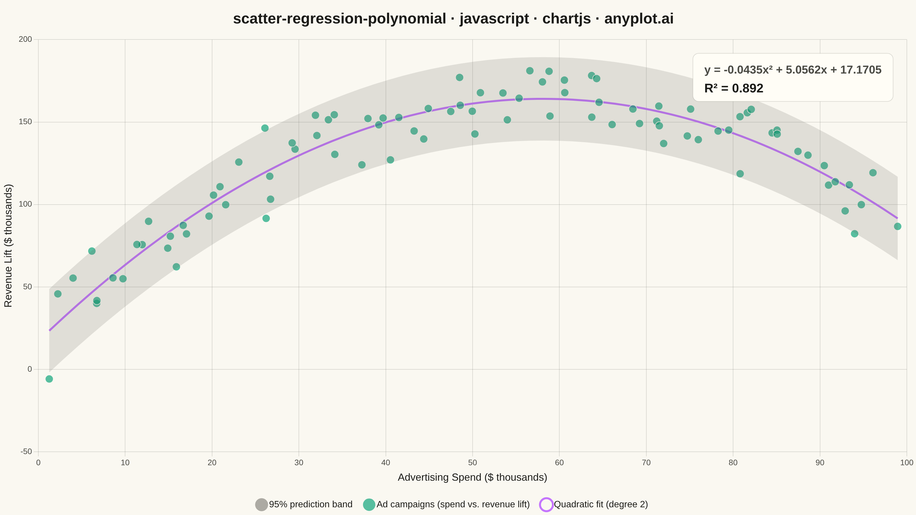
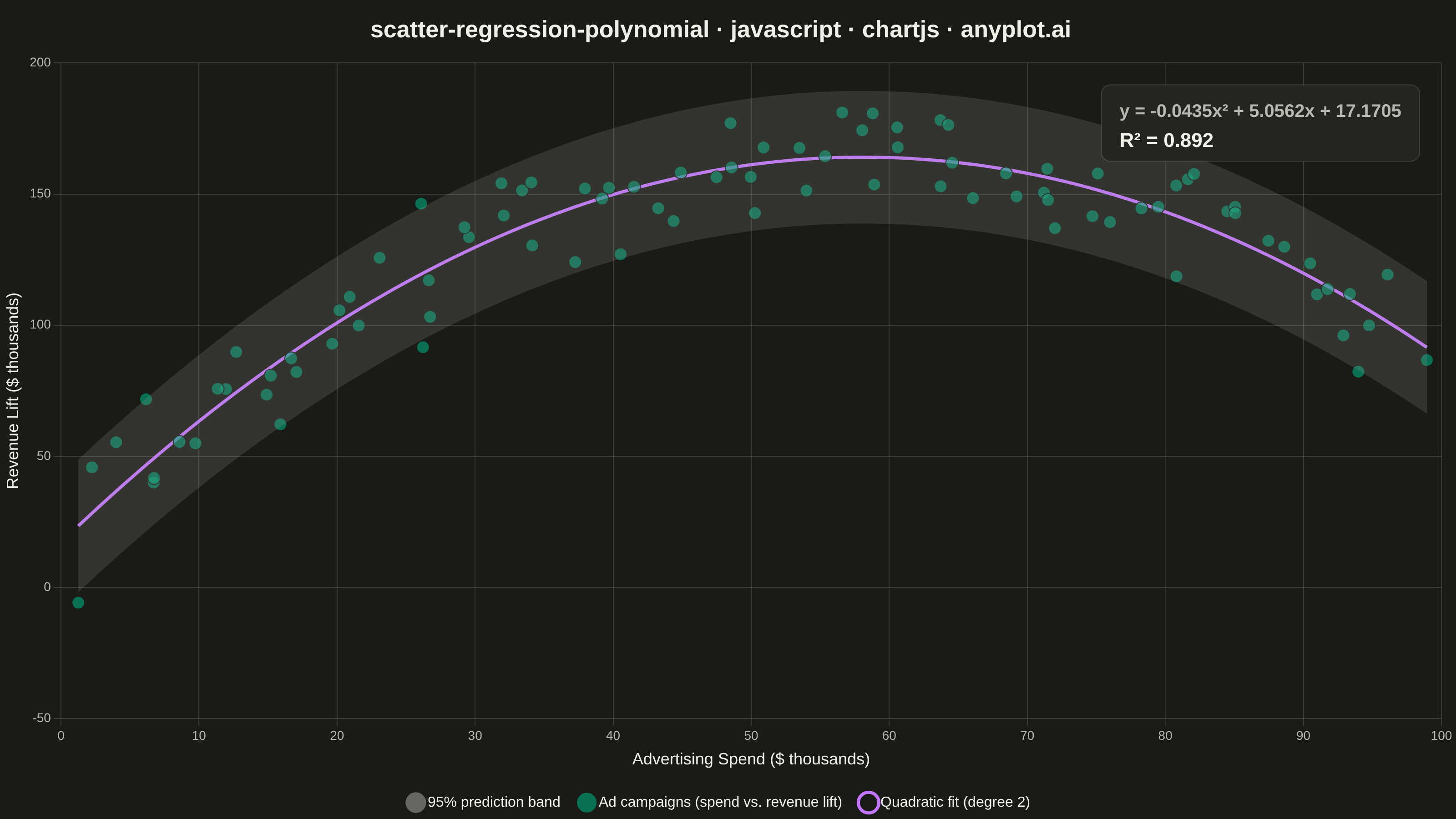
The same plot in 14 other libraries — JavaScript: D3.js, Apache ECharts, Highcharts, MUI X Charts; Python: Altair, Bokeh, lets-plot, Matplotlib, Plotly, plotnine, Pygal, Seaborn; R: ggplot2; Julia: Makie.jl. Compare all 15 side by side: Scatter Plot with Polynomial Regression in Python, R, Julia and JavaScript.
A scatter plot displaying the relationship between two numeric variables with a fitted polynomial regression curve (degree 2-4). This visualization extends beyond linear regression to capture non-linear relationships in data, making it ideal for modeling curved trends, parabolic patterns, and complex data relationships where a straight line would not adequately represent the underlying pattern.
// anyplot.ai
// scatter-regression-polynomial: Scatter Plot with Polynomial Regression
// Library: chartjs 4.4.7 | JavaScript 22.23.1
// Quality: 94/100 | Created: 2026-08-11

const t = window.ANYPLOT_TOKENS;
const THEME = window.ANYPLOT_THEME || "light";
const MUTED = THEME === "light" ? "#6B6A63" : "#A8A79F"; // Imprint muted anchor (theme-adaptive)

// Tiny deterministic LCG + Box-Muller — the browser has no seeded RNG
let seed = 42;
function lcg() {
  seed = (seed * 1664525 + 1013904223) % 4294967296;
  return seed / 4294967296;
}
function gaussian() {
  const u1 = Math.max(lcg(), 1e-9);
  const u2 = lcg();
  return Math.sqrt(-2 * Math.log(u1)) * Math.cos(2 * Math.PI * u2);
}

// Data: advertising spend vs. revenue lift — an inverted-U ("diminishing
// returns then over-saturation") shape that only a degree-2 fit captures.
const N_POINTS = 90;
const points = [];
for (let i = 0; i < N_POINTS; i++) {
  const spend = 2 + 96 * (i / (N_POINTS - 1)) + (lcg() - 0.5) * 3;
  const trueLift = -0.045 * spend * spend + 5.2 * spend + 15;
  const lift = trueLift + gaussian() * 14;
  points.push({ x: spend, y: lift });
}

// Least-squares polynomial fit (degree 2) via normal equations
function polyfit(pts, degree) {
  const cols = degree + 1;
  const XtX = Array.from({ length: cols }, () => new Array(cols).fill(0));
  const Xty = new Array(cols).fill(0);
  for (const { x, y } of pts) {
    const powers = new Array(cols);
    let p = 1;
    for (let k = 0; k < cols; k++) {
      powers[k] = p;
      p *= x;
    }
    for (let i = 0; i < cols; i++) {
      Xty[i] += powers[i] * y;
      for (let j = 0; j < cols; j++) XtX[i][j] += powers[i] * powers[j];
    }
  }
  // Gaussian elimination with partial pivoting
  const M = XtX.map((row, i) => [...row, Xty[i]]);
  for (let col = 0; col < cols; col++) {
    let pivotRow = col;
    for (let r = col + 1; r < cols; r++) {
      if (Math.abs(M[r][col]) > Math.abs(M[pivotRow][col])) pivotRow = r;
    }
    [M[col], M[pivotRow]] = [M[pivotRow], M[col]];
    const pivot = M[col][col];
    for (let c = col; c <= cols; c++) M[col][c] /= pivot;
    for (let r = 0; r < cols; r++) {
      if (r === col) continue;
      const factor = M[r][col];
      for (let c = col; c <= cols; c++) M[r][c] -= factor * M[col][c];
    }
  }
  return M.map((row) => row[cols]);
}

const [c0, c1, c2] = polyfit(points, 2);
const predict = (x) => c0 + c1 * x + c2 * x * x;

// Goodness of fit + residual spread (for the prediction band)
const yMean = points.reduce((s, p) => s + p.y, 0) / points.length;
let ssRes = 0;
let ssTot = 0;
for (const { x, y } of points) {
  ssRes += (y - predict(x)) ** 2;
  ssTot += (y - yMean) ** 2;
}
const r2 = 1 - ssRes / ssTot;
const residualStd = Math.sqrt(ssRes / (points.length - 3));

// Fitted curve + ±1.96σ prediction band, sampled on a fine grid
const xMin = Math.min(...points.map((p) => p.x));
const xMax = Math.max(...points.map((p) => p.x));
const CURVE_STEPS = 60;
const curve = [];
const bandUpper = [];
const bandLower = [];
for (let i = 0; i <= CURVE_STEPS; i++) {
  const x = xMin + ((xMax - xMin) * i) / CURVE_STEPS;
  const yHat = predict(x);
  curve.push({ x, y: yHat });
  bandUpper.push({ x, y: yHat + 1.96 * residualStd });
  bandLower.push({ x, y: yHat - 1.96 * residualStd });
}

function hexToRgba(hex, alpha) {
  const clean = hex.replace("#", "");
  const r = parseInt(clean.substring(0, 2), 16);
  const g = parseInt(clean.substring(2, 4), 16);
  const b = parseInt(clean.substring(4, 6), 16);
  return `rgba(${r}, ${g}, ${b}, ${alpha})`;
}

const signedTerm = (value, symbol) =>
  `${value >= 0 ? "+" : "−"} ${Math.abs(value).toFixed(4)}${symbol}`;
const equation = `y = ${c2.toFixed(4)}x² ${signedTerm(c1, "x")} ${signedTerm(c0, "")}`;
const BAND_SWATCH = hexToRgba(MUTED, 0.55); // opaque enough to read in the legend chip (fill itself stays soft at 0.18)

// Mount
const canvas = document.createElement("canvas");
document.getElementById("container").appendChild(canvas);

// Inline plugin: equation + R² badge, drawn inside the plot area
const fitBadge = {
  id: "fitBadge",
  afterDraw(chart) {
    const { ctx, chartArea } = chart;
    const text1 = equation;
    const text2 = `R² = ${r2.toFixed(3)}`;

    ctx.save();
    ctx.font = "600 20px sans-serif";
    const w1 = ctx.measureText(text1).width;
    ctx.font = "600 22px sans-serif";
    const w2 = ctx.measureText(text2).width;
    const boxW = Math.max(w1, w2) + 40;
    const boxH = 84;
    const boxX = chartArea.right - boxW - 24;
    const boxY = chartArea.top + 24;

    ctx.fillStyle = t.elevatedBg;
    ctx.strokeStyle = t.grid;
    ctx.lineWidth = 1;
    ctx.beginPath();
    ctx.roundRect(boxX, boxY, boxW, boxH, 10);
    ctx.fill();
    ctx.stroke();

    ctx.textBaseline = "middle";
    ctx.fillStyle = t.inkSoft;
    ctx.font = "600 20px sans-serif";
    ctx.fillText(text1, boxX + 20, boxY + 30);
    ctx.fillStyle = t.ink;
    ctx.font = "600 22px sans-serif";
    ctx.fillText(text2, boxX + 20, boxY + 62);
    ctx.restore();
  },
};

// Chart — scatter points + prediction band (behind) + fitted curve (on top)
new Chart(canvas, {
  type: "scatter",
  plugins: [fitBadge],
  data: {
    datasets: [
      {
        label: "_bandUpper",
        type: "line",
        data: bandUpper,
        borderWidth: 0,
        pointRadius: 0,
        fill: false,
      },
      {
        label: "95% prediction band",
        type: "line",
        data: bandLower,
        borderWidth: 0,
        pointRadius: 0,
        backgroundColor: hexToRgba(MUTED, 0.18),
        fill: "-1",
      },
      {
        label: "Ad campaigns (spend vs. revenue lift)",
        data: points,
        backgroundColor: hexToRgba(t.palette[0], 0.65),
        borderColor: t.pageBg,
        borderWidth: 1,
        pointRadius: 7,
        pointHoverRadius: 7,
      },
      {
        label: "Quadratic fit (degree 2)",
        type: "line",
        data: curve,
        borderColor: t.palette[1],
        backgroundColor: "transparent",
        borderWidth: 3.5,
        pointRadius: 0,
        tension: 0.2,
        fill: false,
      },
    ],
  },
  options: {
    responsive: true,
    maintainAspectRatio: false,
    animation: false,
    layout: { padding: { top: 8, right: 16 } },
    plugins: {
      title: {
        display: true,
        text: "scatter-regression-polynomial · javascript · chartjs · anyplot.ai",
        color: t.ink,
        font: { size: 26 },
        padding: { top: 10, bottom: 20 },
      },
      // Legend lives below the plot (not stacked under the title) so the top
      // region stays open for just the title + equation badge.
      legend: {
        position: "bottom",
        labels: {
          color: t.ink,
          font: { size: 16 },
          usePointStyle: true,
          pointStyle: "circle",
          boxWidth: 10,
          padding: 24,
          filter: (item) => !item.text.startsWith("_"),
          generateLabels(chart) {
            const items = Chart.defaults.plugins.legend.labels.generateLabels(chart);
            for (const item of items) {
              if (item.text === "95% prediction band") {
                item.fillStyle = BAND_SWATCH;
                item.strokeStyle = BAND_SWATCH;
              }
            }
            return items;
          },
        },
      },
      tooltip: {
        callbacks: {
          label(ctx) {
            if (ctx.dataset.label !== "Ad campaigns (spend vs. revenue lift)") {
              return ctx.dataset.label;
            }
            const { x, y } = ctx.raw;
            const residual = y - predict(x);
            const sign = residual >= 0 ? "+" : "−";
            return `spend $${x.toFixed(1)}k → lift $${y.toFixed(1)}k (${sign}${Math.abs(residual).toFixed(1)} vs. fit)`;
          },
        },
      },
    },
    scales: {
      x: {
        title: {
          display: true,
          text: "Advertising Spend ($ thousands)",
          color: t.ink,
          font: { size: 18 },
        },
        ticks: { color: t.inkSoft, font: { size: 14 } },
        grid: { color: t.grid },
        border: { display: false },
      },
      y: {
        title: {
          display: true,
          text: "Revenue Lift ($ thousands)",
          color: t.ink,
          font: { size: 18 },
        },
        ticks: { color: t.inkSoft, font: { size: 14 } },
        grid: { color: t.grid },
        border: { display: false },
      },
    },
  },
});
Runnable source as JSON, for any HTTP client: https://api.anyplot.ai/specs/scatter-regression-polynomial/chartjs/code. Any spec id and library id listed in llms-full.txt fit the same URL shape; every URL below is complete and callable.
{
  "spec_id": "scatter-regression-polynomial",
  "language": "javascript",
  "library": "chartjs",
  "page": "https://anyplot.ai/scatter-regression-polynomial/javascript/chartjs",
  "hub": "https://anyplot.ai/scatter-regression-polynomial",
  "code_json": "https://api.anyplot.ai/specs/scatter-regression-polynomial/chartjs/code",
  "spec_json": "https://api.anyplot.ai/specs/scatter-regression-polynomial",
  "render_light_png": "https://storage.googleapis.com/anyplot-images/plots/scatter-regression-polynomial/javascript/chartjs/plot-light.png",
  "render_dark_png": "https://storage.googleapis.com/anyplot-images/plots/scatter-regression-polynomial/javascript/chartjs/plot-dark.png",
  "interactive_light_html": "https://storage.googleapis.com/anyplot-images/plots/scatter-regression-polynomial/javascript/chartjs/plot-light.html",
  "interactive_dark_html": "https://storage.googleapis.com/anyplot-images/plots/scatter-regression-polynomial/javascript/chartjs/plot-dark.html",
  "quality_score": 94.0,
  "license": "MIT",
  "guide": "https://anyplot.ai/llms.txt"
}
Part of Scatter Plot with Polynomial Regression on anyplot.ai.