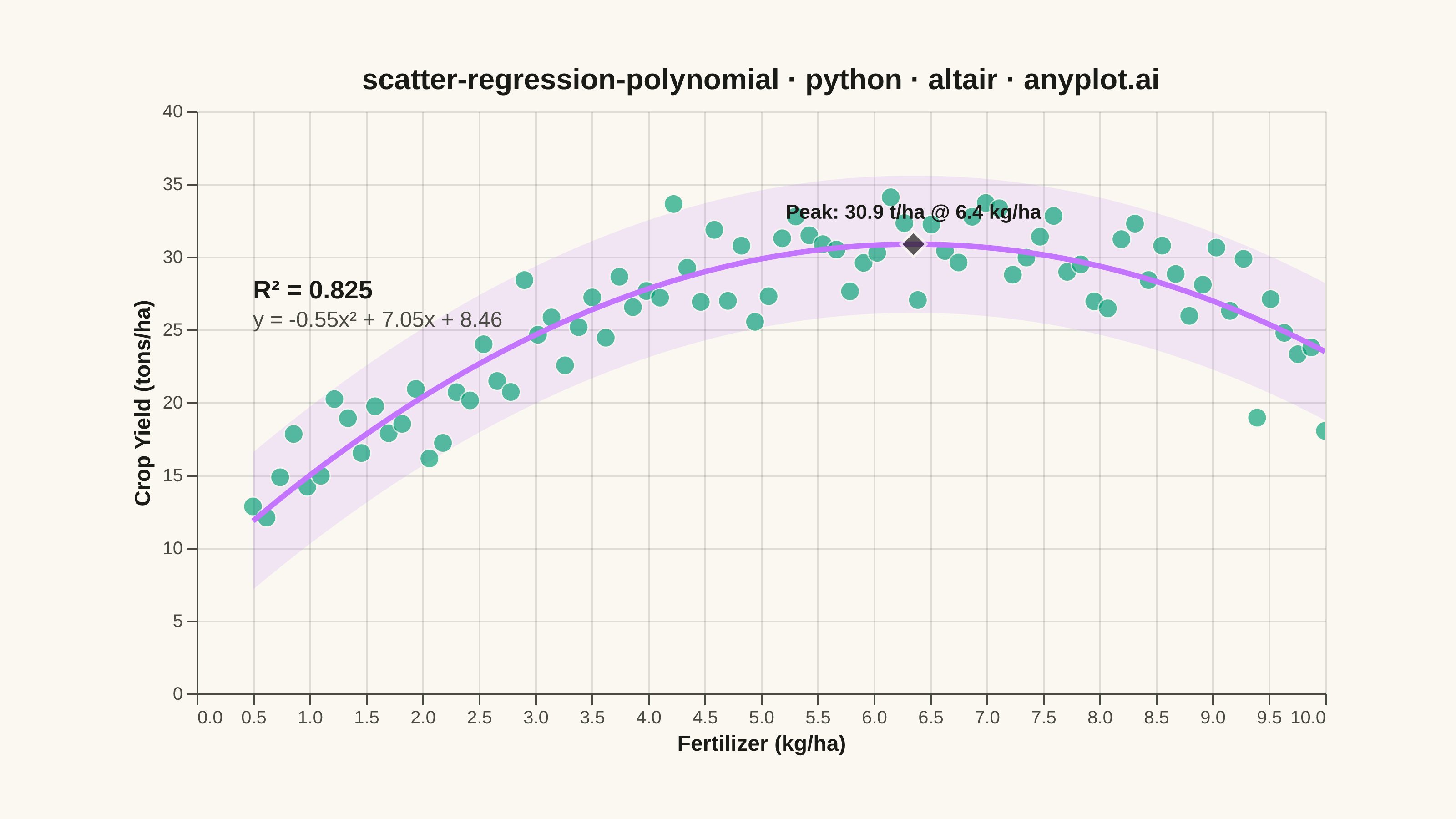
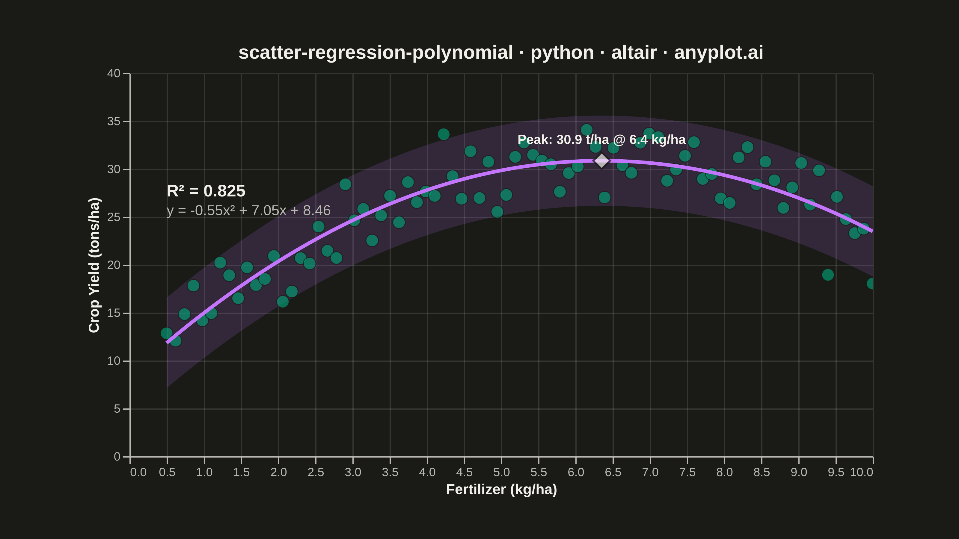
A scatter plot displaying the relationship between two numeric variables with a fitted polynomial regression curve (degree 2-4). This visualization extends beyond linear regression to capture non-linear relationships in data, making it ideal for modeling curved trends, parabolic patterns, and complex data relationships where a straight line would not adequately represent the underlying pattern.
""" anyplot.ai
scatter-regression-polynomial: Scatter Plot with Polynomial Regression
Library: altair 6.2.2 | Python 3.13.14
Quality: 89/100 | Updated: 2026-08-11
"""

import os

import altair as alt
import numpy as np
import pandas as pd
from PIL import Image


# Theme tokens
THEME = os.getenv("ANYPLOT_THEME", "light")
PAGE_BG = "#FAF8F1" if THEME == "light" else "#1A1A17"
INK = "#1A1A17" if THEME == "light" else "#F0EFE8"
INK_SOFT = "#4A4A44" if THEME == "light" else "#B8B7B0"

# Imprint palette
BRAND = "#009E73"  # First series (scatter points)
SECONDARY = "#C475FD"  # Second series (regression curve + band)

# Data - Quadratic relationship with noise (fertilizer vs crop yield)
np.random.seed(42)
n_points = 80
x = np.linspace(0.5, 10, n_points)
# Quadratic relationship: yield increases then plateaus (diminishing returns)
y_true = -0.6 * x**2 + 7.5 * x + 8
y = y_true + np.random.randn(n_points) * 2.5
# Clip to realistic range (crop yield must be positive); ceiling sits well
# above the curve's peak (~31.4) so it never flattens the plateau region.
y = np.clip(y, 1, 36)

# Fit polynomial regression (degree 2)
coeffs = np.polyfit(x, y, 2)
y_pred = np.polyval(coeffs, x)

# Calculate R² value
ss_res = np.sum((y - y_pred) ** 2)
ss_tot = np.sum((y - np.mean(y)) ** 2)
r_squared = 1 - (ss_res / ss_tot)

# Residual standard error, used for a ~95% empirical confidence band
resid_se = np.sqrt(ss_res / (n_points - 3))
band_halfwidth = 1.96 * resid_se

# Create equation string
a, b, c = coeffs
equation = f"y = {a:.2f}x² + {b:.2f}x + {c:.2f}"

# Peak of the fitted curve (vertex of the parabola) - focal point for the story
x_peak = -b / (2 * a)
y_peak = np.polyval(coeffs, x_peak)

# Prepare DataFrames
df_points = pd.DataFrame({"Fertilizer (kg/ha)": x, "Crop Yield (tons/ha)": y})

# Generate smooth curve + confidence band for the regression fit
x_smooth = np.linspace(x.min(), x.max(), 200)
y_smooth = np.polyval(coeffs, x_smooth)
df_curve = pd.DataFrame(
    {
        "Fertilizer (kg/ha)": x_smooth,
        "Crop Yield (tons/ha)": y_smooth,
        "Lower": y_smooth - band_halfwidth,
        "Upper": y_smooth + band_halfwidth,
    }
)

# Hover selection - highlights the nearest point and drives its tooltip
hover = alt.selection_point(on="pointerover", nearest=True, fields=["Fertilizer (kg/ha)"], empty=False)

# Confidence band (drawn first, sits behind the scatter + curve)
band = (
    alt.Chart(df_curve)
    .mark_area(color=SECONDARY, opacity=0.15)
    .encode(x="Fertilizer (kg/ha):Q", y=alt.Y("Lower:Q", title="Crop Yield (tons/ha)"), y2="Upper:Q")
)

# Scatter plot
scatter = (
    alt.Chart(df_points)
    .mark_circle(color=BRAND, stroke=PAGE_BG, strokeWidth=0.75)
    .encode(
        x=alt.X("Fertilizer (kg/ha):Q", title="Fertilizer (kg/ha)"),
        y=alt.Y("Crop Yield (tons/ha):Q", title="Crop Yield (tons/ha)"),
        size=alt.condition(hover, alt.value(260), alt.value(110)),
        opacity=alt.condition(hover, alt.value(0.95), alt.value(0.65)),
        tooltip=["Fertilizer (kg/ha)", "Crop Yield (tons/ha)"],
    )
    .add_params(hover)
)

# Polynomial regression curve
curve = (
    alt.Chart(df_curve).mark_line(size=3, color=SECONDARY).encode(x="Fertilizer (kg/ha):Q", y="Crop Yield (tons/ha):Q")
)

# Peak marker + label - highlights the optimal fertilizer rate as the focal point
peak_df = pd.DataFrame({"Fertilizer (kg/ha)": [x_peak], "Crop Yield (tons/ha)": [y_peak]})
peak_label_df = pd.DataFrame({"x": [x_peak], "y": [y_peak], "text": [f"Peak: {y_peak:.1f} t/ha @ {x_peak:.1f} kg/ha"]})

peak_marker = (
    alt.Chart(peak_df)
    .mark_point(shape="diamond", size=200, filled=True, color=INK, stroke=PAGE_BG, strokeWidth=1.5)
    .encode(x="Fertilizer (kg/ha):Q", y="Crop Yield (tons/ha):Q")
)

peak_label = (
    alt.Chart(peak_label_df)
    .mark_text(align="center", baseline="bottom", dy=-12, fontSize=11, fontWeight="bold", color=INK)
    .encode(x=alt.X("x:Q"), y=alt.Y("y:Q"), text="text:N")
)

# Annotation for R² and equation
r2_text_df = pd.DataFrame({"x": [0.5], "y": [28.5], "text": [f"R² = {r_squared:.3f}"]})
eq_text_df = pd.DataFrame({"x": [0.5], "y": [26.3], "text": [equation]})

r2_annotation = (
    alt.Chart(r2_text_df)
    .mark_text(align="left", baseline="top", fontSize=14, fontWeight="bold", color=INK)
    .encode(x=alt.X("x:Q"), y=alt.Y("y:Q"), text="text:N")
)

eq_annotation = (
    alt.Chart(eq_text_df)
    .mark_text(align="left", baseline="top", fontSize=12, fontWeight="normal", color=INK_SOFT)
    .encode(x=alt.X("x:Q"), y=alt.Y("y:Q"), text="text:N")
)

# Combine layers
chart = (
    (band + scatter + curve + peak_marker + peak_label + r2_annotation + eq_annotation)
    .properties(
        width=620,
        height=320,
        background=PAGE_BG,
        title=alt.Title("scatter-regression-polynomial · python · altair · anyplot.ai", fontSize=16, anchor="middle"),
    )
    .configure_axis(
        labelFontSize=10,
        titleFontSize=12,
        tickSize=6,
        domainColor=INK_SOFT,
        tickColor=INK_SOFT,
        gridColor=INK,
        gridOpacity=0.12,
        labelColor=INK_SOFT,
        titleColor=INK,
    )
    .configure_view(strokeWidth=0, fill=PAGE_BG)
    .configure_title(color=INK)
    .interactive()
)

# Save
chart.save(f"plot-{THEME}.png", scale_factor=4.0)

# PAD-only to the canonical 3200x1800 landscape target (never crop - see
# prompts/library/altair.md "Canvas" for why vl-convert overshoot must fail
# loudly instead of being cropped).
TW, TH = 3200, 1800
_img = Image.open(f"plot-{THEME}.png").convert("RGB")
_w, _h = _img.size
if _w > TW or _h > TH:
    raise SystemExit(
        f"altair vl-convert produced {_w}×{_h}, exceeds target {TW}×{TH}. Shrink chart .properties(width=, height=) values and re-render."
    )
if _w < TW or _h < TH:
    _canvas = Image.new("RGB", (TW, TH), PAGE_BG)
    _canvas.paste(_img, ((TW - _w) // 2, (TH - _h) // 2))
    _canvas.save(f"plot-{THEME}.png")

chart.save(f"plot-{THEME}.html")
Runnable source as JSON, for any HTTP client: https://api.anyplot.ai/specs/scatter-regression-polynomial/altair/code. Any spec id and library id listed in llms-full.txt fit the same URL shape; every URL below is complete and callable.
{
  "spec_id": "scatter-regression-polynomial",
  "language": "python",
  "library": "altair",
  "page": "https://anyplot.ai/scatter-regression-polynomial/python/altair",
  "hub": "https://anyplot.ai/scatter-regression-polynomial",
  "code_json": "https://api.anyplot.ai/specs/scatter-regression-polynomial/altair/code",
  "spec_json": "https://api.anyplot.ai/specs/scatter-regression-polynomial",
  "render_light_png": "https://storage.googleapis.com/anyplot-images/plots/scatter-regression-polynomial/python/altair/plot-light.png",
  "render_dark_png": "https://storage.googleapis.com/anyplot-images/plots/scatter-regression-polynomial/python/altair/plot-dark.png",
  "interactive_light_html": "https://storage.googleapis.com/anyplot-images/plots/scatter-regression-polynomial/python/altair/plot-light.html",
  "interactive_dark_html": "https://storage.googleapis.com/anyplot-images/plots/scatter-regression-polynomial/python/altair/plot-dark.html",
  "quality_score": 89.0,
  "license": "MIT",
  "guide": "https://anyplot.ai/llms.txt"
}
Part of Scatter Plot with Polynomial Regression on anyplot.ai.