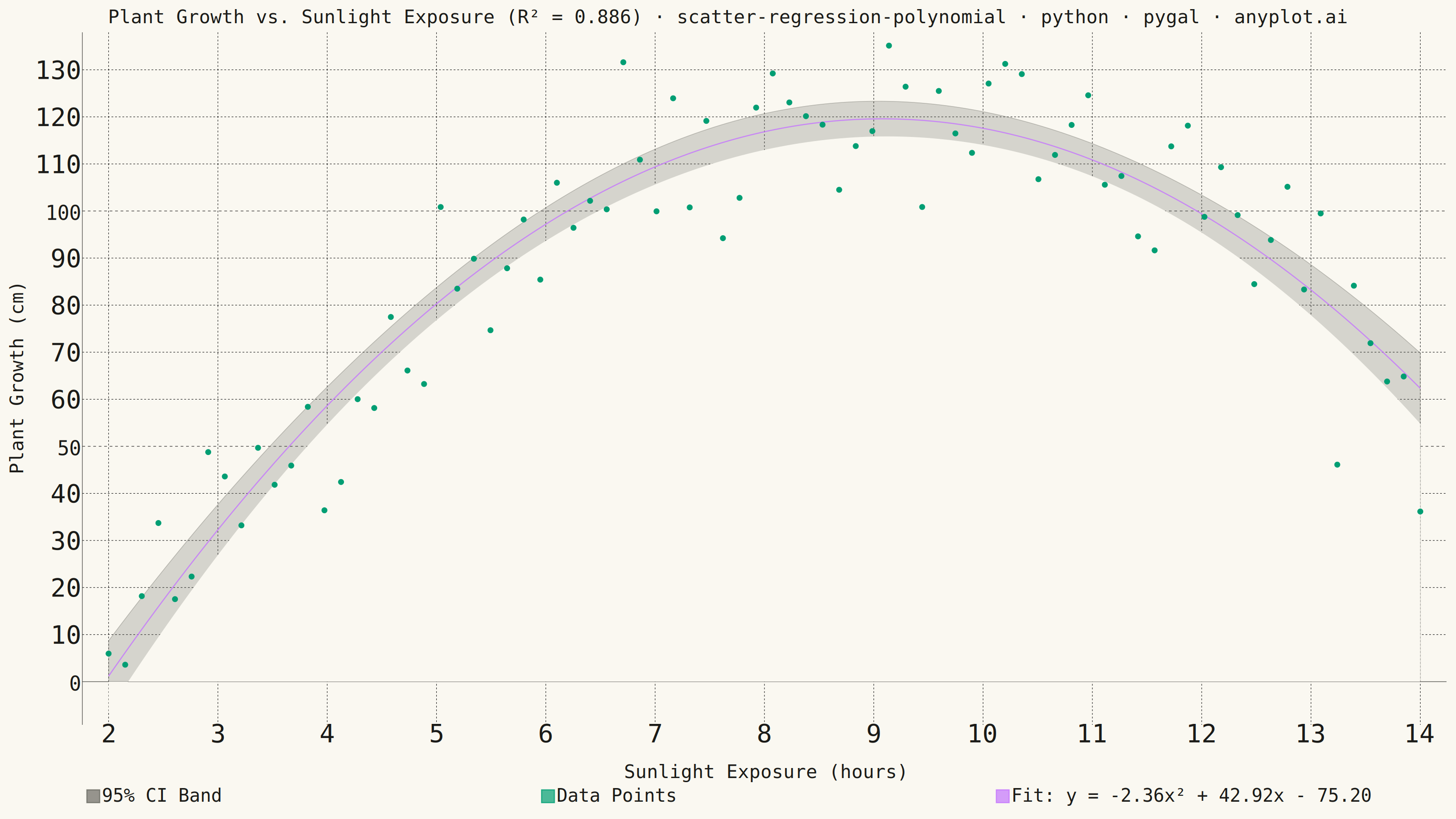
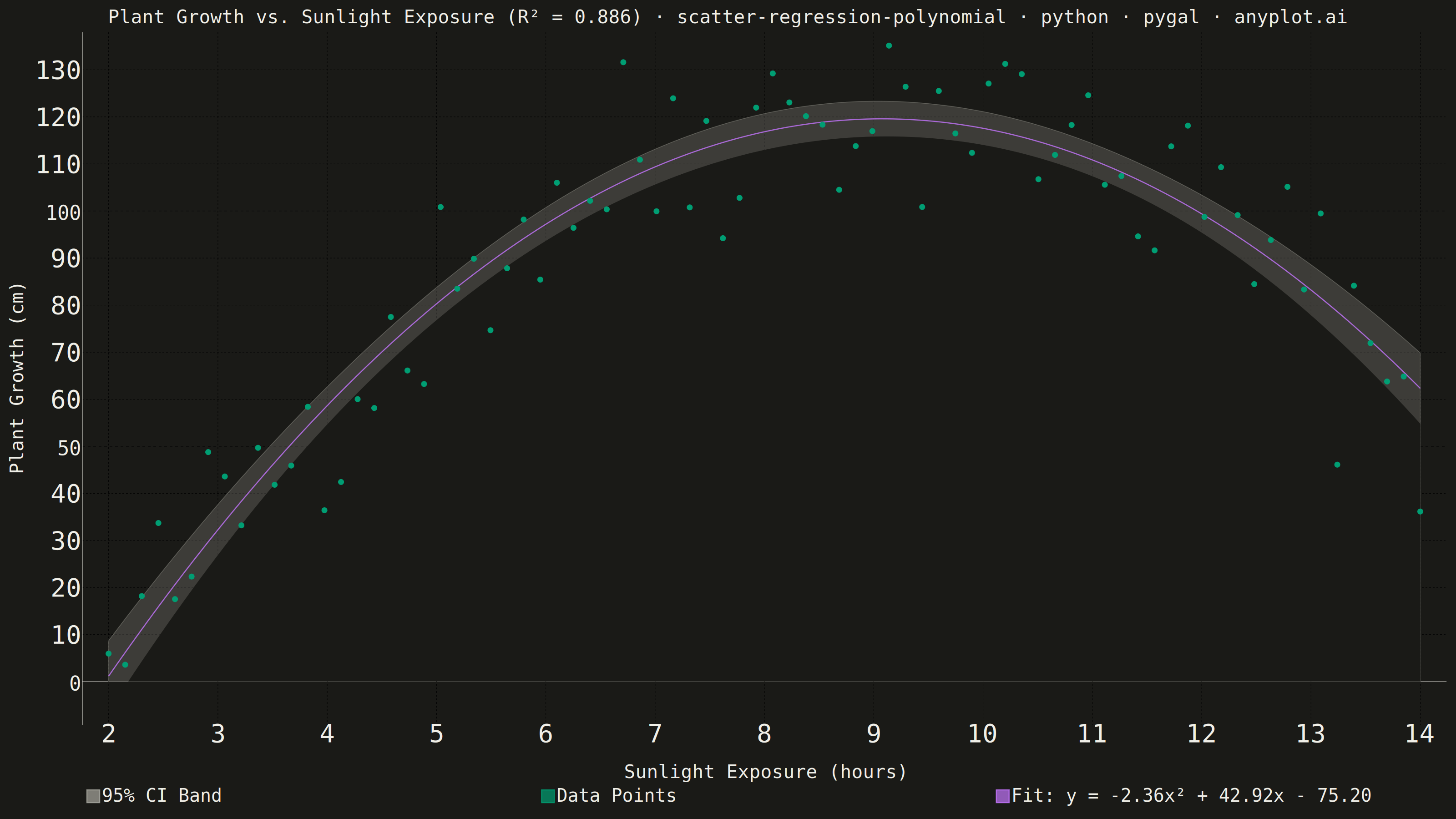
A scatter plot displaying the relationship between two numeric variables with a fitted polynomial regression curve (degree 2-4). This visualization extends beyond linear regression to capture non-linear relationships in data, making it ideal for modeling curved trends, parabolic patterns, and complex data relationships where a straight line would not adequately represent the underlying pattern.
""" anyplot.ai
scatter-regression-polynomial: Scatter Plot with Polynomial Regression
Library: pygal 3.1.3 | Python 3.13.14
Quality: 88/100 | Updated: 2026-08-11
"""

import os

import numpy as np
import pygal
from pygal.style import Style
from scipy import stats


# Theme tokens
THEME = os.getenv("ANYPLOT_THEME", "light")
PAGE_BG = "#FAF8F1" if THEME == "light" else "#1A1A17"
INK = "#1A1A17" if THEME == "light" else "#F0EFE8"
INK_MUTED = "#6B6A63" if THEME == "light" else "#A8A79F"

# Imprint palette
BRAND = "#009E73"  # First series
ACCENT = "#C475FD"  # Second series

# Data
np.random.seed(42)
n_points = 80
x = np.linspace(2, 14, n_points)
y_true = -2.5 * x**2 + 45 * x - 80
y = y_true + np.random.randn(n_points) * 12

# Fit polynomial (degree 2), with covariance for the confidence band below
coeffs, cov = np.polyfit(x, y, 2, cov=True)
poly = np.poly1d(coeffs)

# Calculate R²
y_pred = poly(x)
ss_res = np.sum((y - y_pred) ** 2)
ss_tot = np.sum((y - np.mean(y)) ** 2)
r_squared = 1 - (ss_res / ss_tot)

# Fitted curve + 95% confidence band around the mean prediction. Per-point
# variance is v @ cov @ v, where v = [x^2, x, 1] is a row of the Vandermonde
# design matrix (matches np.polyfit's highest-power-first coefficient order).
x_curve = np.linspace(x.min(), x.max(), 200)
y_curve = poly(x_curve)

dof = len(x) - len(coeffs)
t_val = stats.t.ppf(0.975, dof)
design = np.vander(x_curve, N=len(coeffs))
pred_var = np.einsum("ij,jk,ik->i", design, cov, design)
se_curve = np.sqrt(pred_var)
ci_upper = y_curve + t_val * se_curve
ci_lower = y_curve - t_val * se_curve

# Polynomial equation, folded into the curve's own legend label so it always
# renders (a prior attempt added it as a separate empty series, which pygal
# never draws since it has no data points)
a, b, c = coeffs
b_sign = "+" if b >= 0 else "-"
c_sign = "+" if c >= 0 else "-"
equation = f"y = {a:.2f}x² {b_sign} {abs(b):.2f}x {c_sign} {abs(c):.2f}"

# pygal has no free-text annotation API, so the R² the spec asks to display
# "prominently" is surfaced in the title itself - the most prominent element
# pygal offers.
title = (
    f"Plant Growth vs. Sunlight Exposure (R² = {r_squared:.3f}) · "
    "scatter-regression-polynomial · python · pygal · anyplot.ai"
)
# Scale the title font linearly off the 67-char mandated-title baseline so the
# longer descriptive prefix never overflows the canvas (see plot-generator.md).
title_font_size = round(66 * min(1.0, 67 / len(title)))

# Custom style. Series order is [CI band, CI erase layer, Data Points, Fit
# curve] - see the two chart.add() calls that build the band for why the
# erase layer must sit between the band and the data points.
custom_style = Style(
    background=PAGE_BG,
    plot_background=PAGE_BG,
    foreground=INK,
    foreground_strong=INK,
    foreground_subtle=INK_MUTED,
    colors=(INK_MUTED, PAGE_BG, BRAND, ACCENT),
    title_font_size=title_font_size,
    label_font_size=56,
    major_label_font_size=44,
    legend_font_size=40,
    stroke_width=2.5,
    opacity_hover=".9",
    transition="200ms ease-in",
)

# Create chart
chart = pygal.XY(
    width=3200,
    height=1800,
    style=custom_style,
    title=title,
    x_title="Sunlight Exposure (hours)",
    y_title="Plant Growth (cm)",
    show_legend=True,
    legend_at_bottom=True,
    legend_at_bottom_columns=3,
    legend_box_size=28,
    dots_size=6,
    show_x_guides=True,
    show_y_guides=True,
    x_label_rotation=0,
    truncate_legend=-1,
    margin_bottom=40,
    # pygal's own `.reactive{fill-opacity/stroke-width}` rule is emitted
    # scoped to the chart's `#chart-<uuid>` id, which outweighs a plain
    # `.serie-N .reactive` selector on specificity - `!important` (the same
    # escape hatch pygal's own stylesheets use, e.g. `.always_show .guide.line`)
    # is required for a per-series override to actually win. Soften the CI
    # band (index 0) into translucent shading with a thin edge, and make the
    # erase layer (index 1) fully opaque so it cleanly carves the band's
    # lower bound out with no visible seam of its own.
    css=(
        "file://style.css",
        "file://graph.css",
        "inline:.serie-0 .reactive { fill-opacity: 0.25 !important; stroke-width: 1.5 !important; stroke-opacity: 0.4 !important; }"
        " .serie-1 .reactive { fill-opacity: 1 !important; stroke-width: 0 !important; }",
    ),
)

# 95% CI band, built from two ordinary single-curve fills instead of one
# hand-closed upper+lower polygon: pygal's fill always splices its own
# baseline-connector segment onto the *first and last vertex* of whatever
# path it's given, so a closed polygon whose start/end vertex sits at the
# same x gets that connector added twice at the same x - a stray vertical
# bar. A plain open curve doesn't have this problem, since its first/last
# vertices sit at different x values, which is exactly pygal's supported
# fill shape.
#
# So: fill under the upper bound (translucent - the visible "95% CI Band"),
# then fill under the lower bound in the page-background color (title=None -
# a helper layer, not its own legend entry) to erase everything below it.
# What's left visible is exactly the band between the two curves.
chart.add(
    "95% CI Band",
    [(float(xi), float(yi)) for xi, yi in zip(x_curve, ci_upper, strict=True)],
    stroke=True,
    fill=True,
    show_dots=False,
)
chart.add(
    None,
    [(float(xi), float(yi)) for xi, yi in zip(x_curve, ci_lower, strict=True)],
    stroke=True,
    fill=True,
    show_dots=False,
)

# Scatter points - added after the CI band layers so dots stay visible even
# where the opaque erase layer covers the plot area below the band.
scatter_data = [(float(x[i]), float(y[i])) for i in range(len(x))]
chart.add("Data Points", scatter_data, stroke=False, dots_size=6, opacity=0.7)

# Fit curve - solid stroke, clearly distinct from the scatter, equation in the legend label
curve_data = [(float(x_curve[i]), float(y_curve[i])) for i in range(len(x_curve))]
chart.add(f"Fit: {equation}", curve_data, stroke=True, show_dots=False, dots_size=0)

# Save
chart.render_to_png(f"plot-{THEME}.png")
with open(f"plot-{THEME}.html", "wb") as f:
    f.write(chart.render())
Runnable source as JSON, for any HTTP client: https://api.anyplot.ai/specs/scatter-regression-polynomial/pygal/code. Any spec id and library id listed in llms-full.txt fit the same URL shape; every URL below is complete and callable.
{
  "spec_id": "scatter-regression-polynomial",
  "language": "python",
  "library": "pygal",
  "page": "https://anyplot.ai/scatter-regression-polynomial/python/pygal",
  "hub": "https://anyplot.ai/scatter-regression-polynomial",
  "code_json": "https://api.anyplot.ai/specs/scatter-regression-polynomial/pygal/code",
  "spec_json": "https://api.anyplot.ai/specs/scatter-regression-polynomial",
  "render_light_png": "https://storage.googleapis.com/anyplot-images/plots/scatter-regression-polynomial/python/pygal/plot-light.png",
  "render_dark_png": "https://storage.googleapis.com/anyplot-images/plots/scatter-regression-polynomial/python/pygal/plot-dark.png",
  "interactive_light_html": "https://storage.googleapis.com/anyplot-images/plots/scatter-regression-polynomial/python/pygal/plot-light.html",
  "interactive_dark_html": "https://storage.googleapis.com/anyplot-images/plots/scatter-regression-polynomial/python/pygal/plot-dark.html",
  "quality_score": 88.0,
  "license": "MIT",
  "guide": "https://anyplot.ai/llms.txt"
}
Part of Scatter Plot with Polynomial Regression on anyplot.ai.