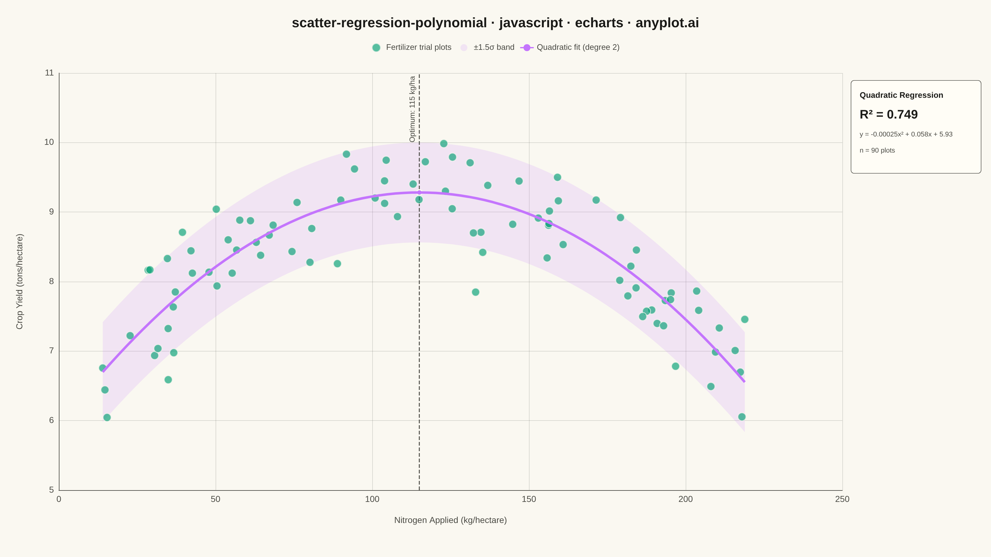
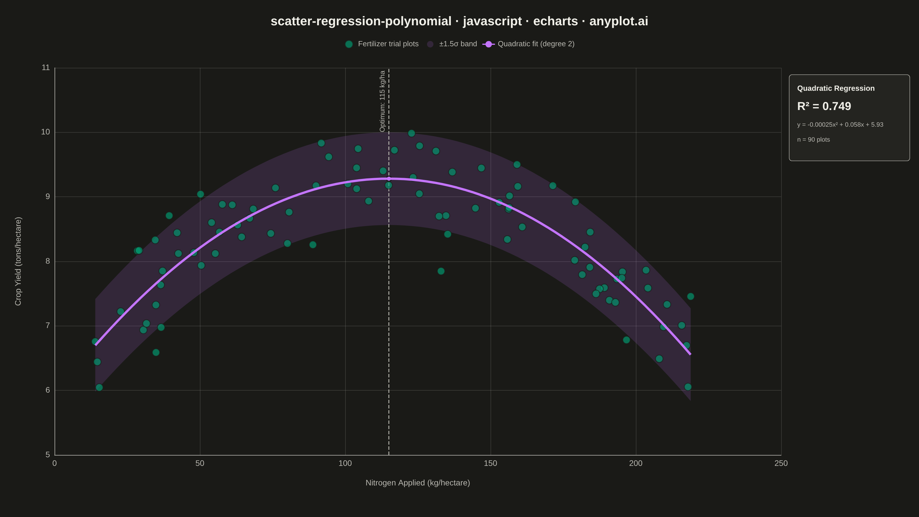
The same plot in 14 other libraries — JavaScript: Chart.js, D3.js, Highcharts, MUI X Charts; Python: Altair, Bokeh, lets-plot, Matplotlib, Plotly, plotnine, Pygal, Seaborn; R: ggplot2; Julia: Makie.jl. Compare all 15 side by side: Scatter Plot with Polynomial Regression in Python, R, Julia and JavaScript.
A scatter plot displaying the relationship between two numeric variables with a fitted polynomial regression curve (degree 2-4). This visualization extends beyond linear regression to capture non-linear relationships in data, making it ideal for modeling curved trends, parabolic patterns, and complex data relationships where a straight line would not adequately represent the underlying pattern.
// anyplot.ai
// scatter-regression-polynomial: Scatter Plot with Polynomial Regression
// Library: echarts 6.1.0 | JavaScript 22.23.1
// Quality: 96/100 | Created: 2026-08-11

//# anyplot-orientation: landscape
const t = window.ANYPLOT_TOKENS;

// --- Data (deterministic, in-memory) ----------------------------------------
// Crop yield response to nitrogen fertilizer — yield climbs with applied
// nitrogen up to an agronomic optimum, then falls off as over-fertilization
// harms the crop. A textbook diminishing/negative-returns curve, best
// captured by a degree-2 polynomial rather than a straight line.
let seed = 42;
function nextRandom() {
  seed = (seed * 1664525 + 1013904223) % 4294967296;
  return seed / 4294967296;
}
function gaussianNoise(std) {
  const u1 = Math.max(nextRandom(), 1e-9);
  const u2 = nextRandom();
  return std * Math.sqrt(-2 * Math.log(u1)) * Math.cos(2 * Math.PI * u2);
}

const N_POINTS = 90;
const PEAK_X = 115; // kg/hectare — agronomic optimum nitrogen rate
const PEAK_Y = 9.2; // tons/hectare — yield at the optimum
const CURVATURE = -0.00023;

const nitrogen = Array.from({ length: N_POINTS }, () => 10 + nextRandom() * 210);
const cropYield = nitrogen.map(
  (x) => PEAK_Y + CURVATURE * (x - PEAK_X) ** 2 + gaussianNoise(0.55)
);

// --- Quadratic regression (least squares via normal equations) -------------
function fitDegree2(xs, ys) {
  let s1 = 0, s2 = 0, s3 = 0, s4 = 0, sy = 0, sxy = 0, sx2y = 0;
  for (let i = 0; i < xs.length; i++) {
    const x = xs[i], y = ys[i], x2 = x * x;
    s1 += x; s2 += x2; s3 += x2 * x; s4 += x2 * x2;
    sy += y; sxy += x * y; sx2y += x2 * y;
  }
  const A = [
    [xs.length, s1, s2],
    [s1, s2, s3],
    [s2, s3, s4],
  ];
  const rhs = [sy, sxy, sx2y];
  const det3 = (m) =>
    m[0][0] * (m[1][1] * m[2][2] - m[1][2] * m[2][1]) -
    m[0][1] * (m[1][0] * m[2][2] - m[1][2] * m[2][0]) +
    m[0][2] * (m[1][0] * m[2][1] - m[1][1] * m[2][0]);
  const withColumn = (col) => A.map((row, i) => row.map((v, j) => (j === col ? rhs[i] : v)));
  const det = det3(A);
  return [det3(withColumn(0)) / det, det3(withColumn(1)) / det, det3(withColumn(2)) / det];
}

const [coefC, coefB, coefA] = fitDegree2(nitrogen, cropYield); // y = coefC + coefB*x + coefA*x^2
const predict = (x) => coefC + coefB * x + coefA * x * x;

const peakX = -coefB / (2 * coefA); // vertex of the fitted parabola (optimum nitrogen rate)
const peakY = predict(peakX);

const yMean = cropYield.reduce((s, y) => s + y, 0) / cropYield.length;
const ssRes = cropYield.reduce((s, y, i) => s + (y - predict(nitrogen[i])) ** 2, 0);
const ssTot = cropYield.reduce((s, y) => s + (y - yMean) ** 2, 0);
const rSquared = 1 - ssRes / ssTot;
const residualStd = Math.sqrt(ssRes / (cropYield.length - 3));
const bandHalfWidth = 1.5 * residualStd;

const xMin = Math.min(...nitrogen);
const xMax = Math.max(...nitrogen);
const CURVE_POINTS = 80;
const curveX = Array.from(
  { length: CURVE_POINTS },
  (_, i) => xMin + ((xMax - xMin) * i) / (CURVE_POINTS - 1)
);
const curveData = curveX.map((x) => [x, predict(x)]);
const bandLowerData = curveX.map((x) => [x, predict(x) - bandHalfWidth]);
const bandWidthData = curveX.map((x) => [x, 2 * bandHalfWidth]);

const eqSign = (v) => (v >= 0 ? "+ " : "− ");
const equationText =
  "y = " + coefA.toFixed(5) + "x² " +
  eqSign(coefB) + Math.abs(coefB).toFixed(3) + "x " +
  eqSign(coefC) + Math.abs(coefC).toFixed(2);

// --- Init -------------------------------------------------------------------
const chart = echarts.init(document.getElementById("container"));

// --- Option -----------------------------------------------------------------
chart.setOption({
  animation: false,
  color: t.palette,
  backgroundColor: "transparent",
  title: {
    text: "scatter-regression-polynomial · javascript · echarts · anyplot.ai",
    left: "center",
    top: 22,
    textStyle: { color: t.ink, fontSize: 22, fontWeight: "bold" },
  },
  legend: {
    data: ["Fertilizer trial plots", "±1.5σ band", "Quadratic fit (degree 2)"],
    top: 64,
    left: "center",
    textStyle: { color: t.inkSoft, fontSize: 13 },
    itemWidth: 22,
    itemHeight: 14,
  },
  tooltip: {
    trigger: "item",
    backgroundColor: t.elevatedBg,
    borderColor: t.inkSoft,
    textStyle: { color: t.ink, fontSize: 13 },
    formatter: function (params) {
      if (params.seriesType === "scatter") {
        return (
          "Nitrogen: " + params.data[0].toFixed(1) + " kg/ha<br>" +
          "Yield: " + params.data[1].toFixed(2) + " t/ha"
        );
      }
      return params.seriesName;
    },
  },
  grid: { left: 95, right: 240, top: 118, bottom: 108 },
  xAxis: {
    type: "value",
    name: "Nitrogen Applied (kg/hectare)",
    nameLocation: "middle",
    nameGap: 42,
    nameTextStyle: { color: t.inkSoft, fontSize: 14 },
    scale: true,
    axisLabel: { color: t.inkSoft, fontSize: 14 },
    axisLine: { lineStyle: { color: t.inkSoft } },
    axisTick: { show: false },
    splitLine: { lineStyle: { color: t.grid } },
  },
  yAxis: {
    type: "value",
    name: "Crop Yield (tons/hectare)",
    nameLocation: "middle",
    nameGap: 56,
    nameTextStyle: { color: t.inkSoft, fontSize: 14 },
    scale: true,
    axisLabel: { color: t.inkSoft, fontSize: 14 },
    axisLine: { lineStyle: { color: t.inkSoft } },
    axisTick: { show: false },
    splitLine: { lineStyle: { color: t.grid } },
  },
  series: [
    {
      name: "Band lower bound",
      type: "line",
      stack: "confidence-band",
      symbol: "none",
      lineStyle: { opacity: 0 },
      areaStyle: { opacity: 0 },
      data: bandLowerData,
      silent: true,
      tooltip: { show: false },
      z: 1,
    },
    {
      name: "±1.5σ band",
      type: "line",
      stack: "confidence-band",
      symbol: "none",
      lineStyle: { opacity: 0 },
      itemStyle: { color: t.palette[1], opacity: 0.15 },
      areaStyle: { color: t.palette[1], opacity: 0.15 },
      data: bandWidthData,
      silent: true,
      tooltip: { show: false },
      z: 1,
    },
    {
      name: "Fertilizer trial plots",
      type: "scatter",
      symbolSize: 13,
      data: nitrogen.map((x, i) => [x, cropYield[i]]),
      itemStyle: {
        color: t.palette[0],
        opacity: 0.65,
        borderColor: t.pageBg,
        borderWidth: 1.5,
      },
      z: 5,
    },
    {
      name: "Quadratic fit (degree 2)",
      type: "line",
      symbol: "none",
      smooth: false,
      data: curveData,
      lineStyle: { color: t.palette[1], width: 4 },
      itemStyle: { color: t.palette[1] },
      z: 10,
      markLine: {
        silent: true,
        symbol: "none",
        label: {
          formatter: "Optimum: " + peakX.toFixed(0) + " kg/ha",
          color: t.inkSoft,
          fontSize: 12,
          position: "insideEndTop",
        },
        lineStyle: { color: t.inkSoft, type: "dashed", width: 1.5 },
        data: [{ xAxis: peakX }],
      },
      markPoint: {
        silent: true,
        symbol: "circle",
        symbolSize: 9,
        itemStyle: { color: t.palette[1], borderColor: t.pageBg, borderWidth: 2 },
        label: { show: false },
        data: [{ coord: [peakX, peakY], name: "Peak" }],
      },
    },
  ],
  graphic: [
    {
      type: "group",
      x: 1374,
      y: 130,
      children: [
        {
          type: "rect",
          shape: { x: 0, y: 0, width: 210, height: 150, r: 5 },
          style: { fill: t.elevatedBg, stroke: t.inkSoft, lineWidth: 0.8 },
        },
        {
          type: "text",
          x: 14,
          y: 18,
          style: { text: "Quadratic Regression", fill: t.ink, fontSize: 13, fontWeight: "bold" },
        },
        {
          type: "text",
          x: 14,
          y: 46,
          style: {
            text: "R² = " + rSquared.toFixed(3),
            fill: t.ink,
            fontSize: 20,
            fontWeight: "bold",
          },
        },
        {
          type: "text",
          x: 14,
          y: 82,
          style: { text: equationText, fill: t.inkSoft, fontSize: 11 },
        },
        {
          type: "text",
          x: 14,
          y: 108,
          style: { text: "n = " + N_POINTS + " plots", fill: t.inkSoft, fontSize: 11 },
        },
      ],
    },
  ],
});
Runnable source as JSON, for any HTTP client: https://api.anyplot.ai/specs/scatter-regression-polynomial/echarts/code. Any spec id and library id listed in llms-full.txt fit the same URL shape; every URL below is complete and callable.
{
  "spec_id": "scatter-regression-polynomial",
  "language": "javascript",
  "library": "echarts",
  "page": "https://anyplot.ai/scatter-regression-polynomial/javascript/echarts",
  "hub": "https://anyplot.ai/scatter-regression-polynomial",
  "code_json": "https://api.anyplot.ai/specs/scatter-regression-polynomial/echarts/code",
  "spec_json": "https://api.anyplot.ai/specs/scatter-regression-polynomial",
  "render_light_png": "https://storage.googleapis.com/anyplot-images/plots/scatter-regression-polynomial/javascript/echarts/plot-light.png",
  "render_dark_png": "https://storage.googleapis.com/anyplot-images/plots/scatter-regression-polynomial/javascript/echarts/plot-dark.png",
  "interactive_light_html": "https://storage.googleapis.com/anyplot-images/plots/scatter-regression-polynomial/javascript/echarts/plot-light.html",
  "interactive_dark_html": "https://storage.googleapis.com/anyplot-images/plots/scatter-regression-polynomial/javascript/echarts/plot-dark.html",
  "quality_score": 96.0,
  "license": "MIT",
  "guide": "https://anyplot.ai/llms.txt"
}
Part of Scatter Plot with Polynomial Regression on anyplot.ai.