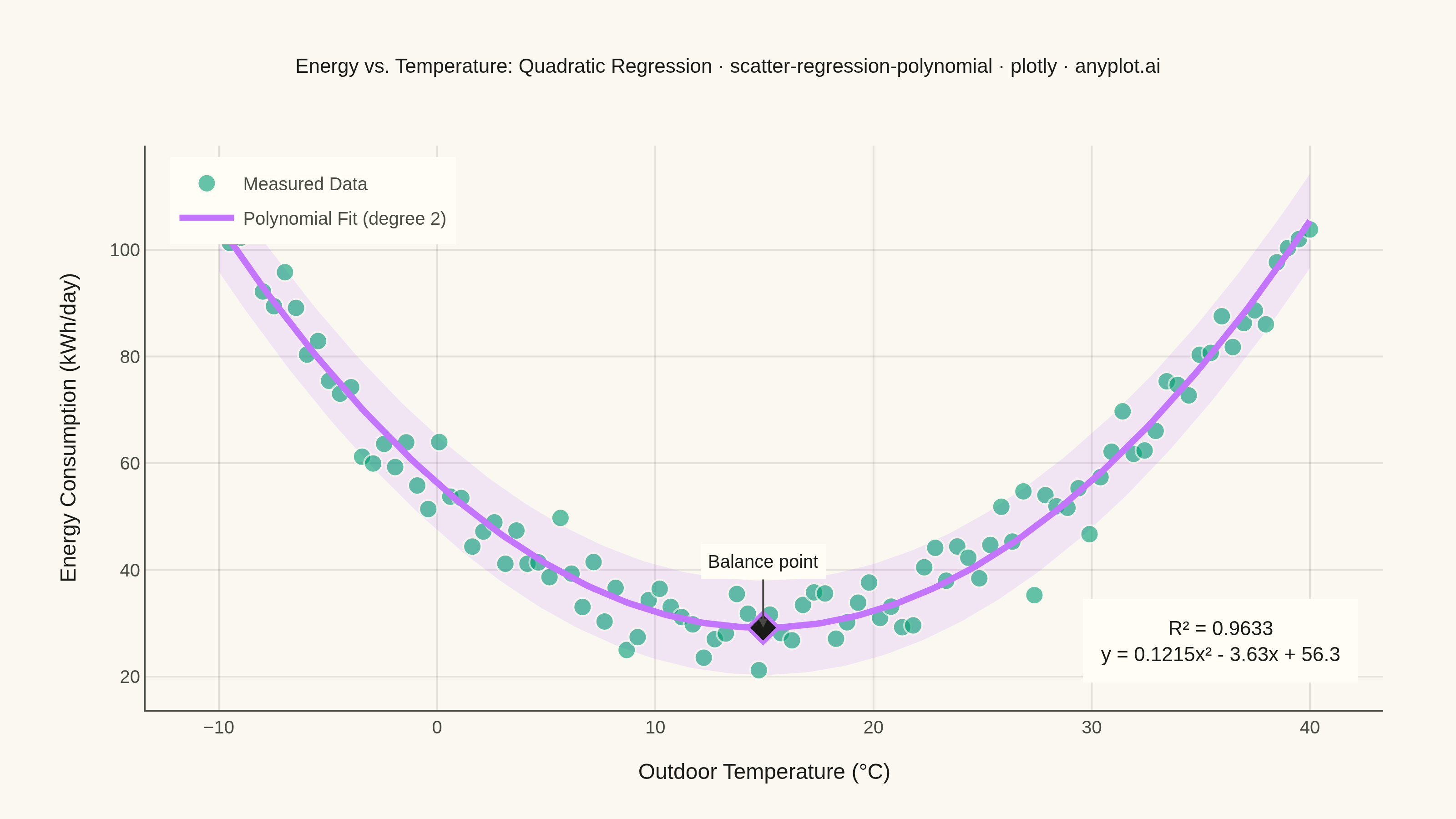
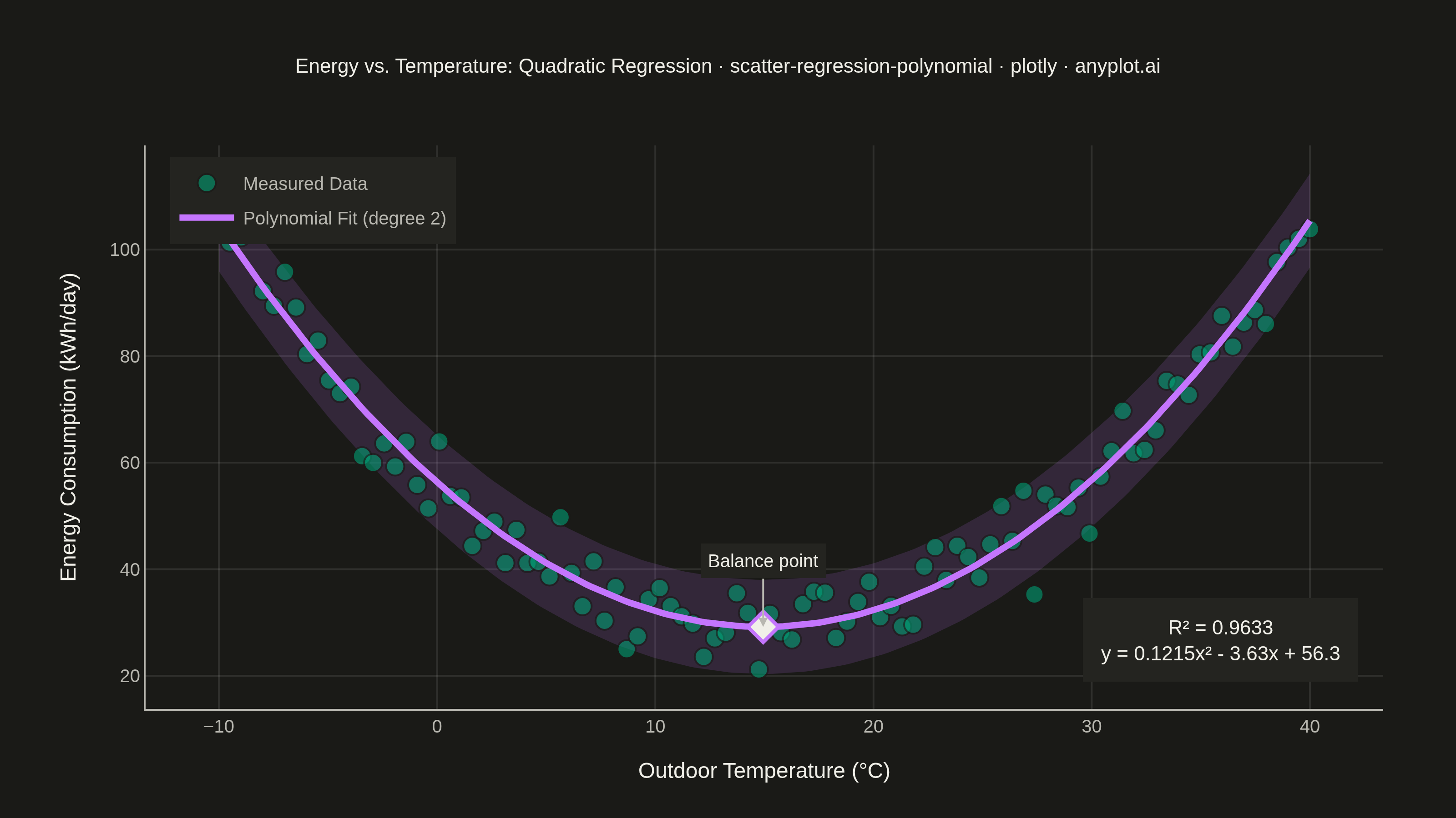
A scatter plot displaying the relationship between two numeric variables with a fitted polynomial regression curve (degree 2-4). This visualization extends beyond linear regression to capture non-linear relationships in data, making it ideal for modeling curved trends, parabolic patterns, and complex data relationships where a straight line would not adequately represent the underlying pattern.
""" anyplot.ai
scatter-regression-polynomial: Scatter Plot with Polynomial Regression
Library: plotly 6.9.0 | Python 3.13.14
Quality: 91/100 | Updated: 2026-08-11
"""

import os

import numpy as np
import plotly.graph_objects as go


# Theme tokens
THEME = os.getenv("ANYPLOT_THEME", "light")
PAGE_BG = "#FAF8F1" if THEME == "light" else "#1A1A17"
ELEVATED_BG = "#FFFDF6" if THEME == "light" else "#242420"
INK = "#1A1A17" if THEME == "light" else "#F0EFE8"
INK_SOFT = "#4A4A44" if THEME == "light" else "#B8B7B0"
GRID = "rgba(26,26,23,0.10)" if THEME == "light" else "rgba(240,239,232,0.10)"

# Imprint palette - first series is always #009E73
BRAND = "#009E73"
ACCENT = "#C475FD"

# Data - Temperature vs Energy Consumption (environmental/building efficiency)
np.random.seed(42)
# Simulate heating/cooling season data where energy consumption follows a U-shaped curve
# (more energy needed for both heating in winter and cooling in summer)
outdoor_temp = np.linspace(-10, 40, 100)
base_consumption = 30
energy_consumption = 0.12 * (outdoor_temp - 15) ** 2 + base_consumption + np.random.normal(0, 5, len(outdoor_temp))

# Polynomial regression (degree 2 - quadratic, capturing the U-shaped curve)
coeffs = np.polyfit(outdoor_temp, energy_consumption, 2)
poly = np.poly1d(coeffs)
x_fit = np.linspace(outdoor_temp.min(), outdoor_temp.max(), 200)
y_fit = poly(x_fit)

# Calculate R²
y_pred = poly(outdoor_temp)
residuals = energy_consumption - y_pred
ss_res = np.sum(residuals**2)
ss_tot = np.sum((energy_consumption - np.mean(energy_consumption)) ** 2)
r_squared = 1 - (ss_res / ss_tot)

# 95% confidence band around the fit, from the residual spread
residual_std = np.std(residuals)
y_upper = y_fit + 1.96 * residual_std
y_lower = y_fit - 1.96 * residual_std

# Format polynomial equation with explicit sign handling (avoids "+ -3.63x")
a, b, c = coeffs
sign_b = "-" if b < 0 else "+"
sign_c = "-" if c < 0 else "+"
equation = f"y = {a:.4f}x² {sign_b} {abs(b):.2f}x {sign_c} {abs(c):.1f}"

# Curve vertex - the "balance point" temperature where energy use is minimized
vertex_x = -b / (2 * a)
vertex_y = poly(vertex_x)

# Create figure
fig = go.Figure()

# Confidence band (drawn first so it sits behind the scatter and fit line)
fig.add_trace(
    go.Scatter(
        x=np.concatenate([x_fit, x_fit[::-1]]),
        y=np.concatenate([y_upper, y_lower[::-1]]),
        fill="toself",
        fillcolor="rgba(196, 117, 253, 0.15)",
        line={"width": 0},
        hoverinfo="skip",
        showlegend=False,
        name="95% Confidence Band",
    )
)

# Scatter points with brand color
fig.add_trace(
    go.Scatter(
        x=outdoor_temp,
        y=energy_consumption,
        mode="markers",
        name="Measured Data",
        marker={"size": 10, "color": BRAND, "opacity": 0.6, "line": {"width": 1, "color": PAGE_BG}},
        hovertemplate="%{x:.1f}°C, %{y:.1f} kWh/day<extra></extra>",
    )
)

# Polynomial regression curve
fig.add_trace(
    go.Scatter(
        x=x_fit,
        y=y_fit,
        mode="lines",
        name="Polynomial Fit (degree 2)",
        line={"color": ACCENT, "width": 3.5},
        hovertemplate="Fit: %{x:.1f}°C, %{y:.1f} kWh/day<extra></extra>",
    )
)

# Highlight the curve's minimum - the real-world "balance point" insight
fig.add_trace(
    go.Scatter(
        x=[vertex_x],
        y=[vertex_y],
        mode="markers",
        name="Balance Point",
        showlegend=False,
        marker={"size": 13, "symbol": "diamond", "color": INK, "line": {"width": 2, "color": ACCENT}},
        hovertemplate=f"Balance point: {vertex_x:.1f}°C, {vertex_y:.1f} kWh/day<extra></extra>",
    )
)

# Title fontsize scaled from the 16px/67-char baseline
title_text = "Energy vs. Temperature: Quadratic Regression · scatter-regression-polynomial · plotly · anyplot.ai"
title_fontsize = max(round(16 * 67 / len(title_text)), 11)

# Layout with theme-adaptive chrome
fig.update_layout(
    autosize=False,
    title={"text": title_text, "font": {"size": title_fontsize, "color": INK}, "x": 0.5, "xanchor": "center"},
    xaxis={
        "title": {"text": "Outdoor Temperature (°C)", "font": {"size": 12, "color": INK}},
        "tickfont": {"size": 10, "color": INK_SOFT},
        "showgrid": True,
        "gridwidth": 1,
        "gridcolor": GRID,
        "linecolor": INK_SOFT,
        "zeroline": False,
    },
    yaxis={
        "title": {"text": "Energy Consumption (kWh/day)", "font": {"size": 12, "color": INK}},
        "tickfont": {"size": 10, "color": INK_SOFT},
        "showgrid": True,
        "gridwidth": 1,
        "gridcolor": GRID,
        "linecolor": INK_SOFT,
        "zeroline": False,
    },
    legend={"font": {"size": 10, "color": INK_SOFT}, "x": 0.02, "y": 0.98, "bgcolor": ELEVATED_BG, "borderwidth": 0},
    paper_bgcolor=PAGE_BG,
    plot_bgcolor=PAGE_BG,
    margin={"l": 80, "r": 40, "t": 80, "b": 60},
    annotations=[
        {
            "x": vertex_x,
            "y": vertex_y,
            "xref": "x",
            "yref": "y",
            "text": "Balance point",
            "showarrow": True,
            "arrowhead": 2,
            "arrowcolor": INK_SOFT,
            "ax": 0,
            "ay": -36,
            "font": {"size": 10, "color": INK},
            "bgcolor": ELEVATED_BG,
            "borderwidth": 0,
            "borderpad": 4,
        },
        {
            "x": 0.98,
            "y": 0.05,
            "xref": "paper",
            "yref": "paper",
            "text": f"R² = {r_squared:.4f}<br>{equation}",
            "showarrow": False,
            "font": {"size": 11, "color": INK},
            "bgcolor": ELEVATED_BG,
            "borderwidth": 0,
            "borderpad": 10,
            "xanchor": "right",
            "yanchor": "bottom",
        },
    ],
)

# Save as PNG and HTML with theme-suffixed filenames — canonical 3200×1800 canvas
fig.write_image(f"plot-{THEME}.png", width=800, height=450, scale=4)
fig.write_html(f"plot-{THEME}.html", include_plotlyjs="cdn")
Runnable source as JSON, for any HTTP client: https://api.anyplot.ai/specs/scatter-regression-polynomial/plotly/code. Any spec id and library id listed in llms-full.txt fit the same URL shape; every URL below is complete and callable.
{
  "spec_id": "scatter-regression-polynomial",
  "language": "python",
  "library": "plotly",
  "page": "https://anyplot.ai/scatter-regression-polynomial/python/plotly",
  "hub": "https://anyplot.ai/scatter-regression-polynomial",
  "code_json": "https://api.anyplot.ai/specs/scatter-regression-polynomial/plotly/code",
  "spec_json": "https://api.anyplot.ai/specs/scatter-regression-polynomial",
  "render_light_png": "https://storage.googleapis.com/anyplot-images/plots/scatter-regression-polynomial/python/plotly/plot-light.png",
  "render_dark_png": "https://storage.googleapis.com/anyplot-images/plots/scatter-regression-polynomial/python/plotly/plot-dark.png",
  "interactive_light_html": "https://storage.googleapis.com/anyplot-images/plots/scatter-regression-polynomial/python/plotly/plot-light.html",
  "interactive_dark_html": "https://storage.googleapis.com/anyplot-images/plots/scatter-regression-polynomial/python/plotly/plot-dark.html",
  "quality_score": 91.0,
  "license": "MIT",
  "guide": "https://anyplot.ai/llms.txt"
}
Part of Scatter Plot with Polynomial Regression on anyplot.ai.