The same plot in 14 other libraries — JavaScript: Chart.js, D3.js, Apache ECharts, MUI X Charts; Python: Altair, Bokeh, lets-plot, Matplotlib, Plotly, plotnine, Pygal, Seaborn; R: ggplot2; Julia: Makie.jl. Compare all 15 side by side: Scatter Plot with Polynomial Regression in Python, R, Julia and JavaScript.
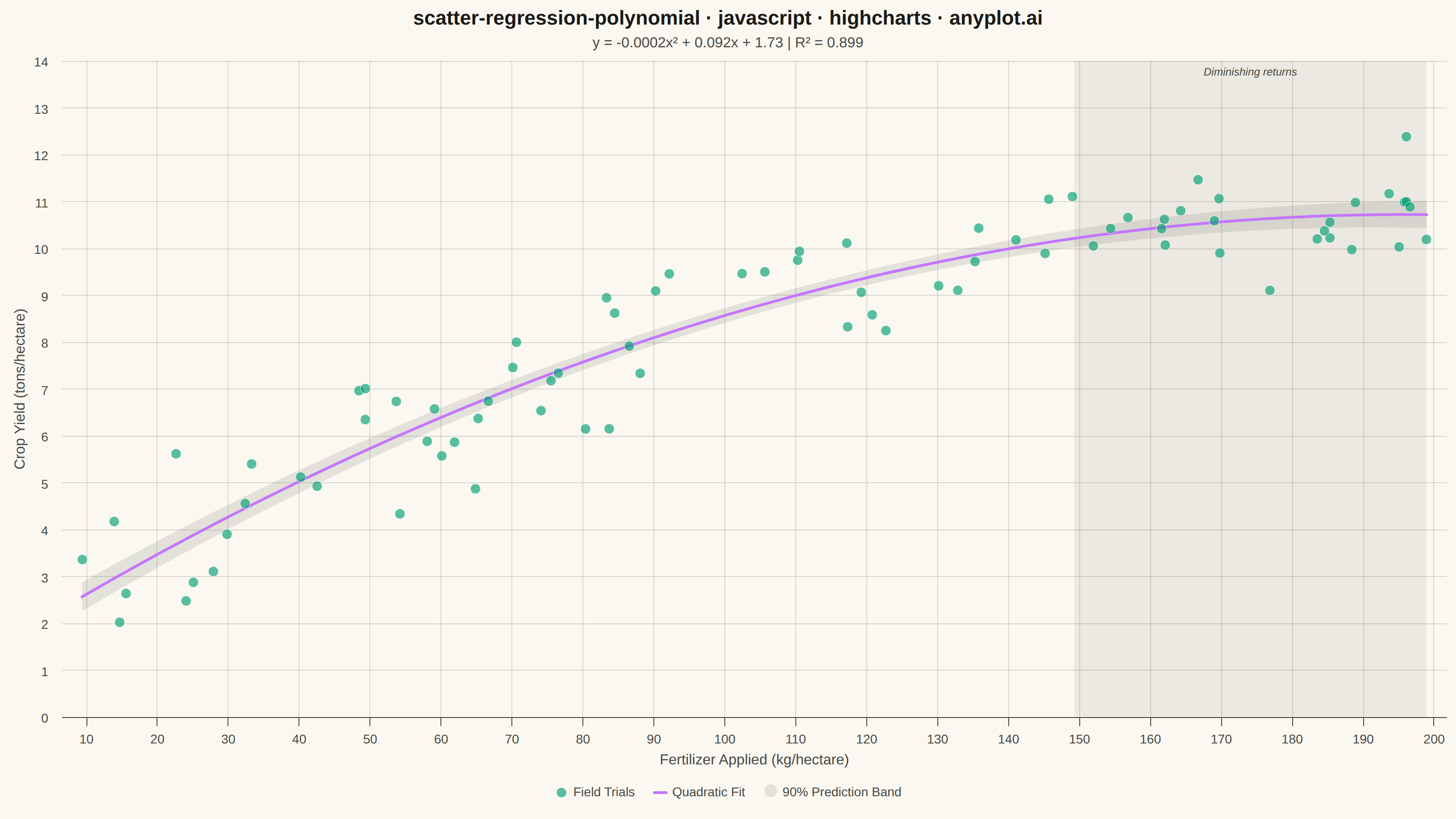
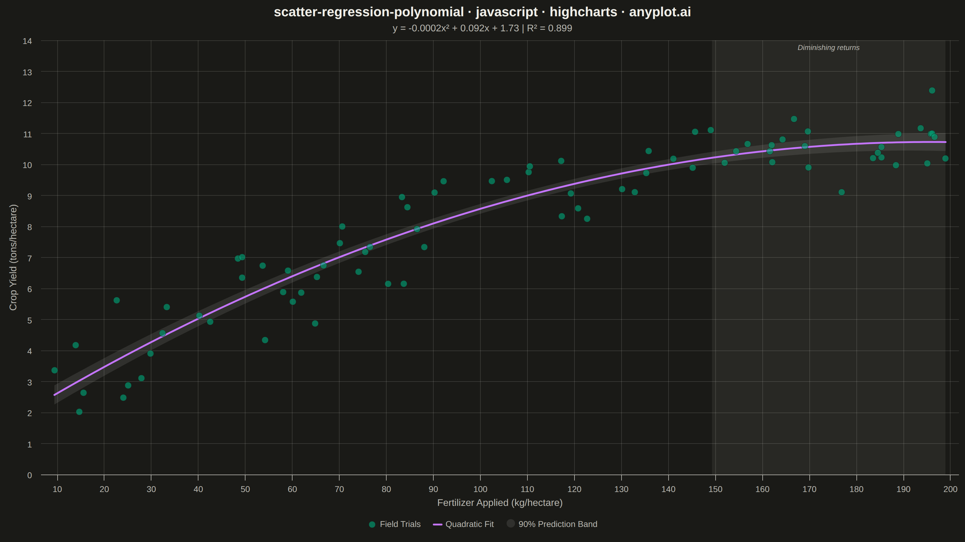
A scatter plot displaying the relationship between two numeric variables with a fitted polynomial regression curve (degree 2-4). This visualization extends beyond linear regression to capture non-linear relationships in data, making it ideal for modeling curved trends, parabolic patterns, and complex data relationships where a straight line would not adequately represent the underlying pattern.
// anyplot.ai
// scatter-regression-polynomial: Scatter Plot with Polynomial Regression
// Library: highcharts 12.6.0 | JavaScript 22.23.1
// Quality: 90/100 | Created: 2026-08-11

const t = window.ANYPLOT_TOKENS;

// --- Data (in-memory, deterministic) ----------------------------------------
// Small fixed-seed LCG — Math.random() is not reproducible in the browser.
let seed = 42;
function rand() {
  seed = (seed * 1664525 + 1013904223) % 4294967296;
  return seed / 4294967296;
}
function gaussian() {
  const u1 = Math.max(rand(), 1e-9);
  const u2 = rand();
  return Math.sqrt(-2 * Math.log(u1)) * Math.cos(2 * Math.PI * u2);
}

// Crop yield response to fertilizer dose — a textbook diminishing-returns
// curve: yield climbs steeply at first, then flattens and tips over past the
// agronomic optimum, so a quadratic captures the pattern a line cannot.
const pointCount = 80;
const fertilizer = [];
const cropYield = [];
for (let i = 0; i < pointCount; i++) {
  const dose = 5 + rand() * 195; // kg/hectare, 5-200
  const trueYield = 2.1 + 0.085 * dose - 0.00021 * dose * dose;
  fertilizer.push(dose);
  cropYield.push(Math.max(0, trueYield + gaussian() * 0.9));
}

// --- Quadratic least-squares fit (normal equations + Gaussian elimination) -
function polyfit(xs, ys, degree) {
  const m = degree + 1;
  const xtx = Array.from({ length: m }, () => new Array(m).fill(0));
  const xty = new Array(m).fill(0);
  for (let i = 0; i < xs.length; i++) {
    const powers = new Array(2 * m - 1);
    let p = 1;
    for (let k = 0; k < powers.length; k++) {
      powers[k] = p;
      p *= xs[i];
    }
    for (let r = 0; r < m; r++) {
      xty[r] += powers[r] * ys[i];
      for (let c = 0; c < m; c++) xtx[r][c] += powers[r + c];
    }
  }
  for (let col = 0; col < m; col++) {
    let pivot = col;
    for (let r = col + 1; r < m; r++) {
      if (Math.abs(xtx[r][col]) > Math.abs(xtx[pivot][col])) pivot = r;
    }
    [xtx[col], xtx[pivot]] = [xtx[pivot], xtx[col]];
    [xty[col], xty[pivot]] = [xty[pivot], xty[col]];
    for (let r = col + 1; r < m; r++) {
      const factor = xtx[r][col] / xtx[col][col];
      for (let c = col; c < m; c++) xtx[r][c] -= factor * xtx[col][c];
      xty[r] -= factor * xty[col];
    }
  }
  const coeffs = new Array(m).fill(0);
  for (let r = m - 1; r >= 0; r--) {
    let sum = xty[r];
    for (let c = r + 1; c < m; c++) sum -= xtx[r][c] * coeffs[c];
    coeffs[r] = sum / xtx[r][r];
  }
  return coeffs; // [c0, c1, c2] for y = c0 + c1*x + c2*x^2
}

const [c0, c1, c2] = polyfit(fertilizer, cropYield, 2);
const predict = (x) => c0 + c1 * x + c2 * x * x;

const meanYield = cropYield.reduce((a, b) => a + b, 0) / pointCount;
let ssRes = 0;
let ssTot = 0;
for (let i = 0; i < pointCount; i++) {
  ssRes += (cropYield[i] - predict(fertilizer[i])) ** 2;
  ssTot += (cropYield[i] - meanYield) ** 2;
}
const rSquared = 1 - ssRes / ssTot;

const xMin = Math.min(...fertilizer);
const xMax = Math.max(...fertilizer);

// Approximate 90% prediction band around the fit — reuses the standard OLS
// leverage formula (se widens away from x̄) applied to the quadratic's
// residual SE. Not the exact leverage of a 3-parameter design matrix, but a
// close, honest visual approximation: pinches near the data's center of mass,
// widens at the extremes.
const xBar = fertilizer.reduce((a, b) => a + b, 0) / pointCount;
const sxx = fertilizer.reduce((acc, x) => acc + (x - xBar) ** 2, 0);
const residualStdErr = Math.sqrt(ssRes / (pointCount - 3)); // 3 fitted params
const tCrit90 = 1.665; // ~90% two-tail critical value at df=77

const curveSteps = 100;
const curvePoints = [];
const bandUpper = [];
const bandLower = [];
for (let i = 0; i <= curveSteps; i++) {
  const x = xMin + ((xMax - xMin) * i) / curveSteps;
  const y = predict(x);
  curvePoints.push([x, y]);
  const se = residualStdErr * Math.sqrt(1 / pointCount + ((x - xBar) ** 2) / sxx);
  bandUpper.push([x, y + tCrit90 * se]);
  bandLower.push([x, y - tCrit90 * se]);
}

// Diminishing-returns onset: the dose past which the marginal yield gain has
// fallen to a quarter of its initial (low-dose) rate — the agronomic point
// where extra fertilizer stops paying off.
const initialSlope = c1 + 2 * c2 * xMin;
const thresholdSlope = 0.25 * initialSlope;
const plateauStart = Math.min(Math.max((thresholdSlope - c1) / (2 * c2), xMin), xMax);

const equation = `y = ${c2.toFixed(4)}x² ${c1 >= 0 ? "+" : "−"} ${Math.abs(c1).toFixed(3)}x ${c0 >= 0 ? "+" : "−"} ${Math.abs(c0).toFixed(2)}`;
const fitSummary = `${equation}    |    R² = ${rSquared.toFixed(3)}`;

function hexToRgba(hex, alpha) {
  const r = parseInt(hex.slice(1, 3), 16);
  const g = parseInt(hex.slice(3, 5), 16);
  const b = parseInt(hex.slice(5, 7), 16);
  return `rgba(${r}, ${g}, ${b}, ${alpha})`;
}

// Imprint "muted" semantic anchor — not in ANYPLOT_TOKENS on the JS side, so
// it's hard-coded per prompts/default-style-guide.md (theme-adaptive).
const muted = t.theme === "dark" ? "#A8A79F" : "#6B6A63";
const bandFill = Highcharts.color(muted).setOpacity(0.16).get();

// --- Chart -------------------------------------------------------------------
// The 90% prediction band is drawn as a plain SVG path in the core renderer,
// redrawn on every chart render — arearange lives in highcharts-more, which
// isn't vendored here.
let bandPath;
Highcharts.chart("container", {
  chart: {
    type: "scatter",
    backgroundColor: "transparent",
    animation: false,
    style: { fontFamily: "inherit" },
    events: {
      render: function () {
        const xAxis = this.xAxis[0];
        const yAxis = this.yAxis[0];
        const upper = bandUpper.map(
          (p, i) => `${i === 0 ? "M" : "L"} ${xAxis.toPixels(p[0], false)} ${yAxis.toPixels(p[1], false)}`,
        );
        const lower = bandLower
          .slice()
          .reverse()
          .map((p) => `L ${xAxis.toPixels(p[0], false)} ${yAxis.toPixels(p[1], false)}`);
        const d = `${upper.join(" ")} ${lower.join(" ")} Z`;
        if (bandPath) {
          bandPath.attr({ d });
        } else {
          bandPath = this.renderer.path().attr({ d, fill: bandFill, zIndex: 2 }).add();
        }
      },
    },
  },
  credits: { enabled: false },
  colors: t.palette,
  title: {
    text: "scatter-regression-polynomial · javascript · highcharts · anyplot.ai",
    style: { color: t.ink, fontSize: "22px", fontWeight: "600" },
  },
  subtitle: {
    text: fitSummary,
    style: { color: t.inkSoft, fontSize: "16px" },
  },
  xAxis: {
    title: {
      text: "Fertilizer Applied (kg/hectare)",
      style: { color: t.inkSoft, fontSize: "16px" },
    },
    lineColor: t.inkSoft,
    tickColor: t.inkSoft,
    gridLineColor: t.grid,
    gridLineWidth: 1,
    labels: { style: { color: t.inkSoft, fontSize: "14px" } },
    plotBands: [
      {
        from: plateauStart,
        to: xMax,
        color: hexToRgba(muted, 0.1),
        label: {
          text: "Diminishing returns",
          verticalAlign: "top",
          align: "center",
          y: 16,
          style: { color: t.inkSoft, fontSize: "12px", fontStyle: "italic" },
        },
      },
    ],
  },
  yAxis: {
    title: {
      text: "Crop Yield (tons/hectare)",
      style: { color: t.inkSoft, fontSize: "16px" },
    },
    lineColor: t.inkSoft,
    tickColor: t.inkSoft,
    gridLineColor: t.grid,
    gridLineWidth: 1,
    labels: { style: { color: t.inkSoft, fontSize: "14px" } },
  },
  legend: {
    itemStyle: { color: t.inkSoft, fontSize: "14px" },
    itemHoverStyle: { color: t.ink },
  },
  plotOptions: {
    series: { animation: false },
  },
  series: [
    {
      type: "scatter",
      name: "Field Trials",
      data: fertilizer.map((x, i) => [x, cropYield[i]]),
      color: hexToRgba(t.palette[0], 0.65),
      zIndex: 5,
      marker: { radius: 5.5, lineWidth: 0.5, lineColor: t.pageBg },
    },
    {
      type: "spline",
      name: "Quadratic Fit",
      data: curvePoints,
      color: t.palette[1],
      lineWidth: 3,
      zIndex: 4,
      marker: { enabled: false },
      enableMouseTracking: false,
    },
    {
      type: "column",
      name: "90% Prediction Band",
      data: [],
      color: bandFill,
      legendSymbol: "rectangle",
      showInLegend: true,
      enableMouseTracking: false,
    },
  ],
});
Runnable source as JSON, for any HTTP client: https://api.anyplot.ai/specs/scatter-regression-polynomial/highcharts/code. Any spec id and library id listed in llms-full.txt fit the same URL shape; every URL below is complete and callable.
{
  "spec_id": "scatter-regression-polynomial",
  "language": "javascript",
  "library": "highcharts",
  "page": "https://anyplot.ai/scatter-regression-polynomial/javascript/highcharts",
  "hub": "https://anyplot.ai/scatter-regression-polynomial",
  "code_json": "https://api.anyplot.ai/specs/scatter-regression-polynomial/highcharts/code",
  "spec_json": "https://api.anyplot.ai/specs/scatter-regression-polynomial",
  "render_light_png": "https://storage.googleapis.com/anyplot-images/plots/scatter-regression-polynomial/javascript/highcharts/plot-light.png",
  "render_dark_png": "https://storage.googleapis.com/anyplot-images/plots/scatter-regression-polynomial/javascript/highcharts/plot-dark.png",
  "interactive_light_html": "https://storage.googleapis.com/anyplot-images/plots/scatter-regression-polynomial/javascript/highcharts/plot-light.html",
  "interactive_dark_html": "https://storage.googleapis.com/anyplot-images/plots/scatter-regression-polynomial/javascript/highcharts/plot-dark.html",
  "quality_score": 90.0,
  "license": "MIT",
  "guide": "https://anyplot.ai/llms.txt"
}
Part of Scatter Plot with Polynomial Regression on anyplot.ai.