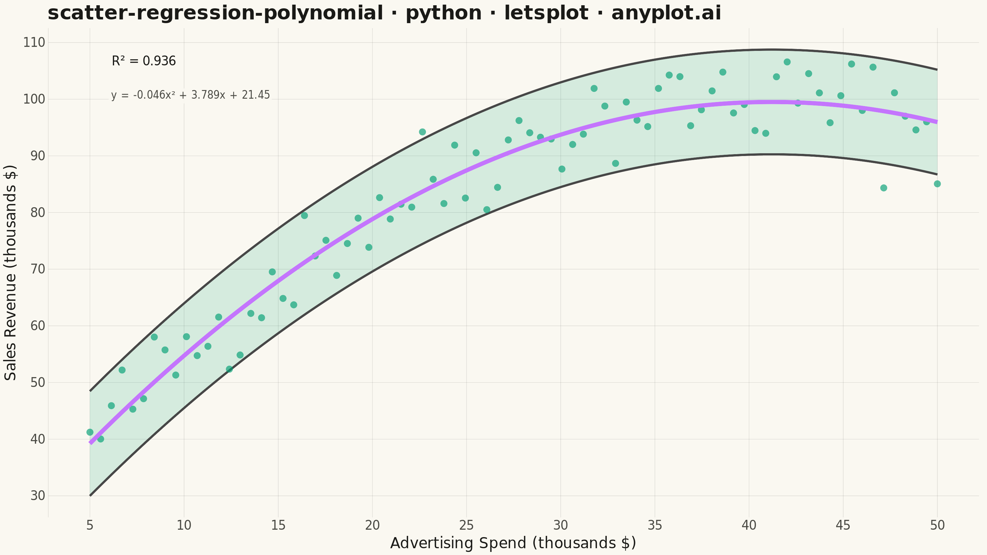
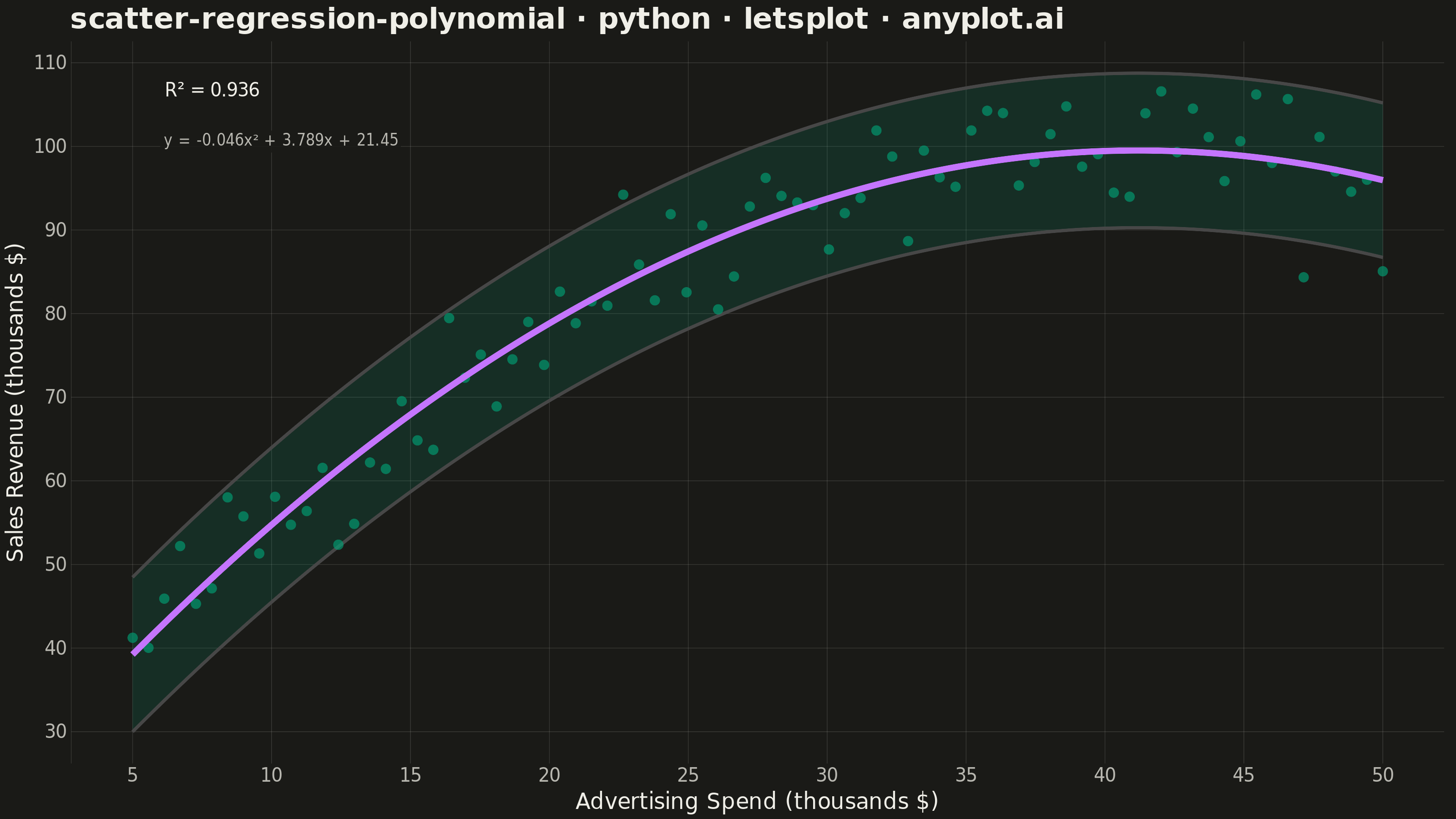
A scatter plot displaying the relationship between two numeric variables with a fitted polynomial regression curve (degree 2-4). This visualization extends beyond linear regression to capture non-linear relationships in data, making it ideal for modeling curved trends, parabolic patterns, and complex data relationships where a straight line would not adequately represent the underlying pattern.
""" anyplot.ai
scatter-regression-polynomial: Scatter Plot with Polynomial Regression
Library: letsplot 4.11.0 | Python 3.13.14
Quality: 90/100 | Updated: 2026-08-11
"""

import os

import numpy as np
import pandas as pd
from lets_plot import *


LetsPlot.setup_html()

# Theme tokens
THEME = os.getenv("ANYPLOT_THEME", "light")
PAGE_BG = "#FAF8F1" if THEME == "light" else "#1A1A17"
ELEVATED_BG = "#FFFDF6" if THEME == "light" else "#242420"
INK = "#1A1A17" if THEME == "light" else "#F0EFE8"
INK_SOFT = "#4A4A44" if THEME == "light" else "#B8B7B0"
RULE = "rgba(26,26,23,0.15)" if THEME == "light" else "rgba(240,239,232,0.15)"

BRAND = "#009E73"  # Imprint palette position 1 - always first series
ACCENT = "#C475FD"  # Imprint palette position 2 - regression line

# Data - Simulating diminishing returns pattern (economics example)
np.random.seed(42)
n_points = 80

# Advertising spend (in thousands)
x = np.linspace(5, 50, n_points)
# Sales revenue with diminishing returns (quadratic relationship)
# y = -0.05x² + 4x + 20 + noise
y = -0.05 * x**2 + 4 * x + 20 + np.random.normal(0, 5, n_points)

# Fit polynomial regression (degree 2 - quadratic) using numpy
poly_degree = 2
coefficients = np.polyfit(x, y, poly_degree)
poly_func = np.poly1d(coefficients)
y_pred = poly_func(x)

# Calculate R²
ss_res = np.sum((y - y_pred) ** 2)
ss_tot = np.sum((y - np.mean(y)) ** 2)
r2 = 1 - (ss_res / ss_tot)

# Generate smooth curve for regression line
x_smooth = np.linspace(x.min(), x.max(), 200)
y_smooth = poly_func(x_smooth)

# Generate confidence band (approximate using residual standard error)
residuals = y - y_pred
std_error = np.std(residuals)
y_upper = y_smooth + 1.96 * std_error
y_lower = y_smooth - 1.96 * std_error

# Create dataframes
df_points = pd.DataFrame({"x": x, "y": y})
df_curve = pd.DataFrame({"x": x_smooth, "y": y_smooth, "y_upper": y_upper, "y_lower": y_lower})

# Get polynomial equation
a, b, c = coefficients
equation = f"y = {a:.3f}x² + {b:.3f}x + {c:.2f}"

# Create plot
plot = (
    ggplot()
    # Confidence band with no border
    + geom_ribbon(
        aes(x="x", ymin="y_lower", ymax="y_upper"),
        data=df_curve,
        fill=BRAND,
        alpha=0.15,
        color=None,
        tooltips=layer_tooltips().line("95% band|@y_lower – @y_upper"),
    )
    # Scatter points
    + geom_point(
        aes(x="x", y="y"),
        data=df_points,
        color=BRAND,
        size=2.5,
        alpha=0.65,
        tooltips=layer_tooltips().line("Advertising spend|$@x k").line("Sales revenue|$@y k"),
    )
    # Polynomial regression line
    + geom_line(
        aes(x="x", y="y"), data=df_curve, color=ACCENT, size=1.5, tooltips=layer_tooltips().line("Fitted revenue|$@y k")
    )
    # Labels and title
    + labs(
        x="Advertising Spend (thousands $)",
        y="Sales Revenue (thousands $)",
        title="scatter-regression-polynomial · python · letsplot · anyplot.ai",
    )
    # Annotations for R² and equation - placed top-left, away from the point
    # cloud (which only rises above y=95 for x > 27) and shielded with a
    # background label box so any future data draw can't overlap the text
    + geom_label(
        aes(x="x", y="y", label="label"),
        data=pd.DataFrame({"x": [x.min() + 1], "y": [y.max()], "label": [f"R² = {r2:.3f}"]}),
        size=5,
        color=INK,
        fill=PAGE_BG,
        label_size=0,
        alpha=0.9,
        hjust=0,
    )
    + geom_label(
        aes(x="x", y="y", label="label"),
        data=pd.DataFrame({"x": [x.min() + 1], "y": [y.max() - 6], "label": [equation]}),
        size=4,
        color=INK_SOFT,
        fill=PAGE_BG,
        label_size=0,
        alpha=0.9,
        hjust=0,
    )
    # Theme
    + theme_minimal()
    + theme(
        plot_background=element_rect(fill=PAGE_BG, color=PAGE_BG),
        panel_background=element_rect(fill=PAGE_BG, color=PAGE_BG),
        panel_border=element_blank(),  # drop box border - L-shaped frame from axis_line only
        panel_grid_major=element_line(color=RULE, size=0.3),
        panel_grid_minor=element_blank(),
        plot_title=element_text(size=16, face="bold", color=INK),
        axis_title=element_text(size=12, color=INK),
        axis_text=element_text(size=10, color=INK_SOFT),
        axis_line=element_line(color=INK_SOFT),
    )
    + ggsize(800, 450)
)

# Save as PNG (scale 4x for 3200x1800)
ggsave(plot, f"plot-{THEME}.png", path=".", scale=4)

# Save as HTML for interactive viewing
ggsave(plot, f"plot-{THEME}.html", path=".")
Runnable source as JSON, for any HTTP client: https://api.anyplot.ai/specs/scatter-regression-polynomial/letsplot/code. Any spec id and library id listed in llms-full.txt fit the same URL shape; every URL below is complete and callable.
{
  "spec_id": "scatter-regression-polynomial",
  "language": "python",
  "library": "letsplot",
  "page": "https://anyplot.ai/scatter-regression-polynomial/python/letsplot",
  "hub": "https://anyplot.ai/scatter-regression-polynomial",
  "code_json": "https://api.anyplot.ai/specs/scatter-regression-polynomial/letsplot/code",
  "spec_json": "https://api.anyplot.ai/specs/scatter-regression-polynomial",
  "render_light_png": "https://storage.googleapis.com/anyplot-images/plots/scatter-regression-polynomial/python/letsplot/plot-light.png",
  "render_dark_png": "https://storage.googleapis.com/anyplot-images/plots/scatter-regression-polynomial/python/letsplot/plot-dark.png",
  "interactive_light_html": "https://storage.googleapis.com/anyplot-images/plots/scatter-regression-polynomial/python/letsplot/plot-light.html",
  "interactive_dark_html": "https://storage.googleapis.com/anyplot-images/plots/scatter-regression-polynomial/python/letsplot/plot-dark.html",
  "quality_score": 90.0,
  "license": "MIT",
  "guide": "https://anyplot.ai/llms.txt"
}
Part of Scatter Plot with Polynomial Regression on anyplot.ai.