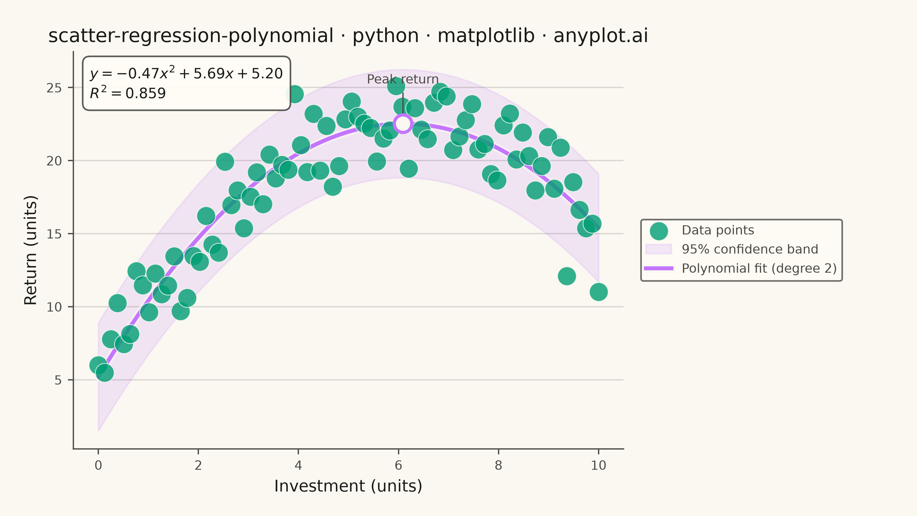
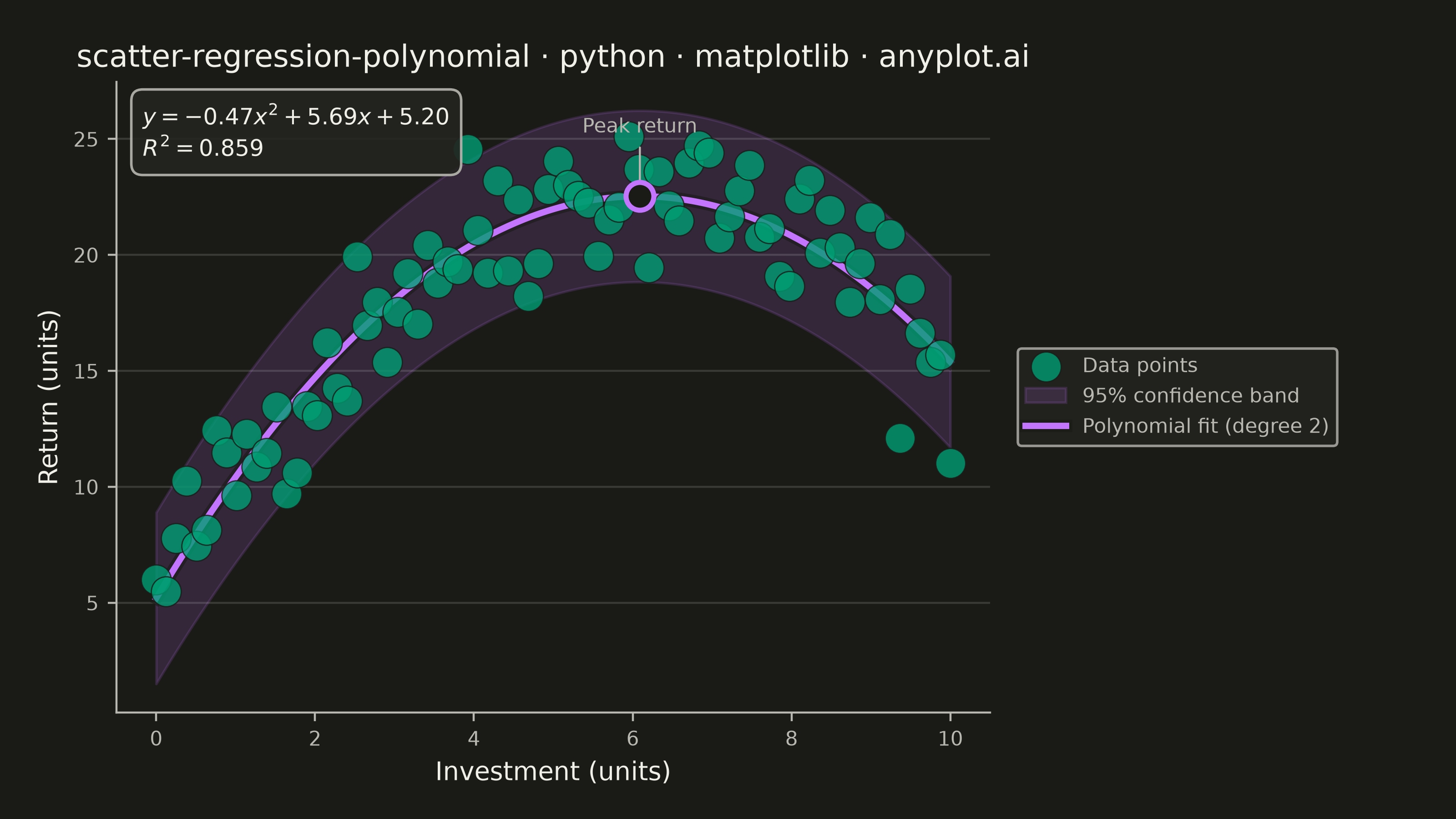
A scatter plot displaying the relationship between two numeric variables with a fitted polynomial regression curve (degree 2-4). This visualization extends beyond linear regression to capture non-linear relationships in data, making it ideal for modeling curved trends, parabolic patterns, and complex data relationships where a straight line would not adequately represent the underlying pattern.
""" anyplot.ai
scatter-regression-polynomial: Scatter Plot with Polynomial Regression
Library: matplotlib 3.11.1 | Python 3.13.14
Quality: 92/100 | Updated: 2026-08-11
"""

import os

import matplotlib.patheffects as patheffects
import matplotlib.pyplot as plt
import numpy as np


# Theme tokens (see prompts/default-style-guide.md "Background" + "Theme-adaptive Chrome")
THEME = os.getenv("ANYPLOT_THEME", "light")
PAGE_BG = "#FAF8F1" if THEME == "light" else "#1A1A17"
ELEVATED_BG = "#FFFDF6" if THEME == "light" else "#242420"
INK = "#1A1A17" if THEME == "light" else "#F0EFE8"
INK_SOFT = "#4A4A44" if THEME == "light" else "#B8B7B0"
BRAND = "#009E73"  # Imprint palette position 1 — ALWAYS first series
SECONDARY = "#C475FD"  # Imprint palette position 2

# Data - Modeling diminishing returns (economics example)
np.random.seed(42)
x = np.linspace(0, 10, 80)
# Quadratic relationship: y = -0.5x² + 6x + 5 + noise
y = -0.5 * x**2 + 6 * x + 5 + np.random.normal(0, 2, len(x))

# Fit polynomial regression (degree 2 - quadratic)
coeffs = np.polyfit(x, y, 2)
poly = np.poly1d(coeffs)
x_smooth = np.linspace(x.min(), x.max(), 200)
y_fit = poly(x_smooth)

# Calculate R² value
y_pred = poly(x)
ss_res = np.sum((y - y_pred) ** 2)
ss_tot = np.sum((y - np.mean(y)) ** 2)
r_squared = 1 - (ss_res / ss_tot)

# Plot — canonical landscape canvas: figsize(8, 4.5) @ dpi=400 => 3200x1800px
fig, ax = plt.subplots(figsize=(8, 4.5), dpi=400, facecolor=PAGE_BG)
ax.set_facecolor(PAGE_BG)

# Scatter points with transparency
ax.scatter(x, y, s=140, alpha=0.8, color=BRAND, edgecolors=PAGE_BG, linewidth=0.5, label="Data points", zorder=3)

# Confidence band (approximate using residual standard error)
residuals = y - y_pred
std_err = np.std(residuals)
ax.fill_between(
    x_smooth,
    y_fit - 1.96 * std_err,
    y_fit + 1.96 * std_err,
    alpha=0.15,
    color=SECONDARY,
    label="95% confidence band",
    zorder=1,
)

# Polynomial regression curve — a soft page-colored halo (patheffects) lifts the
# curve off the scatter cloud without darkening its color in either theme.
(fit_line,) = ax.plot(x_smooth, y_fit, color=SECONDARY, linewidth=2.5, label="Polynomial fit (degree 2)", zorder=2)
fit_line.set_path_effects([patheffects.Stroke(linewidth=5, foreground=PAGE_BG, alpha=0.6), patheffects.Normal()])

# Highlight the curve's peak (vertex of the parabola) — the "diminishing returns"
# insight the plot is telling: returns rise, crest here, then decline.
a, b, c = coeffs
vertex_x = -b / (2 * a)
if x.min() <= vertex_x <= x.max():
    vertex_y = poly(vertex_x)
    ax.plot(
        vertex_x,
        vertex_y,
        marker="o",
        markersize=11,
        markerfacecolor=PAGE_BG,
        markeredgecolor=SECONDARY,
        markeredgewidth=2,
        zorder=4,
    )
    ax.annotate(
        "Peak return",
        xy=(vertex_x, vertex_y),
        xytext=(vertex_x, vertex_y + 0.14 * (y.max() - y.min())),
        ha="center",
        fontsize=8,
        color=INK_SOFT,
        arrowprops={"arrowstyle": "-", "color": INK_SOFT, "linewidth": 0.8},
    )

# Format polynomial equation with mathtext for a cleaner, typeset look
equation = f"$y = {a:.2f}x^2 + {b:.2f}x + {c:.2f}$"

# Add R² and equation annotation (top-left, well clear of the legend which lives outside the axes)
annotation_text = f"{equation}\n$R^2 = {r_squared:.3f}$"
ax.annotate(
    annotation_text,
    xy=(0.03, 0.97),
    xycoords="axes fraction",
    fontsize=9,
    verticalalignment="top",
    bbox={"boxstyle": "round,pad=0.5", "facecolor": ELEVATED_BG, "edgecolor": INK_SOFT, "alpha": 0.9},
    color=INK,
)

# Style
ax.set_xlabel("Investment (units)", fontsize=10, color=INK)
ax.set_ylabel("Return (units)", fontsize=10, color=INK)
ax.set_title(
    "scatter-regression-polynomial · python · matplotlib · anyplot.ai", fontsize=12, fontweight="medium", color=INK
)
ax.tick_params(axis="both", labelsize=8, colors=INK_SOFT)
ax.spines["top"].set_visible(False)
ax.spines["right"].set_visible(False)
for s in ("left", "bottom"):
    ax.spines[s].set_color(INK_SOFT)

ax.yaxis.grid(True, alpha=0.15, linewidth=0.8, color=INK)

# Legend positioned outside the axes (right margin reserved via subplots_adjust below)
# so it never collides with the annotation box in the top-left corner.
leg = ax.legend(fontsize=8, loc="center left", bbox_to_anchor=(1.02, 0.5), frameon=True)
if leg:
    leg.get_frame().set_facecolor(ELEVATED_BG)
    leg.get_frame().set_edgecolor(INK_SOFT)
    plt.setp(leg.get_texts(), color=INK_SOFT)

fig.subplots_adjust(left=0.08, right=0.68, top=0.9, bottom=0.13)
plt.savefig(f"plot-{THEME}.png", dpi=400, facecolor=PAGE_BG)  # bbox_inches MUST stay default (None)
Runnable source as JSON, for any HTTP client: https://api.anyplot.ai/specs/scatter-regression-polynomial/matplotlib/code. Any spec id and library id listed in llms-full.txt fit the same URL shape; every URL below is complete and callable.
{
  "spec_id": "scatter-regression-polynomial",
  "language": "python",
  "library": "matplotlib",
  "page": "https://anyplot.ai/scatter-regression-polynomial/python/matplotlib",
  "hub": "https://anyplot.ai/scatter-regression-polynomial",
  "code_json": "https://api.anyplot.ai/specs/scatter-regression-polynomial/matplotlib/code",
  "spec_json": "https://api.anyplot.ai/specs/scatter-regression-polynomial",
  "render_light_png": "https://storage.googleapis.com/anyplot-images/plots/scatter-regression-polynomial/python/matplotlib/plot-light.png",
  "render_dark_png": "https://storage.googleapis.com/anyplot-images/plots/scatter-regression-polynomial/python/matplotlib/plot-dark.png",
  "quality_score": 92.0,
  "license": "MIT",
  "guide": "https://anyplot.ai/llms.txt"
}
Part of Scatter Plot with Polynomial Regression on anyplot.ai.