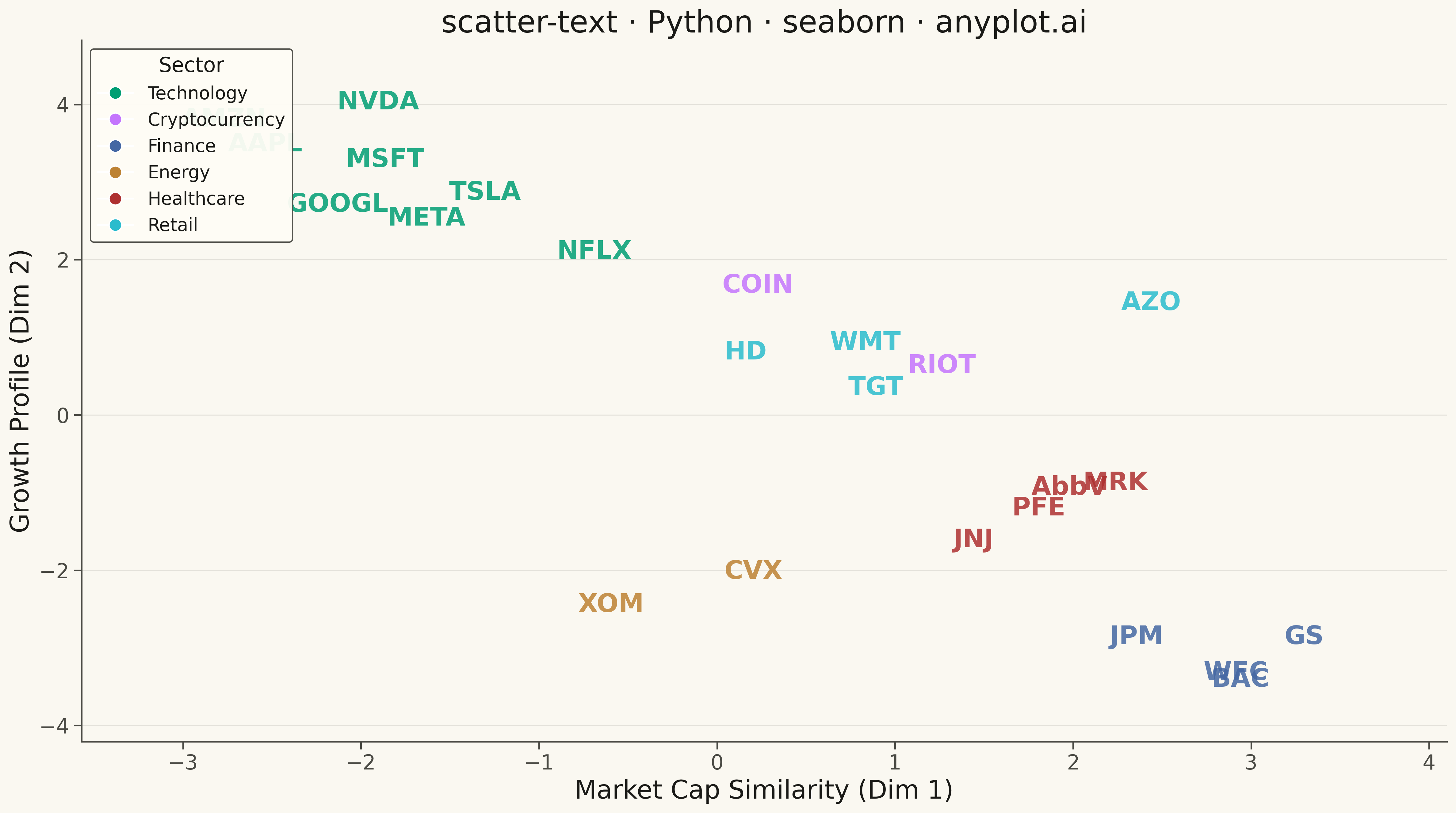
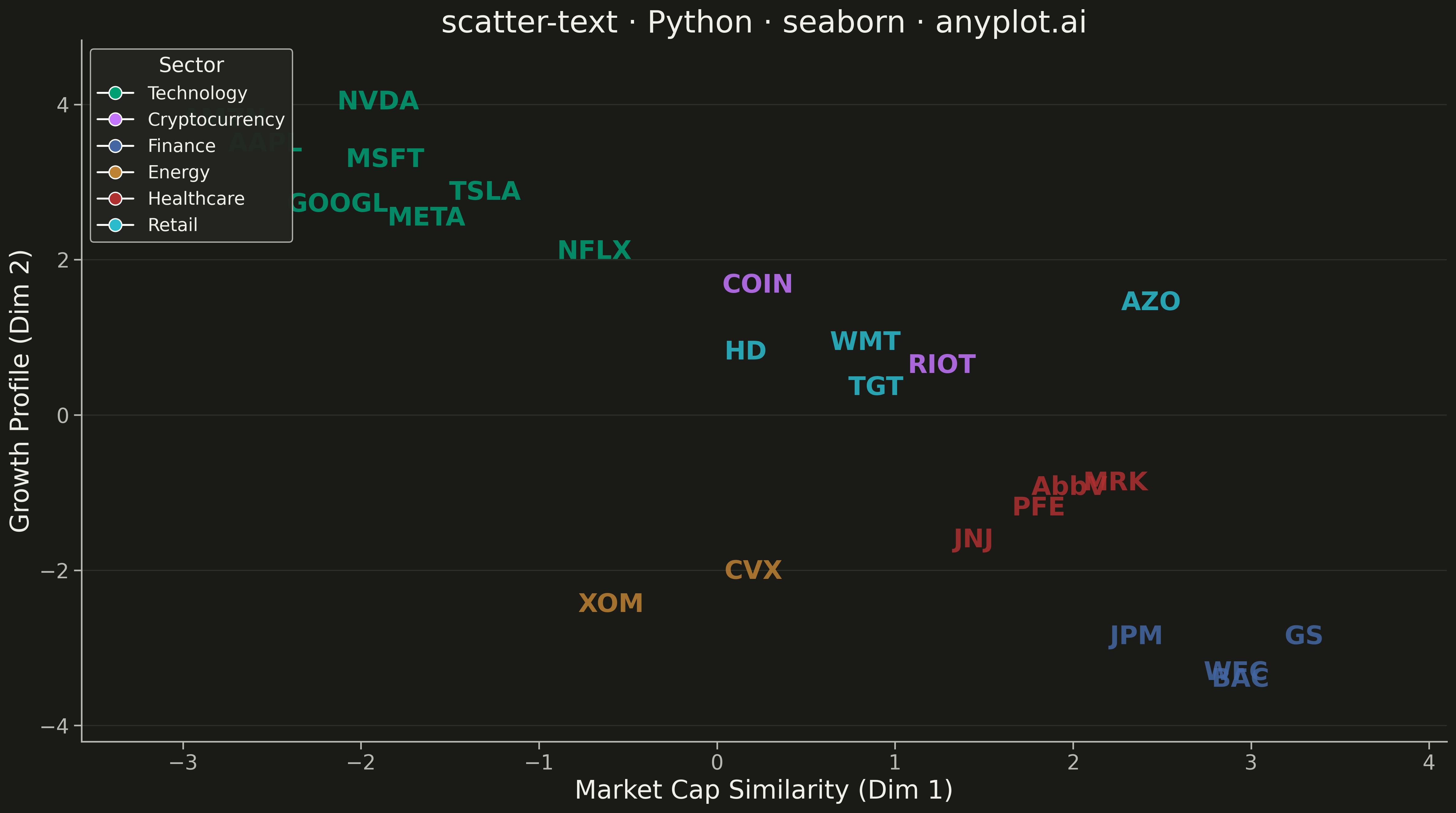
A scatter plot where data points are represented by text labels instead of markers. Each label is positioned at its corresponding coordinates, making the text itself the visual element. This visualization is particularly useful for displaying named entities in 2D space, such as word embeddings, dimensionality reduction outputs, or any scenario where identifying individual items by name is more important than seeing their relative density.
""" anyplot.ai
scatter-text: Scatter Plot with Text Labels Instead of Points
Library: seaborn 0.13.2 | Python 3.13.13
Quality: 87/100 | Updated: 2026-05-17
"""

import os

import matplotlib.pyplot as plt
import numpy as np
import pandas as pd
import seaborn as sns
from matplotlib.lines import Line2D


# Theme tokens
THEME = os.getenv("ANYPLOT_THEME", "light")
PAGE_BG = "#FAF8F1" if THEME == "light" else "#1A1A17"
ELEVATED_BG = "#FFFDF6" if THEME == "light" else "#242420"
INK = "#1A1A17" if THEME == "light" else "#F0EFE8"
INK_SOFT = "#4A4A44" if THEME == "light" else "#B8B7B0"

# Okabe-Ito palette (first series always #009E73)
IMPRINT = ["#009E73", "#C475FD", "#4467A3", "#BD8233", "#AE3030", "#2ABCCD", "#954477"]

# Data - Stock symbols positioned by market metrics (market cap vs growth similarity)
np.random.seed(42)

stocks = [
    "AAPL",
    "MSFT",
    "GOOGL",
    "AMZN",
    "NVDA",
    "TSLA",
    "META",
    "NFLX",
    "COIN",
    "RIOT",
    "JPM",
    "BAC",
    "GS",
    "WFC",
    "XOM",
    "CVX",
    "JNJ",
    "PFE",
    "AbbV",
    "MRK",
    "WMT",
    "TGT",
    "AZO",
    "HD",
]

# Generate well-separated coordinates (simulating market embedding)
base_x = np.array(
    [
        -2.5,
        -2.0,
        -2.2,
        -2.8,
        -1.8,
        -1.2,
        -1.5,
        -0.8,
        0.2,
        1.2,
        2.5,
        2.8,
        3.2,
        3.0,
        -0.5,
        0.3,
        1.5,
        1.8,
        2.0,
        2.3,
        0.8,
        1.0,
        2.5,
        0.2,
    ]
)

base_y = np.array(
    [
        3.5,
        3.2,
        2.8,
        3.8,
        4.0,
        3.0,
        2.5,
        2.2,
        1.8,
        0.5,
        -3.0,
        -3.5,
        -2.8,
        -3.2,
        -2.5,
        -2.0,
        -1.5,
        -1.2,
        -0.8,
        -1.0,
        1.0,
        0.3,
        1.5,
        0.8,
    ]
)

# Add small jitter to prevent exact overlaps
x = base_x + np.random.uniform(-0.15, 0.15, len(base_x))
y = base_y + np.random.uniform(-0.15, 0.15, len(base_y))

# Define sectors for coloring
sectors = [
    "Technology",
    "Technology",
    "Technology",
    "Technology",
    "Technology",
    "Technology",
    "Technology",
    "Technology",
    "Cryptocurrency",
    "Cryptocurrency",
    "Finance",
    "Finance",
    "Finance",
    "Finance",
    "Energy",
    "Energy",
    "Healthcare",
    "Healthcare",
    "Healthcare",
    "Healthcare",
    "Retail",
    "Retail",
    "Retail",
    "Retail",
]

# Create DataFrame
df = pd.DataFrame({"x": x, "y": y, "ticker": stocks, "sector": sectors})

# Map sectors to Okabe-Ito colors
sector_color_map = {
    "Technology": IMPRINT[0],
    "Cryptocurrency": IMPRINT[1],
    "Finance": IMPRINT[2],
    "Energy": IMPRINT[3],
    "Healthcare": IMPRINT[4],
    "Retail": IMPRINT[5],
}

# Set seaborn theme with theme-adaptive colors
sns.set_theme(
    style="ticks",
    rc={
        "figure.facecolor": PAGE_BG,
        "axes.facecolor": PAGE_BG,
        "axes.edgecolor": INK_SOFT,
        "axes.labelcolor": INK,
        "text.color": INK,
        "xtick.color": INK_SOFT,
        "ytick.color": INK_SOFT,
        "grid.color": INK,
        "grid.alpha": 0.10,
    },
)

# Create figure and axis
fig, ax = plt.subplots(figsize=(16, 9), facecolor=PAGE_BG)
ax.set_facecolor(PAGE_BG)

# Plot text labels at each coordinate position
for _, row in df.iterrows():
    color = sector_color_map[row["sector"]]
    ax.text(
        row["x"],
        row["y"],
        row["ticker"],
        fontsize=20,
        fontweight="bold",
        ha="center",
        va="center",
        color=color,
        alpha=0.85,
    )

# Styling
ax.set_xlabel("Market Cap Similarity (Dim 1)", fontsize=20, color=INK)
ax.set_ylabel("Growth Profile (Dim 2)", fontsize=20, color=INK)
ax.set_title("scatter-text · Python · seaborn · anyplot.ai", fontsize=24, color=INK)

ax.tick_params(axis="both", labelsize=16, colors=INK_SOFT)

# Remove top and right spines
ax.spines["top"].set_visible(False)
ax.spines["right"].set_visible(False)
ax.spines["left"].set_color(INK_SOFT)
ax.spines["bottom"].set_color(INK_SOFT)

# Subtle grid
ax.yaxis.grid(True, alpha=0.10, linewidth=0.8, color=INK)

# Create legend with sector colors
legend_elements = [
    Line2D([0], [0], marker="o", color="w", markerfacecolor=color, markersize=10, label=sector)
    for sector, color in sector_color_map.items()
]
ax.legend(
    handles=legend_elements,
    title="Sector",
    loc="upper left",
    framealpha=0.95,
    facecolor=ELEVATED_BG,
    edgecolor=INK_SOFT,
    fontsize=14,
    title_fontsize=16,
)

# Set axis limits with padding
x_margin = 0.8
y_margin = 0.8
ax.set_xlim(x.min() - x_margin, x.max() + x_margin)
ax.set_ylim(y.min() - y_margin, y.max() + y_margin)

plt.tight_layout()
plt.savefig(f"plot-{THEME}.png", dpi=300, bbox_inches="tight", facecolor=PAGE_BG)
Runnable source as JSON, for any HTTP client: https://api.anyplot.ai/specs/scatter-text/seaborn/code. Any spec id and library id listed in llms-full.txt fit the same URL shape; every URL below is complete and callable.
{
  "spec_id": "scatter-text",
  "language": "python",
  "library": "seaborn",
  "page": "https://anyplot.ai/scatter-text/python/seaborn",
  "hub": "https://anyplot.ai/scatter-text",
  "code_json": "https://api.anyplot.ai/specs/scatter-text/seaborn/code",
  "spec_json": "https://api.anyplot.ai/specs/scatter-text",
  "render_light_png": "https://storage.googleapis.com/anyplot-images/plots/scatter-text/python/seaborn/plot-light.png",
  "render_dark_png": "https://storage.googleapis.com/anyplot-images/plots/scatter-text/python/seaborn/plot-dark.png",
  "quality_score": 87.0,
  "license": "MIT",
  "guide": "https://anyplot.ai/llms.txt"
}
Part of Scatter Plot with Text Labels Instead of Points on anyplot.ai.