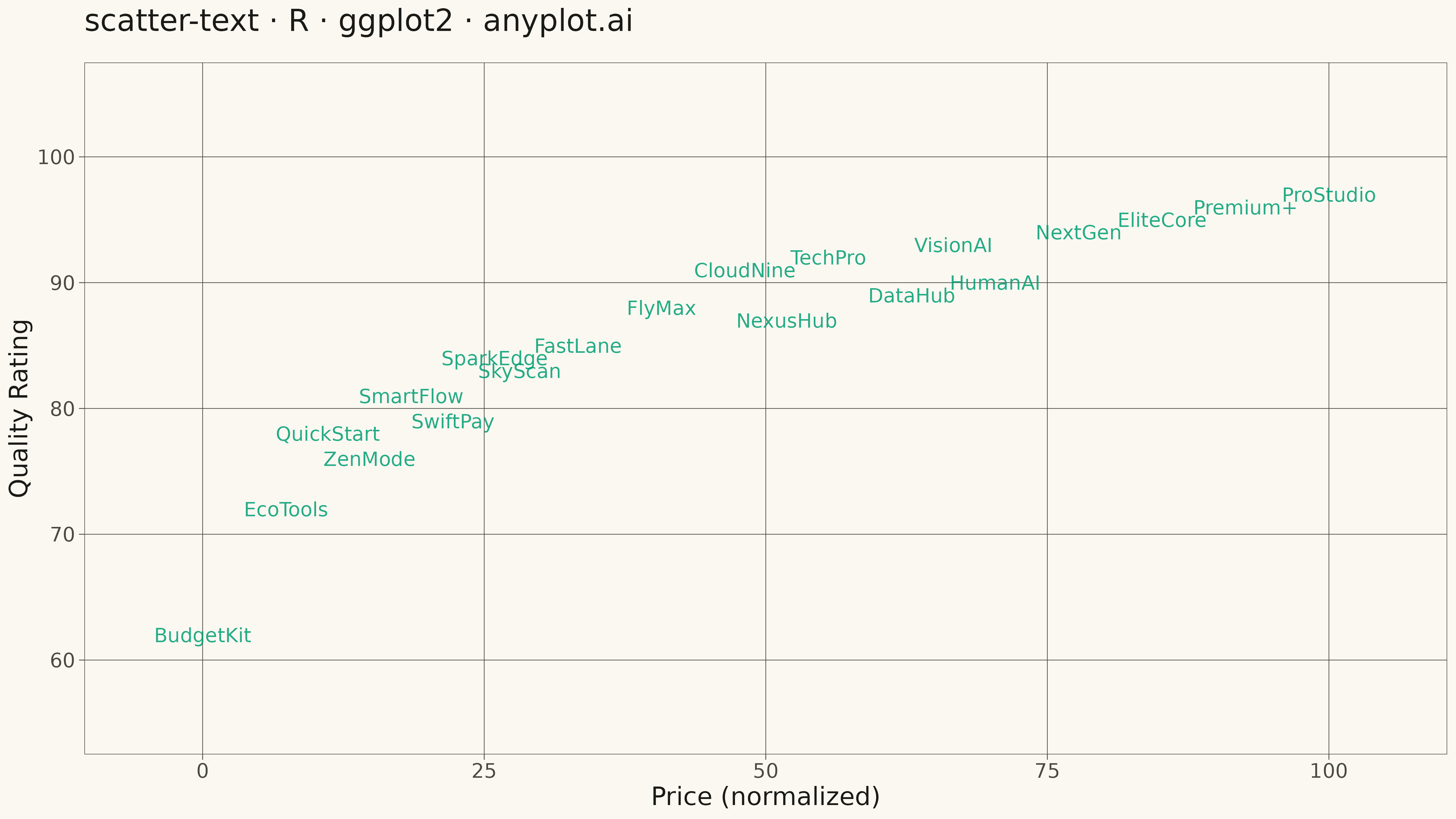
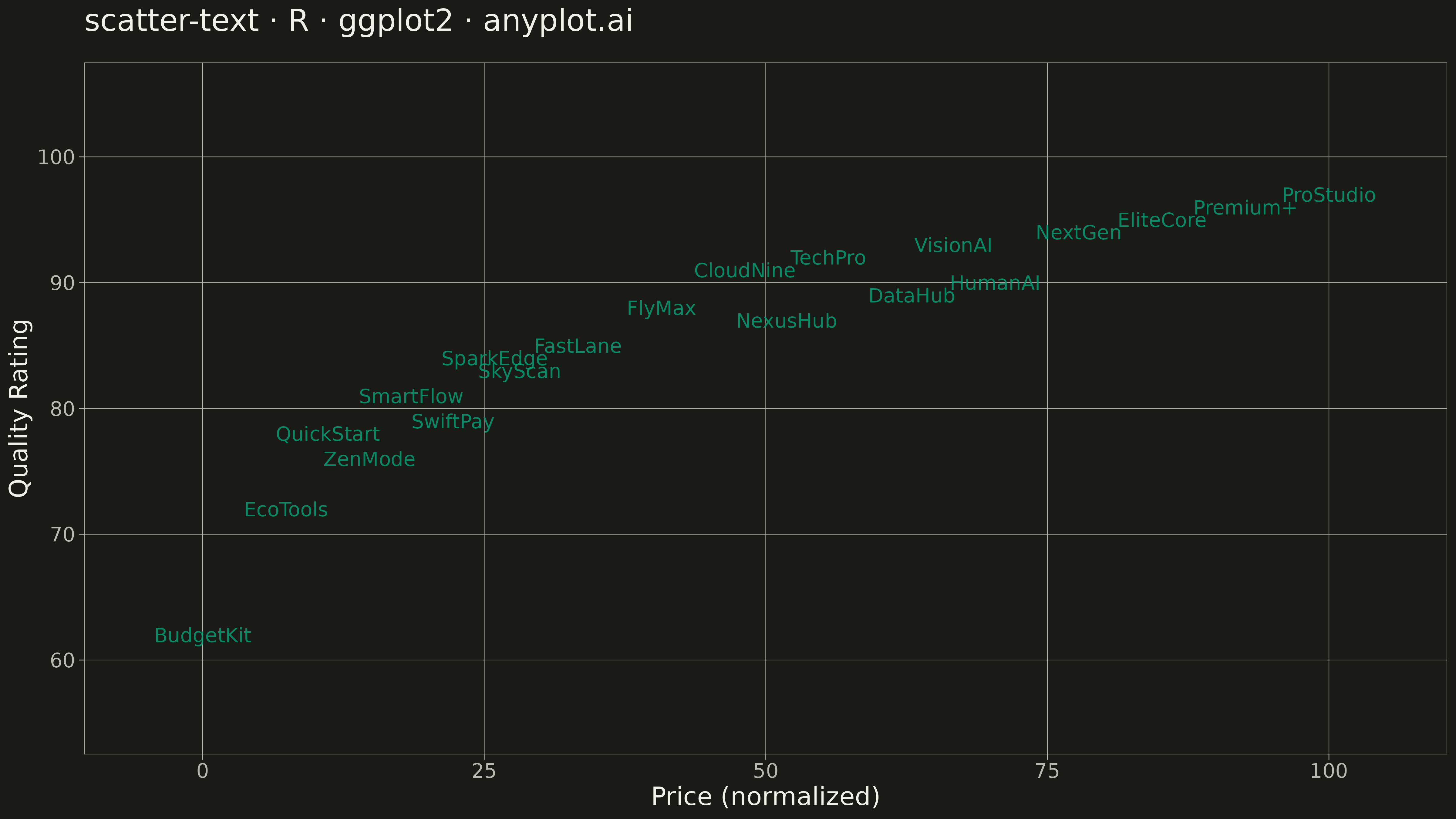
The same plot in 14 other libraries — Python: Altair, Bokeh, lets-plot, Matplotlib, Plotly, plotnine, Pygal, Seaborn; Julia: Makie.jl; JavaScript: Chart.js, D3.js, Apache ECharts, Highcharts, MUI X Charts. Compare all 15 side by side: Scatter Plot with Text Labels Instead of Points in Python, R, Julia and JavaScript.
A scatter plot where data points are represented by text labels instead of markers. Each label is positioned at its corresponding coordinates, making the text itself the visual element. This visualization is particularly useful for displaying named entities in 2D space, such as word embeddings, dimensionality reduction outputs, or any scenario where identifying individual items by name is more important than seeing their relative density.
#' anyplot.ai
#' scatter-text: Scatter Plot with Text Labels Instead of Points
#' Library: ggplot2 3.5.1 | R 4.4.1
#' Quality: 84/100 | Created: 2026-05-17

library(ggplot2)
library(dplyr)
library(ragg)

set.seed(42)

# --- Theme tokens -----------------------------------------------------------
THEME       <- Sys.getenv("ANYPLOT_THEME", "light")
PAGE_BG     <- if (THEME == "light") "#FAF8F1" else "#1A1A17"
ELEVATED_BG <- if (THEME == "light") "#FFFDF6" else "#242420"
INK         <- if (THEME == "light") "#1A1A17" else "#F0EFE8"
INK_SOFT    <- if (THEME == "light") "#4A4A44" else "#B8B7B0"
IMPRINT   <- c("#009E73", "#C475FD", "#4467A3", "#BD8233",
                 "#AE3030", "#2ABCCD", "#954477")

# --- Data: Product positioning in competitive landscape ---------------------
# Scenario: Tech products positioned by price (x) vs quality rating (y)
products <- data.frame(
  name = c("TechPro", "QuickStart", "Premium+", "BudgetKit", "FlyMax",
           "DataHub", "CloudNine", "SparkEdge", "NextGen", "ProStudio",
           "SmartFlow", "EcoTools", "VisionAI", "FastLane", "EliteCore",
           "SwiftPay", "ZenMode", "NexusHub", "SkyScan", "HumanAI"),
  price = c(799, 199, 1299, 49, 599,
            899, 699, 399, 1099, 1399,
            299, 149, 949, 499, 1199,
            349, 249, 749, 429, 999),
  quality = c(92, 78, 96, 62, 88,
              89, 91, 84, 94, 97,
              81, 72, 93, 85, 95,
              79, 76, 87, 83, 90)
)

# Normalize to 0-100 for better visual distribution
products$x <- (products$price - min(products$price)) / (max(products$price) - min(products$price)) * 100
products$y <- products$quality

# --- Plot -------------------------------------------------------------------
p <- ggplot(products, aes(x = x, y = y, label = name)) +
  geom_text(
    color = IMPRINT[1],
    size = 5.5,
    alpha = 0.85,
    fontface = "plain"
  ) +
  labs(
    title = "scatter-text · R · ggplot2 · anyplot.ai",
    x = "Price (normalized)",
    y = "Quality Rating"
  ) +
  scale_x_continuous(limits = c(-5, 105), breaks = seq(0, 100, by = 25)) +
  scale_y_continuous(limits = c(55, 105), breaks = seq(60, 100, by = 10)) +
  theme_minimal(base_size = 14) +
  theme(
    plot.background   = element_rect(fill = PAGE_BG, color = PAGE_BG),
    panel.background  = element_rect(fill = PAGE_BG, color = NA),
    panel.grid.major  = element_line(color = INK_SOFT, linewidth = 0.25),
    panel.grid.minor  = element_blank(),
    panel.border      = element_rect(color = INK_SOFT, fill = NA, linewidth = 0.4),
    axis.title        = element_text(color = INK, size = 20, face = "plain"),
    axis.text         = element_text(color = INK_SOFT, size = 16),
    axis.ticks        = element_line(color = INK_SOFT, linewidth = 0.3),
    axis.ticks.length = unit(0.15, "cm"),
    plot.title        = element_text(color = INK, size = 24, face = "plain", margin = margin(b = 20))
  )

# --- Save -------------------------------------------------------------------
ggsave(
  filename = sprintf("plot-%s.png", THEME),
  plot     = p,
  device   = ragg::agg_png,
  width    = 16,
  height   = 9,
  units    = "in",
  dpi      = 300
)
Runnable source as JSON, for any HTTP client: https://api.anyplot.ai/specs/scatter-text/ggplot2/code. Any spec id and library id listed in llms-full.txt fit the same URL shape; every URL below is complete and callable.
{
  "spec_id": "scatter-text",
  "language": "r",
  "library": "ggplot2",
  "page": "https://anyplot.ai/scatter-text/r/ggplot2",
  "hub": "https://anyplot.ai/scatter-text",
  "code_json": "https://api.anyplot.ai/specs/scatter-text/ggplot2/code",
  "spec_json": "https://api.anyplot.ai/specs/scatter-text",
  "render_light_png": "https://storage.googleapis.com/anyplot-images/plots/scatter-text/r/ggplot2/plot-light.png",
  "render_dark_png": "https://storage.googleapis.com/anyplot-images/plots/scatter-text/r/ggplot2/plot-dark.png",
  "quality_score": 84.0,
  "license": "MIT",
  "guide": "https://anyplot.ai/llms.txt"
}
Part of Scatter Plot with Text Labels Instead of Points on anyplot.ai.