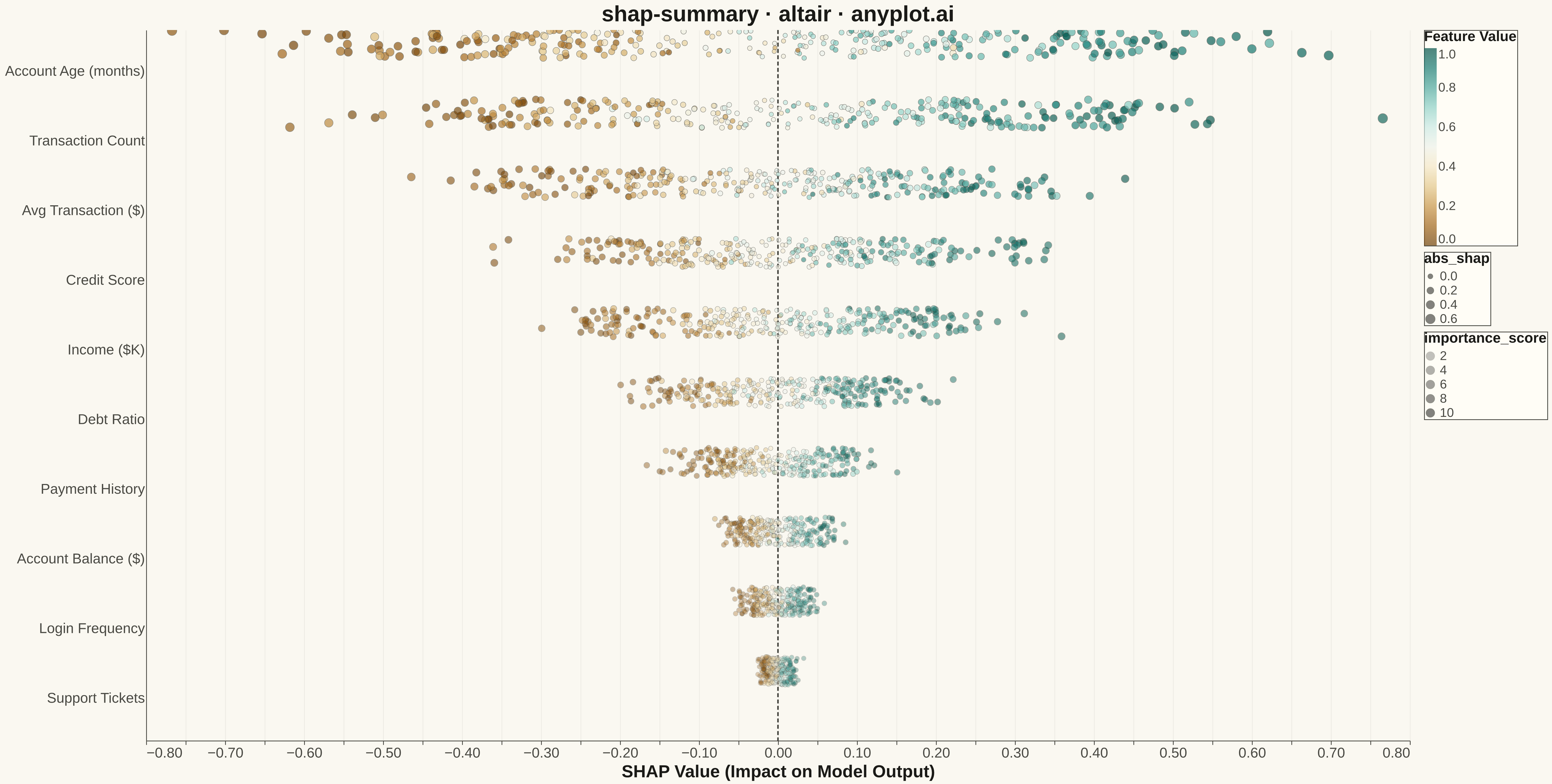
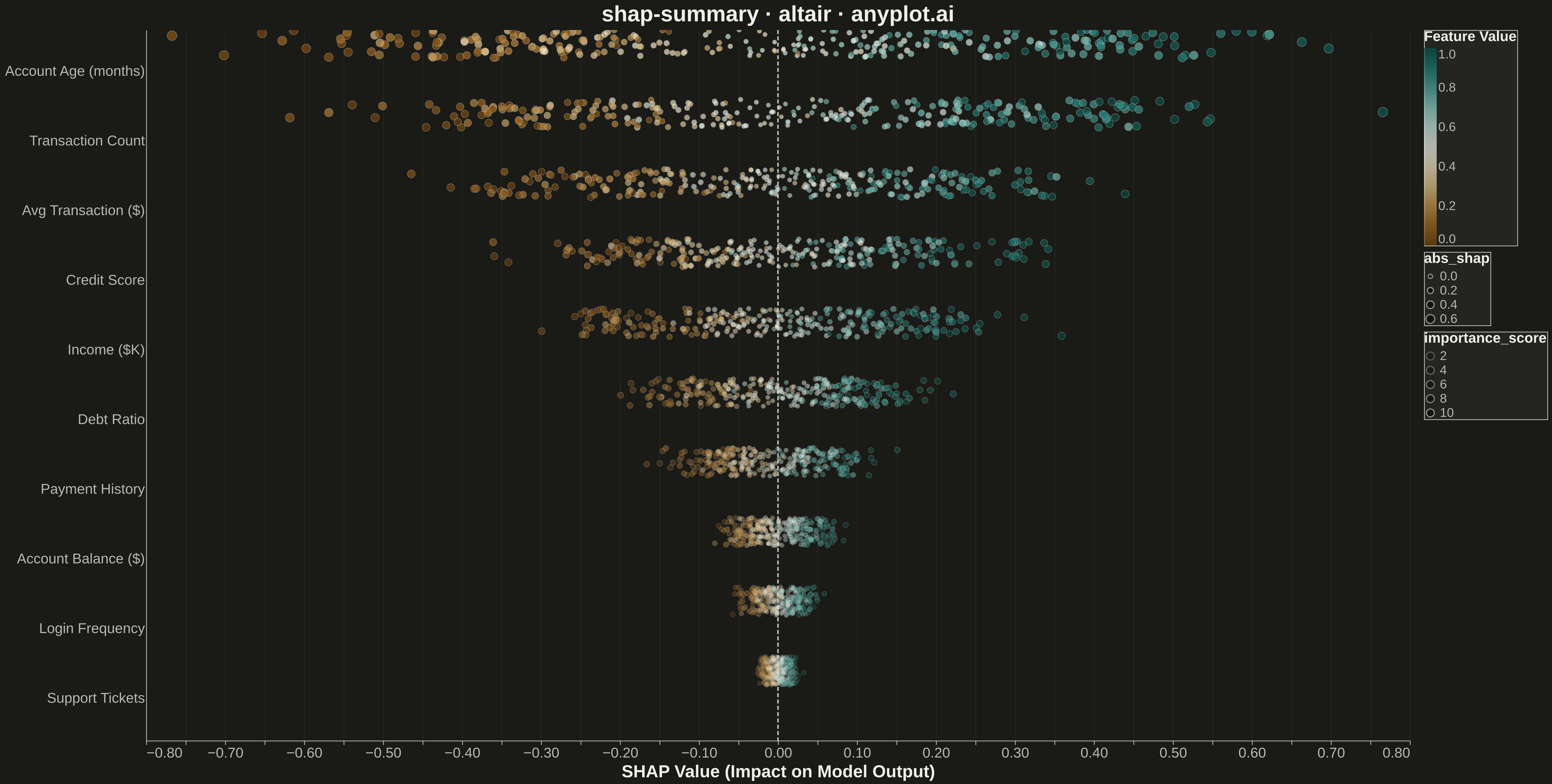
A SHAP (SHapley Additive exPlanations) summary plot displaying the distribution of SHAP values for each feature, ordered by mean absolute SHAP value (importance). Each dot represents a sample, positioned horizontally by its SHAP value and colored by the feature's value (typically low=blue to high=red). This visualization is essential for machine learning interpretability, showing both feature importance and the direction and magnitude of feature effects on model predictions.
""" anyplot.ai
shap-summary: SHAP Summary Plot
Library: altair 6.1.0 | Python 3.13.13
Quality: 95/100 | Updated: 2026-05-14
"""

import os
import sys

import numpy as np
import pandas as pd


# Workaround for module name collision: remove current dir from path temporarily
import_dir = os.path.dirname(os.path.abspath(__file__))
original_path = sys.path.copy()
sys.path = [p for p in sys.path if p != import_dir and not p.endswith("python")]
import altair as alt

sys.path = original_path

THEME = os.getenv("ANYPLOT_THEME", "light")
PAGE_BG = "#FAF8F1" if THEME == "light" else "#1A1A17"
INK = "#1A1A17" if THEME == "light" else "#F0EFE8"
INK_SOFT = "#4A4A44" if THEME == "light" else "#B8B7B0"

# Generate synthetic SHAP values for a model explanation visualization
np.random.seed(42)
n_samples = 300
n_features = 10

# Feature names representing typical ML model inputs
feature_names = [
    "Account Age (months)",
    "Transaction Count",
    "Avg Transaction ($)",
    "Credit Score",
    "Income ($K)",
    "Debt Ratio",
    "Payment History",
    "Account Balance ($)",
    "Login Frequency",
    "Support Tickets",
]

# Create synthetic feature values (normalized to 0-1 for color mapping)
feature_values = np.random.rand(n_samples, n_features)

# Create synthetic SHAP values with varying importances per feature
feature_importances = np.array([0.25, 0.20, 0.15, 0.12, 0.10, 0.07, 0.05, 0.03, 0.02, 0.01])
shap_values = np.zeros((n_samples, n_features))

for i in range(n_features):
    base_effect = (feature_values[:, i] - 0.5) * feature_importances[i] * 4
    noise = np.random.randn(n_samples) * feature_importances[i] * 0.5
    shap_values[:, i] = base_effect + noise

# Sort features by importance
mean_abs_shap = np.mean(np.abs(shap_values), axis=0)
feature_order = np.argsort(mean_abs_shap)[::-1]
feature_order_names = [feature_names[i] for i in feature_order]

# Build dataframe for Altair
rows = []
for feat_idx in feature_order:
    for sample_idx in range(n_samples):
        rows.append(
            {
                "Feature": feature_names[feat_idx],
                "SHAP Value": shap_values[sample_idx, feat_idx],
                "Feature Value": feature_values[sample_idx, feat_idx],
            }
        )

df = pd.DataFrame(rows)

# Calculate feature importance for each row
importance_map = dict(zip(feature_order_names, range(len(feature_order_names), 0, -1), strict=True))
df["importance_score"] = df["Feature"].map(importance_map)
df["abs_shap"] = df["SHAP Value"].abs()

# Create the SHAP summary plot with interactive layers
# Layer 1: Background scatter (lower importance, subtle)
background_scatter = (
    alt.Chart(df)
    .mark_circle(stroke=INK_SOFT, strokeWidth=0.5)
    .encode(
        x=alt.X(
            "SHAP Value:Q",
            title="SHAP Value (Impact on Model Output)",
            axis=alt.Axis(titleFontSize=22, labelFontSize=18, gridOpacity=0.05),
        ),
        y=alt.Y("Feature:N", title=None, sort=feature_order_names, axis=alt.Axis(labelFontSize=18, ticks=False)),
        color=alt.Color(
            "Feature Value:Q",
            scale=alt.Scale(scheme="brownbluegreen", domain=[0, 1]),
            legend=alt.Legend(
                title="Feature Value", titleFontSize=18, labelFontSize=16, orient="right", gradientLength=250
            ),
        ),
        opacity=alt.Opacity(
            "importance_score:Q", scale=alt.Scale(domain=[1, len(feature_order_names)], range=[0.3, 0.7])
        ),
        size=alt.Size("abs_shap:Q", scale=alt.Scale(domain=[0, df["abs_shap"].max()], range=[30, 150])),
        yOffset=alt.YOffset("jitter:Q", scale=alt.Scale(domain=[-1, 1], range=[-18, 18])),
        tooltip=["Feature", "SHAP Value:Q", "Feature Value:Q"],
    )
    .transform_calculate(jitter="random() * 2 - 1")
)

scatter = background_scatter.interactive()

# Add vertical line at x=0
zero_line = (
    alt.Chart(pd.DataFrame({"x": [0]})).mark_rule(color=INK_SOFT, strokeWidth=2, strokeDash=[5, 3]).encode(x="x:Q")
)

# Combine scatter and zero line
chart = (
    (zero_line + scatter)
    .properties(
        width=1600,
        height=900,
        background=PAGE_BG,
        title=alt.Title("shap-summary · altair · anyplot.ai", fontSize=28, anchor="middle", color=INK),
    )
    .configure_axis(
        domainColor=INK_SOFT,
        tickColor=INK_SOFT,
        gridColor=INK,
        gridOpacity=0.10,
        labelColor=INK_SOFT,
        titleColor=INK,
        labelFontSize=18,
        titleFontSize=22,
    )
    .configure_view(strokeWidth=0, fill=PAGE_BG)
    .configure_legend(
        fillColor="#FFFDF6" if THEME == "light" else "#242420",
        strokeColor=INK_SOFT,
        labelColor=INK_SOFT,
        titleColor=INK,
        titleFontSize=18,
        labelFontSize=16,
    )
)

chart.save(f"plot-{THEME}.png", scale_factor=3.0)
chart.save(f"plot-{THEME}.html")
Runnable source as JSON, for any HTTP client: https://api.anyplot.ai/specs/shap-summary/altair/code. Any spec id and library id listed in llms-full.txt fit the same URL shape; every URL below is complete and callable.
{
  "spec_id": "shap-summary",
  "language": "python",
  "library": "altair",
  "page": "https://anyplot.ai/shap-summary/python/altair",
  "hub": "https://anyplot.ai/shap-summary",
  "code_json": "https://api.anyplot.ai/specs/shap-summary/altair/code",
  "spec_json": "https://api.anyplot.ai/specs/shap-summary",
  "render_light_png": "https://storage.googleapis.com/anyplot-images/plots/shap-summary/python/altair/plot-light.png",
  "render_dark_png": "https://storage.googleapis.com/anyplot-images/plots/shap-summary/python/altair/plot-dark.png",
  "interactive_light_html": "https://storage.googleapis.com/anyplot-images/plots/shap-summary/python/altair/plot-light.html",
  "interactive_dark_html": "https://storage.googleapis.com/anyplot-images/plots/shap-summary/python/altair/plot-dark.html",
  "quality_score": 95.0,
  "license": "MIT",
  "guide": "https://anyplot.ai/llms.txt"
}
Part of SHAP Summary Plot on anyplot.ai.