The same plot in 14 other libraries — Python: Altair, Bokeh, lets-plot, Matplotlib, Plotly, Pygal, Seaborn; R: ggplot2; Julia: Makie.jl; JavaScript: Chart.js, D3.js, Apache ECharts, Highcharts, MUI X Charts. Compare all 15 side by side: SHAP Summary Plot in Python, R, Julia and JavaScript.
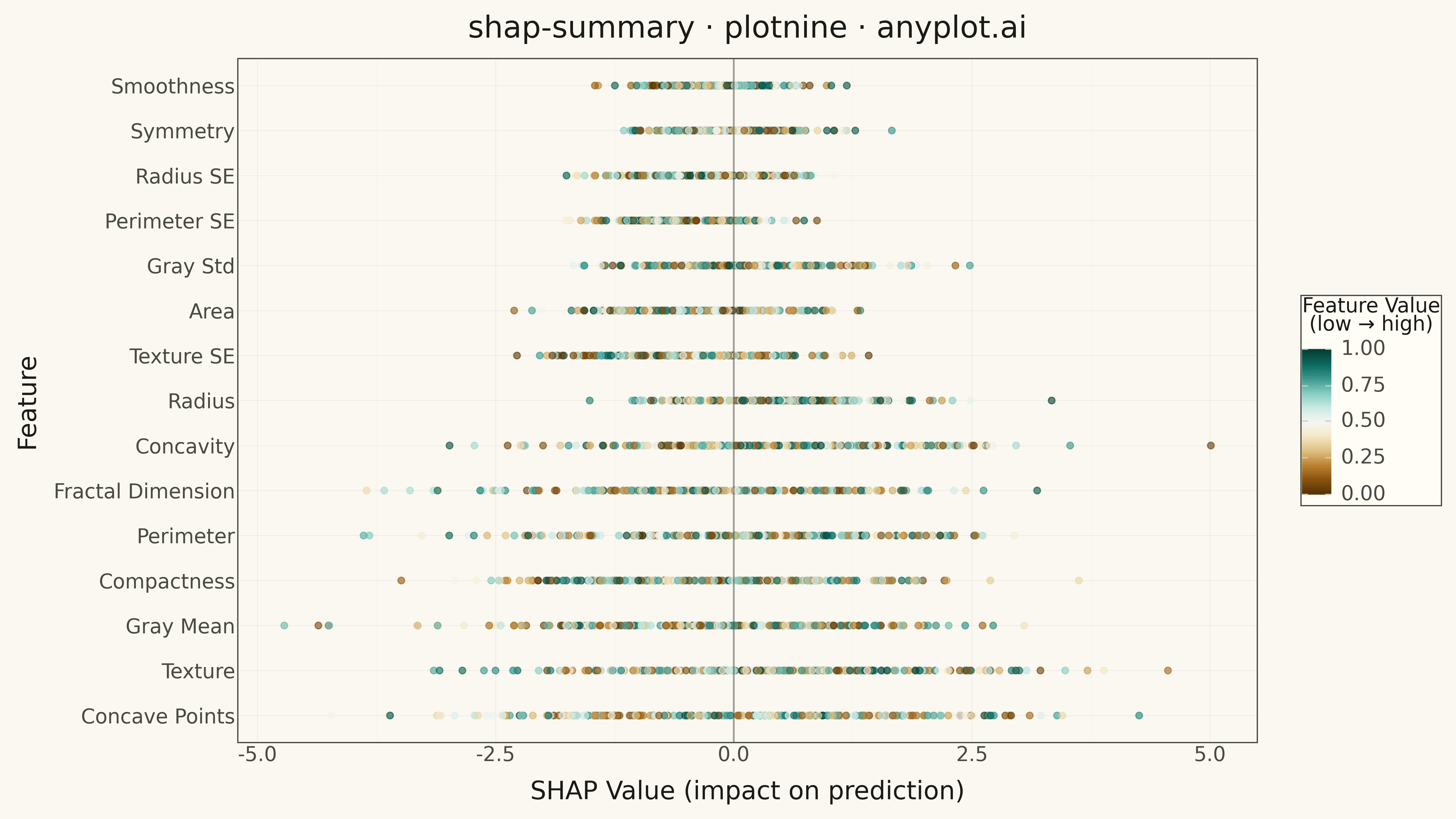
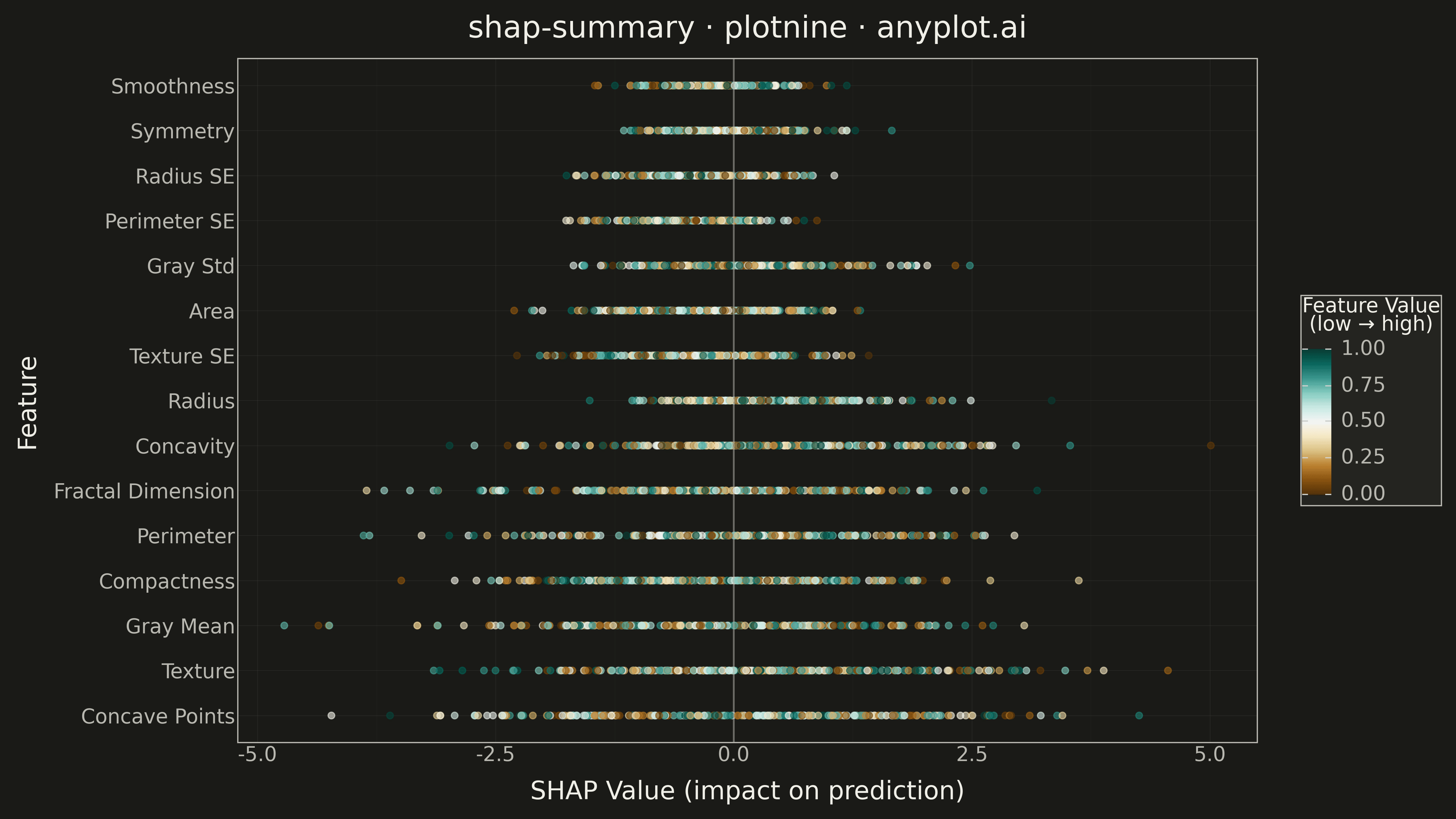
A SHAP (SHapley Additive exPlanations) summary plot displaying the distribution of SHAP values for each feature, ordered by mean absolute SHAP value (importance). Each dot represents a sample, positioned horizontally by its SHAP value and colored by the feature's value (typically low=blue to high=red). This visualization is essential for machine learning interpretability, showing both feature importance and the direction and magnitude of feature effects on model predictions.
""" anyplot.ai
shap-summary: SHAP Summary Plot
Library: plotnine 0.15.4 | Python 3.13.13
Quality: 96/100 | Created: 2026-05-14
"""

import os
import site
import sys


# Add site-packages to the beginning of path to prioritize installed packages
site_packages = next((p for p in site.getsitepackages() if "site-packages" in p), None)
if site_packages:
    sys.path.insert(0, site_packages)

import numpy as np
import pandas as pd
from plotnine import (
    aes,
    element_line,
    element_rect,
    element_text,
    geom_point,
    geom_vline,
    ggplot,
    ggsave,
    labs,
    scale_color_cmap,
    theme,
    theme_minimal,
)


# Theme tokens
THEME = os.getenv("ANYPLOT_THEME", "light")
PAGE_BG = "#FAF8F1" if THEME == "light" else "#1A1A17"
ELEVATED_BG = "#FFFDF6" if THEME == "light" else "#242420"
INK = "#1A1A17" if THEME == "light" else "#F0EFE8"
INK_SOFT = "#4A4A44" if THEME == "light" else "#B8B7B0"

# Generate synthetic SHAP-like data
np.random.seed(42)
n_samples = 250
n_features = 15

# Feature names (simulating model features)
feature_names = [
    "Radius",
    "Texture",
    "Perimeter",
    "Area",
    "Smoothness",
    "Compactness",
    "Concavity",
    "Concave Points",
    "Symmetry",
    "Fractal Dimension",
    "Gray Mean",
    "Gray Std",
    "Radius SE",
    "Texture SE",
    "Perimeter SE",
]

# Generate realistic SHAP values with different distributions per feature
shap_values = np.zeros((n_samples, n_features))
feature_values = np.zeros((n_samples, n_features))

for i in range(n_features):
    # Different distributions for different features
    scale = np.random.uniform(0.3, 1.5)
    center = np.random.uniform(-0.5, 0.5)

    # Generate SHAP values with some features showing positive/negative effects
    shap_values[:, i] = np.random.normal(center, scale, n_samples)

    # Generate normalized feature values (0 to 1) for coloring
    feature_values[:, i] = np.random.uniform(0, 1, n_samples)

# Calculate importance (mean absolute SHAP value) and sort
feature_importance = np.abs(shap_values).mean(axis=0)
sorted_indices = np.argsort(feature_importance)[::-1]

# Create long format dataframe for plotnine
rows = []
for rank, feat_idx in enumerate(sorted_indices):
    feat_name = feature_names[feat_idx]
    shap_vals = shap_values[:, feat_idx]
    feat_vals = feature_values[:, feat_idx]

    for shap_val, feat_val in zip(shap_vals, feat_vals, strict=False):
        rows.append({"feature": feat_name, "shap_value": shap_val, "feature_value": feat_val, "feature_rank": rank})

df = pd.DataFrame(rows)

# Create categorical feature order for Y-axis (sorted by importance)
sorted_feature_names = [feature_names[i] for i in sorted_indices]
df["feature"] = pd.Categorical(df["feature"], categories=sorted_feature_names, ordered=True)

# Plot
plot = (
    ggplot(df, aes(x="shap_value", y="feature", color="feature_value"))
    + geom_point(size=2.5, alpha=0.6)
    + geom_vline(xintercept=0, linetype="solid", color=INK_SOFT, size=0.8, alpha=0.5)
    + scale_color_cmap(cmap_name="BrBG", limits=[0, 1])
    + labs(
        title="shap-summary · plotnine · anyplot.ai",
        x="SHAP Value (impact on prediction)",
        y="Feature",
        color="Feature Value\n(low → high)",
    )
    + theme_minimal()
    + theme(
        figure_size=(16, 9),
        plot_background=element_rect(fill=PAGE_BG, color=PAGE_BG),
        panel_background=element_rect(fill=PAGE_BG),
        panel_grid_major=element_line(color=INK, size=0.3, alpha=0.10),
        panel_grid_minor=element_line(color=INK, size=0.2, alpha=0.05),
        panel_border=element_rect(color=INK_SOFT, fill=None),
        plot_title=element_text(size=24, color=INK, weight="medium"),
        axis_title=element_text(size=20, color=INK),
        axis_text=element_text(size=16, color=INK_SOFT),
        axis_line=element_line(color=INK_SOFT, size=0.5),
        legend_background=element_rect(fill=ELEVATED_BG, color=INK_SOFT),
        legend_text=element_text(size=16, color=INK_SOFT),
        legend_title=element_text(size=16, color=INK),
    )
)

# Save to script directory
script_dir = os.path.dirname(os.path.abspath(__file__))
ggsave(plot, filename=os.path.join(script_dir, f"plot-{THEME}.png"), dpi=300, width=16, height=9)
Runnable source as JSON, for any HTTP client: https://api.anyplot.ai/specs/shap-summary/plotnine/code. Any spec id and library id listed in llms-full.txt fit the same URL shape; every URL below is complete and callable.
{
  "spec_id": "shap-summary",
  "language": "python",
  "library": "plotnine",
  "page": "https://anyplot.ai/shap-summary/python/plotnine",
  "hub": "https://anyplot.ai/shap-summary",
  "code_json": "https://api.anyplot.ai/specs/shap-summary/plotnine/code",
  "spec_json": "https://api.anyplot.ai/specs/shap-summary",
  "render_light_png": "https://storage.googleapis.com/anyplot-images/plots/shap-summary/python/plotnine/plot-light.png",
  "render_dark_png": "https://storage.googleapis.com/anyplot-images/plots/shap-summary/python/plotnine/plot-dark.png",
  "quality_score": 96.0,
  "license": "MIT",
  "guide": "https://anyplot.ai/llms.txt"
}
Part of SHAP Summary Plot on anyplot.ai.