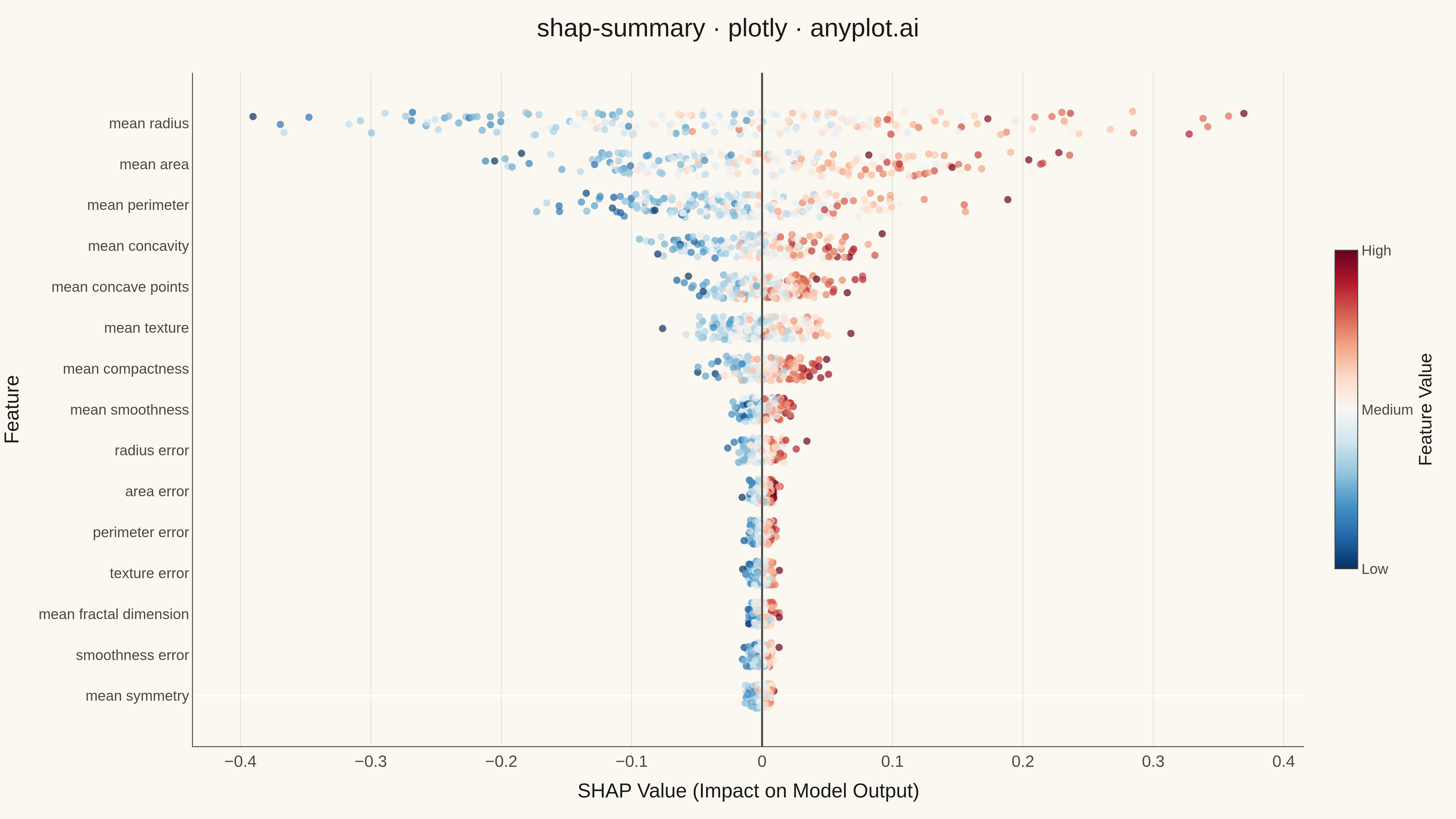
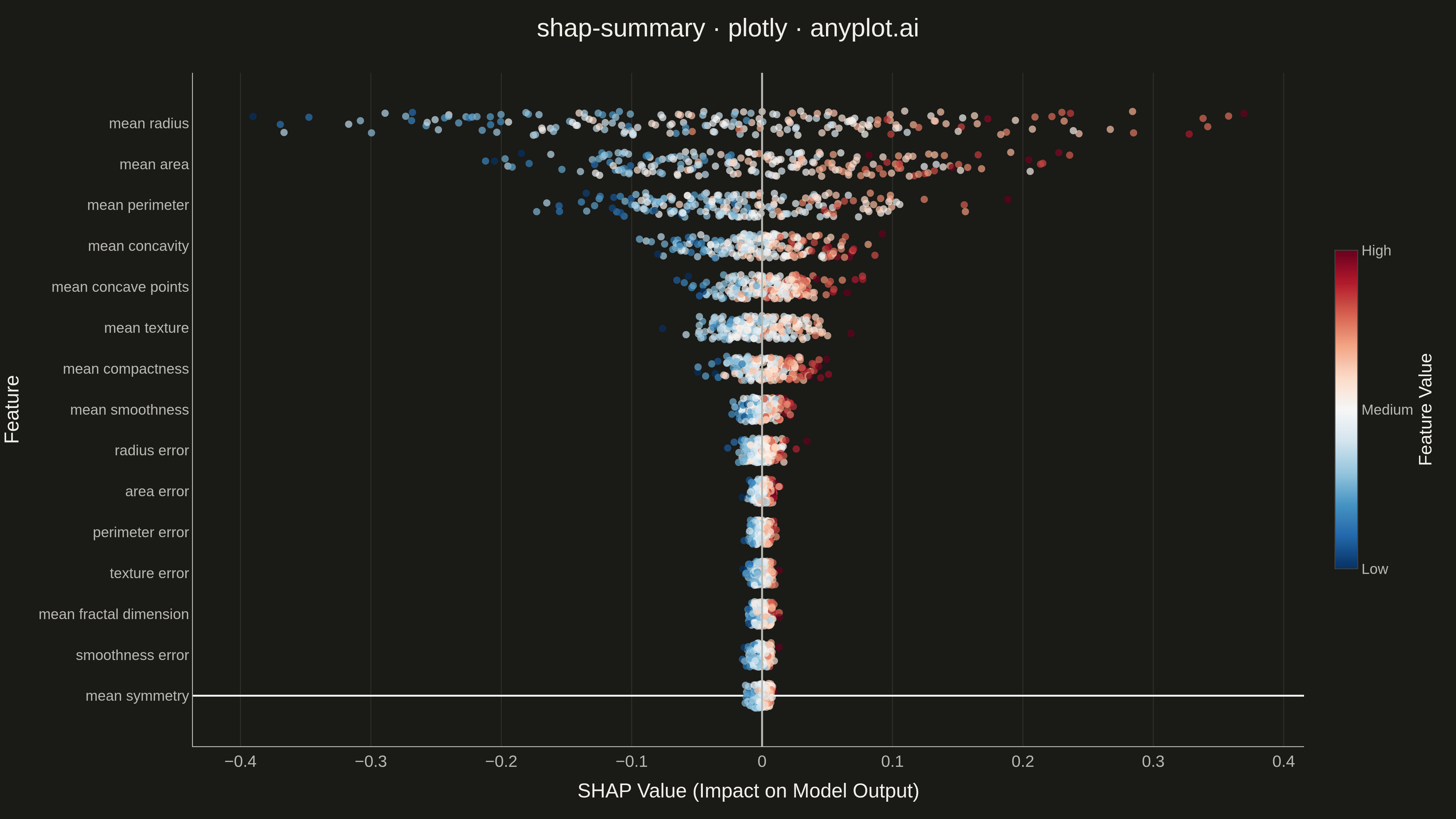
A SHAP (SHapley Additive exPlanations) summary plot displaying the distribution of SHAP values for each feature, ordered by mean absolute SHAP value (importance). Each dot represents a sample, positioned horizontally by its SHAP value and colored by the feature's value (typically low=blue to high=red). This visualization is essential for machine learning interpretability, showing both feature importance and the direction and magnitude of feature effects on model predictions.
""" anyplot.ai
shap-summary: SHAP Summary Plot
Library: plotly 6.7.0 | Python 3.13.13
Quality: 96/100 | Updated: 2026-05-14
"""

import os

import numpy as np
import plotly.graph_objects as go


# Theme tokens
THEME = os.getenv("ANYPLOT_THEME", "light")
PAGE_BG = "#FAF8F1" if THEME == "light" else "#1A1A17"
ELEVATED_BG = "#FFFDF6" if THEME == "light" else "#242420"
INK = "#1A1A17" if THEME == "light" else "#F0EFE8"
INK_SOFT = "#4A4A44" if THEME == "light" else "#B8B7B0"
INK_MUTED = "#6B6A63" if THEME == "light" else "#A8A79F"
GRID = "rgba(26,26,23,0.10)" if THEME == "light" else "rgba(240,239,232,0.10)"
ZERO_LINE = INK_SOFT

# Data - Generate synthetic SHAP values for ML model interpretability demo
np.random.seed(42)

# Simulated feature data (like from a gradient boosting model on tabular data)
n_samples = 200
feature_names = [
    "mean radius",
    "mean texture",
    "mean perimeter",
    "mean area",
    "mean smoothness",
    "mean compactness",
    "mean concavity",
    "mean concave points",
    "mean symmetry",
    "mean fractal dimension",
    "radius error",
    "texture error",
    "perimeter error",
    "area error",
    "smoothness error",
]
n_features = len(feature_names)

# Generate realistic feature values (simulating measurement data)
X = np.zeros((n_samples, n_features))
X[:, 0] = np.random.normal(14, 3.5, n_samples)  # mean radius
X[:, 1] = np.random.normal(19, 4, n_samples)  # mean texture
X[:, 2] = np.random.normal(92, 24, n_samples)  # mean perimeter
X[:, 3] = np.random.normal(655, 350, n_samples)  # mean area
X[:, 4] = np.random.normal(0.096, 0.014, n_samples)  # mean smoothness
X[:, 5] = np.random.normal(0.104, 0.053, n_samples)  # mean compactness
X[:, 6] = np.random.normal(0.089, 0.08, n_samples)  # mean concavity
X[:, 7] = np.random.normal(0.049, 0.039, n_samples)  # mean concave points
X[:, 8] = np.random.normal(0.181, 0.027, n_samples)  # mean symmetry
X[:, 9] = np.random.normal(0.063, 0.007, n_samples)  # mean fractal dimension
X[:, 10] = np.random.normal(0.41, 0.28, n_samples)  # radius error
X[:, 11] = np.random.normal(1.22, 0.55, n_samples)  # texture error
X[:, 12] = np.random.normal(2.87, 2.02, n_samples)  # perimeter error
X[:, 13] = np.random.normal(40, 45, n_samples)  # area error
X[:, 14] = np.random.normal(0.007, 0.003, n_samples)  # smoothness error

# Simulated feature importances with more dramatic variation
importances = np.array([0.32, 0.06, 0.14, 0.20, 0.02, 0.04, 0.08, 0.06, 0.01, 0.01, 0.02, 0.01, 0.01, 0.01, 0.01])

# Generate SHAP values that correlate with feature values (simulating real SHAP behavior)
shap_values = np.zeros((n_samples, n_features))
for i in range(n_features):
    feat_min, feat_max = X[:, i].min(), X[:, i].max()
    feat_normalized = (X[:, i] - feat_min) / (feat_max - feat_min + 1e-10)

    # SHAP values correlate with feature values, scaled by importance
    base_effect = (feat_normalized - 0.5) * importances[i] * 2
    noise = np.random.randn(n_samples) * importances[i] * 0.3
    shap_values[:, i] = base_effect + noise

# Sort features by mean absolute SHAP value (most important first)
mean_abs_shap = np.mean(np.abs(shap_values), axis=0)
sorted_idx = np.argsort(mean_abs_shap)[::-1]

# Show top 15 features for clarity
top_n = 15
sorted_idx = sorted_idx[:top_n]

# Create figure
fig = go.Figure()

# Store feature data for hover template
feature_mins = {}
feature_maxs = {}
for i in range(n_features):
    feature_mins[i] = X[:, i].min()
    feature_maxs[i] = X[:, i].max()

# Add traces for each feature (from bottom to top for proper y-axis ordering)
for rank, feat_idx in enumerate(reversed(sorted_idx)):
    feat_shap = shap_values[:, feat_idx]
    feat_vals = X[:, feat_idx]

    # Normalize feature values for coloring (0 to 1)
    feat_min, feat_max = feat_vals.min(), feat_vals.max()
    feat_normalized = (feat_vals - feat_min) / (feat_max - feat_min + 1e-10)

    # Add jitter to y-position
    y_base = rank
    jitter = np.random.uniform(-0.3, 0.3, n_samples)
    y_positions = y_base + jitter

    # Create color array based on feature values (blue=low, red=high)
    colors = feat_normalized

    # Create hover text with actual feature values
    hover_texts = [
        f"<b>{feature_names[feat_idx]}</b><br>SHAP Value: {shap:.3f}<br>Feature Value: {val:.3f}<extra></extra>"
        for shap, val in zip(feat_shap, feat_vals, strict=False)
    ]

    fig.add_trace(
        go.Scatter(
            x=feat_shap,
            y=y_positions,
            mode="markers",
            marker={
                "size": 8,
                "color": colors,
                "colorscale": "RdBu_r",
                "cmin": 0,
                "cmax": 1,
                "opacity": 0.7,
                "line": {"width": 0},
            },
            text=hover_texts,
            hoverinfo="text",
            name=feature_names[feat_idx][:25],
            showlegend=False,
        )
    )

# Add vertical line at x=0
fig.add_vline(x=0, line_width=2, line_color=ZERO_LINE, line_dash="solid")

# Create y-axis labels (feature names in order from bottom to top)
y_labels = [feature_names[idx][:25] for idx in reversed(sorted_idx)]

# Add colorbar as a separate trace
colorbar_trace = go.Scatter(
    x=[None],
    y=[None],
    mode="markers",
    marker={
        "size": 0.1,
        "color": [0, 1],
        "colorscale": "RdBu_r",
        "cmin": 0,
        "cmax": 1,
        "colorbar": {
            "title": {"text": "Feature Value", "font": {"size": 20, "color": INK}, "side": "right"},
            "tickfont": {"size": 16, "color": INK_SOFT},
            "tickvals": [0, 0.5, 1],
            "ticktext": ["Low", "Medium", "High"],
            "len": 0.5,
            "thickness": 25,
            "x": 1.02,
            "y": 0.5,
        },
        "showscale": True,
    },
    showlegend=False,
    hoverinfo="skip",
)
fig.add_trace(colorbar_trace)

# Update layout
fig.update_layout(
    title={
        "text": "shap-summary · plotly · anyplot.ai",
        "font": {"size": 28, "color": INK},
        "x": 0.5,
        "xanchor": "center",
    },
    xaxis={
        "title": {"text": "SHAP Value (Impact on Model Output)", "font": {"size": 22, "color": INK}},
        "tickfont": {"size": 18, "color": INK_SOFT},
        "zeroline": True,
        "zerolinewidth": 2,
        "zerolinecolor": ZERO_LINE,
        "gridcolor": GRID,
        "showgrid": True,
        "linecolor": INK_SOFT,
    },
    yaxis={
        "title": {"text": "Feature", "font": {"size": 22, "color": INK}},
        "tickfont": {"size": 16, "color": INK_SOFT},
        "tickmode": "array",
        "tickvals": list(range(top_n)),
        "ticktext": y_labels,
        "showgrid": False,
        "linecolor": INK_SOFT,
    },
    plot_bgcolor=PAGE_BG,
    paper_bgcolor=PAGE_BG,
    margin={"l": 200, "r": 120, "t": 80, "b": 80},
    showlegend=False,
    font={"family": "sans-serif", "color": INK},
)

# Save as PNG and HTML (4800 x 2700)
fig.write_image(f"plot-{THEME}.png", width=1600, height=900, scale=3)
fig.write_html(f"plot-{THEME}.html", include_plotlyjs="cdn")
Runnable source as JSON, for any HTTP client: https://api.anyplot.ai/specs/shap-summary/plotly/code. Any spec id and library id listed in llms-full.txt fit the same URL shape; every URL below is complete and callable.
{
  "spec_id": "shap-summary",
  "language": "python",
  "library": "plotly",
  "page": "https://anyplot.ai/shap-summary/python/plotly",
  "hub": "https://anyplot.ai/shap-summary",
  "code_json": "https://api.anyplot.ai/specs/shap-summary/plotly/code",
  "spec_json": "https://api.anyplot.ai/specs/shap-summary",
  "render_light_png": "https://storage.googleapis.com/anyplot-images/plots/shap-summary/python/plotly/plot-light.png",
  "render_dark_png": "https://storage.googleapis.com/anyplot-images/plots/shap-summary/python/plotly/plot-dark.png",
  "interactive_light_html": "https://storage.googleapis.com/anyplot-images/plots/shap-summary/python/plotly/plot-light.html",
  "interactive_dark_html": "https://storage.googleapis.com/anyplot-images/plots/shap-summary/python/plotly/plot-dark.html",
  "quality_score": 96.0,
  "license": "MIT",
  "guide": "https://anyplot.ai/llms.txt"
}
Part of SHAP Summary Plot on anyplot.ai.