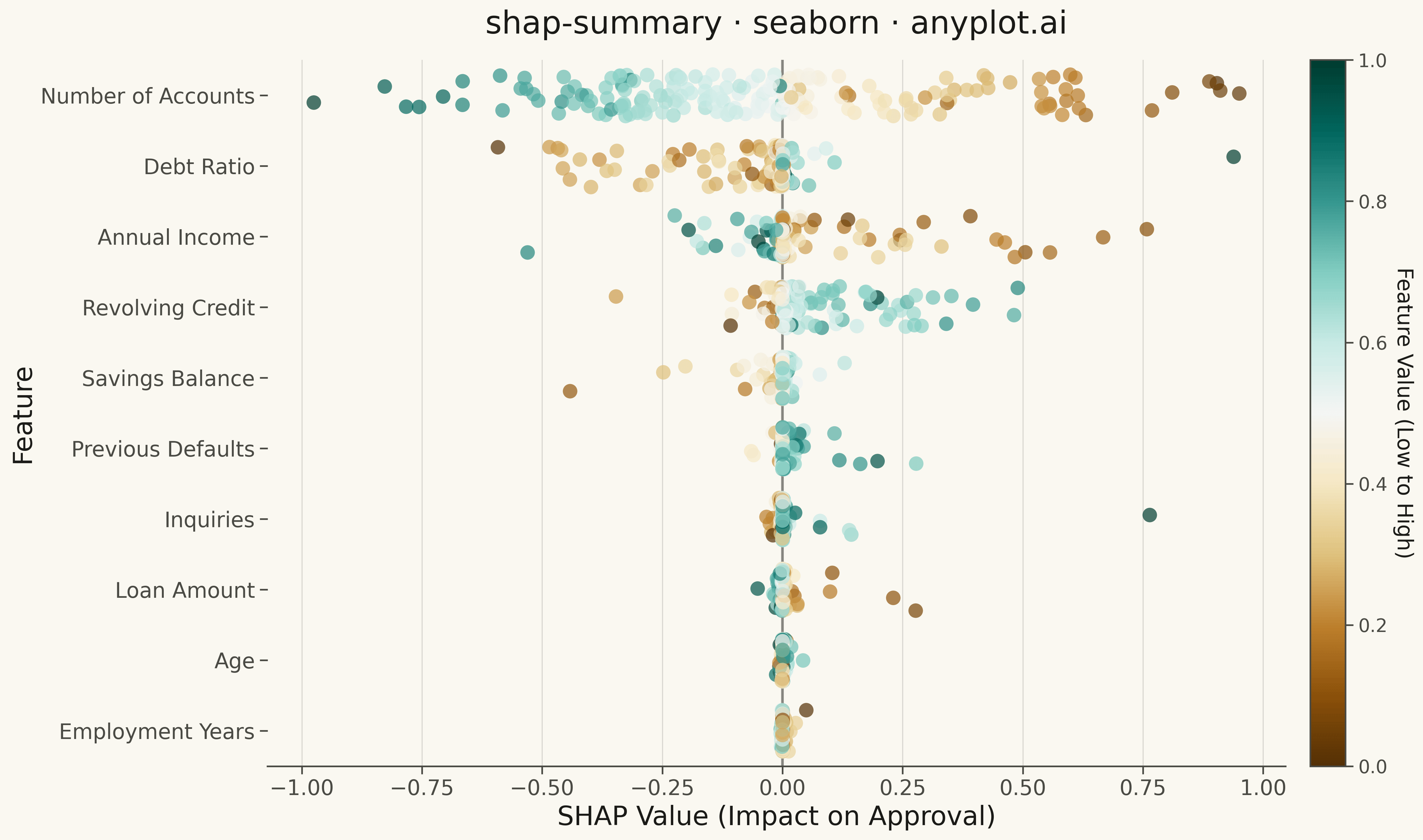
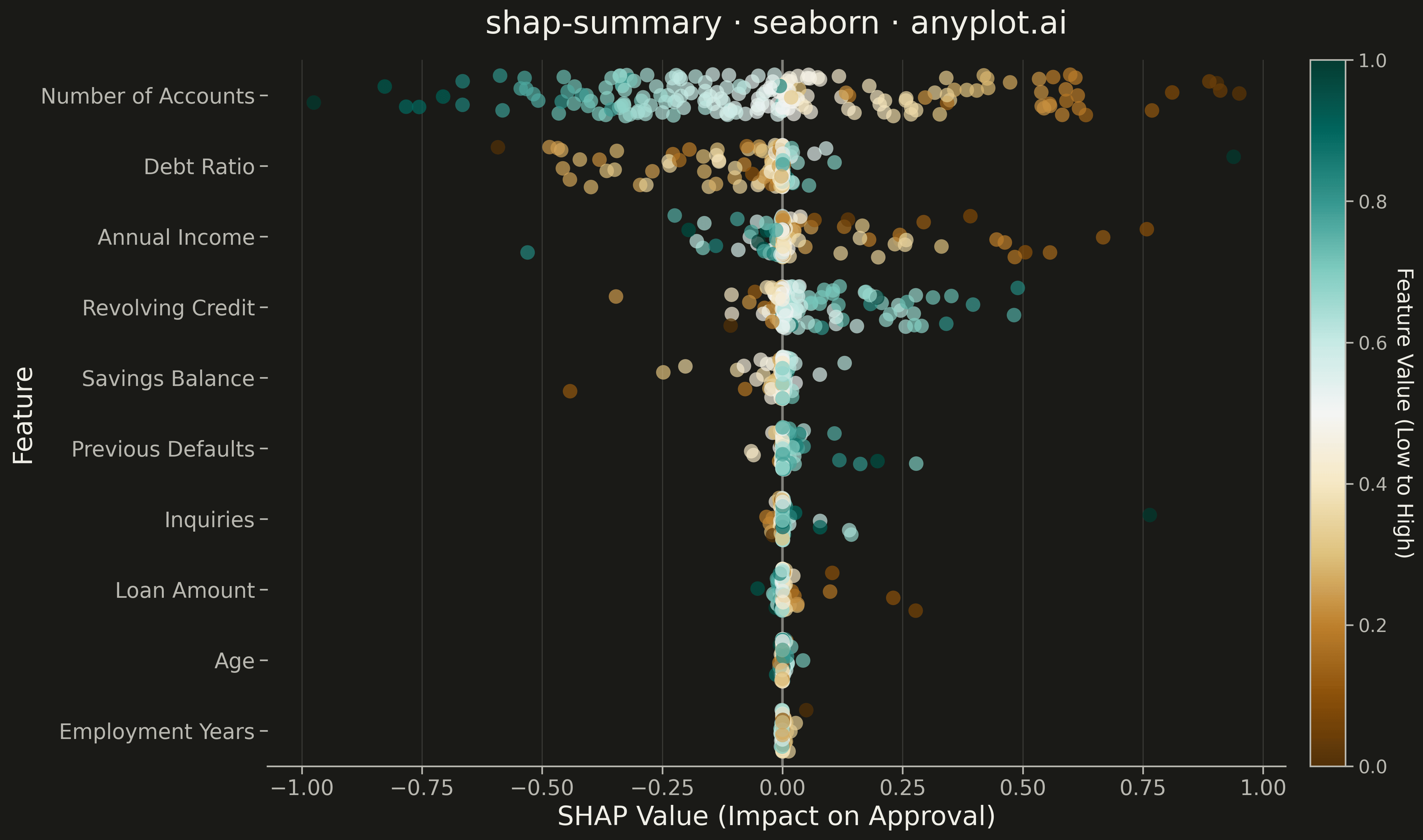
A SHAP (SHapley Additive exPlanations) summary plot displaying the distribution of SHAP values for each feature, ordered by mean absolute SHAP value (importance). Each dot represents a sample, positioned horizontally by its SHAP value and colored by the feature's value (typically low=blue to high=red). This visualization is essential for machine learning interpretability, showing both feature importance and the direction and magnitude of feature effects on model predictions.
""" anyplot.ai
shap-summary: SHAP Summary Plot
Library: seaborn 0.13.2 | Python 3.13.13
Quality: 93/100 | Updated: 2026-05-14
"""

import os
import sys


sys.path.insert(0, "/home/runner/work/anyplot/anyplot/.venv/lib/python3.13/site-packages")

import matplotlib.pyplot as plt
import numpy as np
import pandas as pd
import seaborn as sns
from matplotlib.colors import Normalize
from sklearn.datasets import make_classification
from sklearn.ensemble import GradientBoostingClassifier


# Theme tokens
THEME = os.getenv("ANYPLOT_THEME", "light")
PAGE_BG = "#FAF8F1" if THEME == "light" else "#1A1A17"
ELEVATED_BG = "#FFFDF6" if THEME == "light" else "#242420"
INK = "#1A1A17" if THEME == "light" else "#F0EFE8"
INK_SOFT = "#4A4A44" if THEME == "light" else "#B8B7B0"

# Data - Train a model and compute SHAP-like values for credit approval
np.random.seed(42)
X, y = make_classification(
    n_samples=300, n_features=12, n_informative=10, n_redundant=2, n_classes=2, random_state=42, class_sep=1.5
)

feature_names = [
    "Annual Income",
    "Credit Score",
    "Employment Years",
    "Debt Ratio",
    "Savings Balance",
    "Age",
    "Loan Amount",
    "Payment History",
    "Number of Accounts",
    "Previous Defaults",
    "Revolving Credit",
    "Inquiries",
]

# Train a gradient boosting model
model = GradientBoostingClassifier(n_estimators=100, max_depth=4, random_state=42)
model.fit(X, y)

# Compute approximate SHAP values using tree-based contribution approach
n_samples = 200
sample_indices = np.random.choice(len(X), n_samples, replace=False)
X_sample = X[sample_indices]

# Calculate feature contributions
base_pred = model.predict_proba(X_sample)[:, 1]
baseline = base_pred.mean()
shap_values = np.zeros((n_samples, X_sample.shape[1]))

for i in range(X_sample.shape[1]):
    X_low = X_sample.copy()
    X_high = X_sample.copy()
    X_low[:, i] = np.percentile(X_sample[:, i], 10)
    X_high[:, i] = np.percentile(X_sample[:, i], 90)
    pred_low = model.predict_proba(X_low)[:, 1]
    pred_high = model.predict_proba(X_high)[:, 1]
    feat_normalized = (X_sample[:, i] - X_sample[:, i].min()) / (X_sample[:, i].max() - X_sample[:, i].min() + 1e-8)
    shap_values[:, i] = (pred_high - pred_low) * (feat_normalized - 0.5) * 2

# Normalize feature values for coloring (0 to 1 scale)
feature_values_norm = (X_sample - X_sample.min(axis=0)) / (X_sample.max(axis=0) - X_sample.min(axis=0) + 1e-8)

# Sort features by mean absolute SHAP value
mean_abs_shap = np.abs(shap_values).mean(axis=0)
sorted_indices = np.argsort(mean_abs_shap)[::-1][:10]  # Top 10 features

# Prepare data for seaborn stripplot
plot_data = []
for rank, feat_idx in enumerate(sorted_indices):
    for sample in range(n_samples):
        plot_data.append(
            {
                "Feature": feature_names[feat_idx],
                "SHAP Value": shap_values[sample, feat_idx],
                "Feature Value": feature_values_norm[sample, feat_idx],
                "Rank": rank,
            }
        )

df = pd.DataFrame(plot_data)

# Create ordered category for proper feature ordering
ordered_features = [feature_names[i] for i in sorted_indices]
df["Feature"] = pd.Categorical(df["Feature"], categories=ordered_features, ordered=True)

# Set theme
sns.set_theme(
    style="ticks",
    rc={
        "figure.facecolor": PAGE_BG,
        "axes.facecolor": PAGE_BG,
        "axes.edgecolor": INK_SOFT,
        "axes.labelcolor": INK,
        "text.color": INK,
        "xtick.color": INK_SOFT,
        "ytick.color": INK_SOFT,
        "grid.color": INK,
        "grid.alpha": 0.10,
    },
)

# Create plot
fig, ax = plt.subplots(figsize=(16, 9), facecolor=PAGE_BG)
ax.set_facecolor(PAGE_BG)

# Use seaborn stripplot for the main visualization
sns.stripplot(
    data=df,
    x="SHAP Value",
    y="Feature",
    hue="Feature Value",
    palette="BrBG",
    size=11,
    alpha=0.7,
    jitter=0.3,
    legend=False,
    ax=ax,
)

# Add vertical line at x=0
ax.axvline(x=0, color=INK_SOFT, linestyle="-", linewidth=2, alpha=0.6)

# Styling
ax.set_xlabel("SHAP Value (Impact on Approval)", fontsize=20, color=INK)
ax.set_ylabel("Feature", fontsize=20, color=INK)
ax.set_title("shap-summary · seaborn · anyplot.ai", fontsize=24, color=INK, pad=20)
ax.tick_params(axis="both", labelsize=16, colors=INK_SOFT)

# Subtle grid on x-axis
ax.grid(True, axis="x", alpha=0.15, linestyle="-", linewidth=0.8)

# Add colorbar for feature values
sm = plt.cm.ScalarMappable(cmap="BrBG", norm=Normalize(vmin=0, vmax=1))
sm.set_array([])
cbar = plt.colorbar(sm, ax=ax, pad=0.02)
cbar.set_label("Feature Value (Low to High)", fontsize=16, rotation=270, labelpad=20, color=INK)
cbar.ax.tick_params(labelsize=14, colors=INK_SOFT)

# Remove spines
sns.despine(left=True, ax=ax)

plt.tight_layout()
plt.savefig(f"plot-{THEME}.png", dpi=300, bbox_inches="tight", facecolor=PAGE_BG)
Runnable source as JSON, for any HTTP client: https://api.anyplot.ai/specs/shap-summary/seaborn/code. Any spec id and library id listed in llms-full.txt fit the same URL shape; every URL below is complete and callable.
{
  "spec_id": "shap-summary",
  "language": "python",
  "library": "seaborn",
  "page": "https://anyplot.ai/shap-summary/python/seaborn",
  "hub": "https://anyplot.ai/shap-summary",
  "code_json": "https://api.anyplot.ai/specs/shap-summary/seaborn/code",
  "spec_json": "https://api.anyplot.ai/specs/shap-summary",
  "render_light_png": "https://storage.googleapis.com/anyplot-images/plots/shap-summary/python/seaborn/plot-light.png",
  "render_dark_png": "https://storage.googleapis.com/anyplot-images/plots/shap-summary/python/seaborn/plot-dark.png",
  "quality_score": 93.0,
  "license": "MIT",
  "guide": "https://anyplot.ai/llms.txt"
}
Part of SHAP Summary Plot on anyplot.ai.