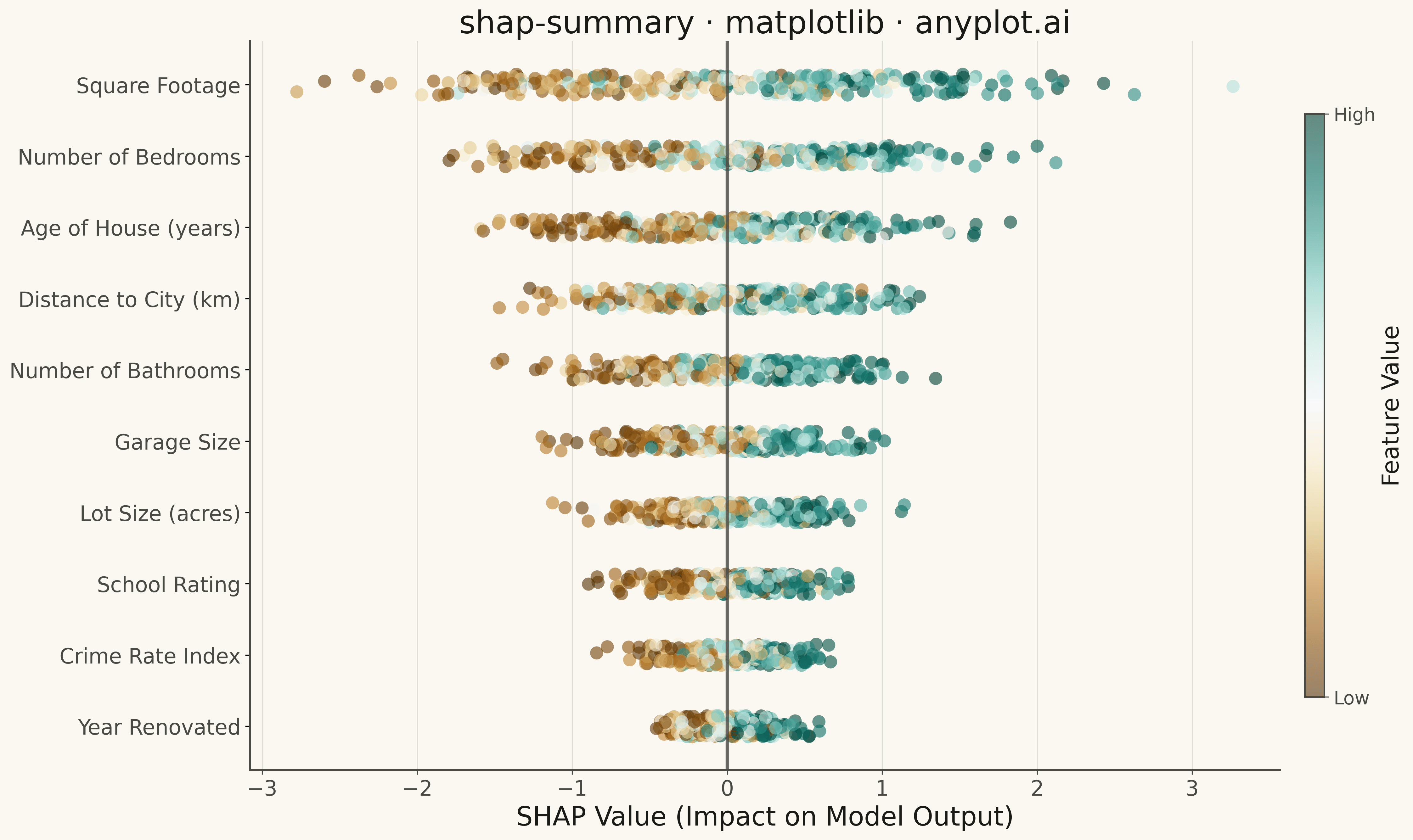
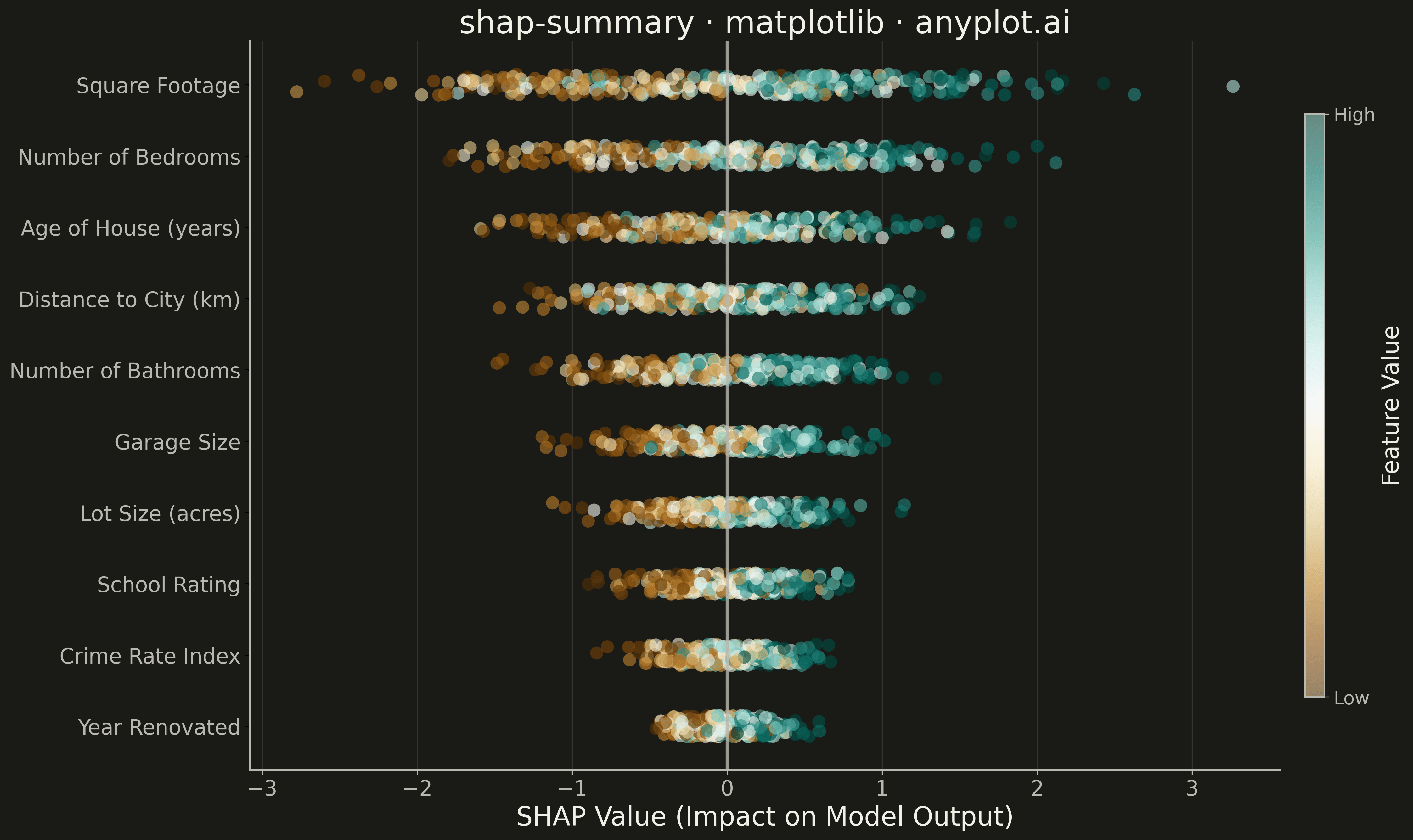
A SHAP (SHapley Additive exPlanations) summary plot displaying the distribution of SHAP values for each feature, ordered by mean absolute SHAP value (importance). Each dot represents a sample, positioned horizontally by its SHAP value and colored by the feature's value (typically low=blue to high=red). This visualization is essential for machine learning interpretability, showing both feature importance and the direction and magnitude of feature effects on model predictions.
""" anyplot.ai
shap-summary: SHAP Summary Plot
Library: matplotlib 3.10.9 | Python 3.13.13
Quality: 91/100 | Updated: 2026-05-14
"""

import os
import sys
from pathlib import Path


# Remove the script's directory from path temporarily to avoid import conflicts
script_dir = str(Path(__file__).parent)
if script_dir in sys.path:
    sys.path.remove(script_dir)

import matplotlib.pyplot as plt
import numpy as np


# Data - Simulating SHAP values from a house price prediction model
np.random.seed(42)
n_samples = 300
n_features = 12

# Feature names (house price prediction context)
feature_names = [
    "Square Footage",
    "Number of Bedrooms",
    "Age of House (years)",
    "Distance to City (km)",
    "Number of Bathrooms",
    "Garage Size",
    "Lot Size (acres)",
    "School Rating",
    "Crime Rate Index",
    "Year Renovated",
    "Property Tax Rate",
    "Median Income (area)",
]

# Generate feature values (normalized 0-1 for coloring)
feature_values = np.random.rand(n_samples, n_features)

# Generate SHAP values with realistic patterns
# More important features have larger absolute SHAP values
importance_scale = np.array([2.5, 1.8, 1.5, 1.4, 1.2, 1.0, 0.9, 0.8, 0.7, 0.5, 0.4, 0.3])
shap_values = np.zeros((n_samples, n_features))

for i in range(n_features):
    # Create SHAP values with some correlation to feature values
    # Higher feature values generally -> higher SHAP values (but not always)
    base_shap = (feature_values[:, i] - 0.5) * importance_scale[i]
    noise = np.random.randn(n_samples) * importance_scale[i] * 0.3
    shap_values[:, i] = base_shap + noise

# Sort features by mean absolute SHAP value (most important first)
mean_abs_shap = np.abs(shap_values).mean(axis=0)
sorted_indices = np.argsort(mean_abs_shap)[::-1]

# Take top 10 features for clarity
top_n = 10
sorted_indices = sorted_indices[:top_n]
sorted_feature_names = [feature_names[i] for i in sorted_indices]
sorted_shap_values = shap_values[:, sorted_indices]
sorted_feature_values = feature_values[:, sorted_indices]

# Theme tokens
THEME = os.getenv("ANYPLOT_THEME", "light")
PAGE_BG = "#FAF8F1" if THEME == "light" else "#1A1A17"
ELEVATED_BG = "#FFFDF6" if THEME == "light" else "#242420"
INK = "#1A1A17" if THEME == "light" else "#F0EFE8"
INK_SOFT = "#4A4A44" if THEME == "light" else "#B8B7B0"

# Plot
fig, ax = plt.subplots(figsize=(16, 9), facecolor=PAGE_BG)
ax.set_facecolor(PAGE_BG)

# Use BrBG colormap for diverging data (SHAP values range from negative to positive)
cmap = plt.cm.BrBG

# Plot each feature as a row of scattered points
for i in range(top_n):
    feature_idx = top_n - 1 - i  # Reverse so most important is at top
    shap_vals = sorted_shap_values[:, feature_idx]
    feat_vals = sorted_feature_values[:, feature_idx]

    # Add jitter to y-position to reduce overlap
    y_positions = np.ones(n_samples) * i + np.random.uniform(-0.15, 0.15, n_samples)

    # Scatter plot with color based on feature value
    scatter = ax.scatter(
        shap_vals, y_positions, c=feat_vals, cmap=cmap, s=100, alpha=0.6, edgecolors="none", vmin=0, vmax=1
    )

# Vertical line at x=0 (theme-adaptive)
ax.axvline(x=0, color=INK_SOFT, linewidth=2.5, linestyle="-", alpha=0.8)

# Styling
ax.set_yticks(range(top_n))
ax.set_yticklabels(sorted_feature_names[::-1], fontsize=16, color=INK_SOFT)
ax.set_xlabel("SHAP Value (Impact on Model Output)", fontsize=20, color=INK)
ax.set_title("shap-summary · matplotlib · anyplot.ai", fontsize=24, fontweight="medium", color=INK)
ax.tick_params(axis="x", labelsize=16, colors=INK_SOFT)

# Grid (subtle, vertical only)
ax.grid(True, axis="x", alpha=0.12, linewidth=0.8, color=INK)
ax.set_axisbelow(True)

# Spine styling
ax.spines["top"].set_visible(False)
ax.spines["right"].set_visible(False)
for s in ("left", "bottom"):
    ax.spines[s].set_color(INK_SOFT)
    ax.spines[s].set_linewidth(1.2)

# Colorbar
cbar = plt.colorbar(scatter, ax=ax, shrink=0.8, aspect=30, pad=0.02)
cbar.set_label("Feature Value", fontsize=18, color=INK)
cbar.set_ticks([0, 1])
cbar.set_ticklabels(["Low", "High"], fontsize=14, color=INK_SOFT)
cbar.ax.tick_params(colors=INK_SOFT, labelsize=14)
cbar.outline.set_edgecolor(INK_SOFT)
cbar.outline.set_linewidth(1.2)

# Adjust layout
plt.tight_layout()
plt.savefig(f"plot-{THEME}.png", dpi=300, bbox_inches="tight", facecolor=PAGE_BG)
Runnable source as JSON, for any HTTP client: https://api.anyplot.ai/specs/shap-summary/matplotlib/code. Any spec id and library id listed in llms-full.txt fit the same URL shape; every URL below is complete and callable.
{
  "spec_id": "shap-summary",
  "language": "python",
  "library": "matplotlib",
  "page": "https://anyplot.ai/shap-summary/python/matplotlib",
  "hub": "https://anyplot.ai/shap-summary",
  "code_json": "https://api.anyplot.ai/specs/shap-summary/matplotlib/code",
  "spec_json": "https://api.anyplot.ai/specs/shap-summary",
  "render_light_png": "https://storage.googleapis.com/anyplot-images/plots/shap-summary/python/matplotlib/plot-light.png",
  "render_dark_png": "https://storage.googleapis.com/anyplot-images/plots/shap-summary/python/matplotlib/plot-dark.png",
  "quality_score": 91.0,
  "license": "MIT",
  "guide": "https://anyplot.ai/llms.txt"
}
Part of SHAP Summary Plot on anyplot.ai.