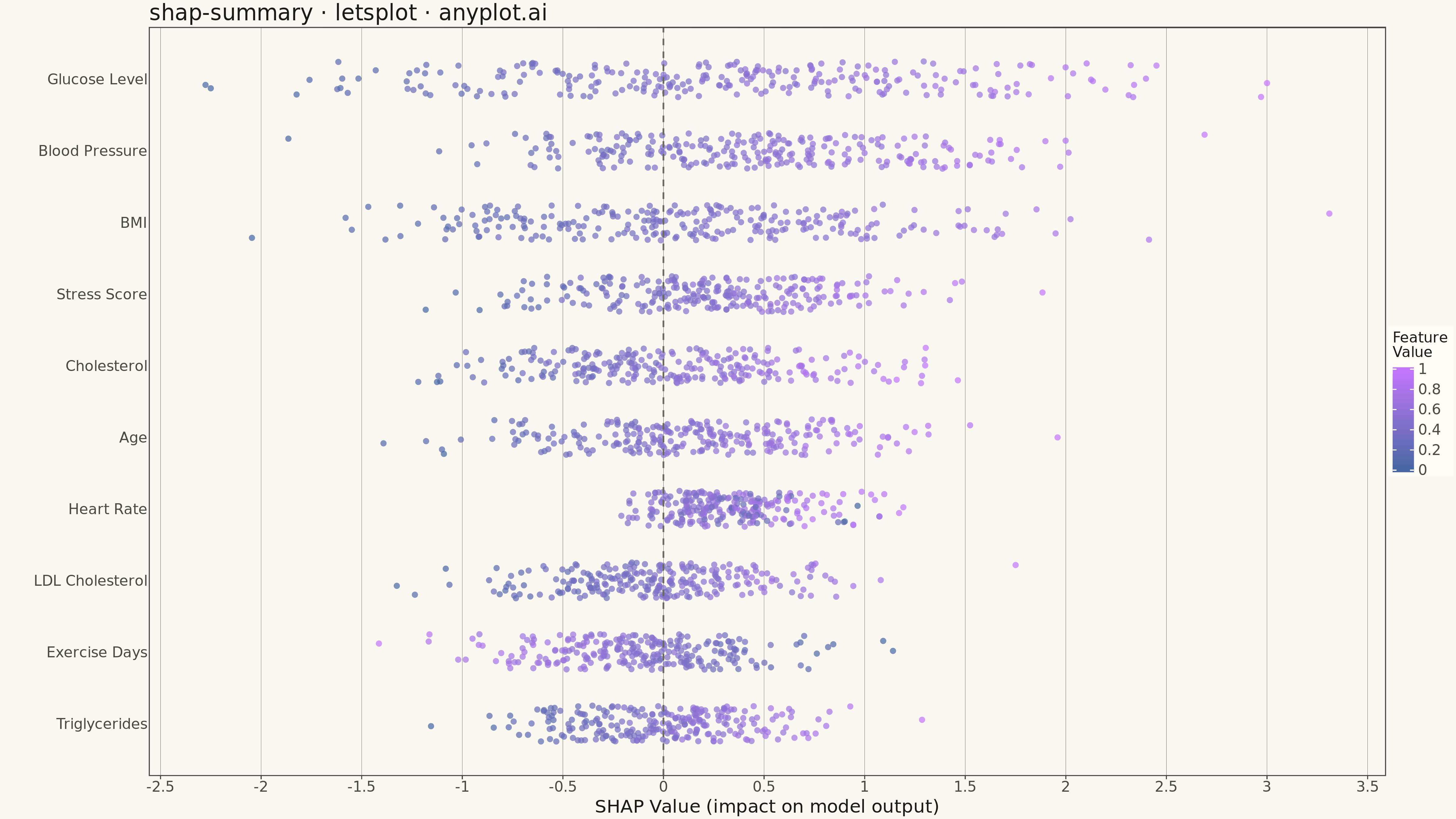
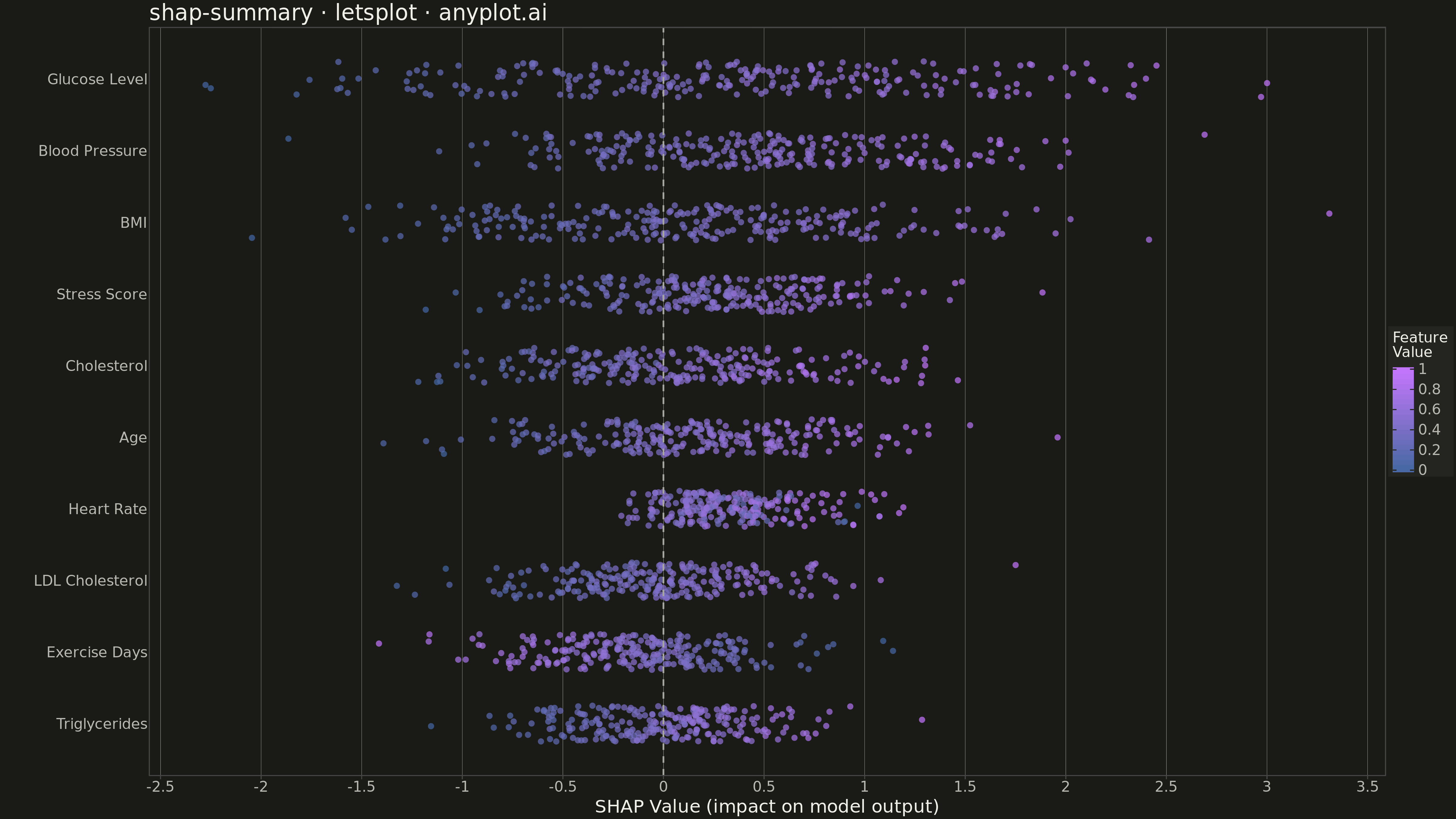
A SHAP (SHapley Additive exPlanations) summary plot displaying the distribution of SHAP values for each feature, ordered by mean absolute SHAP value (importance). Each dot represents a sample, positioned horizontally by its SHAP value and colored by the feature's value (typically low=blue to high=red). This visualization is essential for machine learning interpretability, showing both feature importance and the direction and magnitude of feature effects on model predictions.
""" anyplot.ai
shap-summary: SHAP Summary Plot
Library: letsplot 4.9.0 | Python 3.13.13
Quality: 91/100 | Updated: 2026-05-14
"""

import os
import numpy as np
import pandas as pd
from lets_plot import *


LetsPlot.setup_html()

# Theme setup
THEME = os.getenv("ANYPLOT_THEME", "light")
PAGE_BG = "#FAF8F1" if THEME == "light" else "#1A1A17"
ELEVATED_BG = "#FFFDF6" if THEME == "light" else "#242420"
INK = "#1A1A17" if THEME == "light" else "#F0EFE8"
INK_SOFT = "#4A4A44" if THEME == "light" else "#B8B7B0"
INK_MUTED = "#6B6A63" if THEME == "light" else "#A8A79F"

# Data: Simulate SHAP values for a healthcare outcome prediction model
np.random.seed(42)
n_samples = 250
n_features = 12

feature_names = [
    "BMI",
    "Blood Pressure",
    "Glucose Level",
    "Cholesterol",
    "Heart Rate",
    "Sleep Hours",
    "Exercise Days",
    "Stress Score",
    "Age",
    "Triglycerides",
    "HDL Cholesterol",
    "LDL Cholesterol",
]

# Generate realistic medical feature values
feature_values = np.column_stack(
    [
        np.random.normal(26, 5, n_samples),  # BMI
        np.random.normal(130, 15, n_samples),  # Blood Pressure (systolic)
        np.random.normal(110, 25, n_samples),  # Glucose Level
        np.random.normal(200, 40, n_samples),  # Cholesterol
        np.random.normal(75, 12, n_samples),  # Heart Rate
        np.random.normal(7, 1.5, n_samples),  # Sleep Hours
        np.random.normal(4, 2, n_samples),  # Exercise Days/week
        np.random.normal(50, 20, n_samples),  # Stress Score (0-100)
        np.random.normal(55, 15, n_samples),  # Age
        np.random.normal(150, 50, n_samples),  # Triglycerides
        np.random.normal(50, 12, n_samples),  # HDL Cholesterol
        np.random.normal(130, 30, n_samples),  # LDL Cholesterol
    ]
)

# Generate SHAP values with realistic medical relationships
shap_values = np.zeros((n_samples, n_features))

# BMI: positive effect on risk (higher BMI = worse outcome)
bmi_norm = (feature_values[:, 0] - 25) / 5
shap_values[:, 0] = bmi_norm * 0.8 + np.random.normal(0, 0.15, n_samples)

# Blood Pressure: positive effect
bp_norm = (feature_values[:, 1] - 120) / 20
shap_values[:, 1] = bp_norm * 0.9 + np.random.normal(0, 0.14, n_samples)

# Glucose Level: strong positive effect
glucose_norm = (feature_values[:, 2] - 100) / 30
shap_values[:, 2] = glucose_norm * 1.2 + np.random.normal(0, 0.18, n_samples)

# Cholesterol: positive effect
chol_norm = (feature_values[:, 3] - 200) / 50
shap_values[:, 3] = chol_norm * 0.7 + np.random.normal(0, 0.16, n_samples)

# Heart Rate: U-shaped effect (too low or too high is bad)
hr_centered = np.abs(feature_values[:, 4] - 72)
shap_values[:, 4] = (hr_centered / 15) * 0.5 + np.random.normal(0, 0.12, n_samples)

# Sleep Hours: negative effect (more sleep = better)
shap_values[:, 5] = -(feature_values[:, 5] - 7) * 0.15 + np.random.normal(0, 0.1, n_samples)

# Exercise Days: strong negative effect (protective)
shap_values[:, 6] = -(feature_values[:, 6] - 3.5) * 0.2 + np.random.normal(0, 0.12, n_samples)

# Stress Score: positive effect
stress_norm = (feature_values[:, 7] - 40) / 25
shap_values[:, 7] = stress_norm * 0.6 + np.random.normal(0, 0.13, n_samples)

# Age: positive effect
age_norm = (feature_values[:, 8] - 50) / 20
shap_values[:, 8] = age_norm * 0.7 + np.random.normal(0, 0.14, n_samples)

# Triglycerides: moderate positive effect
trig_norm = (feature_values[:, 9] - 150) / 60
shap_values[:, 9] = trig_norm * 0.45 + np.random.normal(0, 0.11, n_samples)

# HDL Cholesterol: negative effect (protective)
hdl_norm = (feature_values[:, 10] - 50) / 15
shap_values[:, 10] = -hdl_norm * 0.35 + np.random.normal(0, 0.09, n_samples)

# LDL Cholesterol: positive effect
ldl_norm = (feature_values[:, 11] - 130) / 40
shap_values[:, 11] = ldl_norm * 0.55 + np.random.normal(0, 0.13, n_samples)

# Calculate mean absolute SHAP value for feature importance
mean_abs_shap = np.abs(shap_values).mean(axis=0)
feature_order = np.argsort(mean_abs_shap)[::-1]

# Select top 10 features
top_k = 10
top_indices = feature_order[:top_k]

# Create long-form DataFrame for plotting
data_records = []
for rank, feat_idx in enumerate(top_indices):
    feat_name = feature_names[feat_idx]
    feat_shap = shap_values[:, feat_idx]
    feat_val = feature_values[:, feat_idx]
    # Normalize feature values to 0-1 for consistent coloring
    feat_val_norm = (feat_val - feat_val.min()) / (feat_val.max() - feat_val.min() + 1e-8)
    # Add vertical jitter for visibility
    jitter = np.random.uniform(-0.25, 0.25, n_samples)

    for i in range(n_samples):
        data_records.append(
            {
                "Feature": feat_name,
                "SHAP Value": feat_shap[i],
                "Feature Value": feat_val_norm[i],
                "y_position": (top_k - 1 - rank) + jitter[i],
                "importance_rank": rank,
            }
        )

df = pd.DataFrame(data_records)

# Create ordered feature list (most important at top)
ordered_features = [feature_names[i] for i in top_indices]

# Theme configuration
anyplot_theme = theme(
    plot_background=element_rect(fill=PAGE_BG, color=PAGE_BG),
    panel_background=element_rect(fill=PAGE_BG),
    panel_grid_major_x=element_line(color=INK_MUTED, size=0.3),
    panel_grid_minor=element_blank(),
    axis_title=element_text(color=INK, size=20),
    axis_text=element_text(color=INK_SOFT, size=16),
    plot_title=element_text(color=INK, size=24),
    legend_background=element_rect(fill=ELEVATED_BG, color=INK_SOFT),
    legend_title=element_text(color=INK, size=16),
    legend_text=element_text(color=INK_SOFT, size=16),
    panel_grid_major_y=element_blank(),
)

# Plot
plot = (
    ggplot(df, aes(x="SHAP Value", y="y_position", color="Feature Value"))
    + geom_point(size=3, alpha=0.7)
    + geom_vline(xintercept=0, color=INK_MUTED, size=0.8, linetype="dashed")
    + scale_color_gradient(low="#4467A3", high="#C475FD", name="Feature\nValue")
    + scale_y_continuous(breaks=list(range(top_k)), labels=ordered_features[::-1])
    + labs(x="SHAP Value (impact on model output)", y="", title="shap-summary · letsplot · anyplot.ai")
    + ggsize(1600, 900)
    + anyplot_theme
)

# Save as PNG and HTML
_plot_dir = os.path.dirname(os.path.abspath(__file__))
ggsave(plot, f"{_plot_dir}/plot-{THEME}.png", scale=3)
ggsave(plot, f"{_plot_dir}/plot-{THEME}.html")
Runnable source as JSON, for any HTTP client: https://api.anyplot.ai/specs/shap-summary/letsplot/code. Any spec id and library id listed in llms-full.txt fit the same URL shape; every URL below is complete and callable.
{
  "spec_id": "shap-summary",
  "language": "python",
  "library": "letsplot",
  "page": "https://anyplot.ai/shap-summary/python/letsplot",
  "hub": "https://anyplot.ai/shap-summary",
  "code_json": "https://api.anyplot.ai/specs/shap-summary/letsplot/code",
  "spec_json": "https://api.anyplot.ai/specs/shap-summary",
  "render_light_png": "https://storage.googleapis.com/anyplot-images/plots/shap-summary/python/letsplot/plot-light.png",
  "render_dark_png": "https://storage.googleapis.com/anyplot-images/plots/shap-summary/python/letsplot/plot-dark.png",
  "interactive_light_html": "https://storage.googleapis.com/anyplot-images/plots/shap-summary/python/letsplot/plot-light.html",
  "interactive_dark_html": "https://storage.googleapis.com/anyplot-images/plots/shap-summary/python/letsplot/plot-dark.html",
  "quality_score": 91.0,
  "license": "MIT",
  "guide": "https://anyplot.ai/llms.txt"
}
Part of SHAP Summary Plot on anyplot.ai.