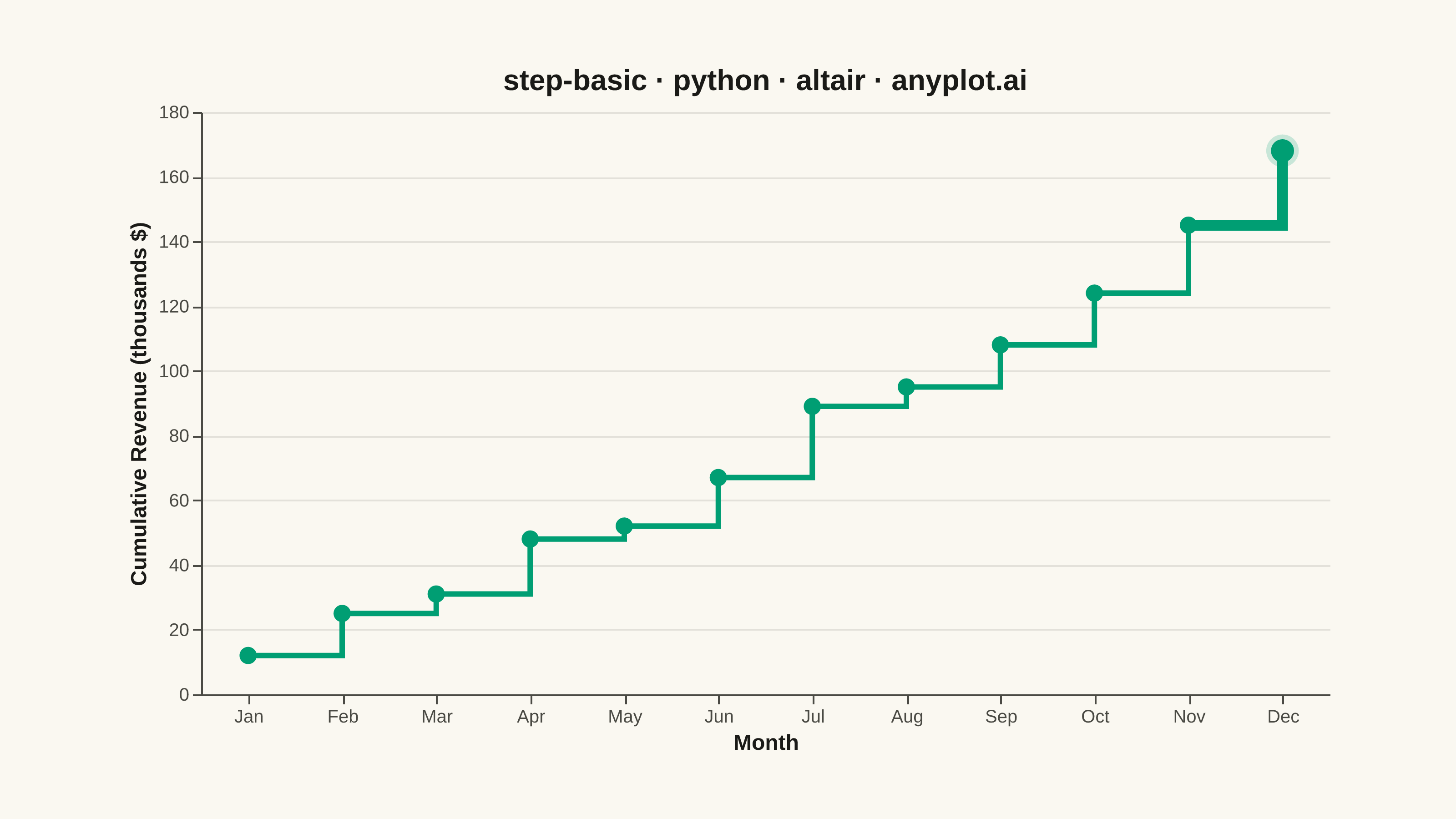
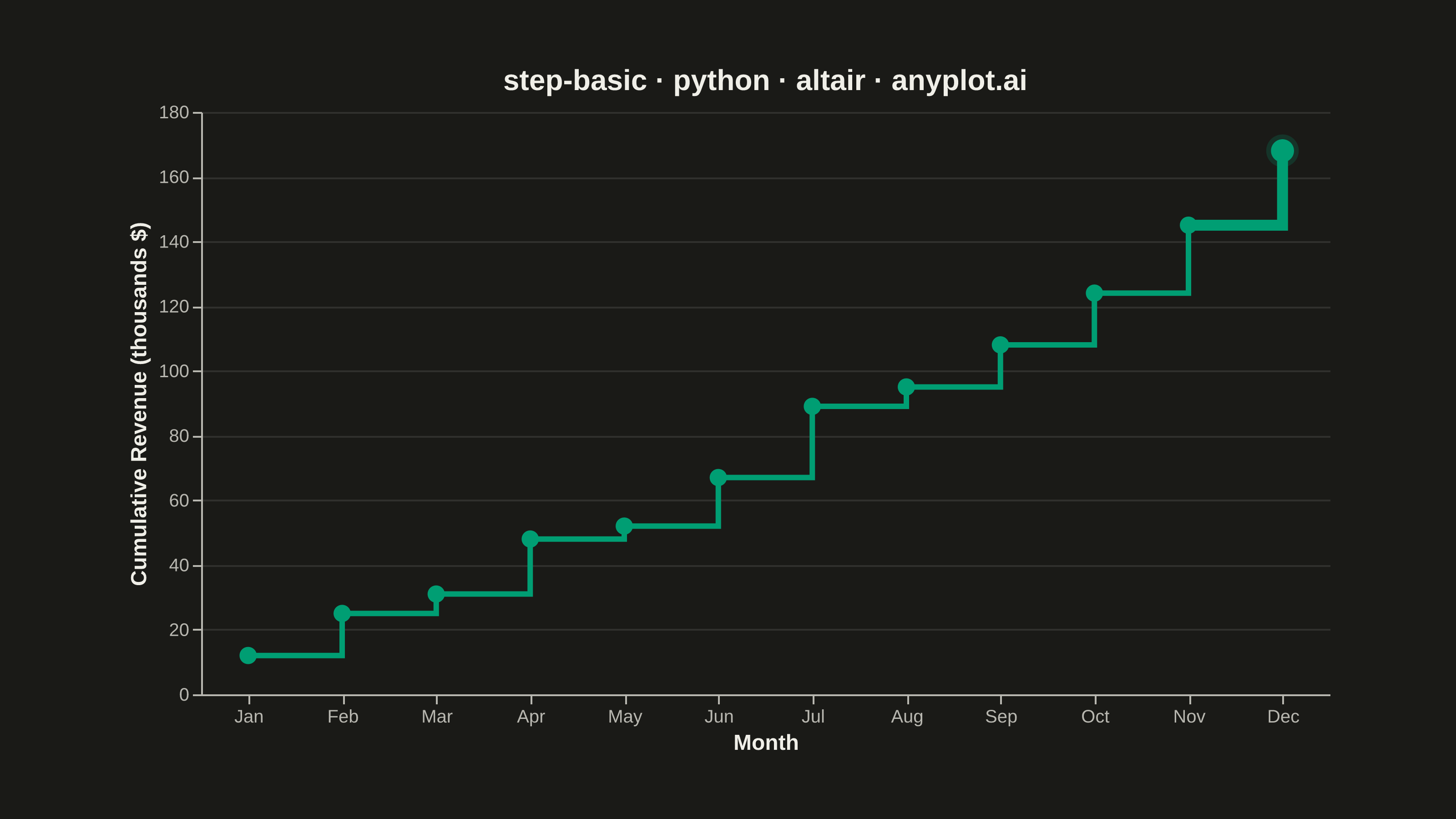
A step plot (also known as a stair plot or stepped line chart) displays data using horizontal lines connected by vertical lines, creating a stair-step pattern. Unlike line charts that interpolate between points, step plots show values as constant until the next change occurs. This makes them ideal for visualizing data that changes at discrete intervals, emphasizing the exact moments when values change.
""" anyplot.ai
step-basic: Basic Step Plot
Library: altair 6.2.2 | Python 3.13.14
Quality: 91/100 | Updated: 2026-07-25
"""

import os
import sys


# Workaround: this file is named altair.py, which shadows the altair module
_cwd = os.getcwd()
if _cwd in sys.path:
    sys.path.remove(_cwd)
if "" in sys.path:
    sys.path.remove("")

import altair as alt

sys.path.insert(0, _cwd)

import pandas as pd
from PIL import Image

# Theme tokens
THEME = os.getenv("ANYPLOT_THEME", "light")
PAGE_BG = "#FAF8F1" if THEME == "light" else "#1A1A17"
INK = "#1A1A17" if THEME == "light" else "#F0EFE8"
INK_SOFT = "#4A4A44" if THEME == "light" else "#B8B7B0"
BRAND = "#009E73"

# Data — monthly cumulative software subscription revenue
months = ["Jan", "Feb", "Mar", "Apr", "May", "Jun", "Jul", "Aug", "Sep", "Oct", "Nov", "Dec"]
cumulative_revenue = [12, 25, 31, 48, 52, 67, 89, 95, 108, 124, 145, 168]

df = pd.DataFrame({"Month": months, "Cumulative Revenue": cumulative_revenue})

# Largest month-over-month jump — used to give the chart a focal point (size/opacity
# accent only, no text callout; brand green stays the only data color per the palette rules)
deltas = [b - a for a, b in zip(cumulative_revenue, cumulative_revenue[1:], strict=False)]
peak_idx = deltas.index(max(deltas)) + 1
peak_month = months[peak_idx]
peak_df = df[df["Month"] == peak_month]

# Step line
line = (
    alt.Chart(df)
    .mark_line(interpolate="step-after", strokeWidth=3, color=BRAND)
    .encode(
        x=alt.X("Month:N", title="Month", sort=months, axis=alt.Axis(labelAngle=0)),
        y=alt.Y("Cumulative Revenue:Q", title="Cumulative Revenue (thousands $)"),
    )
)

# Thicker overlay on the steepest step to emphasize the largest jump
highlight_line = (
    alt.Chart(df.iloc[peak_idx - 1 : peak_idx + 1])
    .mark_line(interpolate="step-after", strokeWidth=6, color=BRAND)
    .encode(x=alt.X("Month:N", sort=months), y="Cumulative Revenue:Q")
)

# Markers at each data point
points = (
    alt.Chart(df)
    .mark_point(size=90, color=BRAND, filled=True, opacity=1.0)
    .encode(x=alt.X("Month:N", sort=months), y="Cumulative Revenue:Q")
)

# Soft halo + enlarged marker at the peak jump's endpoint — the chart's focal point
peak_halo = (
    alt.Chart(peak_df)
    .mark_point(size=320, color=BRAND, filled=True, opacity=0.20)
    .encode(x=alt.X("Month:N", sort=months), y="Cumulative Revenue:Q")
)
peak_marker = (
    alt.Chart(peak_df)
    .mark_point(size=160, color=BRAND, filled=True, opacity=1.0)
    .encode(x=alt.X("Month:N", sort=months), y="Cumulative Revenue:Q")
)

# Compose and style — see prompts/library/altair.md "Canvas" for the inner-view sizing rationale
chart = (
    (line + highlight_line + points + peak_halo + peak_marker)
    .properties(
        width=620,
        height=320,
        background=PAGE_BG,
        title=alt.Title("step-basic · python · altair · anyplot.ai", fontSize=16, color=INK),
    )
    .configure_view(fill=PAGE_BG, stroke=None)
    .configure_axis(
        domainColor=INK_SOFT,
        tickColor=INK_SOFT,
        gridColor=INK,
        gridOpacity=0.10,
        labelColor=INK_SOFT,
        titleColor=INK,
        labelFontSize=10,
        titleFontSize=12,
    )
)

# Save
chart.save(f"plot-{THEME}.png", scale_factor=4.0)

# Pad-to-target — vl-convert pads the inner view with title/axis/legend extents,
# so the saved PNG rarely lands exactly on the canonical size (see altair.md "Canvas")
TW, TH = 3200, 1800
_img = Image.open(f"plot-{THEME}.png").convert("RGB")
_w, _h = _img.size
if _w > TW or _h > TH:
    raise SystemExit(
        f"altair vl-convert produced {_w}×{_h}, exceeds target {TW}×{TH}. "
        f"Shrink chart .properties(width=, height=) values and re-render."
    )
if _w < TW or _h < TH:
    _canvas = Image.new("RGB", (TW, TH), PAGE_BG)
    _canvas.paste(_img, ((TW - _w) // 2, (TH - _h) // 2))
    _canvas.save(f"plot-{THEME}.png")

chart.save(f"plot-{THEME}.html")
Runnable source as JSON, for any HTTP client: https://api.anyplot.ai/specs/step-basic/altair/code. Any spec id and library id listed in llms-full.txt fit the same URL shape; every URL below is complete and callable.
{
  "spec_id": "step-basic",
  "language": "python",
  "library": "altair",
  "page": "https://anyplot.ai/step-basic/python/altair",
  "hub": "https://anyplot.ai/step-basic",
  "code_json": "https://api.anyplot.ai/specs/step-basic/altair/code",
  "spec_json": "https://api.anyplot.ai/specs/step-basic",
  "render_light_png": "https://storage.googleapis.com/anyplot-images/plots/step-basic/python/altair/plot-light.png",
  "render_dark_png": "https://storage.googleapis.com/anyplot-images/plots/step-basic/python/altair/plot-dark.png",
  "interactive_light_html": "https://storage.googleapis.com/anyplot-images/plots/step-basic/python/altair/plot-light.html",
  "interactive_dark_html": "https://storage.googleapis.com/anyplot-images/plots/step-basic/python/altair/plot-dark.html",
  "quality_score": 91.0,
  "license": "MIT",
  "guide": "https://anyplot.ai/llms.txt"
}
Part of Basic Step Plot on anyplot.ai.