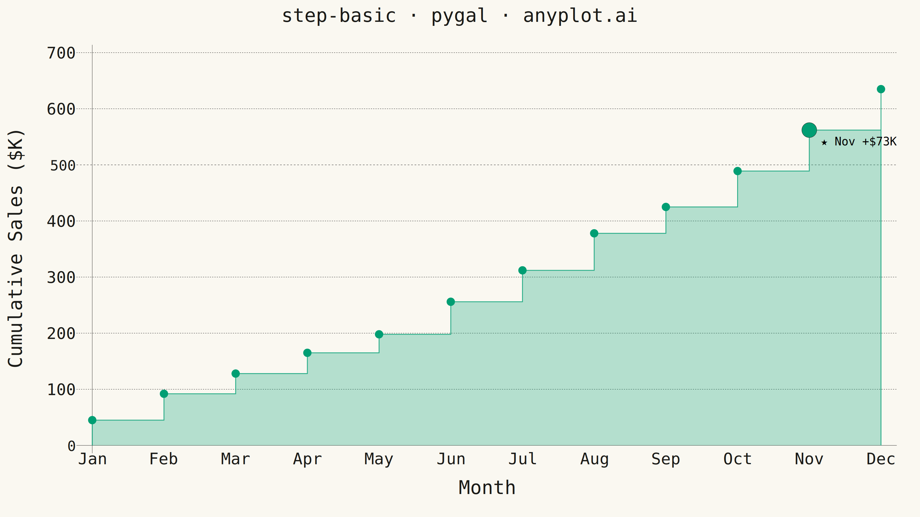
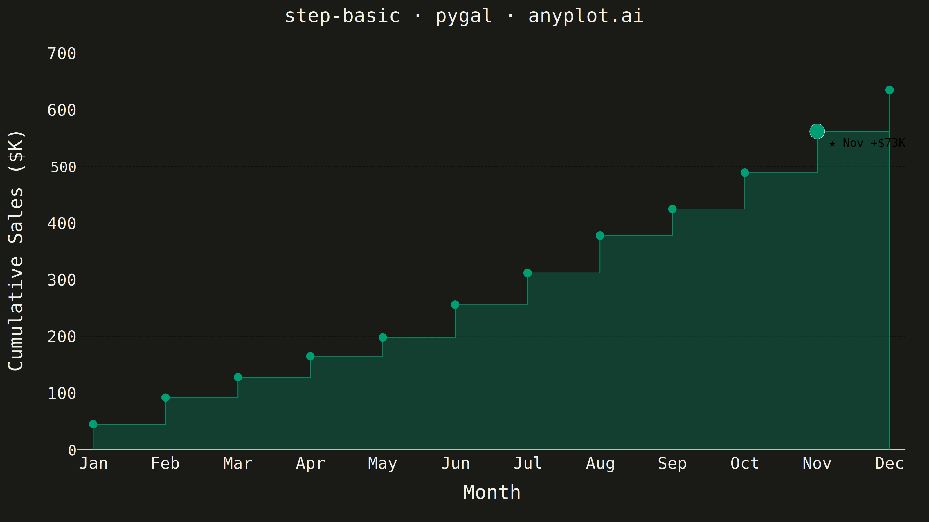
A step plot (also known as a stair plot or stepped line chart) displays data using horizontal lines connected by vertical lines, creating a stair-step pattern. Unlike line charts that interpolate between points, step plots show values as constant until the next change occurs. This makes them ideal for visualizing data that changes at discrete intervals, emphasizing the exact moments when values change.
""" anyplot.ai
step-basic: Basic Step Plot
Library: pygal 3.1.3 | Python 3.13.14
Quality: 88/100 | Updated: 2026-07-25
"""

import os
import sys


# Pop script dir so this file (pygal.py) doesn't shadow the installed pygal package
_script_dir = sys.path.pop(0)
import pygal
from pygal.style import Style


sys.path.insert(0, _script_dir)

# Theme tokens
THEME = os.getenv("ANYPLOT_THEME", "light")
PAGE_BG = "#FAF8F1" if THEME == "light" else "#1A1A17"
INK = "#1A1A17" if THEME == "light" else "#F0EFE8"
INK_SOFT = "#4A4A44" if THEME == "light" else "#B8B7B0"
INK_MUTED = "#6B6A63" if THEME == "light" else "#A8A79F"

IMPRINT = ("#009E73", "#C475FD", "#4467A3", "#BD8233", "#AE3030", "#2ABCCD", "#954477")

# Data - Monthly cumulative sales (in thousands)
months = ["Jan", "Feb", "Mar", "Apr", "May", "Jun", "Jul", "Aug", "Sep", "Oct", "Nov", "Dec"]
cumulative_sales = [45, 92, 128, 165, 198, 256, 312, 378, 425, 489, 562, 635]

# Find month with peak month-on-month growth for storytelling emphasis
monthly_growth = [cumulative_sales[i] - cumulative_sales[i - 1] for i in range(1, len(cumulative_sales))]
peak_idx = monthly_growth.index(max(monthly_growth)) + 1  # Nov (index 10) — +$73K

NODE_R = 14  # standard dot radius — bumped for stronger visibility on sparse 12-point data
PEAK_R = 26  # peak dot radius — clearly emphasized vs. the standard dots


def _blank(value, **_kwargs):
    """Suppress the static print-value for every node except the peak (avoids clutter)."""
    return ""


# Build true step-chart data using pygal.XY coordinates.
# Pattern per data point i: (i, prev_val)[no dot] → (i, val)[dot] → (i+1, val)[no dot]
# This creates genuine vertical rises and horizontal holds — no diagonal approximation.
step_data = []
for i, (month, val) in enumerate(zip(months, cumulative_sales, strict=True)):
    if i > 0:
        # Bottom of vertical step: hold previous value up to this x position
        step_data.append({"value": (i, cumulative_sales[i - 1]), "node": {"r": 0}, "formatter": _blank})

    # Actual data point — larger dot + rich tooltip label for interactivity
    increment = val - (cumulative_sales[i - 1] if i > 0 else 0)
    is_peak = i == peak_idx
    if is_peak:
        label = f"★ Peak growth — {month}: +${increment}K → ${val}K cumulative"
        point = {
            "value": (i, val),
            "node": {"r": PEAK_R},
            "label": label,
            # Defined stroke ring makes the peak marker read as a deliberate accent,
            # not just a bigger version of the same dot.
            "style": f"fill: {IMPRINT[0]}; stroke: {INK}; stroke-width: 4",
            "formatter": lambda v, _text=f"★ {month} +${increment}K": _text,
        }
    else:
        label = f"{month}: ${val}K cumulative (+${increment}K)"
        point = {"value": (i, val), "node": {"r": NODE_R}, "label": label, "formatter": _blank}
    step_data.append(point)

    if i < len(months) - 1:
        # Horizontal hold: extend current value to the next x position
        step_data.append({"value": (i + 1, val), "node": {"r": 0}, "formatter": _blank})

# Custom style
custom_style = Style(
    background=PAGE_BG,
    plot_background=PAGE_BG,
    foreground=INK,
    foreground_strong=INK,
    foreground_subtle=INK_MUTED,
    colors=IMPRINT,
    title_font_size=66,
    label_font_size=56,
    major_label_font_size=50,
    legend_font_size=44,
    value_font_size=40,
    stroke_width=3,
    opacity="0.28",
    opacity_hover="0.9",
)

# Chart — XY mode gives full control over x coordinates for true vertical step transitions
chart = pygal.XY(
    width=3200,
    height=1800,
    title="step-basic · pygal · anyplot.ai",
    x_title="Month",
    y_title="Cumulative Sales ($K)",
    style=custom_style,
    show_dots=True,
    dots_size=NODE_R,
    stroke_style={"width": 6},
    show_y_guides=True,
    show_x_guides=False,
    show_legend=False,
    fill=True,
    print_values=True,  # static peak-growth label on the PNG (per-node formatter suppresses the rest)
    print_zeroes=False,
    margin=80,
    range=(0, 700),  # headroom above the Dec peak (635) so the top dot isn't flush with the frame
    x_value_formatter=lambda x: months[round(x)] if 0 <= round(x) <= 11 else "",
)

# Place x-axis tick labels at integer positions 0–11 (mapped to month names by formatter)
chart.x_labels = list(range(12))
chart.add("Cumulative Sales", step_data)

# Save
chart.render_to_png(f"plot-{THEME}.png")
with open(f"plot-{THEME}.html", "wb") as f:
    f.write(chart.render())
Runnable source as JSON, for any HTTP client: https://api.anyplot.ai/specs/step-basic/pygal/code. Any spec id and library id listed in llms-full.txt fit the same URL shape; every URL below is complete and callable.
{
  "spec_id": "step-basic",
  "language": "python",
  "library": "pygal",
  "page": "https://anyplot.ai/step-basic/python/pygal",
  "hub": "https://anyplot.ai/step-basic",
  "code_json": "https://api.anyplot.ai/specs/step-basic/pygal/code",
  "spec_json": "https://api.anyplot.ai/specs/step-basic",
  "render_light_png": "https://storage.googleapis.com/anyplot-images/plots/step-basic/python/pygal/plot-light.png",
  "render_dark_png": "https://storage.googleapis.com/anyplot-images/plots/step-basic/python/pygal/plot-dark.png",
  "interactive_light_html": "https://storage.googleapis.com/anyplot-images/plots/step-basic/python/pygal/plot-light.html",
  "interactive_dark_html": "https://storage.googleapis.com/anyplot-images/plots/step-basic/python/pygal/plot-dark.html",
  "quality_score": 88.0,
  "license": "MIT",
  "guide": "https://anyplot.ai/llms.txt"
}
Part of Basic Step Plot on anyplot.ai.