The same plot in 14 other libraries — JavaScript: Chart.js, D3.js, Apache ECharts, MUI X Charts; Python: Altair, Bokeh, lets-plot, Matplotlib, Plotly, plotnine, Pygal, Seaborn; R: ggplot2; Julia: Makie.jl. Compare all 15 side by side: Subplot Grid Layout in Python, R, Julia and JavaScript.
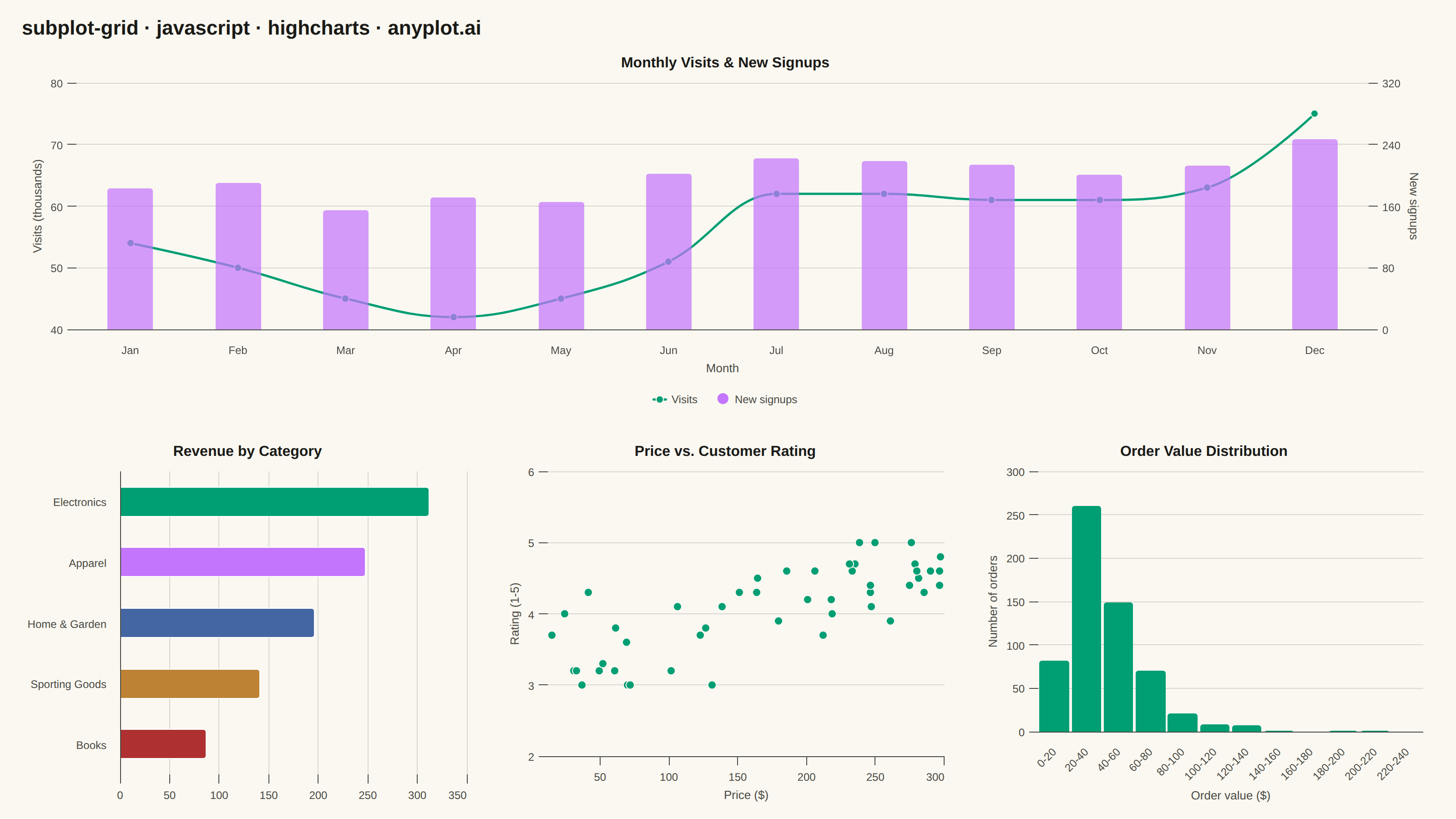
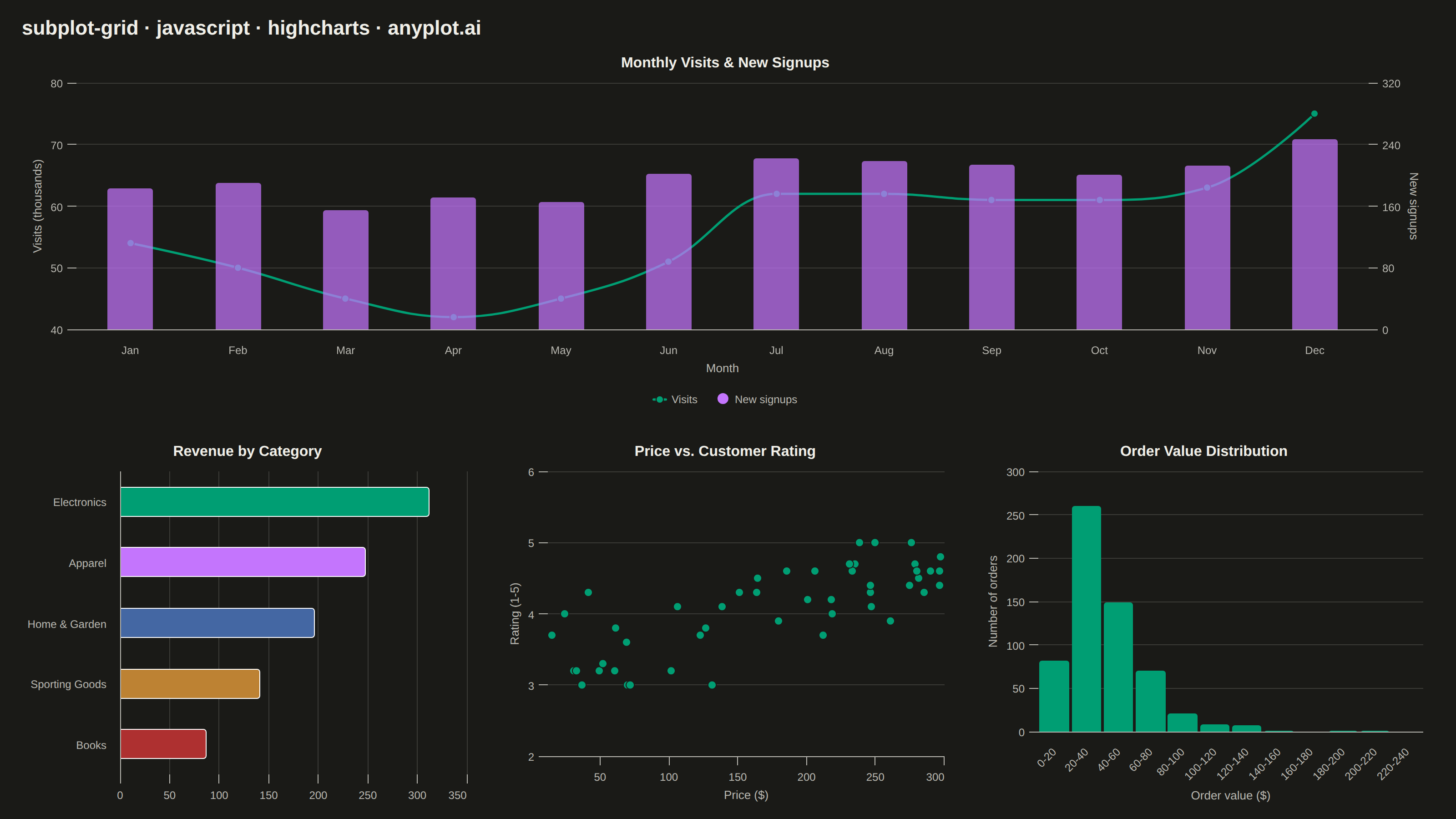
A customizable grid of multiple subplots allowing different plot types in each cell, with shared or independent axes. Unlike faceted plots that repeat the same visualization for data subsets, subplot grids enable combining distinct visualizations (scatter, line, bar, histogram, etc.) into a cohesive multi-panel figure for comprehensive data presentation.
// anyplot.ai
// subplot-grid: Subplot Grid Layout
// Library: highcharts 12.6.0 | JavaScript 22.23.2
// Quality: 87/100 | Created: 2026-09-09

const t = window.ANYPLOT_TOKENS;

// --- Fixed-seed LCG (no seeded RNG in the browser) ----------------------------------
function lcg(seed) {
  let s = seed;
  return () => {
    s = (s * 1664525 + 1013904223) % 4294967296;
    return s / 4294967296;
  };
}
const rand = lcg(20260909);
function randNormal(mean, sd) {
  const u1 = Math.max(rand(), 1e-12);
  const u2 = rand();
  return mean + sd * Math.sqrt(-2 * Math.log(u1)) * Math.cos(2 * Math.PI * u2);
}

// --- Panel 1 data: monthly website visits & new signups, a seasonal trend (combo) --
const months = ["Jan", "Feb", "Mar", "Apr", "May", "Jun", "Jul", "Aug", "Sep", "Oct", "Nov", "Dec"];
const seasonal = [1, 0, -1, -2, -2, -1, 1, 2, 1, 0, 1, 3];
const visitsThousands = seasonal.map((s, i) => Math.round(48 + s * 4 + i * 1.4 + randNormal(0, 1.6)));
// Second series on the SAME month axis (a different, smaller-scale count) so panel 1
// can demonstrate a shared x-axis with independent y-axes for comparison at different scales.
const newSignups = seasonal.map((s, i) => Math.round(180 + s * 12 + i * 3 + randNormal(0, 8)));

// --- Panel 2 data: quarterly revenue by product category (bar) ---------------------
const categories = ["Electronics", "Apparel", "Home & Garden", "Sporting Goods", "Books"];
const revenueThousands = [312, 248, 196, 141, 87];

// --- Panel 3 data: product price vs. customer rating (scatter) ---------------------
const nProducts = 48;
const priceUsd = [];
const rating = [];
for (let i = 0; i < nProducts; i++) {
  const price = 8 + 290 * rand();
  const r = Math.min(5, Math.max(1, 3.1 + 0.0055 * price + randNormal(0, 0.45)));
  priceUsd.push(Math.round(price * 100) / 100);
  rating.push(Math.round(r * 10) / 10);
}

// --- Panel 4 data: order value distribution, right-skewed (histogram via column) ---
const nOrders = 600;
const orderValues = [];
for (let i = 0; i < nOrders; i++) {
  orderValues.push(Math.exp(randNormal(3.6, 0.55)));
}
const binWidth = 20;
const binCount = 12;
const binCounts = new Array(binCount).fill(0);
orderValues.forEach((v) => {
  const idx = Math.min(binCount - 1, Math.floor(v / binWidth));
  binCounts[idx] += 1;
});
const binLabels = binCounts.map((_, i) => `${i * binWidth}-${(i + 1) * binWidth}`);

// --- Shared chart chrome for every panel --------------------------------------------
function baseOptions(type, panelTitle, xTitle, yTitle) {
  return {
    chart: { type, backgroundColor: "transparent", animation: false,
             spacing: [10, 16, 10, 10], style: { fontFamily: "inherit" } },
    credits: { enabled: false },
    colors: t.palette,
    title: { text: panelTitle, style: { color: t.ink, fontSize: "16px", fontWeight: "600" }, margin: 12 },
    xAxis: { title: { text: xTitle, style: { color: t.inkSoft, fontSize: "13px" } },
             lineColor: t.inkSoft, tickColor: t.inkSoft, gridLineColor: t.grid,
             labels: { style: { color: t.inkSoft, fontSize: "12px" } } },
    yAxis: { title: { text: yTitle, style: { color: t.inkSoft, fontSize: "13px" } },
             gridLineColor: t.grid, lineColor: t.inkSoft, tickColor: t.inkSoft, tickWidth: 1,
             labels: { style: { color: t.inkSoft, fontSize: "12px" } } },
    legend: { enabled: false },
    plotOptions: { series: { animation: false } },
  };
}

// Panel 1 — Monthly Visits & New Signups (spline + column combo): SHARED x-axis (both
// series plot against the same month categories, directly comparable month-to-month)
// paired with INDEPENDENT y-axes (thousands of visits vs. raw signup counts live on very
// different scales). Panels 2-4 keep fully independent axes since each visualizes an
// unrelated variable at its own scale — together the grid demonstrates both modes the
// spec calls for.
const panel1 = baseOptions("spline", "Monthly Visits & New Signups", "Month", null);
panel1.xAxis.categories = months;
panel1.yAxis = [
  { title: { text: "Visits (thousands)", style: { color: t.inkSoft, fontSize: "13px" } },
    gridLineColor: t.grid, lineColor: t.inkSoft, tickColor: t.inkSoft, tickWidth: 1,
    labels: { style: { color: t.inkSoft, fontSize: "12px" } } },
  { title: { text: "New signups", style: { color: t.inkSoft, fontSize: "13px" } },
    gridLineColor: "transparent", lineColor: t.inkSoft, tickColor: t.inkSoft, tickWidth: 1,
    labels: { style: { color: t.inkSoft, fontSize: "12px" } }, opposite: true },
];
panel1.legend = { enabled: true, itemStyle: { color: t.inkSoft, fontSize: "12px" }, itemHoverStyle: { color: t.ink } };
panel1.tooltip = {
  shared: true,
  formatter: function () {
    const lines = this.points.map((p) => `${p.series.name}: ${p.y}${p.series.name === "Visits" ? "k" : ""}`);
    return `<b>${this.x}</b><br/>${lines.join("<br/>")}`;
  },
};
panel1.series = [
  {
    name: "Visits", type: "spline", yAxis: 0,
    data: visitsThousands,
    color: t.palette[0],
    lineWidth: 2.5,
    marker: { radius: 4, fillColor: t.palette[0], lineColor: t.pageBg, lineWidth: 1 },
  },
  {
    name: "New signups", type: "column", yAxis: 1,
    data: newSignups,
    color: t.palette[1],
    opacity: 0.85,
    pointPadding: 0.2, groupPadding: 0.15, borderWidth: 0,
  },
];

// Panel 2 — Revenue by Product Category (bar): categorical comparison ---------------
const panel2 = baseOptions("bar", "Revenue by Category", "Revenue (thousand $)", null);
panel2.xAxis.categories = categories;
panel2.xAxis.title = null;
panel2.yAxis.gridLineColor = t.grid;
panel2.tooltip = { formatter: function () { return `${this.point.category}: $${this.y}k`; } };
panel2.series = [{ name: "Revenue", data: revenueThousands, colorByPoint: true }];

// Panel 3 — Price vs. Customer Rating (scatter): correlation between two variables ---
const panel3 = baseOptions("scatter", "Price vs. Customer Rating", "Price ($)", "Rating (1-5)");
panel3.tooltip = {
  formatter: function () { return `Price: $${this.x.toFixed(2)}<br/>Rating: ${this.y.toFixed(1)}`; },
};
panel3.series = [{
  name: "Products",
  data: priceUsd.map((p, i) => ({ x: p, y: rating[i] })),
  marker: { symbol: "circle", radius: 4.5, fillColor: t.palette[0], lineColor: t.pageBg, lineWidth: 1 },
}];

// Panel 4 — Order Value Distribution (histogram via binned column) -------------------
const panel4 = baseOptions("column", "Order Value Distribution", "Order value ($)", "Number of orders");
panel4.xAxis.categories = binLabels;
panel4.xAxis.labels.rotation = -45;
panel4.plotOptions.column = { pointPadding: 0, groupPadding: 0.04, borderWidth: 0 };
panel4.tooltip = { formatter: function () { return `$${this.point.category}: ${this.y} orders`; } };
panel4.series = [{ name: "Orders", data: binCounts, color: t.palette[0] }];

// --- Layout: shared header + a configurable, asymmetric grid of independently-mounted panels ---
const root = document.getElementById("container");

const header = document.createElement("div");
header.style.cssText = `padding:18px 24px 4px; font-size:22px; font-weight:600; color:${t.ink}; font-family:inherit;`;
header.textContent = "subplot-grid · javascript · highcharts · anyplot.ai";
root.appendChild(header);

// Asymmetric 3-col x 2-row grid: panel 1 (the combo trend chart) spans the full top row
// as the featured panel, giving the dashboard a clear focal point instead of four
// equally-weighted cells; the remaining three panels sit side by side below it.
const gridCols = 3;
const grid = document.createElement("div");
grid.style.cssText =
  `display:grid; grid-template-columns:repeat(${gridCols}, 1fr); grid-template-rows:1fr 1fr; ` +
  "gap:16px; margin:4px 20px 20px; height:calc(100% - 62px);";
root.appendChild(grid);

const panelSpecs = [
  { id: "panel-visits", column: "1 / -1", row: "1" },
  { id: "panel-revenue", column: "1", row: "2" },
  { id: "panel-price-rating", column: "2", row: "2" },
  { id: "panel-order-dist", column: "3", row: "2" },
];
panelSpecs.forEach(({ id, column, row }) => {
  const cell = document.createElement("div");
  cell.id = id;
  cell.style.cssText = `grid-column:${column}; grid-row:${row};`;
  grid.appendChild(cell);
});

Highcharts.chart("panel-visits", panel1);
Highcharts.chart("panel-revenue", panel2);
Highcharts.chart("panel-price-rating", panel3);
Highcharts.chart("panel-order-dist", panel4);
Runnable source as JSON, for any HTTP client: https://api.anyplot.ai/specs/subplot-grid/highcharts/code. Any spec id and library id listed in llms-full.txt fit the same URL shape; every URL below is complete and callable.
{
  "spec_id": "subplot-grid",
  "language": "javascript",
  "library": "highcharts",
  "page": "https://anyplot.ai/subplot-grid/javascript/highcharts",
  "hub": "https://anyplot.ai/subplot-grid",
  "code_json": "https://api.anyplot.ai/specs/subplot-grid/highcharts/code",
  "spec_json": "https://api.anyplot.ai/specs/subplot-grid",
  "render_light_png": "https://storage.googleapis.com/anyplot-images/plots/subplot-grid/javascript/highcharts/plot-light.png",
  "render_dark_png": "https://storage.googleapis.com/anyplot-images/plots/subplot-grid/javascript/highcharts/plot-dark.png",
  "interactive_light_html": "https://storage.googleapis.com/anyplot-images/plots/subplot-grid/javascript/highcharts/plot-light.html",
  "interactive_dark_html": "https://storage.googleapis.com/anyplot-images/plots/subplot-grid/javascript/highcharts/plot-dark.html",
  "quality_score": 87.0,
  "license": "MIT",
  "guide": "https://anyplot.ai/llms.txt"
}
Part of Subplot Grid Layout on anyplot.ai.