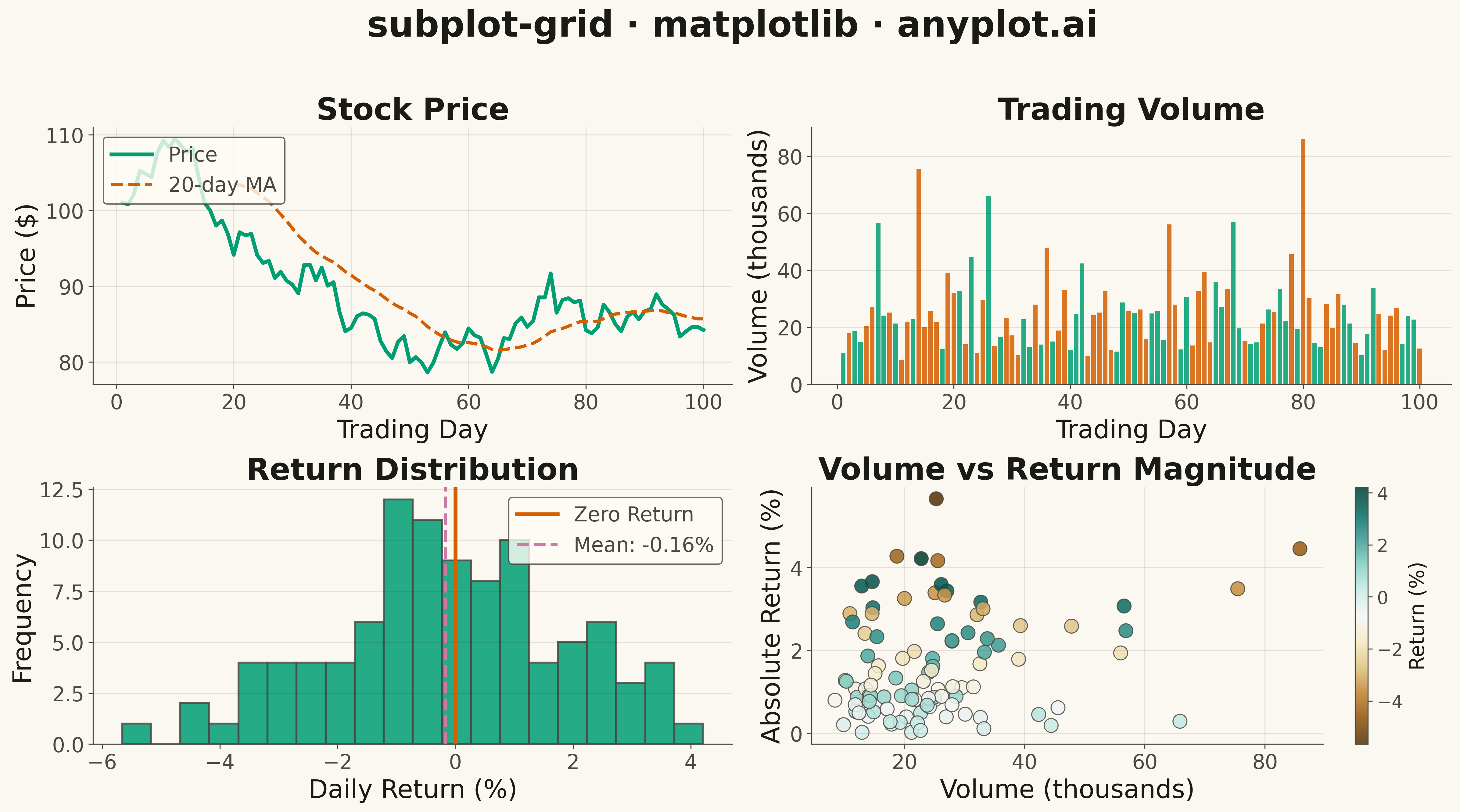
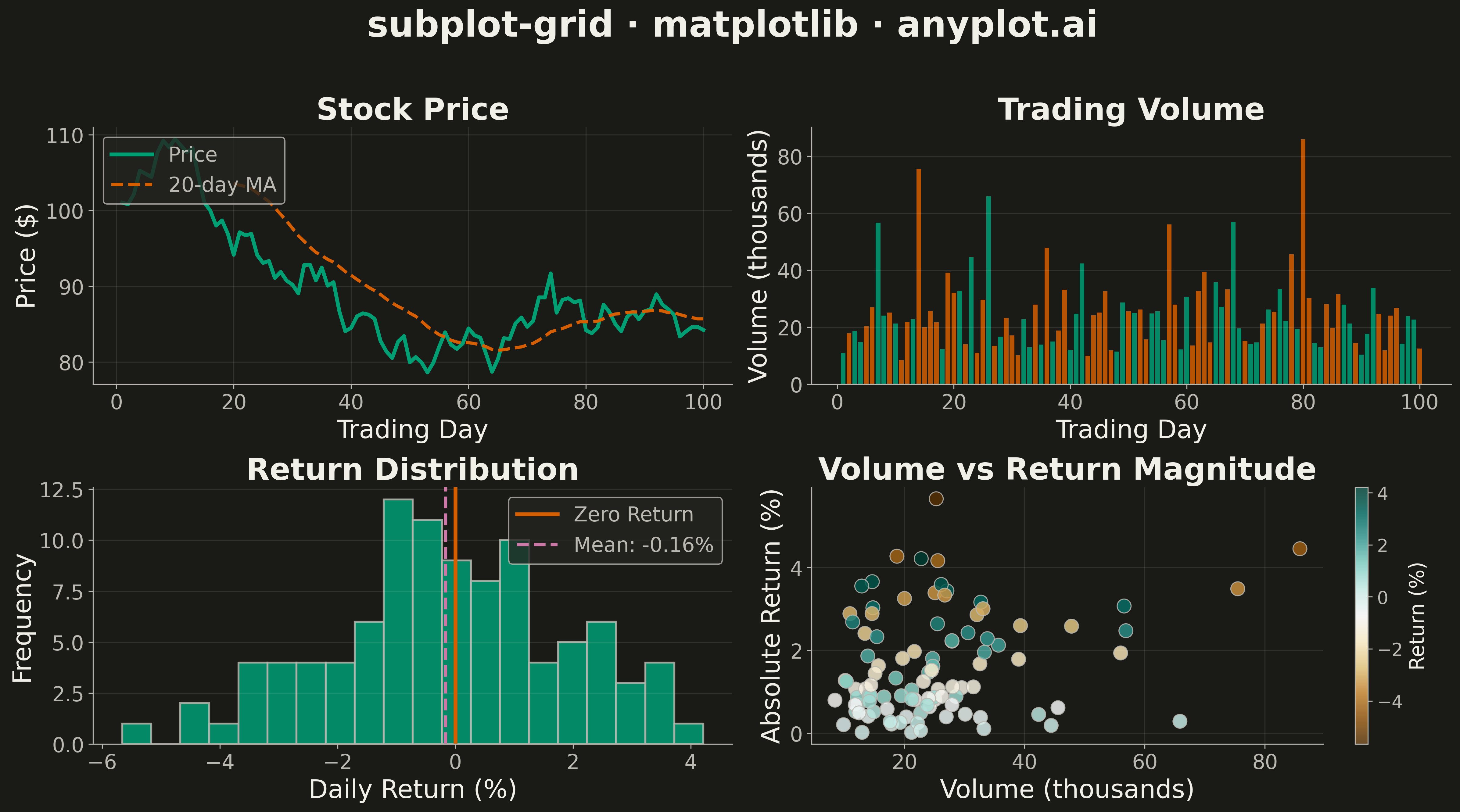
A customizable grid of multiple subplots allowing different plot types in each cell, with shared or independent axes. Unlike faceted plots that repeat the same visualization for data subsets, subplot grids enable combining distinct visualizations (scatter, line, bar, histogram, etc.) into a cohesive multi-panel figure for comprehensive data presentation.
""" anyplot.ai
subplot-grid: Subplot Grid Layout
Library: matplotlib 3.10.9 | Python 3.13.13
Quality: 73/100 | Updated: 2026-05-13
"""

import matplotlib.pyplot as plt
import numpy as np


# Data - Financial dashboard example
np.random.seed(42)

# Time axis (trading days)
days = np.arange(1, 101)

# Price data (random walk with drift)
price_changes = np.random.randn(100) * 2 + 0.05
prices = 100 + np.cumsum(price_changes)

# Volume data (lognormal distribution)
volumes = np.random.lognormal(mean=10, sigma=0.5, size=100)

# Daily returns
returns = np.diff(prices) / prices[:-1] * 100

# Moving averages
ma_20 = np.convolve(prices, np.ones(20) / 20, mode="valid")

# Create 2x2 subplot grid
fig, axes = plt.subplots(2, 2, figsize=(16, 9))

# Subplot 1: Price Line Chart (top-left)
ax1 = axes[0, 0]
ax1.plot(days, prices, linewidth=2.5, color="#306998", label="Price")
ax1.plot(days[19:], ma_20, linewidth=2, color="#FFD43B", linestyle="--", label="20-day MA")
ax1.set_xlabel("Trading Day", fontsize=16)
ax1.set_ylabel("Price ($)", fontsize=16)
ax1.set_title("Stock Price", fontsize=18, fontweight="bold")
ax1.tick_params(axis="both", labelsize=14)
ax1.legend(fontsize=14, loc="upper left")
ax1.grid(True, alpha=0.3, linestyle="--")

# Subplot 2: Volume Bar Chart (top-right)
ax2 = axes[0, 1]
colors = ["#306998" if r >= 0 else "#D94A4A" for r in np.append(0, returns)]
ax2.bar(days, volumes / 1000, width=0.8, color=colors, alpha=0.8, edgecolor="none")
ax2.set_xlabel("Trading Day", fontsize=16)
ax2.set_ylabel("Volume (thousands)", fontsize=16)
ax2.set_title("Trading Volume", fontsize=18, fontweight="bold")
ax2.tick_params(axis="both", labelsize=14)
ax2.grid(True, alpha=0.3, linestyle="--", axis="y")

# Subplot 3: Returns Histogram (bottom-left)
ax3 = axes[1, 0]
ax3.hist(returns, bins=20, color="#306998", edgecolor="white", linewidth=1.5, alpha=0.8)
ax3.axvline(x=0, color="#FFD43B", linewidth=2.5, linestyle="-", label="Zero Return")
ax3.axvline(x=np.mean(returns), color="#D94A4A", linewidth=2.5, linestyle="--", label=f"Mean: {np.mean(returns):.2f}%")
ax3.set_xlabel("Daily Return (%)", fontsize=16)
ax3.set_ylabel("Frequency", fontsize=16)
ax3.set_title("Return Distribution", fontsize=18, fontweight="bold")
ax3.tick_params(axis="both", labelsize=14)
ax3.legend(fontsize=12, loc="upper right")
ax3.grid(True, alpha=0.3, linestyle="--", axis="y")

# Subplot 4: Price vs Volume Scatter (bottom-right)
ax4 = axes[1, 1]
scatter = ax4.scatter(
    volumes[1:] / 1000,  # Match returns size (99 elements)
    np.abs(returns),
    s=80,
    c=returns,
    cmap="RdYlGn",
    alpha=0.7,
    edgecolor="white",
    linewidth=0.5,
)
ax4.set_xlabel("Volume (thousands)", fontsize=16)
ax4.set_ylabel("Absolute Return (%)", fontsize=16)
ax4.set_title("Volume vs Return Magnitude", fontsize=18, fontweight="bold")
ax4.tick_params(axis="both", labelsize=14)
cbar = plt.colorbar(scatter, ax=ax4)
cbar.ax.tick_params(labelsize=12)
cbar.set_label("Return (%)", fontsize=14)
ax4.grid(True, alpha=0.3, linestyle="--")

# Main title
fig.suptitle("subplot-grid · matplotlib · pyplots.ai", fontsize=24, fontweight="bold", y=0.98)

plt.tight_layout(rect=[0, 0, 1, 0.95])
plt.savefig("plot.png", dpi=300, bbox_inches="tight")
Runnable source as JSON, for any HTTP client: https://api.anyplot.ai/specs/subplot-grid/matplotlib/code. Any spec id and library id listed in llms-full.txt fit the same URL shape; every URL below is complete and callable.
{
  "spec_id": "subplot-grid",
  "language": "python",
  "library": "matplotlib",
  "page": "https://anyplot.ai/subplot-grid/python/matplotlib",
  "hub": "https://anyplot.ai/subplot-grid",
  "code_json": "https://api.anyplot.ai/specs/subplot-grid/matplotlib/code",
  "spec_json": "https://api.anyplot.ai/specs/subplot-grid",
  "render_light_png": "https://storage.googleapis.com/anyplot-images/plots/subplot-grid/python/matplotlib/plot-light.png",
  "render_dark_png": "https://storage.googleapis.com/anyplot-images/plots/subplot-grid/python/matplotlib/plot-dark.png",
  "quality_score": 73.0,
  "license": "MIT",
  "guide": "https://anyplot.ai/llms.txt"
}
Part of Subplot Grid Layout on anyplot.ai.