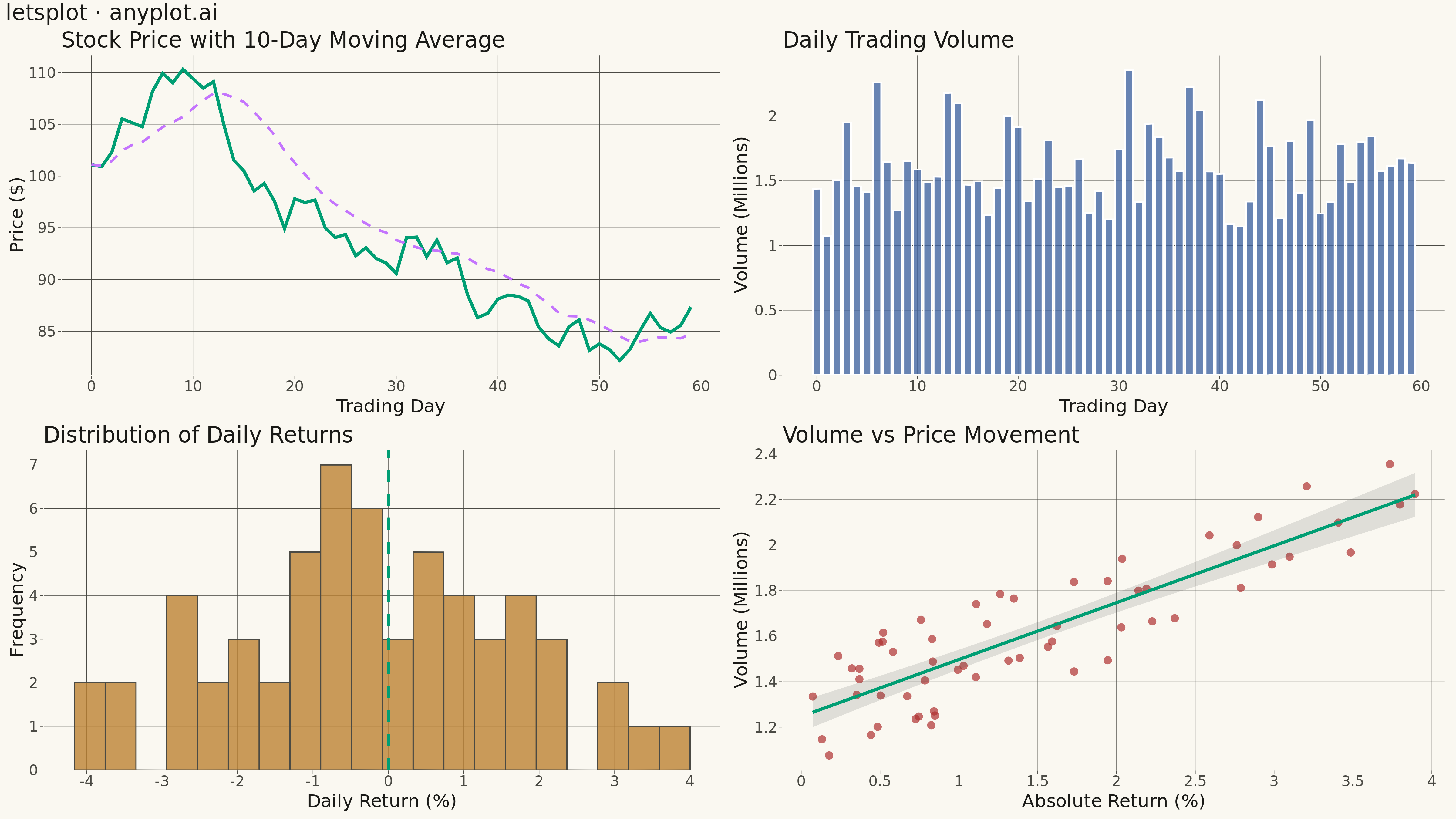
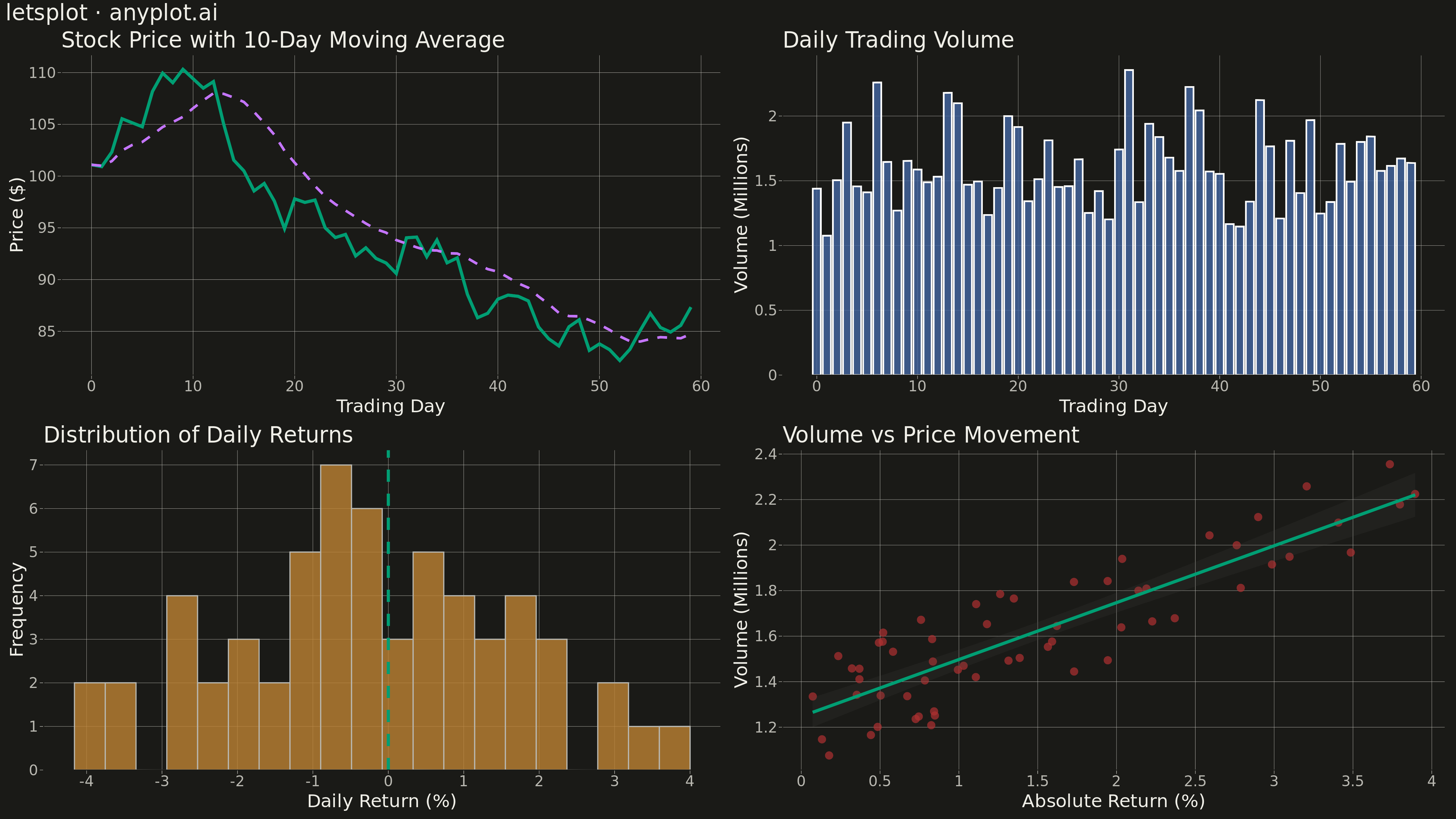
A customizable grid of multiple subplots allowing different plot types in each cell, with shared or independent axes. Unlike faceted plots that repeat the same visualization for data subsets, subplot grids enable combining distinct visualizations (scatter, line, bar, histogram, etc.) into a cohesive multi-panel figure for comprehensive data presentation.
""" anyplot.ai
subplot-grid: Subplot Grid Layout
Library: letsplot 4.9.0 | Python 3.13.13
Quality: 94/100 | Updated: 2026-05-13
"""

import os

import numpy as np
import pandas as pd
from lets_plot import *


LetsPlot.setup_html()

THEME = os.getenv("ANYPLOT_THEME", "light")

# Theme-adaptive colors
PAGE_BG = "#FAF8F1" if THEME == "light" else "#1A1A17"
ELEVATED_BG = "#FFFDF6" if THEME == "light" else "#242420"
INK = "#1A1A17" if THEME == "light" else "#F0EFE8"
INK_SOFT = "#4A4A44" if THEME == "light" else "#B8B7B0"

# Okabe-Ito palette (colorblind-safe)
IMPRINT = [
    "#009E73",  # 1: brand green
    "#C475FD",  # 2: vermillion
    "#4467A3",  # 3: blue
    "#BD8233",  # 4: reddish purple
    "#AE3030",  # 5: orange
    "#2ABCCD",  # 6: sky blue
    "#954477",  # 7: yellow
]

# Data - Financial dashboard theme
np.random.seed(42)

# Generate 60 days of stock-like data
days = 60
day_nums = np.arange(days)

# Price data (cumulative random walk)
returns = np.random.normal(0.001, 0.02, days)
price = 100 * np.cumprod(1 + returns)

# Volume data (random with some correlation to price moves)
base_volume = 1_000_000
volume = base_volume * (1 + 0.5 * np.abs(returns) / 0.02 + np.random.uniform(0, 0.5, days))

# Daily returns for histogram
daily_returns = np.diff(np.log(price)) * 100  # Log returns as percentage

# Create DataFrames for each subplot
price_df = pd.DataFrame({"day": day_nums, "price": price})
volume_df = pd.DataFrame({"day": day_nums, "volume": volume / 1_000_000})  # In millions
returns_df = pd.DataFrame({"return": daily_returns})

# Rolling 10-day average for price
price_df["rolling_avg"] = pd.Series(price).rolling(window=10, min_periods=1).mean()

# Theme-adaptive plot styling
anyplot_theme = theme(
    plot_background=element_rect(fill=PAGE_BG, color=PAGE_BG),
    panel_background=element_rect(fill=PAGE_BG, color=PAGE_BG),
    panel_grid_major=element_line(color=INK_SOFT, size=0.3),
    panel_grid_minor=element_blank(),
    axis_title=element_text(size=20, color=INK),
    axis_text=element_text(size=16, color=INK_SOFT),
    axis_line=element_line(color=INK_SOFT, size=0.5),
    axis_ticks=element_line(color=INK_SOFT, size=0.5),
    plot_title=element_text(size=24, color=INK),
    legend_background=element_rect(fill=ELEVATED_BG, color=INK_SOFT),
    legend_text=element_text(color=INK_SOFT, size=16),
    legend_title=element_text(color=INK, size=16),
)

# Create individual plots

# Top left: Price line chart (brand green for primary, orange for secondary)
price_plot = (
    ggplot(price_df, aes(x="day", y="price"))
    + geom_line(color=IMPRINT[0], size=1.5)
    + geom_line(aes(y="rolling_avg"), color=IMPRINT[1], size=1.2, linetype="dashed")
    + labs(x="Trading Day", y="Price ($)", title="Stock Price with 10-Day Moving Average")
    + theme_minimal()
    + anyplot_theme
)

# Top right: Volume bar chart (blue)
volume_plot = (
    ggplot(volume_df, aes(x="day", y="volume"))
    + geom_bar(stat="identity", fill=IMPRINT[2], alpha=0.8, width=0.8)
    + labs(x="Trading Day", y="Volume (Millions)", title="Daily Trading Volume")
    + theme_minimal()
    + anyplot_theme
)

# Bottom left: Returns histogram (reddish purple bars, brand green reference line)
returns_plot = (
    ggplot(returns_df, aes(x="return"))
    + geom_histogram(fill=IMPRINT[3], color=INK_SOFT, bins=20, alpha=0.8)
    + geom_vline(xintercept=0, color=IMPRINT[0], size=1.5, linetype="dashed")
    + labs(x="Daily Return (%)", y="Frequency", title="Distribution of Daily Returns")
    + theme_minimal()
    + anyplot_theme
)

# Bottom right: Scatter plot - price vs volume relationship
scatter_df = pd.DataFrame({"abs_return": np.abs(daily_returns), "volume": volume[1:] / 1_000_000})
scatter_plot = (
    ggplot(scatter_df, aes(x="abs_return", y="volume"))
    + geom_point(color=IMPRINT[4], size=4, alpha=0.7)
    + geom_smooth(method="lm", color=IMPRINT[0], size=1.5, fill=None)
    + labs(x="Absolute Return (%)", y="Volume (Millions)", title="Volume vs Price Movement")
    + theme_minimal()
    + anyplot_theme
)

# Combine into 2x2 grid using gggrid
grid_plot = gggrid([price_plot, volume_plot, returns_plot, scatter_plot], ncol=2)

# Add overall title
final_plot = grid_plot + ggsize(1600, 900) + ggtitle("letsplot · anyplot.ai") + anyplot_theme

# Save as PNG (scale=3 for 4800x2700, path='.' to save in current directory)
ggsave(final_plot, f"plot-{THEME}.png", path=".", scale=3)

# Also save as HTML for interactive version
ggsave(final_plot, f"plot-{THEME}.html", path=".")
Runnable source as JSON, for any HTTP client: https://api.anyplot.ai/specs/subplot-grid/letsplot/code. Any spec id and library id listed in llms-full.txt fit the same URL shape; every URL below is complete and callable.
{
  "spec_id": "subplot-grid",
  "language": "python",
  "library": "letsplot",
  "page": "https://anyplot.ai/subplot-grid/python/letsplot",
  "hub": "https://anyplot.ai/subplot-grid",
  "code_json": "https://api.anyplot.ai/specs/subplot-grid/letsplot/code",
  "spec_json": "https://api.anyplot.ai/specs/subplot-grid",
  "render_light_png": "https://storage.googleapis.com/anyplot-images/plots/subplot-grid/python/letsplot/plot-light.png",
  "render_dark_png": "https://storage.googleapis.com/anyplot-images/plots/subplot-grid/python/letsplot/plot-dark.png",
  "interactive_light_html": "https://storage.googleapis.com/anyplot-images/plots/subplot-grid/python/letsplot/plot-light.html",
  "interactive_dark_html": "https://storage.googleapis.com/anyplot-images/plots/subplot-grid/python/letsplot/plot-dark.html",
  "quality_score": 94.0,
  "license": "MIT",
  "guide": "https://anyplot.ai/llms.txt"
}
Part of Subplot Grid Layout on anyplot.ai.