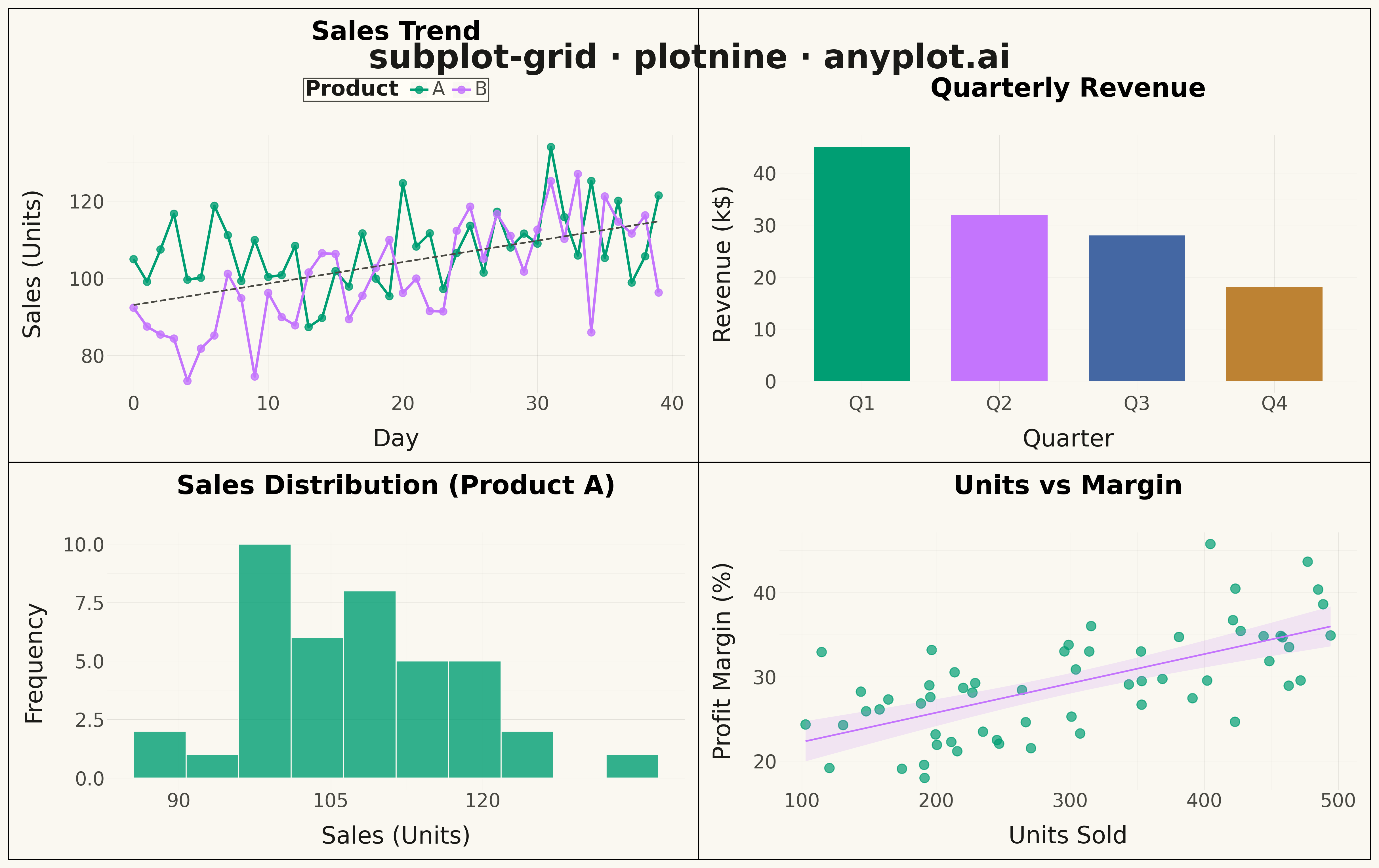
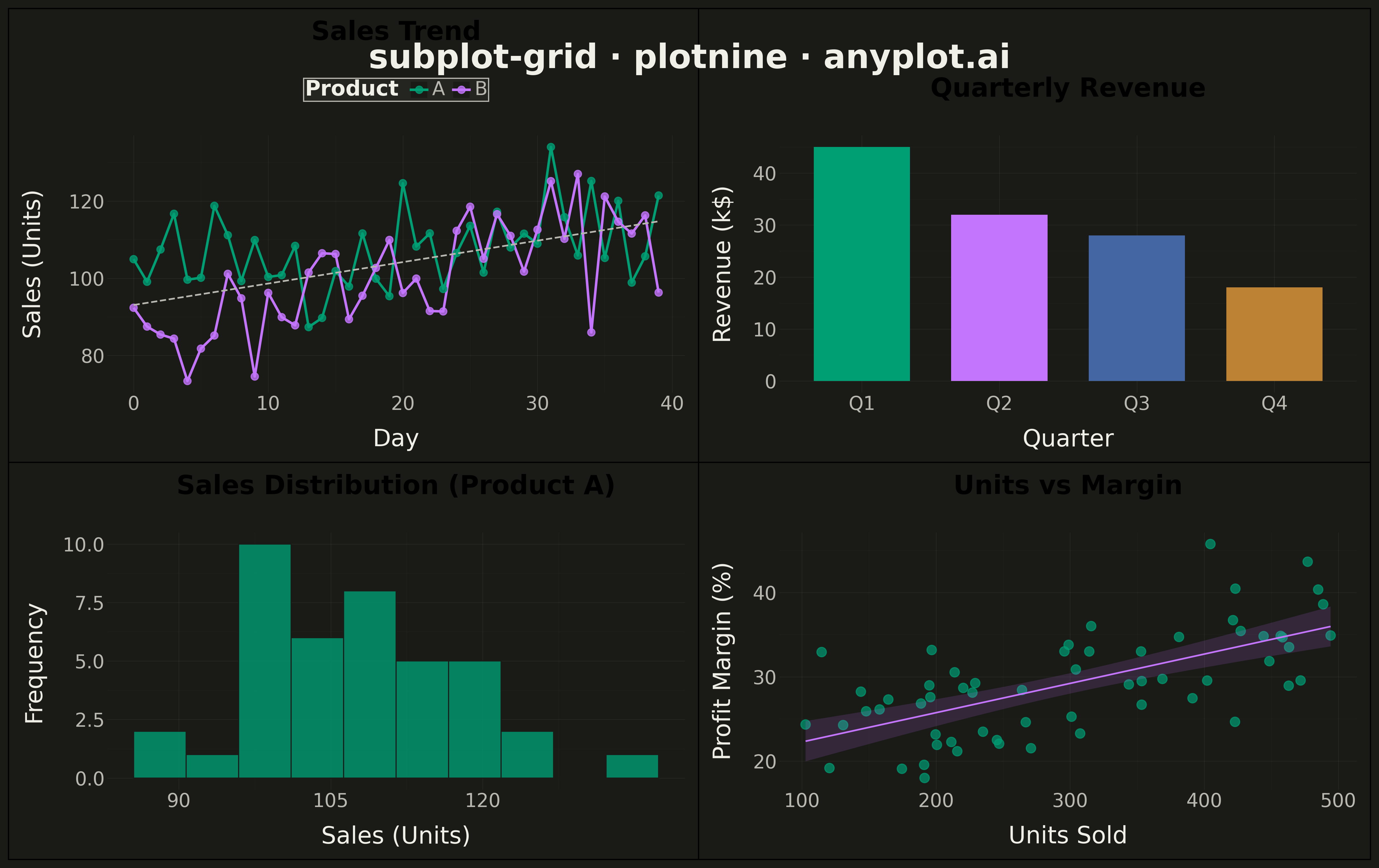
A customizable grid of multiple subplots allowing different plot types in each cell, with shared or independent axes. Unlike faceted plots that repeat the same visualization for data subsets, subplot grids enable combining distinct visualizations (scatter, line, bar, histogram, etc.) into a cohesive multi-panel figure for comprehensive data presentation.
""" anyplot.ai
subplot-grid: Subplot Grid Layout
Library: plotnine 0.15.4 | Python 3.13.13
Quality: 94/100 | Updated: 2026-05-13
"""

import os

import numpy as np
import pandas as pd
from plotnine import (
    aes,
    element_line,
    element_rect,
    element_text,
    geom_bar,
    geom_histogram,
    geom_line,
    geom_point,
    ggplot,
    labs,
    scale_color_manual,
    scale_fill_manual,
    scale_x_continuous,
    stat_smooth,
    theme,
    theme_minimal,
)


# Theme tokens
THEME = os.getenv("ANYPLOT_THEME", "light")
PAGE_BG = "#FAF8F1" if THEME == "light" else "#1A1A17"
ELEVATED_BG = "#FFFDF6" if THEME == "light" else "#242420"
INK = "#1A1A17" if THEME == "light" else "#F0EFE8"
INK_SOFT = "#4A4A44" if THEME == "light" else "#B8B7B0"

BRAND = "#009E73"
SECONDARY = "#C475FD"

# Data - Product performance dashboard
np.random.seed(42)

# Daily product metrics
n_days = 40
days = pd.date_range("2024-01-01", periods=n_days, freq="D")
products = ["A", "B"]

# Generate time series data
data_list = []
for product in products:
    base = 100 if product == "A" else 85
    trend = 0.5 if product == "A" else 0.8
    sales = base + np.arange(n_days) * trend + np.random.randn(n_days) * 10
    data_list.append(pd.DataFrame({"date": days, "sales": sales, "product": product}))

df_timeseries = pd.concat(data_list, ignore_index=True)
df_timeseries["day_num"] = (df_timeseries["date"] - df_timeseries["date"].min()).dt.days

# Category breakdown data
categories = ["Q1", "Q2", "Q3", "Q4"]
revenues = [45, 32, 28, 18]
df_category = pd.DataFrame({"category": categories, "revenue": revenues})
df_category["category"] = pd.Categorical(df_category["category"], categories=categories, ordered=True)

# Product distribution data
df_prod_a = df_timeseries[df_timeseries["product"] == "A"]["sales"]

# Scatter data - relationship between units sold and profit margin
units = np.random.uniform(100, 500, 60)
margin = 20 + 0.03 * units + np.random.randn(60) * 5
df_scatter = pd.DataFrame({"units": units, "margin": margin})

# Okabe-Ito palette for categorical data
okabe_ito = [BRAND, SECONDARY, "#4467A3", "#BD8233", "#AE3030", "#2ABCCD", "#954477"]

# Shared theme for all plots - sized for 4800x2700 canvas
base_theme = theme_minimal() + theme(
    plot_title=element_text(size=22, face="bold", ha="center", margin={"b": 10}),
    axis_title=element_text(size=20, color=INK),
    axis_text=element_text(size=16, color=INK_SOFT),
    legend_text=element_text(size=16, color=INK_SOFT),
    legend_title=element_text(size=18, face="bold", color=INK),
    panel_grid_major=element_line(color=INK, size=0.3, alpha=0.10),
    panel_grid_minor=element_line(color=INK, size=0.2, alpha=0.05),
    panel_background=element_rect(fill=PAGE_BG, color=None),
    plot_background=element_rect(fill=PAGE_BG, color=None),
    legend_background=element_rect(fill=ELEVATED_BG, color=INK_SOFT),
    legend_position="top",
    plot_margin=0.01,
)

# Plot 1: Sales trend over time (Line chart)
p1 = (
    ggplot(df_timeseries, aes(x="day_num", y="sales", color="product"))
    + geom_line(size=1.2)
    + geom_point(size=3, alpha=0.8)
    + stat_smooth(method="lm", se=False, linetype="dashed", size=0.8, color=INK_SOFT)
    + scale_color_manual(values=okabe_ito[:2])
    + labs(title="Sales Trend", x="Day", y="Sales (Units)", color="Product")
    + base_theme
)

# Plot 2: Revenue by category (Bar chart)
p2 = (
    ggplot(df_category, aes(x="category", y="revenue", fill="category"))
    + geom_bar(stat="identity", width=0.7, show_legend=False)
    + scale_fill_manual(values=okabe_ito[:4])
    + labs(title="Quarterly Revenue", x="Quarter", y="Revenue (k$)")
    + base_theme
)

# Plot 3: Sales distribution histogram for Product A
df_hist = pd.DataFrame({"sales": df_prod_a.values})
p3 = (
    ggplot(df_hist, aes(x="sales"))
    + geom_histogram(bins=10, fill=BRAND, color=PAGE_BG, alpha=0.8)
    + scale_x_continuous(breaks=[90, 105, 120])
    + labs(title="Sales Distribution (Product A)", x="Sales (Units)", y="Frequency")
    + base_theme
)

# Plot 4: Units vs Margin scatter plot
p4 = (
    ggplot(df_scatter, aes(x="units", y="margin"))
    + geom_point(size=4, color=BRAND, alpha=0.7)
    + stat_smooth(method="lm", color=SECONDARY, se=True, fill=SECONDARY, alpha=0.15, size=0.8)
    + labs(title="Units vs Margin", x="Units Sold", y="Profit Margin (%)")
    + base_theme
)

# Compose into 2x2 grid using plotnine's composition operators
top_row = p1 | p2
bottom_row = p3 | p4
grid = top_row / bottom_row

# Draw the grid and customize overall layout
fig = grid.draw()
fig.set_size_inches(16, 10)
fig.patch.set_facecolor(PAGE_BG)
fig.subplots_adjust(top=0.88, bottom=0.10, hspace=0.35, wspace=0.28)

# Add main title with better positioning
fig.suptitle("subplot-grid · plotnine · anyplot.ai", fontsize=28, fontweight="bold", y=0.96, color=INK)

fig.savefig(f"plot-{THEME}.png", dpi=300, bbox_inches="tight", facecolor=PAGE_BG)
Runnable source as JSON, for any HTTP client: https://api.anyplot.ai/specs/subplot-grid/plotnine/code. Any spec id and library id listed in llms-full.txt fit the same URL shape; every URL below is complete and callable.
{
  "spec_id": "subplot-grid",
  "language": "python",
  "library": "plotnine",
  "page": "https://anyplot.ai/subplot-grid/python/plotnine",
  "hub": "https://anyplot.ai/subplot-grid",
  "code_json": "https://api.anyplot.ai/specs/subplot-grid/plotnine/code",
  "spec_json": "https://api.anyplot.ai/specs/subplot-grid",
  "render_light_png": "https://storage.googleapis.com/anyplot-images/plots/subplot-grid/python/plotnine/plot-light.png",
  "render_dark_png": "https://storage.googleapis.com/anyplot-images/plots/subplot-grid/python/plotnine/plot-dark.png",
  "quality_score": 94.0,
  "license": "MIT",
  "guide": "https://anyplot.ai/llms.txt"
}
Part of Subplot Grid Layout on anyplot.ai.