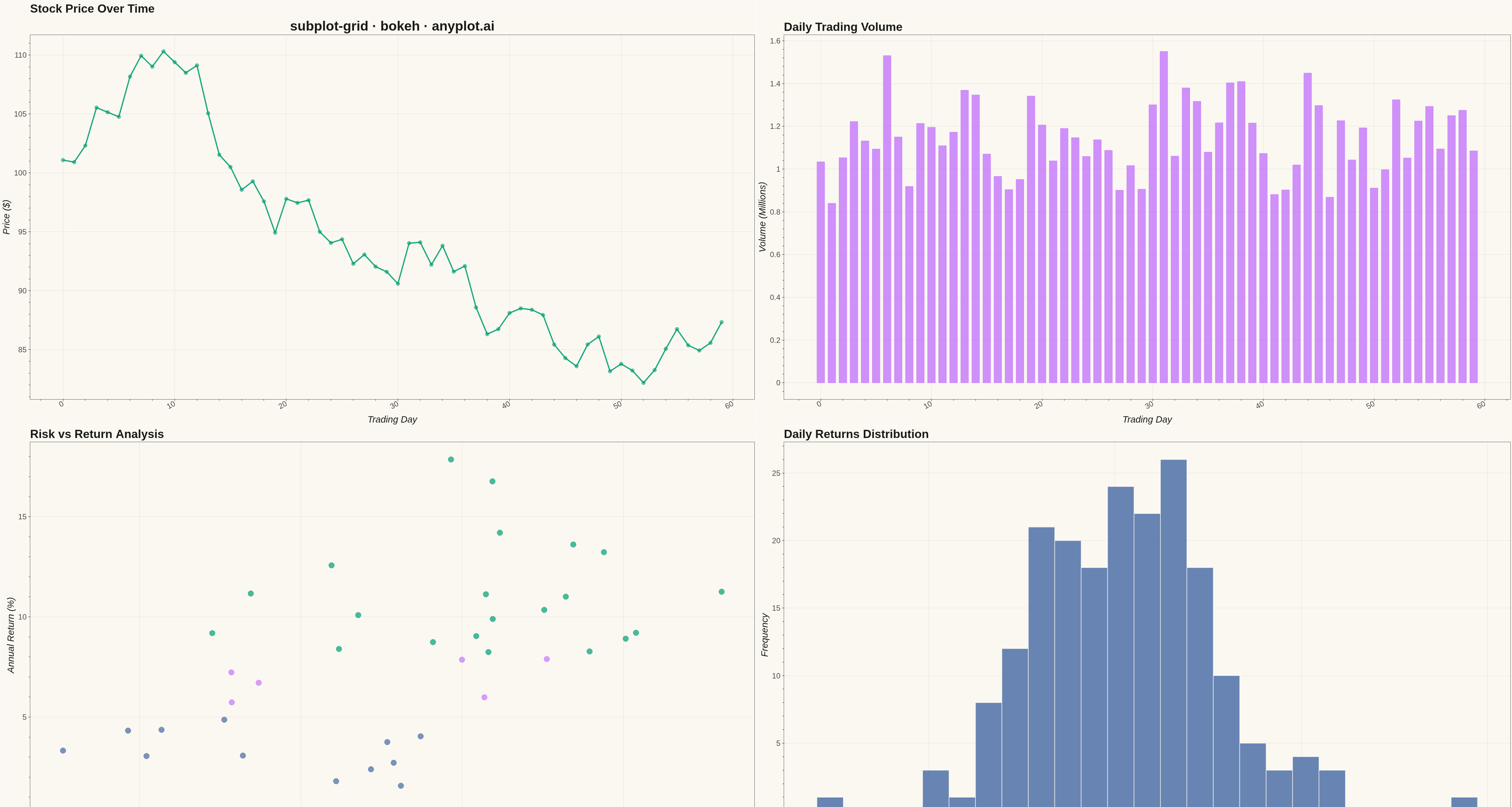
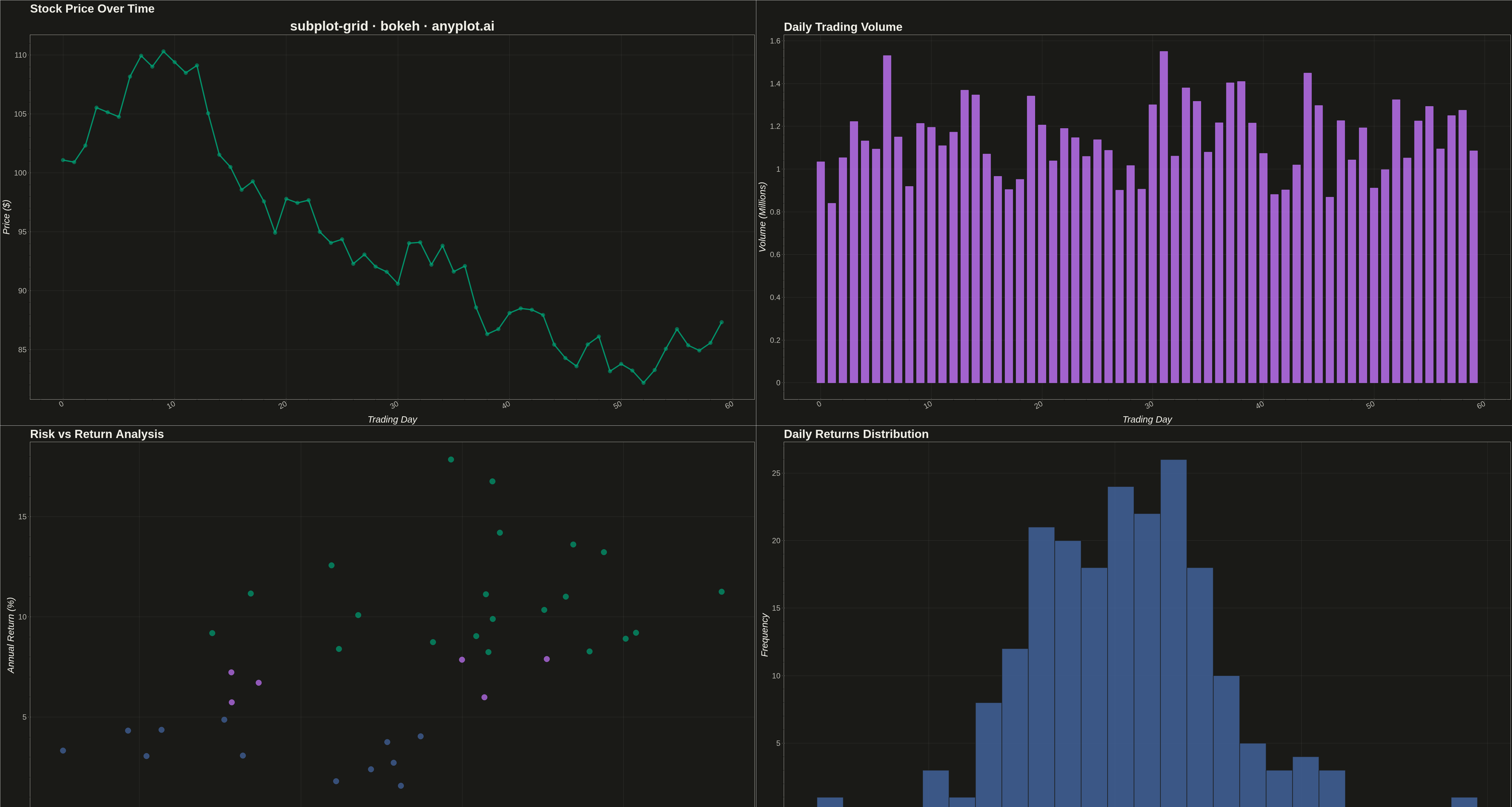
A customizable grid of multiple subplots allowing different plot types in each cell, with shared or independent axes. Unlike faceted plots that repeat the same visualization for data subsets, subplot grids enable combining distinct visualizations (scatter, line, bar, histogram, etc.) into a cohesive multi-panel figure for comprehensive data presentation.
""" anyplot.ai
subplot-grid: Subplot Grid Layout
Library: bokeh 3.9.0 | Python 3.13.13
Quality: 90/100 | Updated: 2026-05-13
"""

import os
import time
from pathlib import Path

import numpy as np
import pandas as pd
from bokeh.io import output_file, save
from bokeh.layouts import gridplot
from bokeh.models import ColumnDataSource, Title
from bokeh.plotting import figure
from selenium import webdriver
from selenium.webdriver.chrome.options import Options


# Theme tokens (see prompts/default-style-guide.md "Background" + "Theme-adaptive Chrome")
THEME = os.getenv("ANYPLOT_THEME", "light")
PAGE_BG = "#FAF8F1" if THEME == "light" else "#1A1A17"
ELEVATED_BG = "#FFFDF6" if THEME == "light" else "#242420"
INK = "#1A1A17" if THEME == "light" else "#F0EFE8"
INK_SOFT = "#4A4A44" if THEME == "light" else "#B8B7B0"

# Okabe-Ito palette (first series is always #009E73)
IMPRINT = ["#009E73", "#C475FD", "#4467A3", "#BD8233", "#AE3030", "#2ABCCD", "#954477"]

# Data - Financial dashboard with multiple metrics
np.random.seed(42)

# Time series data for price and volume (trading days)
n_days = 60
dates = pd.date_range("2024-01-01", periods=n_days, freq="B")
date_strings = [d.strftime("%b %d") for d in dates]

# Price data (cumulative returns creating realistic price movement)
returns = np.random.normal(0.001, 0.02, n_days)
price = 100 * np.cumprod(1 + returns)

# Volume data (with some correlation to price movement)
base_volume = np.random.uniform(0.8, 1.2, n_days) * 1_000_000
volume = base_volume * (1 + np.abs(returns) * 10)

# Scatter data for risk vs return
n_assets = 40
asset_returns = np.random.normal(8, 4, n_assets)
asset_risk = np.abs(asset_returns) * 0.3 + np.random.uniform(2, 8, n_assets)

# Histogram data - daily returns distribution
daily_returns = np.random.normal(0.1, 2.5, 200)

# ========== SUBPLOT 1: Price Line Chart (top-left) ==========
source_price = ColumnDataSource(data={"x": list(range(n_days)), "y": price, "date": date_strings})

p1 = figure(
    width=2400,
    height=1350,
    title="Stock Price Over Time",
    x_axis_label="Trading Day",
    y_axis_label="Price ($)",
    tools="",
    toolbar_location=None,
)
p1.line("x", "y", source=source_price, line_width=4, color=IMPRINT[0], alpha=0.9)
p1.scatter("x", "y", source=source_price, size=12, color=IMPRINT[0], alpha=0.6)

# Styling for p1
p1.background_fill_color = PAGE_BG
p1.border_fill_color = PAGE_BG
p1.outline_line_color = INK_SOFT
p1.title.text_font_size = "28pt"
p1.title.text_color = INK
p1.xaxis.axis_label_text_font_size = "22pt"
p1.yaxis.axis_label_text_font_size = "22pt"
p1.xaxis.axis_label_text_color = INK
p1.yaxis.axis_label_text_color = INK
p1.xaxis.major_label_text_font_size = "18pt"
p1.yaxis.major_label_text_font_size = "18pt"
p1.xaxis.major_label_text_color = INK_SOFT
p1.yaxis.major_label_text_color = INK_SOFT
p1.xaxis.axis_line_color = INK_SOFT
p1.yaxis.axis_line_color = INK_SOFT
p1.xaxis.major_tick_line_color = INK_SOFT
p1.yaxis.major_tick_line_color = INK_SOFT
p1.xaxis.major_label_orientation = 0.5
p1.grid.grid_line_color = INK
p1.grid.grid_line_alpha = 0.10

# ========== SUBPLOT 2: Volume Bar Chart (top-right) ==========
source_volume = ColumnDataSource(data={"x": list(range(n_days)), "y": volume / 1_000_000, "date": date_strings})

p2 = figure(
    width=2400,
    height=1350,
    title="Daily Trading Volume",
    x_axis_label="Trading Day",
    y_axis_label="Volume (Millions)",
    tools="",
    toolbar_location=None,
)
p2.vbar(x="x", top="y", source=source_volume, width=0.7, color=IMPRINT[1], alpha=0.8)

# Styling for p2
p2.background_fill_color = PAGE_BG
p2.border_fill_color = PAGE_BG
p2.outline_line_color = INK_SOFT
p2.title.text_font_size = "28pt"
p2.title.text_color = INK
p2.xaxis.axis_label_text_font_size = "22pt"
p2.yaxis.axis_label_text_font_size = "22pt"
p2.xaxis.axis_label_text_color = INK
p2.yaxis.axis_label_text_color = INK
p2.xaxis.major_label_text_font_size = "18pt"
p2.yaxis.major_label_text_font_size = "18pt"
p2.xaxis.major_label_text_color = INK_SOFT
p2.yaxis.major_label_text_color = INK_SOFT
p2.xaxis.axis_line_color = INK_SOFT
p2.yaxis.axis_line_color = INK_SOFT
p2.xaxis.major_tick_line_color = INK_SOFT
p2.yaxis.major_tick_line_color = INK_SOFT
p2.xaxis.major_label_orientation = 0.5
p2.grid.grid_line_color = INK
p2.grid.grid_line_alpha = 0.10

# ========== SUBPLOT 3: Risk vs Return Scatter (bottom-left) ==========
# Color by performance using Okabe-Ito palette
colors = [IMPRINT[0] if r > 8 else (IMPRINT[2] if r < 5 else IMPRINT[1]) for r in asset_returns]

source_scatter = ColumnDataSource(data={"x": asset_risk, "y": asset_returns, "color": colors})

p3 = figure(
    width=2400,
    height=1350,
    title="Risk vs Return Analysis",
    x_axis_label="Risk (Volatility %)",
    y_axis_label="Annual Return (%)",
    tools="",
    toolbar_location=None,
)
p3.scatter("x", "y", source=source_scatter, size=18, color="color", alpha=0.7)

# Styling for p3
p3.background_fill_color = PAGE_BG
p3.border_fill_color = PAGE_BG
p3.outline_line_color = INK_SOFT
p3.title.text_font_size = "28pt"
p3.title.text_color = INK
p3.xaxis.axis_label_text_font_size = "22pt"
p3.yaxis.axis_label_text_font_size = "22pt"
p3.xaxis.axis_label_text_color = INK
p3.yaxis.axis_label_text_color = INK
p3.xaxis.major_label_text_font_size = "18pt"
p3.yaxis.major_label_text_font_size = "18pt"
p3.xaxis.major_label_text_color = INK_SOFT
p3.yaxis.major_label_text_color = INK_SOFT
p3.xaxis.axis_line_color = INK_SOFT
p3.yaxis.axis_line_color = INK_SOFT
p3.xaxis.major_tick_line_color = INK_SOFT
p3.yaxis.major_tick_line_color = INK_SOFT
p3.grid.grid_line_color = INK
p3.grid.grid_line_alpha = 0.10

# ========== SUBPLOT 4: Returns Distribution Histogram (bottom-right) ==========
# Create histogram bins
hist, edges = np.histogram(daily_returns, bins=25)

source_hist = ColumnDataSource(data={"top": hist, "left": edges[:-1], "right": edges[1:]})

p4 = figure(
    width=2400,
    height=1350,
    title="Daily Returns Distribution",
    x_axis_label="Daily Return (%)",
    y_axis_label="Frequency",
    tools="",
    toolbar_location=None,
)
p4.quad(
    top="top",
    bottom=0,
    left="left",
    right="right",
    source=source_hist,
    fill_color=IMPRINT[2],
    line_color=PAGE_BG,
    alpha=0.8,
    line_width=2,
)

# Styling for p4
p4.background_fill_color = PAGE_BG
p4.border_fill_color = PAGE_BG
p4.outline_line_color = INK_SOFT
p4.title.text_font_size = "28pt"
p4.title.text_color = INK
p4.xaxis.axis_label_text_font_size = "22pt"
p4.yaxis.axis_label_text_font_size = "22pt"
p4.xaxis.axis_label_text_color = INK
p4.yaxis.axis_label_text_color = INK
p4.xaxis.major_label_text_font_size = "18pt"
p4.yaxis.major_label_text_font_size = "18pt"
p4.xaxis.major_label_text_color = INK_SOFT
p4.yaxis.major_label_text_color = INK_SOFT
p4.xaxis.axis_line_color = INK_SOFT
p4.yaxis.axis_line_color = INK_SOFT
p4.xaxis.major_tick_line_color = INK_SOFT
p4.yaxis.major_tick_line_color = INK_SOFT
p4.grid.grid_line_color = INK
p4.grid.grid_line_alpha = 0.10

# ========== CREATE GRID LAYOUT ==========
grid = gridplot([[p1, p2], [p3, p4]], merge_tools=False, toolbar_location=None)

# Add main title using the first plot's add_layout
main_title = Title(text="subplot-grid · bokeh · anyplot.ai", text_font_size="32pt", text_color=INK, align="center")
p1.add_layout(main_title, "above")

# Write the interactive HTML (also a required catalog artifact)
output_file(f"plot-{THEME}.html")
save(grid)

# Screenshot it with headless Chrome — Selenium 4 / Selenium Manager
# auto-resolves a working driver for the system Chrome.
W, H = 4800, 2700
opts = Options()
for arg in (
    "--headless=new",
    "--no-sandbox",
    "--disable-dev-shm-usage",
    "--disable-gpu",
    f"--window-size={W},{H}",
    "--hide-scrollbars",
):
    opts.add_argument(arg)
driver = webdriver.Chrome(options=opts)
driver.set_window_size(W, H)
driver.get(f"file://{Path(f'plot-{THEME}.html').resolve()}")
time.sleep(3)
driver.save_screenshot(f"plot-{THEME}.png")
driver.quit()
Runnable source as JSON, for any HTTP client: https://api.anyplot.ai/specs/subplot-grid/bokeh/code. Any spec id and library id listed in llms-full.txt fit the same URL shape; every URL below is complete and callable.
{
  "spec_id": "subplot-grid",
  "language": "python",
  "library": "bokeh",
  "page": "https://anyplot.ai/subplot-grid/python/bokeh",
  "hub": "https://anyplot.ai/subplot-grid",
  "code_json": "https://api.anyplot.ai/specs/subplot-grid/bokeh/code",
  "spec_json": "https://api.anyplot.ai/specs/subplot-grid",
  "render_light_png": "https://storage.googleapis.com/anyplot-images/plots/subplot-grid/python/bokeh/plot-light.png",
  "render_dark_png": "https://storage.googleapis.com/anyplot-images/plots/subplot-grid/python/bokeh/plot-dark.png",
  "interactive_light_html": "https://storage.googleapis.com/anyplot-images/plots/subplot-grid/python/bokeh/plot-light.html",
  "interactive_dark_html": "https://storage.googleapis.com/anyplot-images/plots/subplot-grid/python/bokeh/plot-dark.html",
  "quality_score": 90.0,
  "license": "MIT",
  "guide": "https://anyplot.ai/llms.txt"
}
Part of Subplot Grid Layout on anyplot.ai.