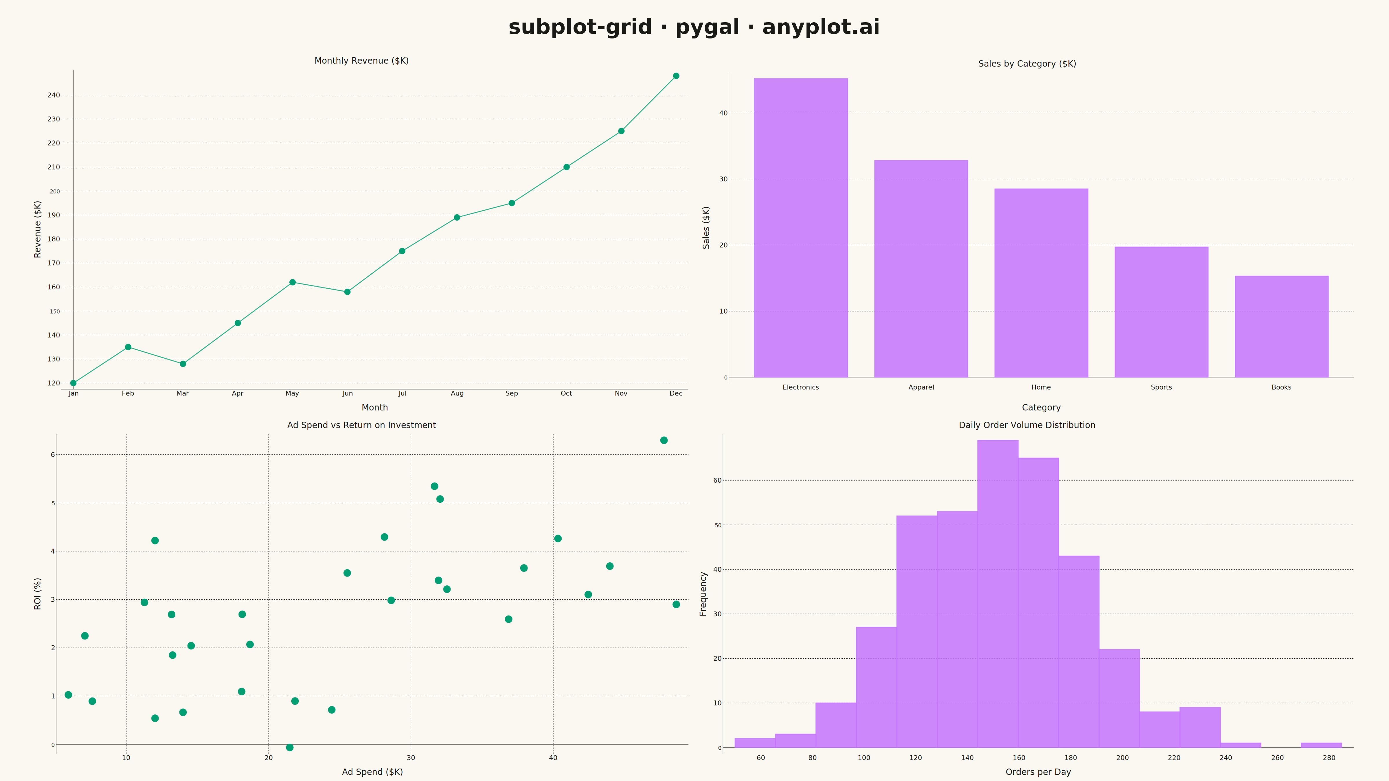
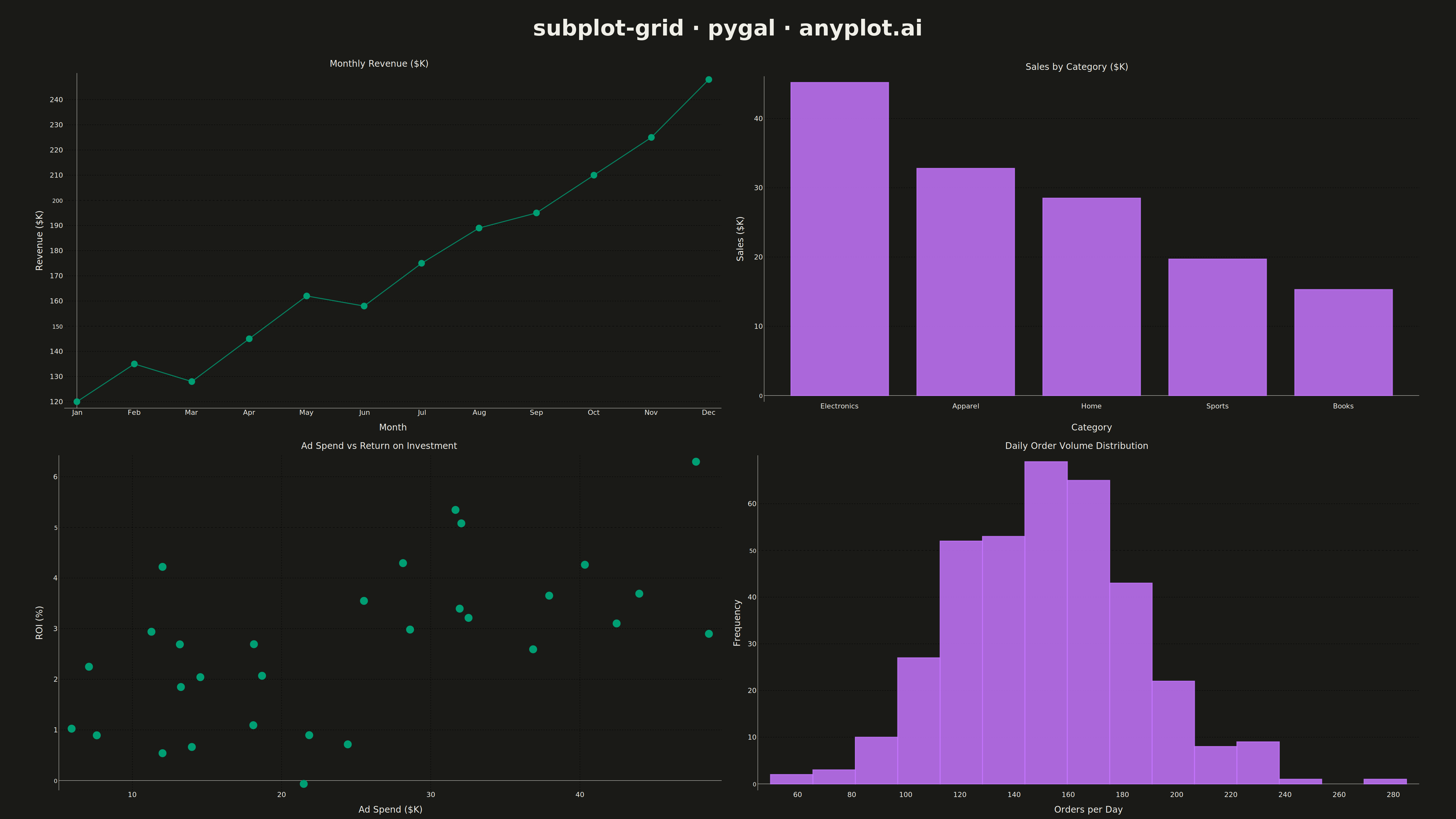
A customizable grid of multiple subplots allowing different plot types in each cell, with shared or independent axes. Unlike faceted plots that repeat the same visualization for data subsets, subplot grids enable combining distinct visualizations (scatter, line, bar, histogram, etc.) into a cohesive multi-panel figure for comprehensive data presentation.
""" anyplot.ai
subplot-grid: Subplot Grid Layout
Library: pygal 3.1.0 | Python 3.13.13
Quality: 81/100 | Updated: 2026-05-13
"""

import os
from io import BytesIO

import cairosvg
import numpy as np
import pygal
from PIL import Image, ImageDraw, ImageFont
from pygal.style import Style


# Theme tokens
THEME = os.getenv("ANYPLOT_THEME", "light")
PAGE_BG = "#FAF8F1" if THEME == "light" else "#1A1A17"
INK = "#1A1A17" if THEME == "light" else "#F0EFE8"
INK_SOFT = "#4A4A44" if THEME == "light" else "#B8B7B0"
INK_MUTED = "#6B6A63" if THEME == "light" else "#A8A79F"
BRAND = "#009E73"
COLOR_2 = "#C475FD"

# Data - Business performance dashboard with multiple metrics
np.random.seed(42)

# Monthly revenue trend (line chart)
months = ["Jan", "Feb", "Mar", "Apr", "May", "Jun", "Jul", "Aug", "Sep", "Oct", "Nov", "Dec"]
revenue = [120, 135, 128, 145, 162, 158, 175, 189, 195, 210, 225, 248]  # in thousands

# Sales by category (bar chart)
categories = ["Electronics", "Apparel", "Home", "Sports", "Books"]
sales = [45.2, 32.8, 28.5, 19.7, 15.3]  # in thousands

# Advertising spend vs ROI (scatter)
ad_spend = np.random.uniform(5, 50, 30)  # advertising spend in thousands
roi = ad_spend * 0.12 + np.random.normal(0, 1.5, 30)  # ROI percentage

# Daily order volume distribution (histogram)
daily_orders = np.random.normal(loc=150, scale=35, size=365)
daily_orders = np.clip(daily_orders, 50, 300)
n_bins = 15
counts, bin_edges = np.histogram(daily_orders, bins=n_bins)
hist_data = [(int(count), float(bin_edges[i]), float(bin_edges[i + 1])) for i, count in enumerate(counts)]

# Chart styles
line_style = Style(
    background=PAGE_BG,
    plot_background=PAGE_BG,
    foreground=INK,
    foreground_strong=INK,
    foreground_subtle=INK_MUTED,
    colors=(BRAND,),
    font_family="sans-serif",
    title_font_size=28,
    label_font_size=22,
    major_label_font_size=18,
    legend_font_size=16,
    value_font_size=14,
    stroke_width=3,
    opacity=0.85,
    opacity_hover=1.0,
)

bar_style = Style(
    background=PAGE_BG,
    plot_background=PAGE_BG,
    foreground=INK,
    foreground_strong=INK,
    foreground_subtle=INK_MUTED,
    colors=(COLOR_2,),
    font_family="sans-serif",
    title_font_size=28,
    label_font_size=22,
    major_label_font_size=18,
    legend_font_size=16,
    value_font_size=14,
    stroke_width=3,
    opacity=0.85,
    opacity_hover=1.0,
)

scatter_style = Style(
    background=PAGE_BG,
    plot_background=PAGE_BG,
    foreground=INK,
    foreground_strong=INK,
    foreground_subtle=INK_MUTED,
    colors=(BRAND,),
    font_family="sans-serif",
    title_font_size=28,
    label_font_size=22,
    major_label_font_size=18,
    legend_font_size=16,
    value_font_size=14,
    stroke_width=3,
    opacity=0.85,
    opacity_hover=1.0,
)

hist_style = Style(
    background=PAGE_BG,
    plot_background=PAGE_BG,
    foreground=INK,
    foreground_strong=INK,
    foreground_subtle=INK_MUTED,
    colors=(COLOR_2,),
    font_family="sans-serif",
    title_font_size=28,
    label_font_size=22,
    major_label_font_size=18,
    legend_font_size=16,
    value_font_size=14,
    stroke_width=3,
    opacity=0.85,
    opacity_hover=1.0,
)

# Create individual charts for the 2x2 grid
cell_width = 2200
cell_height = 1200

# Top-left: Line chart - Monthly Revenue Trend
line_chart = pygal.Line(
    width=cell_width,
    height=cell_height,
    style=line_style,
    title="Monthly Revenue ($K)",
    x_title="Month",
    y_title="Revenue ($K)",
    show_legend=False,
    show_dots=True,
    dots_size=10,
    show_y_guides=True,
    show_x_guides=False,
    truncate_label=-1,
)
line_chart.x_labels = months
line_chart.add("Revenue", revenue)

# Top-right: Bar chart - Sales by Category
bar_chart = pygal.Bar(
    width=cell_width,
    height=cell_height,
    style=bar_style,
    title="Sales by Category ($K)",
    x_title="Category",
    y_title="Sales ($K)",
    show_legend=False,
    print_values=False,
    show_y_guides=True,
    show_x_guides=False,
    spacing=20,
    truncate_label=-1,
)
bar_chart.x_labels = categories
bar_chart.add("Sales", sales)

# Bottom-left: Scatter plot - Ad Spend vs ROI
scatter_chart = pygal.XY(
    width=cell_width,
    height=cell_height,
    style=scatter_style,
    title="Ad Spend vs Return on Investment",
    x_title="Ad Spend ($K)",
    y_title="ROI (%)",
    show_legend=False,
    stroke=False,
    dots_size=12,
    show_y_guides=True,
    show_x_guides=True,
)
scatter_points = [(float(x), float(y)) for x, y in zip(ad_spend, roi, strict=True)]
scatter_chart.add("Campaigns", scatter_points)

# Bottom-right: Histogram - Daily Order Distribution
hist_chart = pygal.Histogram(
    width=cell_width,
    height=cell_height,
    style=hist_style,
    title="Daily Order Volume Distribution",
    x_title="Orders per Day",
    y_title="Frequency",
    show_legend=False,
    show_y_guides=True,
    show_x_guides=False,
)
hist_chart.add("Orders", hist_data)

# Render each chart to PNG
charts = [[line_chart, bar_chart], [scatter_chart, hist_chart]]

images = []
for row_charts in charts:
    row_images = []
    for chart in row_charts:
        svg_bytes = chart.render()
        png_bytes = cairosvg.svg2png(bytestring=svg_bytes, output_width=cell_width, output_height=cell_height)
        img = Image.open(BytesIO(png_bytes))
        row_images.append(img)
    images.append(row_images)

# Create combined image (4800 x 2700 with space for main title)
title_height = 180
total_width = 4800
total_height = 2700

combined = Image.new("RGB", (total_width, total_height), PAGE_BG)

# Calculate grid positioning
grid_height = total_height - title_height
margin_x = 100
grid_width = total_width - 2 * margin_x
actual_cell_width = grid_width // 2
actual_cell_height = grid_height // 2

# Paste charts into 2x2 grid
for row_idx, row_images in enumerate(images):
    for col_idx, img in enumerate(row_images):
        img_resized = img.resize((actual_cell_width, actual_cell_height), Image.LANCZOS)
        x = margin_x + col_idx * actual_cell_width
        y = title_height + row_idx * actual_cell_height
        combined.paste(img_resized, (x, y))

# Add main title using PIL
draw = ImageDraw.Draw(combined)

try:
    title_font = ImageFont.truetype("/usr/share/fonts/truetype/dejavu/DejaVuSans-Bold.ttf", 72)
except OSError:
    title_font = ImageFont.load_default()

title_text = "subplot-grid · pygal · anyplot.ai"
bbox = draw.textbbox((0, 0), title_text, font=title_font)
title_width = bbox[2] - bbox[0]
title_x = (total_width - title_width) // 2
draw.text((title_x, 50), title_text, fill=INK, font=title_font)

# Save final PNG
combined.save(f"plot-{THEME}.png", dpi=(300, 300))

# Create interactive HTML version
html_content = f"""<!DOCTYPE html>
<html>
<head>
    <title>subplot-grid · pygal · anyplot.ai</title>
    <style>
        body {{
            font-family: sans-serif;
            background: {PAGE_BG};
            color: {INK};
            margin: 20px;
        }}
        h1 {{
            text-align: center;
            color: {INK};
            font-size: 32px;
            margin-bottom: 30px;
        }}
        .grid {{
            display: grid;
            grid-template-columns: repeat(2, 1fr);
            gap: 20px;
            max-width: 1600px;
            margin: 0 auto;
        }}
        .chart {{
            width: 100%;
            border: 1px solid {INK_MUTED};
            border-radius: 8px;
            overflow: hidden;
        }}
        .chart svg {{ width: 100%; height: auto; }}
    </style>
</head>
<body>
    <h1>subplot-grid · pygal · anyplot.ai</h1>
    <div class="grid">
"""

# Add all four charts
all_charts = [line_chart, bar_chart, scatter_chart, hist_chart]
for chart in all_charts:
    svg_data = chart.render(is_unicode=True)
    svg_data = svg_data.replace('<?xml version="1.0" encoding="utf-8"?>', "")
    html_content += f'        <div class="chart">{svg_data}</div>\n'

html_content += """    </div>
</body>
</html>"""

with open(f"plot-{THEME}.html", "w") as f:
    f.write(html_content)
Runnable source as JSON, for any HTTP client: https://api.anyplot.ai/specs/subplot-grid/pygal/code. Any spec id and library id listed in llms-full.txt fit the same URL shape; every URL below is complete and callable.
{
  "spec_id": "subplot-grid",
  "language": "python",
  "library": "pygal",
  "page": "https://anyplot.ai/subplot-grid/python/pygal",
  "hub": "https://anyplot.ai/subplot-grid",
  "code_json": "https://api.anyplot.ai/specs/subplot-grid/pygal/code",
  "spec_json": "https://api.anyplot.ai/specs/subplot-grid",
  "render_light_png": "https://storage.googleapis.com/anyplot-images/plots/subplot-grid/python/pygal/plot-light.png",
  "render_dark_png": "https://storage.googleapis.com/anyplot-images/plots/subplot-grid/python/pygal/plot-dark.png",
  "interactive_light_html": "https://storage.googleapis.com/anyplot-images/plots/subplot-grid/python/pygal/plot-light.html",
  "interactive_dark_html": "https://storage.googleapis.com/anyplot-images/plots/subplot-grid/python/pygal/plot-dark.html",
  "quality_score": 81.0,
  "license": "MIT",
  "guide": "https://anyplot.ai/llms.txt"
}
Part of Subplot Grid Layout on anyplot.ai.