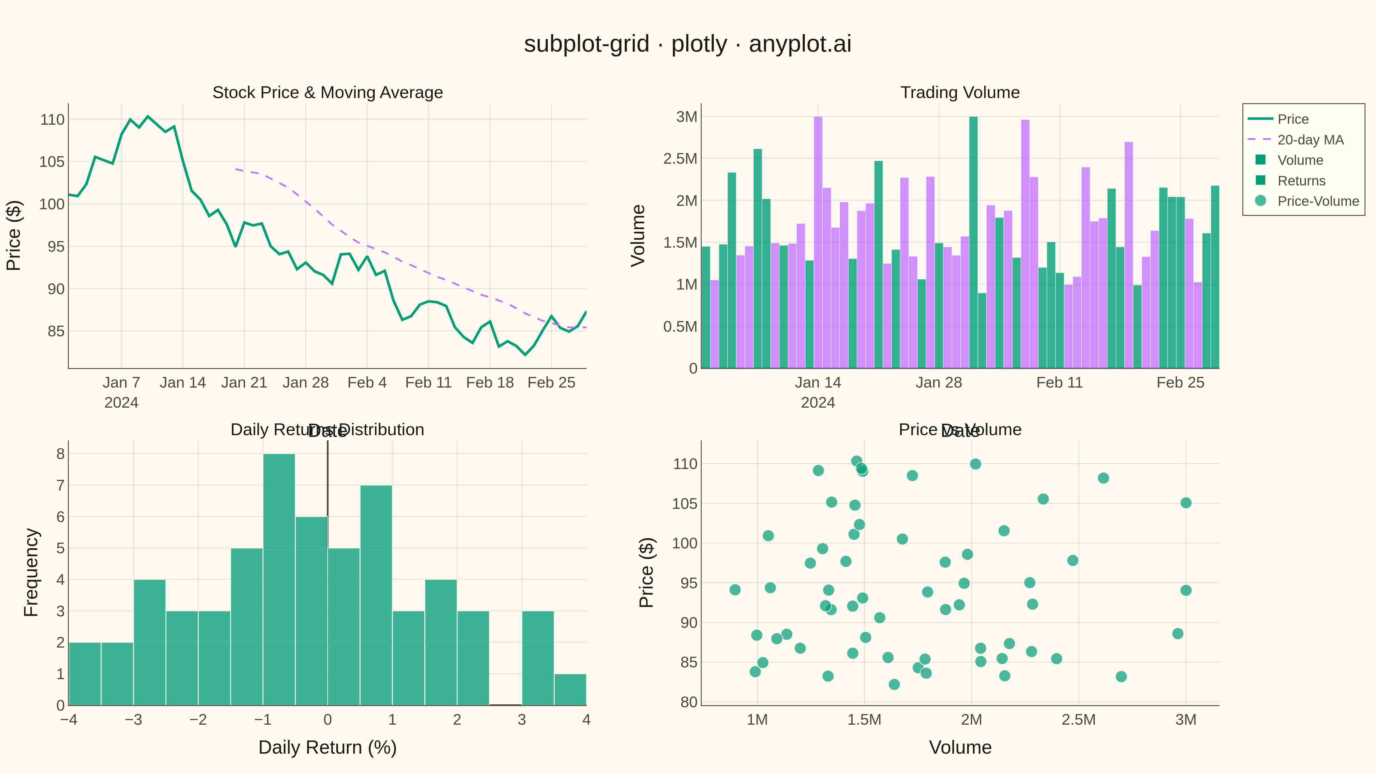
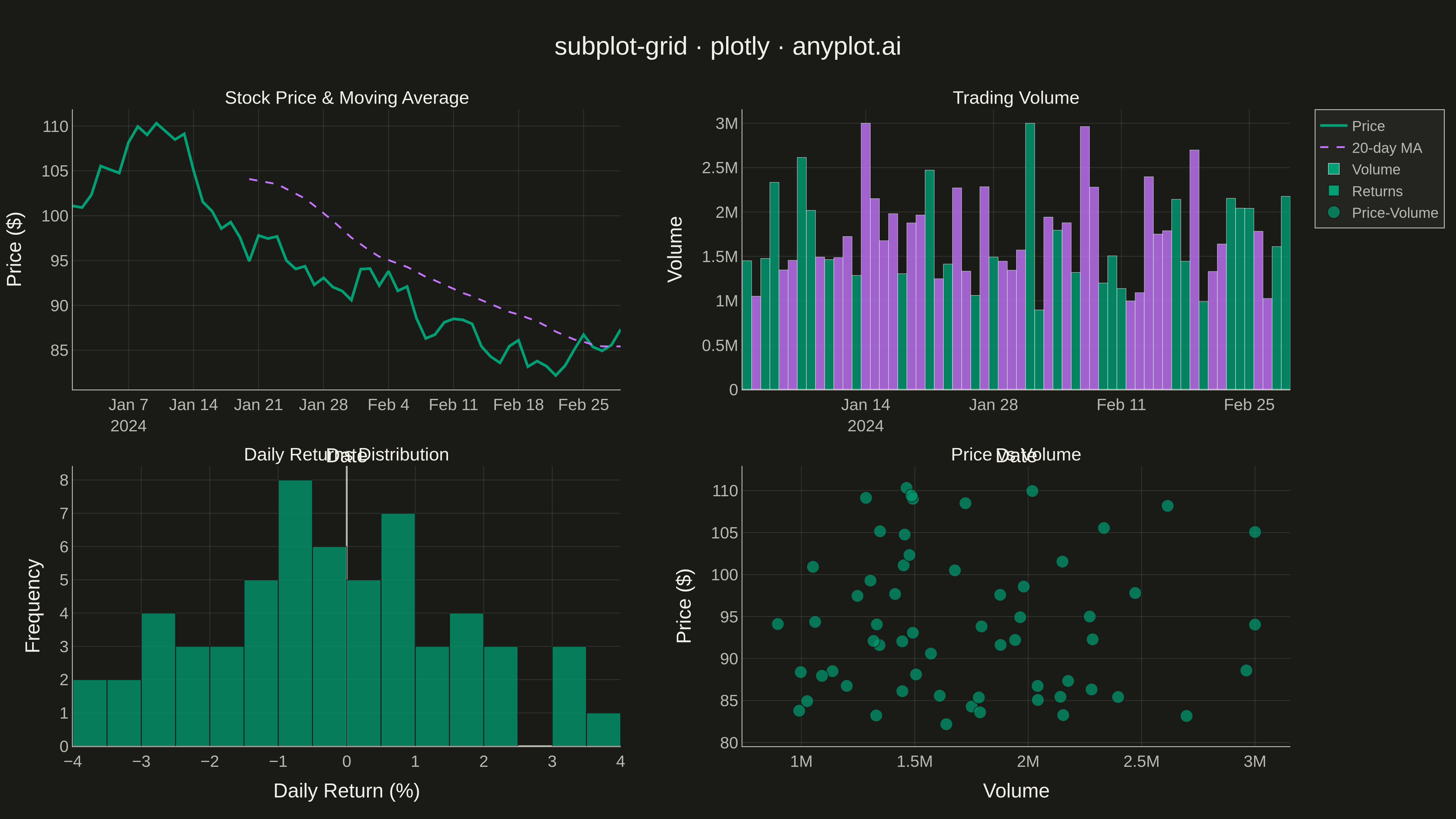
A customizable grid of multiple subplots allowing different plot types in each cell, with shared or independent axes. Unlike faceted plots that repeat the same visualization for data subsets, subplot grids enable combining distinct visualizations (scatter, line, bar, histogram, etc.) into a cohesive multi-panel figure for comprehensive data presentation.
""" anyplot.ai
subplot-grid: Subplot Grid Layout
Library: plotly 6.7.0 | Python 3.13.13
Quality: 97/100 | Updated: 2026-05-13
"""

import os
import sys


# Remove current directory from sys.path to avoid shadowing installed packages
sys.path = [p for p in sys.path if p not in ("", ".")]

import numpy as np
import pandas as pd
import plotly.graph_objects as go
from plotly.subplots import make_subplots


# Theme tokens
THEME = os.getenv("ANYPLOT_THEME", "light")
PAGE_BG = "#FAF8F1" if THEME == "light" else "#1A1A17"
ELEVATED_BG = "#FFFDF6" if THEME == "light" else "#242420"
INK = "#1A1A17" if THEME == "light" else "#F0EFE8"
INK_SOFT = "#4A4A44" if THEME == "light" else "#B8B7B0"
GRID = "rgba(26,26,23,0.10)" if THEME == "light" else "rgba(240,239,232,0.10)"

# Okabe-Ito palette
IMPRINT = ["#009E73", "#C475FD", "#4467A3", "#BD8233", "#AE3030", "#2ABCCD", "#954477"]

# Data - Financial dashboard example
np.random.seed(42)

# Generate 60 days of stock data
days = 60
dates = pd.date_range("2024-01-01", periods=days, freq="D")

# Stock price with realistic walk
returns = np.random.normal(0.001, 0.02, days)
price = 100 * np.cumprod(1 + returns)

# Volume data (correlated with absolute price movement)
base_volume = 1000000
volume = base_volume + np.abs(returns) * 50000000 + np.random.normal(0, 200000, days)
volume = np.clip(volume, 500000, 3000000)

# Daily returns for histogram
daily_returns = np.diff(price) / price[:-1] * 100

# Moving averages
ma_20 = pd.Series(price).rolling(20).mean().values

# Create 2x2 subplot grid
fig = make_subplots(
    rows=2,
    cols=2,
    subplot_titles=("Stock Price & Moving Average", "Trading Volume", "Daily Returns Distribution", "Price vs Volume"),
    horizontal_spacing=0.1,
    vertical_spacing=0.12,
    specs=[[{"type": "scatter"}, {"type": "bar"}], [{"type": "histogram"}, {"type": "scatter"}]],
)

# Subplot 1: Line chart - Stock price with moving average
fig.add_trace(
    go.Scatter(x=dates, y=price, mode="lines", name="Price", line={"color": IMPRINT[0], "width": 3}), row=1, col=1
)
fig.add_trace(
    go.Scatter(
        x=dates, y=ma_20, mode="lines", name="20-day MA", line={"color": IMPRINT[1], "width": 2, "dash": "dash"}
    ),
    row=1,
    col=1,
)

# Subplot 2: Bar chart - Volume
volume_colors = [IMPRINT[0] if r >= 0 else IMPRINT[1] for r in returns]
fig.add_trace(go.Bar(x=dates, y=volume, name="Volume", marker={"color": volume_colors, "opacity": 0.8}), row=1, col=2)

# Subplot 3: Histogram - Daily returns distribution
fig.add_trace(
    go.Histogram(
        x=daily_returns,
        nbinsx=20,
        name="Returns",
        marker={"color": IMPRINT[0], "opacity": 0.75, "line": {"color": PAGE_BG, "width": 1}},
    ),
    row=2,
    col=1,
)

# Subplot 4: Scatter - Price vs Volume relationship
fig.add_trace(
    go.Scatter(
        x=volume,
        y=price,
        mode="markers",
        name="Price-Volume",
        marker={"color": IMPRINT[0], "size": 14, "opacity": 0.7, "line": {"color": PAGE_BG, "width": 1}},
    ),
    row=2,
    col=2,
)

# Update layout
fig.update_layout(
    title={
        "text": "subplot-grid · plotly · anyplot.ai",
        "font": {"size": 28, "color": INK},
        "x": 0.5,
        "xanchor": "center",
    },
    showlegend=True,
    legend={
        "font": {"size": 16, "color": INK_SOFT},
        "x": 1.02,
        "y": 1,
        "xanchor": "left",
        "yanchor": "top",
        "bgcolor": ELEVATED_BG,
        "bordercolor": INK_SOFT,
        "borderwidth": 1,
    },
    paper_bgcolor=PAGE_BG,
    plot_bgcolor=PAGE_BG,
    font={"color": INK},
    margin={"l": 80, "r": 150, "t": 120, "b": 80},
)

# Update all axes with theme-adaptive colors and gridlines
fig.update_xaxes(
    tickfont={"size": 18, "color": INK_SOFT},
    title_font={"size": 22, "color": INK},
    gridcolor=GRID,
    showgrid=True,
    gridwidth=1,
    linecolor=INK_SOFT,
    zerolinecolor=INK_SOFT,
)
fig.update_yaxes(
    tickfont={"size": 18, "color": INK_SOFT},
    title_font={"size": 22, "color": INK},
    gridcolor=GRID,
    showgrid=True,
    gridwidth=1,
    linecolor=INK_SOFT,
    zerolinecolor=INK_SOFT,
)

# Specific axis labels
fig.update_xaxes(title_text="Date", row=1, col=1)
fig.update_yaxes(title_text="Price ($)", row=1, col=1)
fig.update_xaxes(title_text="Date", row=1, col=2)
fig.update_yaxes(title_text="Volume", row=1, col=2)
fig.update_xaxes(title_text="Daily Return (%)", row=2, col=1)
fig.update_yaxes(title_text="Frequency", row=2, col=1)
fig.update_xaxes(title_text="Volume", row=2, col=2)
fig.update_yaxes(title_text="Price ($)", row=2, col=2)

# Update subplot titles font size and color
for annotation in fig["layout"]["annotations"]:
    annotation["font"] = {"size": 20, "color": INK}

# Save PNG (4800x2700 via scale=3)
fig.write_image(f"plot-{THEME}.png", width=1600, height=900, scale=3)

# Save interactive HTML
fig.write_html(f"plot-{THEME}.html", include_plotlyjs="cdn")
Runnable source as JSON, for any HTTP client: https://api.anyplot.ai/specs/subplot-grid/plotly/code. Any spec id and library id listed in llms-full.txt fit the same URL shape; every URL below is complete and callable.
{
  "spec_id": "subplot-grid",
  "language": "python",
  "library": "plotly",
  "page": "https://anyplot.ai/subplot-grid/python/plotly",
  "hub": "https://anyplot.ai/subplot-grid",
  "code_json": "https://api.anyplot.ai/specs/subplot-grid/plotly/code",
  "spec_json": "https://api.anyplot.ai/specs/subplot-grid",
  "render_light_png": "https://storage.googleapis.com/anyplot-images/plots/subplot-grid/python/plotly/plot-light.png",
  "render_dark_png": "https://storage.googleapis.com/anyplot-images/plots/subplot-grid/python/plotly/plot-dark.png",
  "interactive_light_html": "https://storage.googleapis.com/anyplot-images/plots/subplot-grid/python/plotly/plot-light.html",
  "interactive_dark_html": "https://storage.googleapis.com/anyplot-images/plots/subplot-grid/python/plotly/plot-dark.html",
  "quality_score": 97.0,
  "license": "MIT",
  "guide": "https://anyplot.ai/llms.txt"
}
Part of Subplot Grid Layout on anyplot.ai.