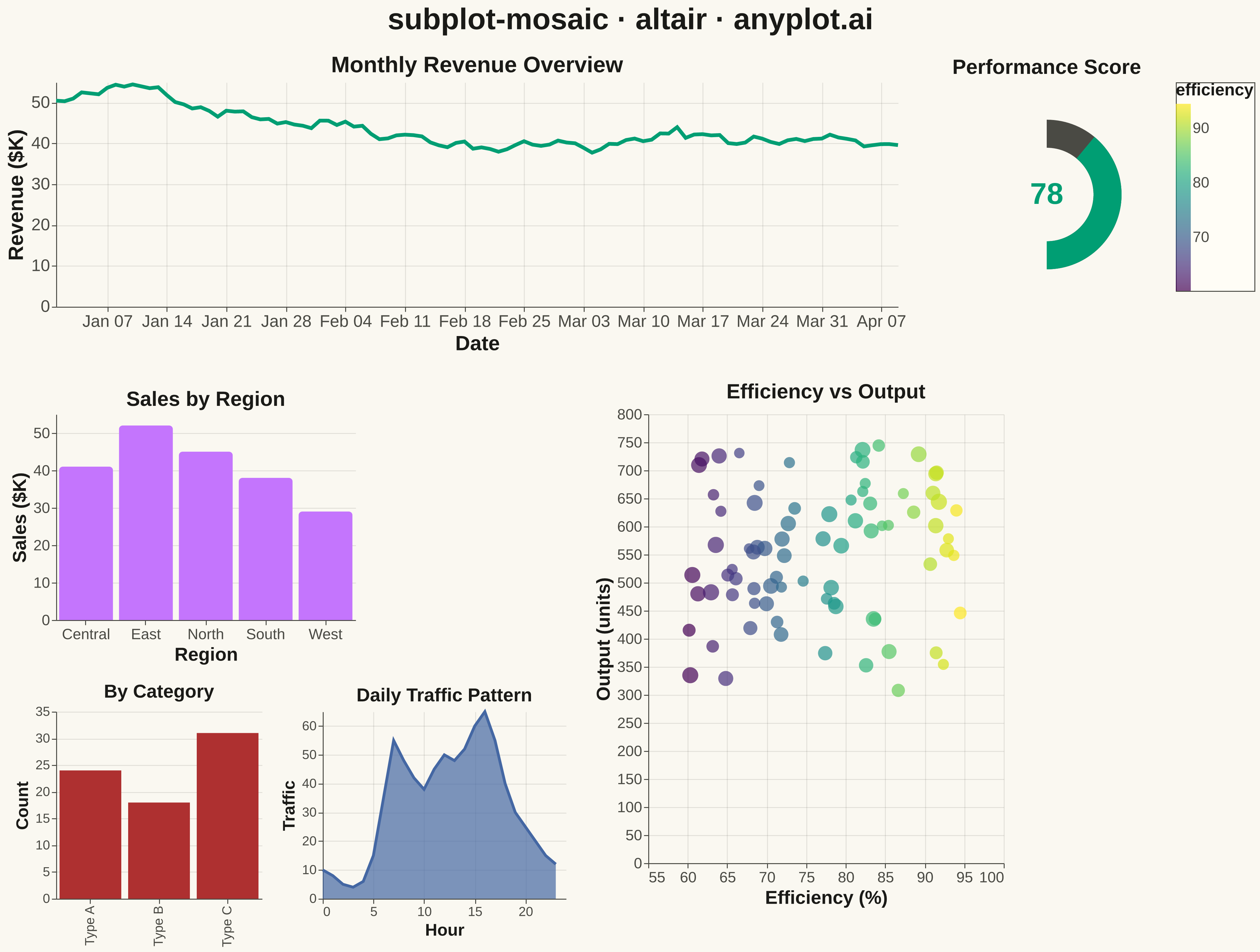
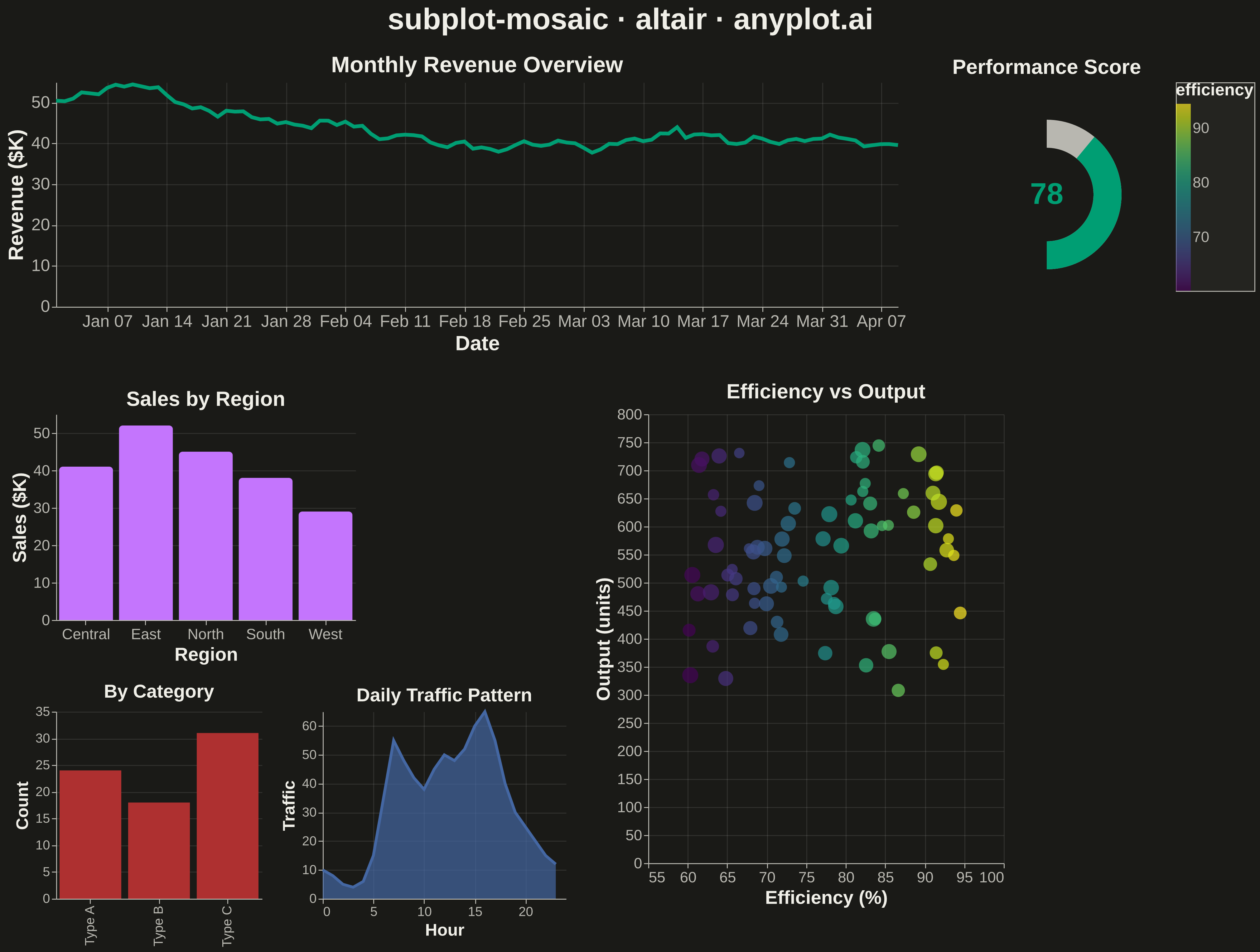
A complex subplot layout where different subplots can have varying sizes and arrangements using intuitive ASCII-art style string definitions. Unlike GridSpec approaches that require explicit row/column spanning, mosaic layouts allow defining layouts through visual string patterns (e.g., "AB;CC" creates A and B on top, C spanning below), making complex configurations more readable and maintainable.
""" anyplot.ai
subplot-mosaic: Mosaic Subplot Layout with Varying Sizes
Library: altair 6.1.0 | Python 3.13.13
Quality: 94/100 | Updated: 2026-05-14
"""

import os

import altair as alt
import numpy as np
import pandas as pd


# Theme configuration
THEME = os.getenv("ANYPLOT_THEME", "light")
PAGE_BG = "#FAF8F1" if THEME == "light" else "#1A1A17"
ELEVATED_BG = "#FFFDF6" if THEME == "light" else "#242420"
INK = "#1A1A17" if THEME == "light" else "#F0EFE8"
INK_SOFT = "#4A4A44" if THEME == "light" else "#B8B7B0"

# Okabe-Ito palette (first series is always #009E73)
IMPRINT = ["#009E73", "#C475FD", "#4467A3", "#BD8233", "#AE3030", "#2ABCCD"]

# Data - Create diverse datasets for dashboard-style mosaic layout
np.random.seed(42)

# Panel A: Wide time series (top, spanning 2 columns)
dates = pd.date_range("2024-01-01", periods=100, freq="D")
df_timeseries = pd.DataFrame(
    {"date": dates, "value": np.cumsum(np.random.randn(100)) + 50, "category": "Revenue Trend"}
)

# Panel B: Small metric (top right corner)
df_gauge = pd.DataFrame({"metric": ["Current"], "value": [78], "max_value": [100]})

# Panel C: Bar chart (middle left)
df_bars = pd.DataFrame({"region": ["North", "South", "East", "West", "Central"], "sales": [45, 38, 52, 29, 41]})

# Panel D: Scatter plot (middle right, spanning 2 rows)
n_points = 80
df_scatter = pd.DataFrame(
    {
        "efficiency": np.random.uniform(60, 95, n_points),
        "output": np.random.uniform(100, 500, n_points) + np.random.uniform(60, 95, n_points) * 3,
        "size": np.random.uniform(20, 100, n_points),
    }
)

# Panel E: Small bar chart (bottom left)
df_categories = pd.DataFrame({"type": ["Type A", "Type B", "Type C"], "count": [24, 18, 31]})

# Panel F: Small area chart (bottom middle)
df_area = pd.DataFrame(
    {
        "hour": list(range(24)),
        "traffic": [10, 8, 5, 4, 6, 15, 35, 55, 48, 42, 38, 45, 50, 48, 52, 60, 65, 55, 40, 30, 25, 20, 15, 12],
    }
)

# Create individual charts with proper styling

# Chart A: Wide time series (spans 2 columns at top)
chart_a = (
    alt.Chart(df_timeseries)
    .mark_line(strokeWidth=4, color=IMPRINT[0])
    .encode(
        x=alt.X("date:T", title="Date", axis=alt.Axis(labelFontSize=18, titleFontSize=22)),
        y=alt.Y("value:Q", title="Revenue ($K)", axis=alt.Axis(labelFontSize=18, titleFontSize=22)),
    )
    .properties(width=900, height=240, title=alt.Title("Monthly Revenue Overview", fontSize=24))
)

# Chart B: Gauge-style metric (small, top right)
chart_b_bg = alt.Chart(df_gauge).mark_arc(innerRadius=50, outerRadius=80, theta=3.14159, theta2=0, color=INK_SOFT)

chart_b_value = (
    alt.Chart(df_gauge)
    .mark_arc(
        innerRadius=50,
        outerRadius=80,
        theta=3.14159,
        theta2=alt.expr("3.14159 - (datum.value / datum.max_value) * 3.14159"),
        color=IMPRINT[0],
    )
    .encode()
)

chart_b_text = (
    alt.Chart(df_gauge)
    .mark_text(fontSize=32, fontWeight="bold", color=IMPRINT[0])
    .encode(text=alt.Text("value:Q", format=".0f"))
)

chart_b = alt.layer(chart_b_bg, chart_b_value, chart_b_text).properties(
    width=240, height=240, title=alt.Title("Performance Score", fontSize=22)
)

# Chart C: Bar chart (middle left)
chart_c = (
    alt.Chart(df_bars)
    .mark_bar(color=IMPRINT[1], cornerRadiusTopLeft=4, cornerRadiusTopRight=4)
    .encode(
        x=alt.X("region:N", title="Region", axis=alt.Axis(labelFontSize=16, titleFontSize=20, labelAngle=0)),
        y=alt.Y("sales:Q", title="Sales ($K)", axis=alt.Axis(labelFontSize=16, titleFontSize=20)),
        tooltip=["region:N", alt.Tooltip("sales:Q", format=".1f")],
    )
    .properties(width=320, height=220, title=alt.Title("Sales by Region", fontSize=22))
)

# Chart D: Scatter plot with legend (spans 2 rows on right side)
chart_d = (
    alt.Chart(df_scatter)
    .mark_circle(opacity=0.7)
    .encode(
        x=alt.X(
            "efficiency:Q",
            title="Efficiency (%)",
            scale=alt.Scale(domain=[55, 100]),
            axis=alt.Axis(labelFontSize=16, titleFontSize=20),
        ),
        y=alt.Y("output:Q", title="Output (units)", axis=alt.Axis(labelFontSize=16, titleFontSize=20)),
        size=alt.Size("size:Q", scale=alt.Scale(range=[80, 300]), legend=None),
        color=alt.Color(
            "efficiency:Q", scale=alt.Scale(scheme="viridis"), legend=alt.Legend(titleFontSize=18, labelFontSize=16)
        ),
        tooltip=["efficiency:Q", "output:Q", alt.Tooltip("size:Q", format=".1f")],
    )
    .properties(width=380, height=480, title=alt.Title("Efficiency vs Output", fontSize=22))
)

# Chart E: Small bar chart (bottom left)
chart_e = (
    alt.Chart(df_categories)
    .mark_bar(color=IMPRINT[4])
    .encode(
        x=alt.X("type:N", title=None, axis=alt.Axis(labelFontSize=14)),
        y=alt.Y("count:Q", title="Count", axis=alt.Axis(labelFontSize=14, titleFontSize=18)),
        tooltip=["type:N", alt.Tooltip("count:Q", format="d")],
    )
    .properties(width=220, height=200, title=alt.Title("By Category", fontSize=20))
)

# Chart F: Area chart (bottom middle)
chart_f = (
    alt.Chart(df_area)
    .mark_area(color=IMPRINT[2], opacity=0.7, line={"color": IMPRINT[2], "strokeWidth": 3})
    .encode(
        x=alt.X("hour:Q", title="Hour", axis=alt.Axis(labelFontSize=14, titleFontSize=18)),
        y=alt.Y("traffic:Q", title="Traffic", axis=alt.Axis(labelFontSize=14, titleFontSize=18)),
        tooltip=["hour:Q", alt.Tooltip("traffic:Q", format="d")],
    )
    .properties(width=260, height=200, title=alt.Title("Daily Traffic Pattern", fontSize=20))
)

# Build mosaic layout with empty cell using concatenation
# Layout pattern: "AAB" (A=time series spanning 2 cols, B=gauge)
#                 "CDD" (C=bars, D=scatter spanning 2 cols and 2 rows)
#                 "EFD" (E=categories, F=area, D continues from above)

# Top row: time series (wide) + gauge
top_row = alt.hconcat(chart_a, chart_b, spacing=30)

# Middle row: bars + scatter (scatter spans into bottom row)
left_middle = chart_c
left_bottom = alt.hconcat(chart_e, chart_f, spacing=20)
left_column = alt.vconcat(left_middle, left_bottom, spacing=20)

# Combine middle and bottom rows
middle_bottom_row = alt.hconcat(left_column, chart_d, spacing=30)

# Combine all rows
mosaic = (
    alt.vconcat(top_row, middle_bottom_row, spacing=30)
    .properties(
        title=alt.Title("subplot-mosaic · altair · anyplot.ai", fontSize=32, anchor="middle", offset=20),
        background=PAGE_BG,
    )
    .configure(background=PAGE_BG)
    .configure_view(fill=PAGE_BG, stroke=INK_SOFT, strokeWidth=0)
    .configure_axis(
        domainColor=INK_SOFT, tickColor=INK_SOFT, gridColor=INK, gridOpacity=0.10, labelColor=INK_SOFT, titleColor=INK
    )
    .configure_title(color=INK, fontSize=32)
    .configure_legend(fillColor=ELEVATED_BG, strokeColor=INK_SOFT, labelColor=INK_SOFT, titleColor=INK)
)

# Save outputs with theme-suffixed filenames
mosaic.save(f"plot-{THEME}.png", scale_factor=3.0)
mosaic.save(f"plot-{THEME}.html")
Runnable source as JSON, for any HTTP client: https://api.anyplot.ai/specs/subplot-mosaic/altair/code. Any spec id and library id listed in llms-full.txt fit the same URL shape; every URL below is complete and callable.
{
  "spec_id": "subplot-mosaic",
  "language": "python",
  "library": "altair",
  "page": "https://anyplot.ai/subplot-mosaic/python/altair",
  "hub": "https://anyplot.ai/subplot-mosaic",
  "code_json": "https://api.anyplot.ai/specs/subplot-mosaic/altair/code",
  "spec_json": "https://api.anyplot.ai/specs/subplot-mosaic",
  "render_light_png": "https://storage.googleapis.com/anyplot-images/plots/subplot-mosaic/python/altair/plot-light.png",
  "render_dark_png": "https://storage.googleapis.com/anyplot-images/plots/subplot-mosaic/python/altair/plot-dark.png",
  "interactive_light_html": "https://storage.googleapis.com/anyplot-images/plots/subplot-mosaic/python/altair/plot-light.html",
  "interactive_dark_html": "https://storage.googleapis.com/anyplot-images/plots/subplot-mosaic/python/altair/plot-dark.html",
  "quality_score": 94.0,
  "license": "MIT",
  "guide": "https://anyplot.ai/llms.txt"
}
Part of Mosaic Subplot Layout with Varying Sizes on anyplot.ai.