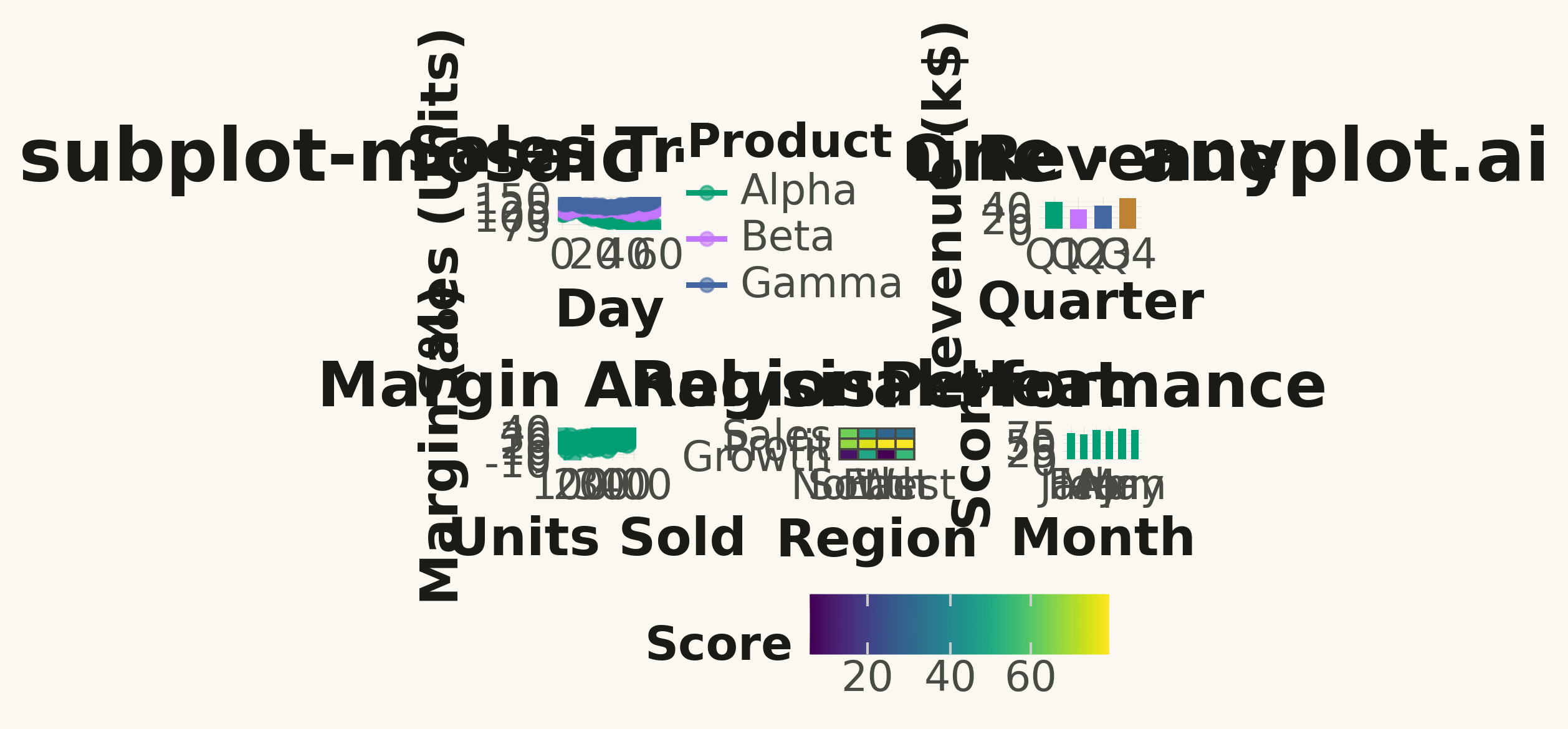
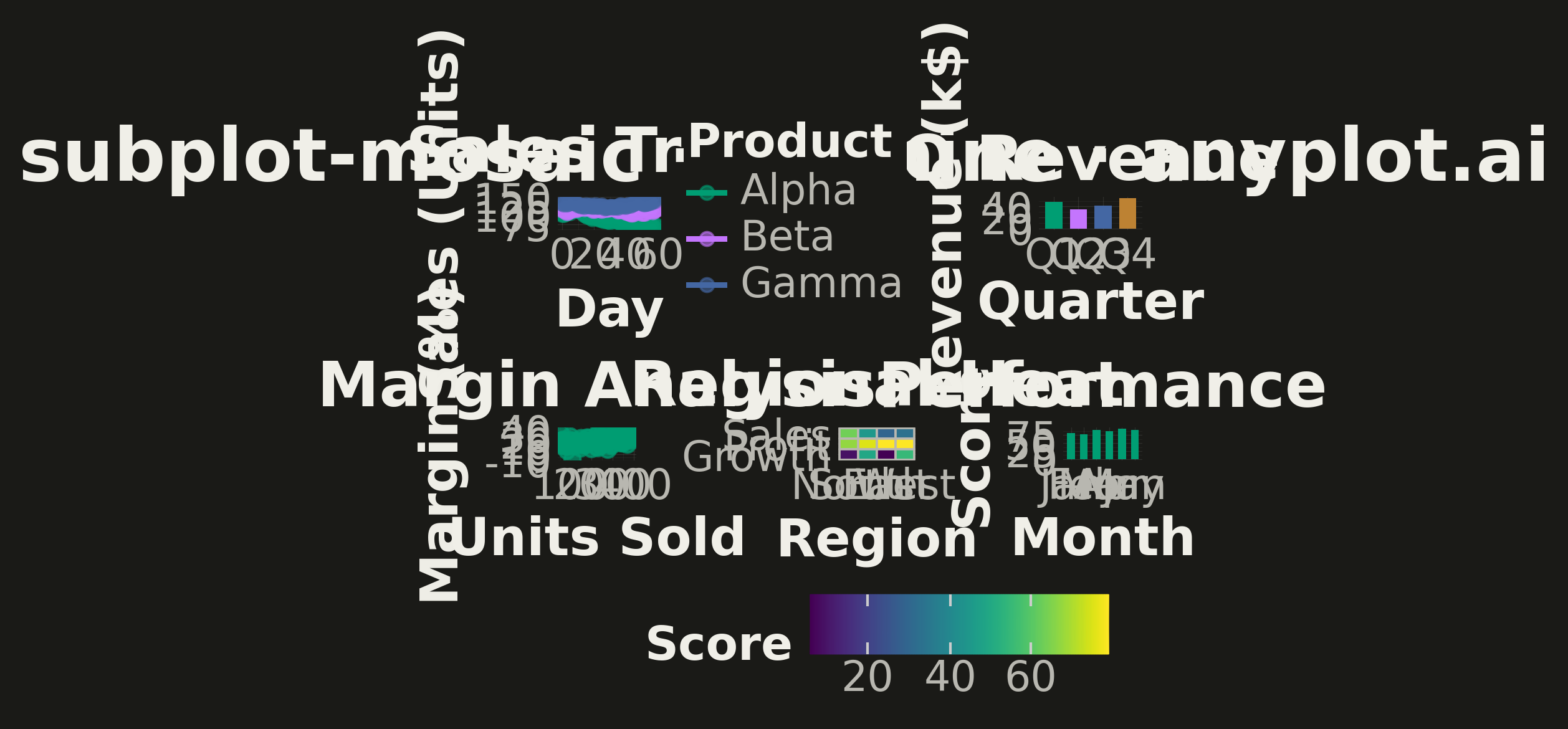
A complex subplot layout where different subplots can have varying sizes and arrangements using intuitive ASCII-art style string definitions. Unlike GridSpec approaches that require explicit row/column spanning, mosaic layouts allow defining layouts through visual string patterns (e.g., "AB;CC" creates A and B on top, C spanning below), making complex configurations more readable and maintainable.
""" anyplot.ai
subplot-mosaic: Mosaic Subplot Layout with Varying Sizes
Library: plotnine 0.15.4 | Python 3.13.13
Quality: 95/100 | Updated: 2026-05-14
"""

import os
import sys


# Workaround for module/filename conflict: remove current dir from path persistently
sys.path = [p for p in sys.path if not p.startswith(os.path.dirname(__file__))]

import numpy as np
import pandas as pd
from plotnine import (
    aes,
    element_line,
    element_rect,
    element_text,
    geom_bar,
    geom_line,
    geom_point,
    geom_tile,
    ggplot,
    labs,
    scale_color_manual,
    scale_fill_cmap,
    scale_fill_manual,
    theme,
    theme_minimal,
)


# Theme tokens
THEME = os.getenv("ANYPLOT_THEME", "light")
PAGE_BG = "#FAF8F1" if THEME == "light" else "#1A1A17"
INK = "#1A1A17" if THEME == "light" else "#F0EFE8"
INK_SOFT = "#4A4A44" if THEME == "light" else "#B8B7B0"

# Okabe-Ito palette
IMPRINT = ["#009E73", "#C475FD", "#4467A3", "#BD8233", "#AE3030", "#2ABCCD", "#954477"]

# Data - Product performance dashboard
np.random.seed(42)

# Daily metrics for overview chart (large top-left panel)
n_days = 60
days = np.arange(n_days)
products = ["Alpha", "Beta", "Gamma"]
colors_panel_a = IMPRINT[:3]

df_overview = pd.concat(
    [
        pd.DataFrame({"day": days, "sales": 100 + i * 15 + np.cumsum(np.random.randn(n_days) * 3), "product": name})
        for i, name in enumerate(products)
    ],
    ignore_index=True,
)

# Category performance (medium right panel)
categories = ["Q1", "Q2", "Q3", "Q4"]
df_category = pd.DataFrame({"quarter": categories, "revenue": [48, 35, 42, 55]})
df_category["quarter"] = pd.Categorical(df_category["quarter"], categories=categories, ordered=True)

# Distribution data (bottom-left)
df_scatter = pd.DataFrame({"units": np.random.uniform(50, 400, 80), "margin": 15 + np.random.randn(80) * 8})
df_scatter["margin"] = df_scatter["margin"] + 0.03 * df_scatter["units"]

# Heatmap data (bottom-middle)
regions = ["North", "South", "East", "West"]
metrics_list = ["Sales", "Profit", "Growth"]
heatmap_vals = np.random.rand(len(metrics_list), len(regions)) * 100
df_heat = pd.DataFrame(
    [
        {"region": regions[j], "metric": metrics_list[i], "value": heatmap_vals[i, j]}
        for i in range(len(metrics_list))
        for j in range(len(regions))
    ]
)
df_heat["region"] = pd.Categorical(df_heat["region"], categories=regions, ordered=True)
df_heat["metric"] = pd.Categorical(df_heat["metric"], categories=metrics_list[::-1], ordered=True)

# Small metric panel (bottom-right)
months = ["Jan", "Feb", "Mar", "Apr", "May", "Jun"]
df_monthly = pd.DataFrame({"month": months, "score": [82, 78, 91, 88, 95, 92]})
df_monthly["month"] = pd.Categorical(df_monthly["month"], categories=months, ordered=True)

# Theme configuration
anyplot_theme = theme(
    plot_background=element_rect(fill=PAGE_BG, color=PAGE_BG),
    panel_background=element_rect(fill=PAGE_BG),
    panel_grid_major=element_line(color=INK, size=0.3, alpha=0.10),
    panel_grid_minor=element_line(color=INK, size=0.2, alpha=0.05),
    axis_title=element_text(size=20, color=INK, face="bold"),
    axis_text=element_text(size=16, color=INK_SOFT),
    plot_title=element_text(size=24, color=INK, face="bold"),
    legend_background=element_rect(fill=PAGE_BG, color="none"),
    legend_text=element_text(size=16, color=INK_SOFT),
    legend_title=element_text(size=18, color=INK, face="bold"),
)

# Panel A: Sales Overview - line plot (large, 2/3 width)
p_overview = (
    ggplot(df_overview, aes(x="day", y="sales", color="product"))
    + geom_line(size=1.2)
    + geom_point(size=2.5, alpha=0.6)
    + scale_color_manual(values=colors_panel_a)
    + labs(x="Day", y="Sales (Units)", color="Product", title="Sales Trend")
    + theme_minimal()
    + anyplot_theme
    + theme(figure_size=(10.5, 5.2))
)

# Panel B: Quarterly Revenue - bar plot (small, 1/3 width)
p_category = (
    ggplot(df_category, aes(x="quarter", y="revenue", fill="quarter"))
    + geom_bar(stat="identity", width=0.7, show_legend=False)
    + scale_fill_manual(values=IMPRINT[:4])
    + labs(x="Quarter", y="Revenue (k$)", title="Q Revenue")
    + theme_minimal()
    + anyplot_theme
    + theme(figure_size=(3.5, 5.2))
)

# Panel C: Units vs Margin - scatter (bottom-left)
p_scatter = (
    ggplot(df_scatter, aes(x="units", y="margin"))
    + geom_point(size=3, color=IMPRINT[0], alpha=0.7)
    + labs(x="Units Sold", y="Margin (%)", title="Margin Analysis")
    + theme_minimal()
    + anyplot_theme
    + theme(figure_size=(4, 3.2))
)

# Panel D: Regional Performance - heatmap (bottom-middle)
p_heatmap = (
    ggplot(df_heat, aes(x="region", y="metric", fill="value"))
    + geom_tile(color=INK_SOFT, size=0.5)
    + scale_fill_cmap(cmap_name="viridis")
    + labs(x="Region", y="", fill="Score", title="Regional Heat")
    + theme_minimal()
    + anyplot_theme
    + theme(figure_size=(4.5, 3.2), legend_position="bottom", legend_direction="horizontal")
)

# Panel E: Monthly Score - bar plot (bottom-right)
p_monthly = (
    ggplot(df_monthly, aes(x="month", y="score"))
    + geom_bar(stat="identity", fill=IMPRINT[0], width=0.6, show_legend=False)
    + labs(x="Month", y="Score", title="Performance")
    + theme_minimal()
    + anyplot_theme
    + theme(figure_size=(4, 3.2))
)

# Create mosaic layout using plotnine composition
# Top row: A (large) | B (small)
# Bottom row: C | D | E
top_row = p_overview | p_category
bottom_row = p_scatter | p_heatmap | p_monthly
layout = top_row / bottom_row

# Draw and save
fig = layout.draw()
fig.suptitle("subplot-mosaic · plotnine · anyplot.ai", fontsize=28, fontweight="bold", y=0.98, color=INK)
fig.set_facecolor(PAGE_BG)
fig.subplots_adjust(top=0.92, bottom=0.08, left=0.05, right=0.95, hspace=0.32, wspace=0.22)

fig.savefig(f"plot-{THEME}.png", dpi=300, bbox_inches="tight", facecolor=PAGE_BG)
Runnable source as JSON, for any HTTP client: https://api.anyplot.ai/specs/subplot-mosaic/plotnine/code. Any spec id and library id listed in llms-full.txt fit the same URL shape; every URL below is complete and callable.
{
  "spec_id": "subplot-mosaic",
  "language": "python",
  "library": "plotnine",
  "page": "https://anyplot.ai/subplot-mosaic/python/plotnine",
  "hub": "https://anyplot.ai/subplot-mosaic",
  "code_json": "https://api.anyplot.ai/specs/subplot-mosaic/plotnine/code",
  "spec_json": "https://api.anyplot.ai/specs/subplot-mosaic",
  "render_light_png": "https://storage.googleapis.com/anyplot-images/plots/subplot-mosaic/python/plotnine/plot-light.png",
  "render_dark_png": "https://storage.googleapis.com/anyplot-images/plots/subplot-mosaic/python/plotnine/plot-dark.png",
  "quality_score": 95.0,
  "license": "MIT",
  "guide": "https://anyplot.ai/llms.txt"
}
Part of Mosaic Subplot Layout with Varying Sizes on anyplot.ai.