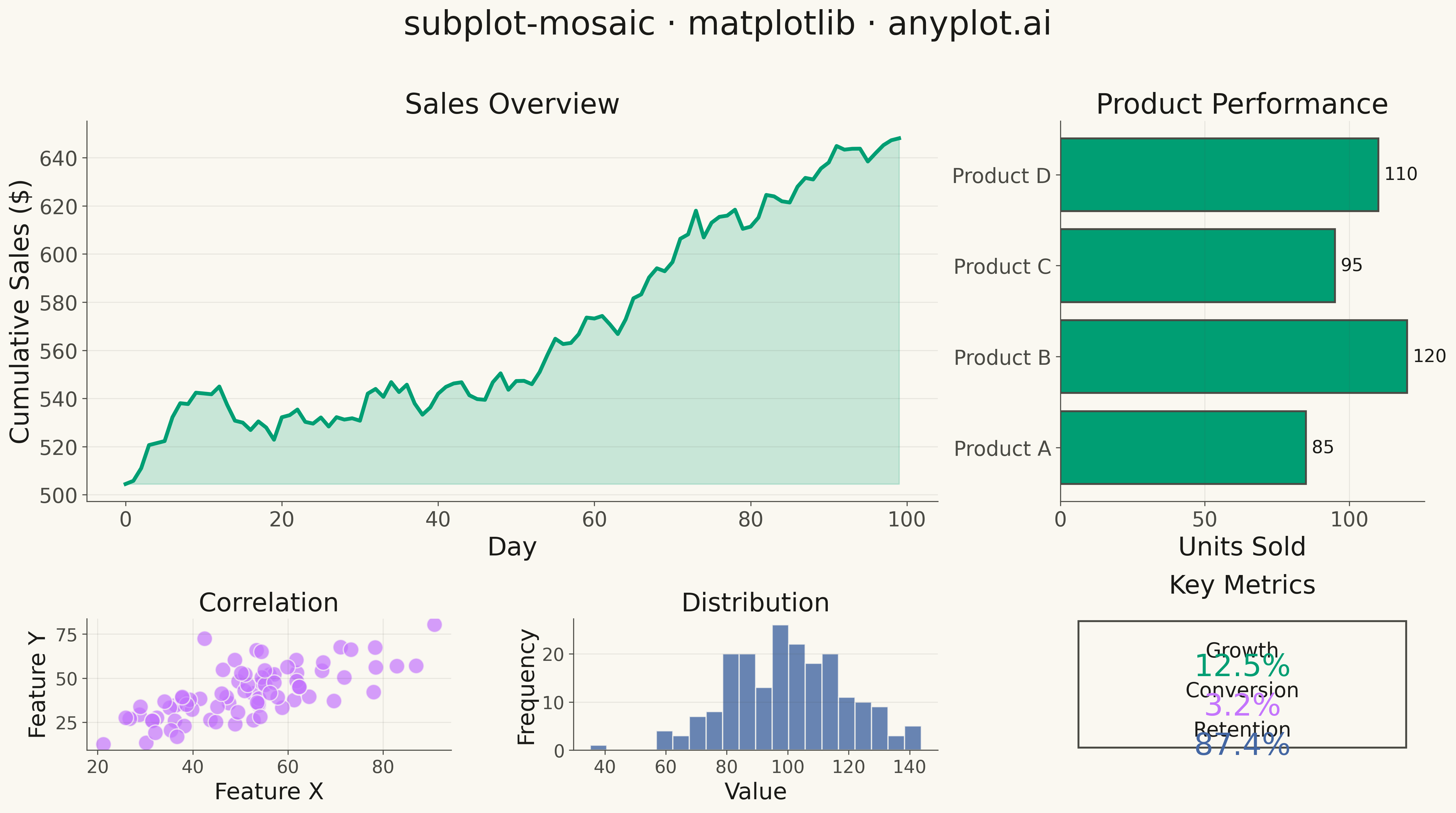
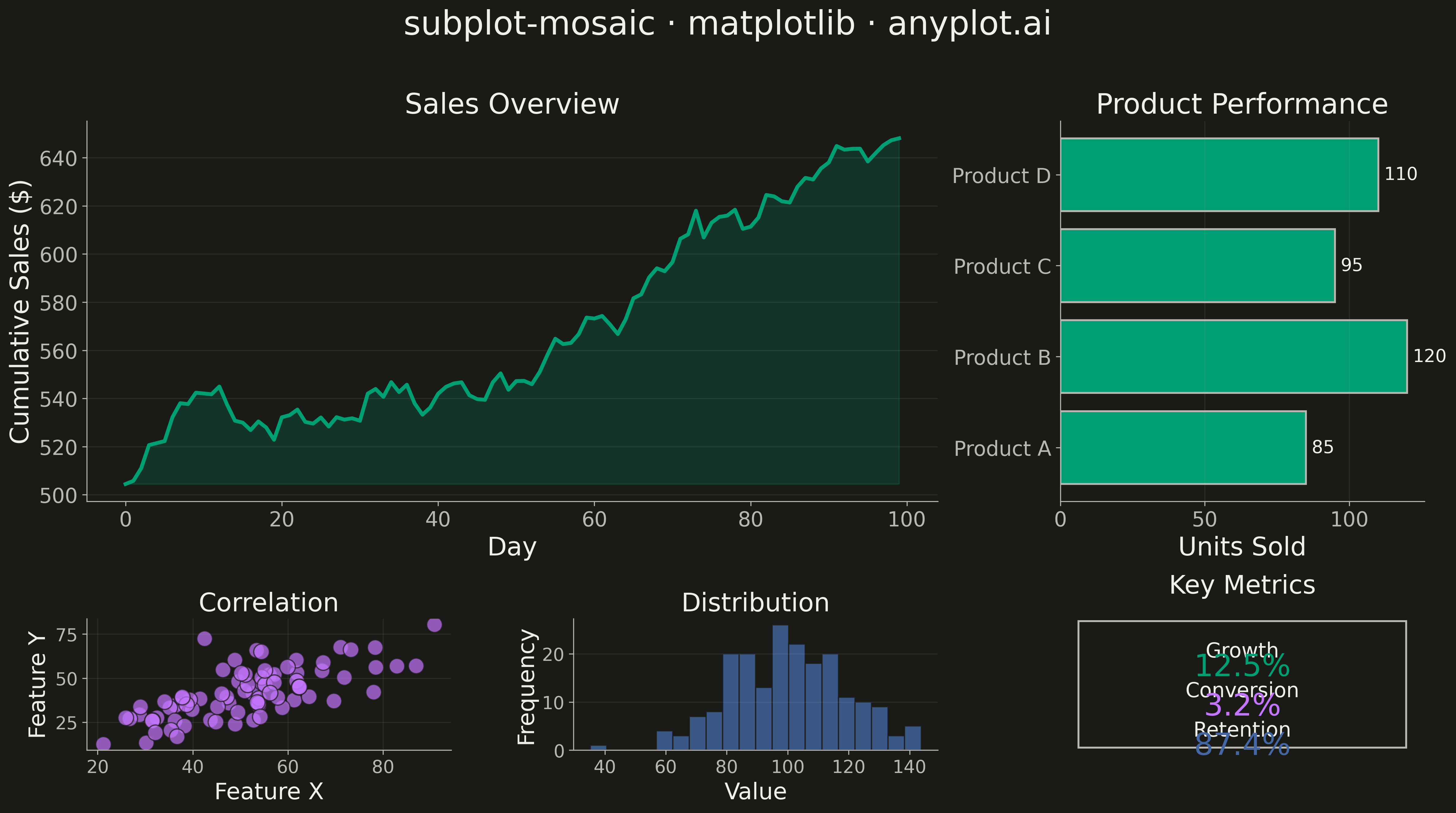
A complex subplot layout where different subplots can have varying sizes and arrangements using intuitive ASCII-art style string definitions. Unlike GridSpec approaches that require explicit row/column spanning, mosaic layouts allow defining layouts through visual string patterns (e.g., "AB;CC" creates A and B on top, C spanning below), making complex configurations more readable and maintainable.
""" anyplot.ai
subplot-mosaic: Mosaic Subplot Layout with Varying Sizes
Library: matplotlib 3.10.9 | Python 3.13.13
Quality: 90/100 | Updated: 2026-05-14
"""

import os

import matplotlib.pyplot as plt
import numpy as np


# Theme tokens
THEME = os.getenv("ANYPLOT_THEME", "light")
PAGE_BG = "#FAF8F1" if THEME == "light" else "#1A1A17"
ELEVATED_BG = "#FFFDF6" if THEME == "light" else "#242420"
INK = "#1A1A17" if THEME == "light" else "#F0EFE8"
INK_SOFT = "#4A4A44" if THEME == "light" else "#B8B7B0"
INK_MUTED = "#6B6A63" if THEME == "light" else "#A8A79F"

# Okabe-Ito palette
BRAND = "#009E73"  # Position 1 - always first series
OI_2 = "#C475FD"
OI_3 = "#4467A3"
OI_4 = "#BD8233"

# Data
np.random.seed(42)

# Time series data for main overview chart
dates = np.arange(100)
sales = np.cumsum(np.random.randn(100) * 5 + 2) + 500

# Category data for bar chart
categories = ["Product A", "Product B", "Product C", "Product D"]
values = [85, 120, 95, 110]

# Scatter data for correlation plot
x_scatter = np.random.normal(50, 15, 80)
y_scatter = x_scatter * 0.8 + np.random.normal(0, 10, 80)

# Histogram data
measurements = np.random.normal(100, 20, 200)

# Metric values for small panels
metrics = {"Growth": 12.5, "Conversion": 3.2, "Retention": 87.4}

# Create mosaic layout: "AAB;AAB;CDE" pattern
# A = large overview (spans 2 rows, 2 cols), B = bar chart (right side, 2 rows)
# C, D, E = three small panels at bottom
mosaic = """
AAB
AAB
CDE
"""

fig, axes = plt.subplot_mosaic(mosaic, figsize=(16, 9), facecolor=PAGE_BG)
fig.patch.set_facecolor(PAGE_BG)

# A: Main time series overview
axes["A"].set_facecolor(PAGE_BG)
axes["A"].plot(dates, sales, linewidth=3, color=BRAND)
axes["A"].fill_between(dates, sales.min(), sales, alpha=0.2, color=BRAND)
axes["A"].set_xlabel("Day", fontsize=20, color=INK)
axes["A"].set_ylabel("Cumulative Sales ($)", fontsize=20, color=INK)
axes["A"].set_title("Sales Overview", fontsize=22, color=INK, fontweight="medium")
axes["A"].tick_params(axis="both", labelsize=16, colors=INK_SOFT)
for spine in ("top", "right"):
    axes["A"].spines[spine].set_visible(False)
for spine in ("left", "bottom"):
    axes["A"].spines[spine].set_color(INK_SOFT)
axes["A"].yaxis.grid(True, alpha=0.10, color=INK_SOFT, linewidth=0.8)

# B: Bar chart for categories
axes["B"].set_facecolor(PAGE_BG)
bars = axes["B"].barh(categories, values, color=BRAND, edgecolor=INK_SOFT, linewidth=1.5)
axes["B"].set_xlabel("Units Sold", fontsize=20, color=INK)
axes["B"].set_title("Product Performance", fontsize=22, color=INK, fontweight="medium")
axes["B"].tick_params(axis="both", labelsize=16, colors=INK_SOFT)
for spine in ("top", "right"):
    axes["B"].spines[spine].set_visible(False)
for spine in ("left", "bottom"):
    axes["B"].spines[spine].set_color(INK_SOFT)
axes["B"].xaxis.grid(True, alpha=0.10, color=INK_SOFT, linewidth=0.8)
# Add value labels
for bar, val in zip(bars, values, strict=True):
    axes["B"].text(val + 2, bar.get_y() + bar.get_height() / 2, str(val), va="center", fontsize=14, color=INK)

# C: Scatter plot
axes["C"].set_facecolor(PAGE_BG)
axes["C"].scatter(x_scatter, y_scatter, s=150, alpha=0.7, color=OI_2, edgecolors=PAGE_BG, linewidth=1)
axes["C"].set_xlabel("Feature X", fontsize=18, color=INK)
axes["C"].set_ylabel("Feature Y", fontsize=18, color=INK)
axes["C"].set_title("Correlation", fontsize=20, color=INK, fontweight="medium")
axes["C"].tick_params(axis="both", labelsize=14, colors=INK_SOFT)
for spine in ("top", "right"):
    axes["C"].spines[spine].set_visible(False)
for spine in ("left", "bottom"):
    axes["C"].spines[spine].set_color(INK_SOFT)
axes["C"].grid(True, alpha=0.10, color=INK_SOFT, linewidth=0.8)

# D: Histogram
axes["D"].set_facecolor(PAGE_BG)
axes["D"].hist(measurements, bins=20, color=OI_3, edgecolor=PAGE_BG, linewidth=1, alpha=0.8)
axes["D"].set_xlabel("Value", fontsize=18, color=INK)
axes["D"].set_ylabel("Frequency", fontsize=18, color=INK)
axes["D"].set_title("Distribution", fontsize=20, color=INK, fontweight="medium")
axes["D"].tick_params(axis="both", labelsize=14, colors=INK_SOFT)
for spine in ("top", "right"):
    axes["D"].spines[spine].set_visible(False)
for spine in ("left", "bottom"):
    axes["D"].spines[spine].set_color(INK_SOFT)
axes["D"].yaxis.grid(True, alpha=0.10, color=INK_SOFT, linewidth=0.8)

# E: Metrics display
axes["E"].set_facecolor(PAGE_BG)
axes["E"].set_xlim(0, 1)
axes["E"].set_ylim(0, 1)
axes["E"].axis("off")
axes["E"].set_title("Key Metrics", fontsize=20, color=INK, fontweight="medium", pad=20)
y_positions = [0.75, 0.45, 0.15]
colors = [BRAND, OI_2, OI_3]
for (name, value), y_pos, color in zip(metrics.items(), y_positions, colors, strict=True):
    axes["E"].text(0.5, y_pos, name, ha="center", va="center", fontsize=16, color=INK, fontweight="medium")
    axes["E"].text(0.5, y_pos - 0.12, f"{value}%", ha="center", va="center", fontsize=24, color=color)
# Add box around metrics
rect = plt.Rectangle((0.05, 0.02), 0.9, 0.96, fill=False, edgecolor=INK_SOFT, linewidth=1.5)
axes["E"].add_patch(rect)

# Main title
fig.suptitle("subplot-mosaic · matplotlib · anyplot.ai", fontsize=26, fontweight="medium", color=INK, y=0.98)

plt.tight_layout(rect=[0, 0, 1, 0.95])
plt.savefig(f"plot-{THEME}.png", dpi=300, bbox_inches="tight", facecolor=PAGE_BG)
Runnable source as JSON, for any HTTP client: https://api.anyplot.ai/specs/subplot-mosaic/matplotlib/code. Any spec id and library id listed in llms-full.txt fit the same URL shape; every URL below is complete and callable.
{
  "spec_id": "subplot-mosaic",
  "language": "python",
  "library": "matplotlib",
  "page": "https://anyplot.ai/subplot-mosaic/python/matplotlib",
  "hub": "https://anyplot.ai/subplot-mosaic",
  "code_json": "https://api.anyplot.ai/specs/subplot-mosaic/matplotlib/code",
  "spec_json": "https://api.anyplot.ai/specs/subplot-mosaic",
  "render_light_png": "https://storage.googleapis.com/anyplot-images/plots/subplot-mosaic/python/matplotlib/plot-light.png",
  "render_dark_png": "https://storage.googleapis.com/anyplot-images/plots/subplot-mosaic/python/matplotlib/plot-dark.png",
  "quality_score": 90.0,
  "license": "MIT",
  "guide": "https://anyplot.ai/llms.txt"
}
Part of Mosaic Subplot Layout with Varying Sizes on anyplot.ai.