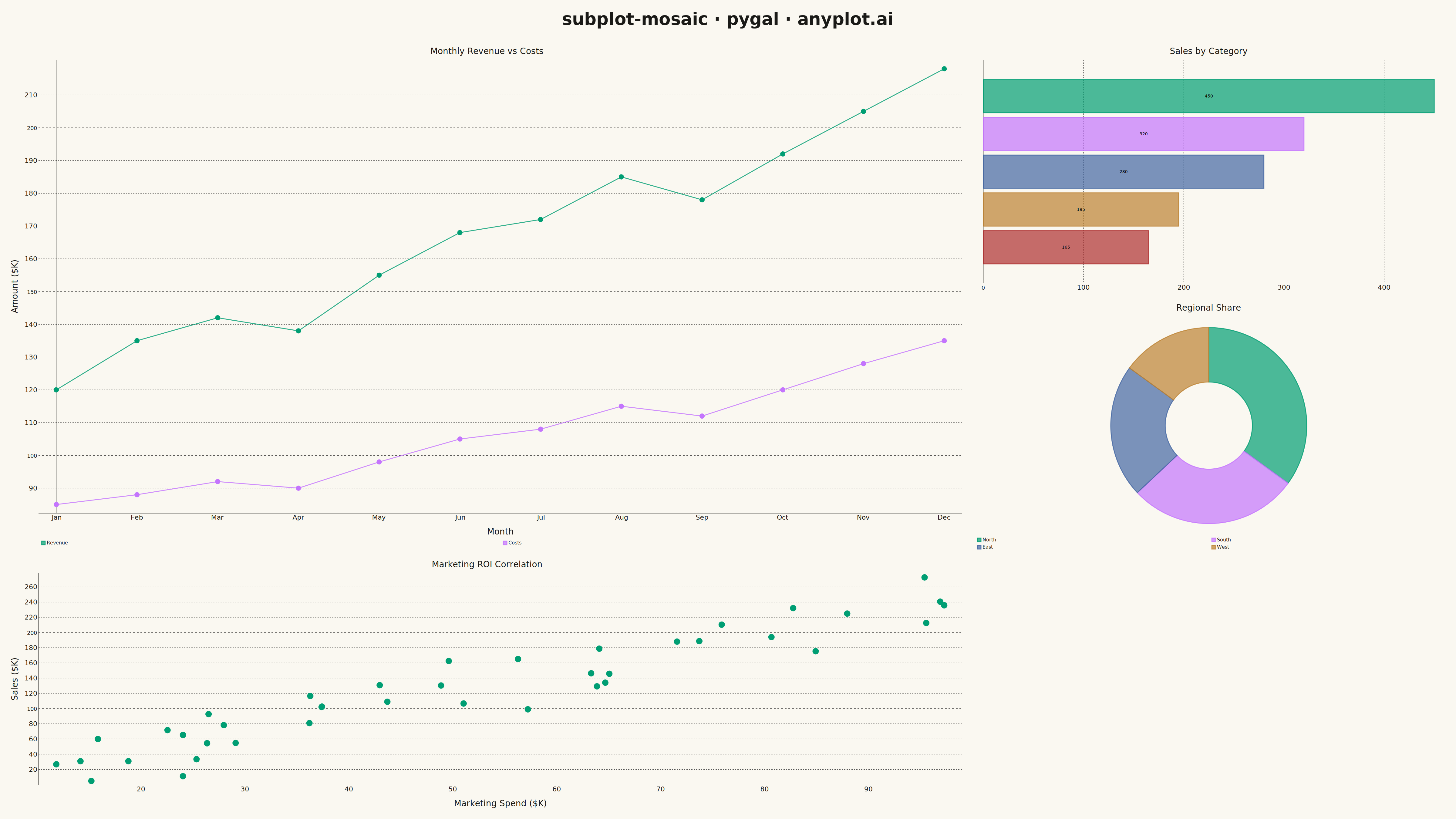
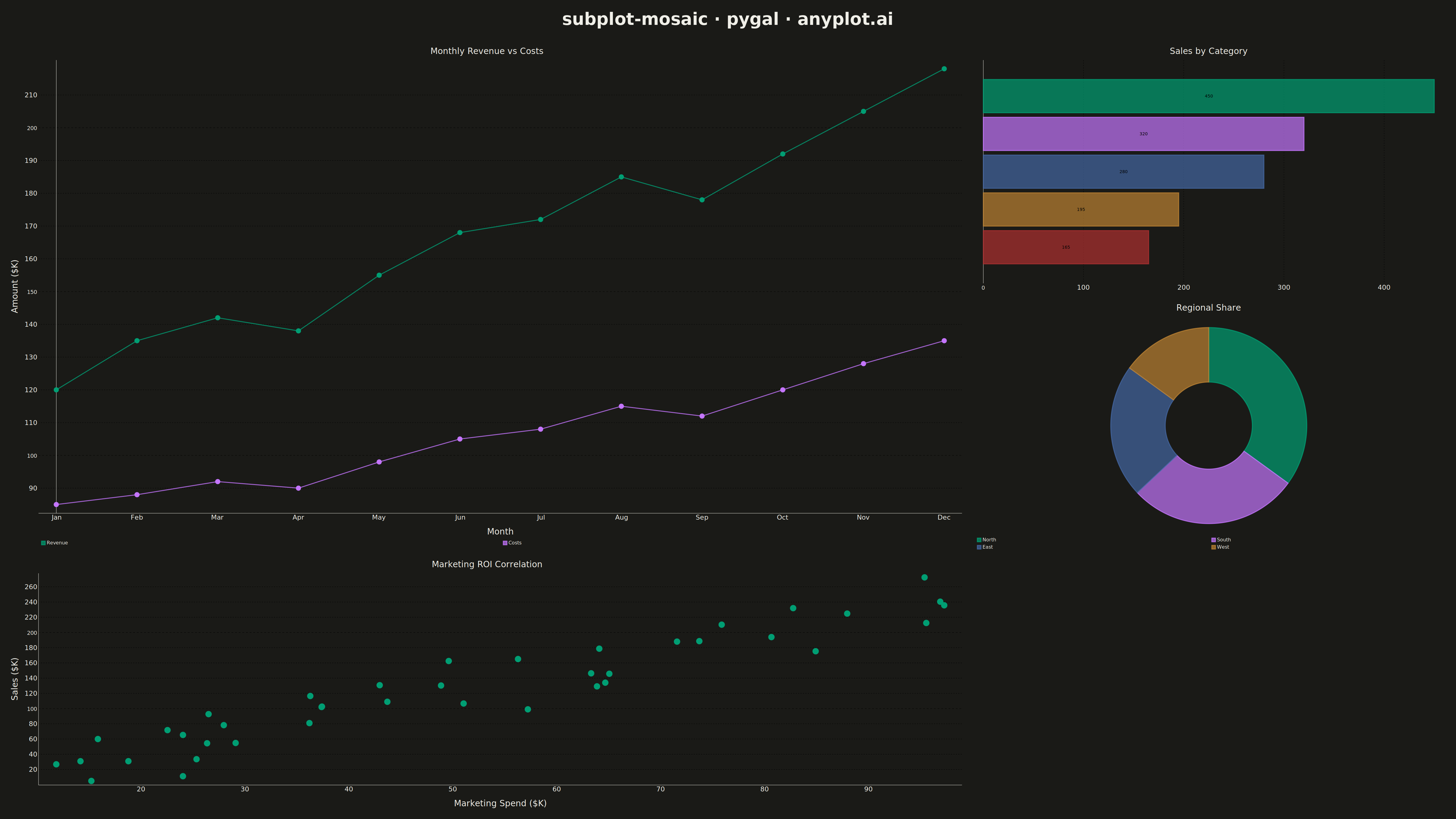
A complex subplot layout where different subplots can have varying sizes and arrangements using intuitive ASCII-art style string definitions. Unlike GridSpec approaches that require explicit row/column spanning, mosaic layouts allow defining layouts through visual string patterns (e.g., "AB;CC" creates A and B on top, C spanning below), making complex configurations more readable and maintainable.
""" anyplot.ai
subplot-mosaic: Mosaic Subplot Layout with Varying Sizes
Library: pygal 3.1.0 | Python 3.13.13
Quality: 91/100 | Updated: 2026-05-14
"""

import os
import sys
from io import BytesIO


# Avoid shadowing the pygal package by this script
sys.dont_write_bytecode = True
_this_file = os.path.abspath(__file__)
_this_dir = os.path.dirname(_this_file)
if _this_dir in sys.path:
    sys.path.remove(_this_dir)

import cairosvg
import numpy as np
import pygal
from PIL import Image, ImageDraw, ImageFont
from pygal.style import Style


THEME = os.getenv("ANYPLOT_THEME", "light")
PAGE_BG = "#FAF8F1" if THEME == "light" else "#1A1A17"
ELEVATED_BG = "#FFFDF6" if THEME == "light" else "#242420"
INK = "#1A1A17" if THEME == "light" else "#F0EFE8"
INK_SOFT = "#4A4A44" if THEME == "light" else "#B8B7B0"
INK_MUTED = "#6B6A63" if THEME == "light" else "#A8A79F"

IMPRINT = (
    "#009E73",  # brand green (first series)
    "#C475FD",  # vermillion
    "#4467A3",  # blue
    "#BD8233",  # reddish purple
    "#AE3030",  # orange
    "#2ABCCD",  # sky blue
    "#954477",  # yellow
)

# Data - Dashboard showing sales performance across different dimensions
np.random.seed(42)

# Time series data for main overview chart (Panel A - wide)
months = ["Jan", "Feb", "Mar", "Apr", "May", "Jun", "Jul", "Aug", "Sep", "Oct", "Nov", "Dec"]
revenue = [120, 135, 142, 138, 155, 168, 172, 185, 178, 192, 205, 218]
costs = [85, 88, 92, 90, 98, 105, 108, 115, 112, 120, 128, 135]

# Category data for bar chart (Panel B)
categories = ["Electronics", "Clothing", "Home", "Sports", "Books"]
category_sales = [450, 320, 280, 195, 165]

# Pie chart data for market share (Panel C)
regions = ["North", "South", "East", "West"]
region_shares = [35, 28, 22, 15]

# Scatter data for correlation (Panel D)
n_points = 40
marketing_spend = np.random.uniform(10, 100, n_points)
sales_response = marketing_spend * 2.5 + np.random.normal(0, 25, n_points)

# Gauge data for KPI (Panel E)
current_target_pct = 78

# Custom style for theme
custom_style = Style(
    background=PAGE_BG,
    plot_background=PAGE_BG,
    foreground=INK,
    foreground_strong=INK,
    foreground_subtle=INK_MUTED,
    colors=IMPRINT,
    font_family="sans-serif",
    title_font_size=28,
    label_font_size=22,
    major_label_font_size=18,
    legend_font_size=16,
    value_font_size=14,
    stroke_width=3,
)

# Mosaic layout pattern: "AAB;AAC;DDF"
# A = large chart (2x2), B = medium chart (1x1), C = medium chart (1x1)
# D = medium chart (2x1), F = placeholder (empty cell)

total_width = 4800
total_height = 2700
title_height = 120
padding = 20

# Calculate cell sizes for 3-column, 3-row grid
grid_width = total_width - 2 * padding
grid_height = total_height - title_height - 2 * padding
col_width = grid_width // 3
row_height = grid_height // 3

# Panel A: Line chart (spans 2 cols, 2 rows) - Revenue & Costs over time
chart_a = pygal.Line(
    width=int(col_width * 2),
    height=int(row_height * 2),
    style=custom_style,
    show_legend=True,
    legend_at_bottom=True,
    show_y_guides=True,
    show_x_guides=False,
    x_title="Month",
    y_title="Amount ($K)",
    title="Monthly Revenue vs Costs",
    show_dots=True,
    dots_size=8,
    stroke_style={"width": 3},
    truncate_label=-1,
)
chart_a.x_labels = months
chart_a.add("Revenue", revenue)
chart_a.add("Costs", costs)

# Panel B: Horizontal bar chart (1 col, 1 row) - Category sales
chart_b = pygal.HorizontalBar(
    width=int(col_width),
    height=int(row_height),
    style=custom_style,
    show_legend=False,
    show_y_guides=True,
    title="Sales by Category",
    truncate_label=-1,
    print_values=True,
    print_values_position="center",
    value_font_size=14,
)
for cat, val in zip(categories, category_sales, strict=True):
    chart_b.add(cat, val)

# Panel C: Pie chart (1 col, 1 row) - Regional distribution
chart_c = pygal.Pie(
    width=int(col_width),
    height=int(row_height),
    style=custom_style,
    show_legend=True,
    legend_at_bottom=True,
    title="Regional Share",
    inner_radius=0.4,
    truncate_label=-1,
)
for region, share in zip(regions, region_shares, strict=True):
    chart_c.add(region, share)

# Panel D: XY scatter chart (2 cols, 1 row) - Marketing vs Sales
chart_d = pygal.XY(
    width=int(col_width * 2),
    height=int(row_height),
    style=custom_style,
    show_legend=False,
    show_y_guides=True,
    x_title="Marketing Spend ($K)",
    y_title="Sales ($K)",
    title="Marketing ROI Correlation",
    stroke=False,
    dots_size=10,
    truncate_label=-1,
)
scatter_data = [(float(x), float(y)) for x, y in zip(marketing_spend, sales_response, strict=True)]
chart_d.add("Correlation", scatter_data)

# Panel E: Gauge chart (1 col, 1 row) - Target achievement
chart_e = pygal.SolidGauge(
    width=int(col_width),
    height=int(row_height),
    style=custom_style,
    show_legend=False,
    title="Target Achievement",
    inner_radius=0.6,
    half_pie=True,
)
chart_e.add("Progress", [{"value": current_target_pct, "max_value": 100}])

# Render charts to PNG via SVG+Cairo
svg_a = chart_a.render()
png_a = cairosvg.svg2png(bytestring=svg_a, output_width=int(col_width * 2), output_height=int(row_height * 2))
img_a = Image.open(BytesIO(png_a))

svg_b = chart_b.render()
png_b = cairosvg.svg2png(bytestring=svg_b, output_width=int(col_width), output_height=int(row_height))
img_b = Image.open(BytesIO(png_b))

svg_c = chart_c.render()
png_c = cairosvg.svg2png(bytestring=svg_c, output_width=int(col_width), output_height=int(row_height))
img_c = Image.open(BytesIO(png_c))

svg_d = chart_d.render()
png_d = cairosvg.svg2png(bytestring=svg_d, output_width=int(col_width * 2), output_height=int(row_height))
img_d = Image.open(BytesIO(png_d))

svg_e = chart_e.render()
png_e = cairosvg.svg2png(bytestring=svg_e, output_width=int(col_width), output_height=int(row_height))
img_e = Image.open(BytesIO(png_e))

# Create placeholder image (empty cell) with theme-adaptive background
placeholder = Image.new("RGB", (int(col_width), int(row_height)), PAGE_BG)

# Create combined image
combined = Image.new("RGB", (total_width, total_height), PAGE_BG)

# Place charts according to mosaic pattern: "AAB;AAC;DDF"
# Row 0: A (cols 0-1), B (col 2)
# Row 1: A (cols 0-1), C (col 2)
# Row 2: D (cols 0-1), F (col 2, empty)

x_offset = padding
y_offset = title_height + padding

combined.paste(img_a, (x_offset, y_offset))
combined.paste(img_b, (x_offset + int(col_width * 2), y_offset))
combined.paste(img_c, (x_offset + int(col_width * 2), y_offset + int(row_height)))
combined.paste(img_d, (x_offset, y_offset + int(row_height * 2)))
combined.paste(placeholder, (x_offset + int(col_width * 2), y_offset + int(row_height * 2)))

# Add main title
draw = ImageDraw.Draw(combined)

try:
    title_font = ImageFont.truetype("/usr/share/fonts/truetype/dejavu/DejaVuSans-Bold.ttf", 56)
except OSError:
    title_font = ImageFont.load_default()

title_text = "subplot-mosaic · pygal · anyplot.ai"
bbox = draw.textbbox((0, 0), title_text, font=title_font)
title_width = bbox[2] - bbox[0]
title_x = (total_width - title_width) // 2
draw.text((title_x, 30), title_text, fill=INK, font=title_font)

# Save final image
combined.save(f"plot-{THEME}.png", dpi=(300, 300))

# Save as HTML with interactive SVG grid
html_content = f"""<!DOCTYPE html>
<html>
<head>
    <title>subplot-mosaic · pygal · anyplot.ai</title>
    <style>
        body {{ font-family: sans-serif; background: {PAGE_BG}; margin: 20px; }}
        h1 {{ text-align: center; color: {INK}; font-size: 32px; margin-bottom: 20px; }}
        .mosaic {{
            display: grid;
            grid-template-columns: 1fr 1fr 1fr;
            grid-template-rows: 1fr 1fr 1fr;
            gap: 10px;
            max-width: 1600px;
            margin: 0 auto;
            height: 900px;
        }}
        .panel-a {{ grid-column: 1 / 3; grid-row: 1 / 3; }}
        .panel-b {{ grid-column: 3; grid-row: 1; }}
        .panel-c {{ grid-column: 3; grid-row: 2; }}
        .panel-d {{ grid-column: 1 / 3; grid-row: 3; }}
        .panel-f {{ grid-column: 3; grid-row: 3; background: {PAGE_BG}; }}
        .panel svg {{ width: 100%; height: 100%; }}
    </style>
</head>
<body>
    <h1>subplot-mosaic · pygal · anyplot.ai</h1>
    <div class="mosaic">
"""

svg_a_str = chart_a.render(is_unicode=True).replace('<?xml version="1.0" encoding="utf-8"?>', "")
svg_b_str = chart_b.render(is_unicode=True).replace('<?xml version="1.0" encoding="utf-8"?>', "")
svg_c_str = chart_c.render(is_unicode=True).replace('<?xml version="1.0" encoding="utf-8"?>', "")
svg_d_str = chart_d.render(is_unicode=True).replace('<?xml version="1.0" encoding="utf-8"?>', "")
svg_e_str = chart_e.render(is_unicode=True).replace('<?xml version="1.0" encoding="utf-8"?>', "")

html_content += f'        <div class="panel panel-a">{svg_a_str}</div>\n'
html_content += f'        <div class="panel panel-b">{svg_b_str}</div>\n'
html_content += f'        <div class="panel panel-c">{svg_c_str}</div>\n'
html_content += f'        <div class="panel panel-d">{svg_d_str}</div>\n'
html_content += '        <div class="panel panel-f"></div>\n'
html_content += """    </div>
</body>
</html>"""

with open(f"plot-{THEME}.html", "w") as f:
    f.write(html_content)
Runnable source as JSON, for any HTTP client: https://api.anyplot.ai/specs/subplot-mosaic/pygal/code. Any spec id and library id listed in llms-full.txt fit the same URL shape; every URL below is complete and callable.
{
  "spec_id": "subplot-mosaic",
  "language": "python",
  "library": "pygal",
  "page": "https://anyplot.ai/subplot-mosaic/python/pygal",
  "hub": "https://anyplot.ai/subplot-mosaic",
  "code_json": "https://api.anyplot.ai/specs/subplot-mosaic/pygal/code",
  "spec_json": "https://api.anyplot.ai/specs/subplot-mosaic",
  "render_light_png": "https://storage.googleapis.com/anyplot-images/plots/subplot-mosaic/python/pygal/plot-light.png",
  "render_dark_png": "https://storage.googleapis.com/anyplot-images/plots/subplot-mosaic/python/pygal/plot-dark.png",
  "interactive_light_html": "https://storage.googleapis.com/anyplot-images/plots/subplot-mosaic/python/pygal/plot-light.html",
  "interactive_dark_html": "https://storage.googleapis.com/anyplot-images/plots/subplot-mosaic/python/pygal/plot-dark.html",
  "quality_score": 91.0,
  "license": "MIT",
  "guide": "https://anyplot.ai/llms.txt"
}
Part of Mosaic Subplot Layout with Varying Sizes on anyplot.ai.