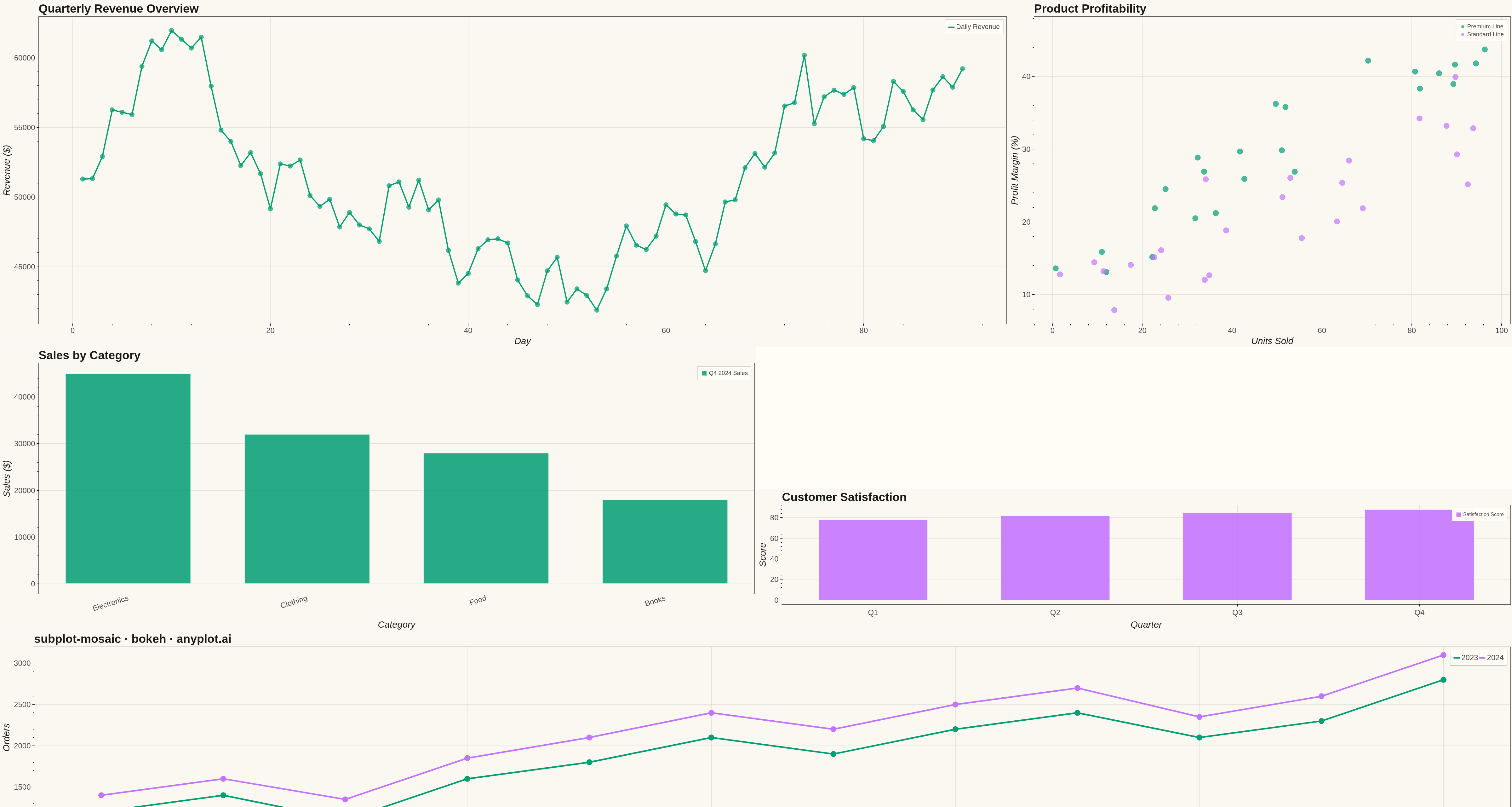
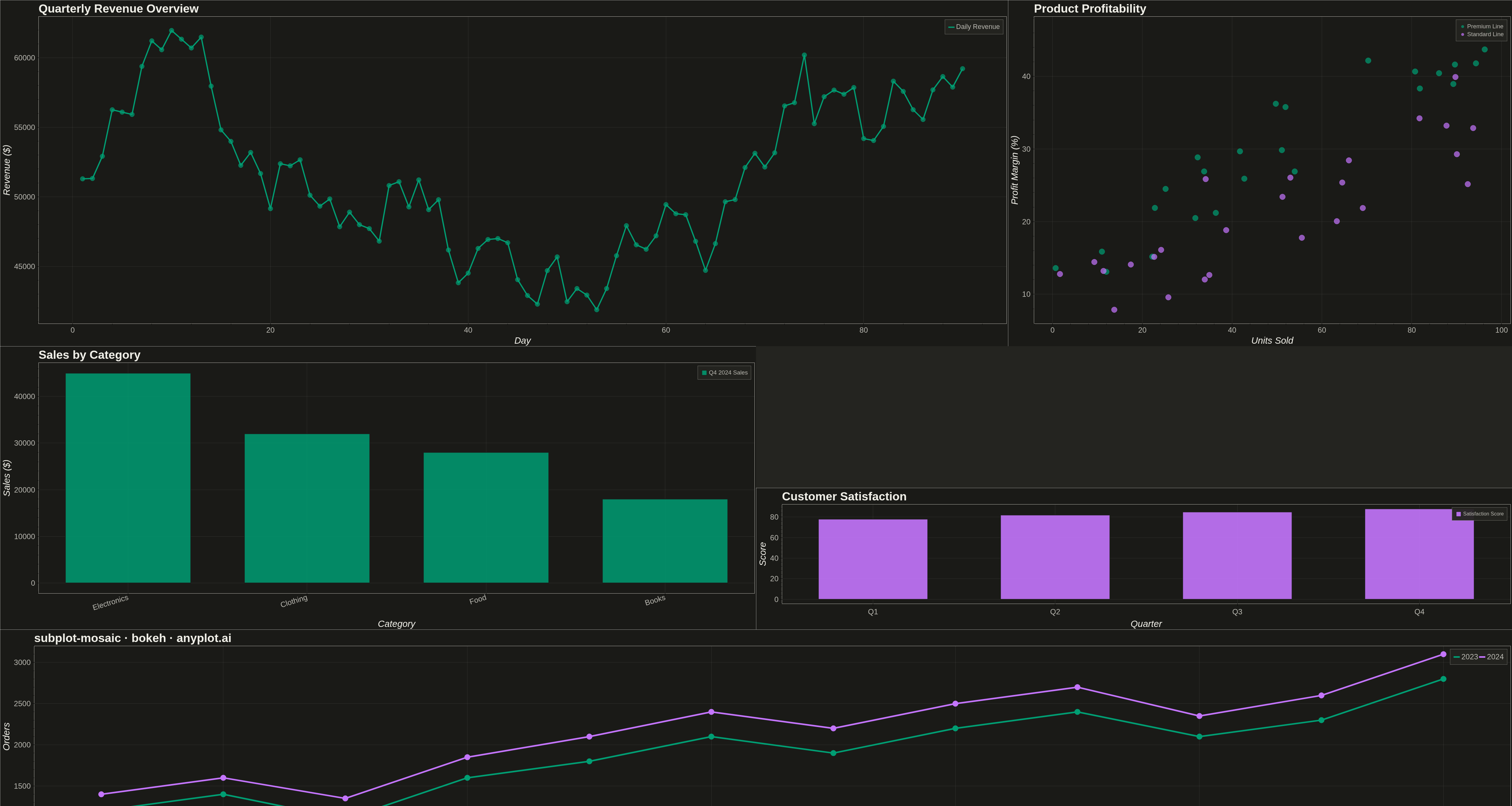
A complex subplot layout where different subplots can have varying sizes and arrangements using intuitive ASCII-art style string definitions. Unlike GridSpec approaches that require explicit row/column spanning, mosaic layouts allow defining layouts through visual string patterns (e.g., "AB;CC" creates A and B on top, C spanning below), making complex configurations more readable and maintainable.
""" anyplot.ai
subplot-mosaic: Mosaic Subplot Layout with Varying Sizes
Library: bokeh 3.9.0 | Python 3.13.13
Quality: 95/100 | Updated: 2026-05-14
"""

import os
import time
from pathlib import Path

import numpy as np
from bokeh.io import output_file, save
from bokeh.layouts import Spacer, column, row
from bokeh.models import ColumnDataSource
from bokeh.plotting import figure
from selenium import webdriver
from selenium.webdriver.chrome.options import Options


THEME = os.getenv("ANYPLOT_THEME", "light")
PAGE_BG = "#FAF8F1" if THEME == "light" else "#1A1A17"
ELEVATED_BG = "#FFFDF6" if THEME == "light" else "#242420"
INK = "#1A1A17" if THEME == "light" else "#F0EFE8"
INK_SOFT = "#4A4A44" if THEME == "light" else "#B8B7B0"

IMPRINT = ["#009E73", "#C475FD", "#4467A3", "#BD8233"]

np.random.seed(42)

# Data for various subplots - Dashboard with business metrics

# A: Large overview time series (top left, spans 2 cols)
days = np.arange(1, 91)
revenue = 50000 + np.cumsum(np.random.randn(90) * 2000) + days * 300
source_a = ColumnDataSource(data={"day": days, "revenue": revenue})

# B: Scatter plot (top right) - two product lines
products_a = np.random.rand(25) * 100
profit_margin_a = products_a * 0.35 + np.random.randn(25) * 4 + 12
products_b = np.random.rand(25) * 100
profit_margin_b = products_b * 0.25 + np.random.randn(25) * 5 + 8
source_b1 = ColumnDataSource(data={"products": products_a, "profit_margin": profit_margin_a})
source_b2 = ColumnDataSource(data={"products": products_b, "profit_margin": profit_margin_b})

# C: Bar chart - Categories (middle left)
categories = ["Electronics", "Clothing", "Food", "Books"]
sales = [45000, 32000, 28000, 18000]
source_c = ColumnDataSource(data={"category": categories, "sales": sales})

# D: Line chart - Monthly trend (bottom, spans full width) - two years
months = np.arange(1, 13)
orders_2023 = [1200, 1400, 1100, 1600, 1800, 2100, 1900, 2200, 2400, 2100, 2300, 2800]
orders_2024 = [1400, 1600, 1350, 1850, 2100, 2400, 2200, 2500, 2700, 2350, 2600, 3100]
source_d1 = ColumnDataSource(data={"month": months, "orders": orders_2023})
source_d2 = ColumnDataSource(data={"month": months, "orders": orders_2024})

# E: Conversion rate trend (two channels)
weeks = np.arange(1, 13)
conversion_web = 3.2 + np.cumsum(np.random.randn(12) * 0.15)
conversion_mobile = 2.8 + np.cumsum(np.random.randn(12) * 0.18)
source_e1 = ColumnDataSource(data={"week": weeks, "conversion": conversion_web})
source_e2 = ColumnDataSource(data={"week": weeks, "conversion": conversion_mobile})

# F: Customer satisfaction
quarters = ["Q1", "Q2", "Q3", "Q4"]
satisfaction = [78, 82, 85, 88]
source_f = ColumnDataSource(data={"quarter": quarters, "satisfaction": satisfaction})


def style_figure(fig):
    fig.background_fill_color = PAGE_BG
    fig.border_fill_color = PAGE_BG
    fig.outline_line_color = INK_SOFT
    fig.title.text_color = INK
    fig.title.text_font_size = "28pt"
    fig.xaxis.axis_label_text_color = INK
    fig.yaxis.axis_label_text_color = INK
    fig.xaxis.axis_label_text_font_size = "22pt"
    fig.yaxis.axis_label_text_font_size = "22pt"
    fig.xaxis.major_label_text_color = INK_SOFT
    fig.yaxis.major_label_text_color = INK_SOFT
    fig.xaxis.major_label_text_font_size = "18pt"
    fig.yaxis.major_label_text_font_size = "18pt"
    fig.xaxis.axis_line_color = INK_SOFT
    fig.yaxis.axis_line_color = INK_SOFT
    fig.xgrid.grid_line_color = INK
    fig.ygrid.grid_line_color = INK
    fig.xgrid.grid_line_alpha = 0.10
    fig.ygrid.grid_line_alpha = 0.10
    fig.toolbar_location = None


# A: Large Revenue Overview (spans 2 columns, taller)
p_a = figure(
    width=3200, height=1100, title="Quarterly Revenue Overview", x_axis_label="Day", y_axis_label="Revenue ($)"
)
p_a.line("day", "revenue", source=source_a, line_width=4, color=IMPRINT[0], legend_label="Daily Revenue")
p_a.scatter("day", "revenue", source=source_a, size=15, color=IMPRINT[0], alpha=0.7)
p_a.legend.label_text_font_size = "16pt"
p_a.legend.background_fill_color = ELEVATED_BG
p_a.legend.border_line_color = INK_SOFT
p_a.legend.label_text_color = INK_SOFT
style_figure(p_a)

# B: Product Profitability Scatter with two product lines
p_b = figure(
    width=1600, height=1100, title="Product Profitability", x_axis_label="Units Sold", y_axis_label="Profit Margin (%)"
)
p_b.scatter(
    "products", "profit_margin", source=source_b1, size=18, color=IMPRINT[0], alpha=0.7, legend_label="Premium Line"
)
p_b.scatter(
    "products", "profit_margin", source=source_b2, size=18, color=IMPRINT[1], alpha=0.7, legend_label="Standard Line"
)
p_b.legend.label_text_font_size = "14pt"
p_b.legend.background_fill_color = ELEVATED_BG
p_b.legend.border_line_color = INK_SOFT
p_b.legend.label_text_color = INK_SOFT
p_b.title.text_font_size = "24pt"
p_b.xaxis.axis_label_text_font_size = "18pt"
p_b.yaxis.axis_label_text_font_size = "18pt"
p_b.xaxis.major_label_text_font_size = "14pt"
p_b.yaxis.major_label_text_font_size = "14pt"
style_figure(p_b)

# C: Category Sales Bar Chart
p_c = figure(
    width=2400,
    height=900,
    x_range=categories,
    title="Sales by Category",
    x_axis_label="Category",
    y_axis_label="Sales ($)",
)
p_c.vbar(
    x="category",
    top="sales",
    source=source_c,
    width=0.7,
    color=IMPRINT[0],
    alpha=0.85,
    line_color=PAGE_BG,
    line_width=2,
    legend_label="Q4 2024 Sales",
)
p_c.legend.label_text_font_size = "14pt"
p_c.legend.background_fill_color = ELEVATED_BG
p_c.legend.border_line_color = INK_SOFT
p_c.legend.label_text_color = INK_SOFT
p_c.title.text_font_size = "24pt"
p_c.xaxis.axis_label_text_font_size = "18pt"
p_c.yaxis.axis_label_text_font_size = "18pt"
p_c.xaxis.major_label_text_font_size = "14pt"
p_c.yaxis.major_label_text_font_size = "14pt"
p_c.xaxis.major_label_orientation = 0.3
style_figure(p_c)

# Empty cell spacer (gap in mosaic)
empty_spacer = Spacer(width=2400, height=450, background=ELEVATED_BG)

# F: Customer Satisfaction Bar
p_f = figure(
    width=2400,
    height=450,
    x_range=quarters,
    title="Customer Satisfaction",
    x_axis_label="Quarter",
    y_axis_label="Score",
)
p_f.vbar(
    x="quarter",
    top="satisfaction",
    source=source_f,
    width=0.6,
    color=IMPRINT[1],
    alpha=0.9,
    line_color=PAGE_BG,
    line_width=2,
    legend_label="Satisfaction Score",
)
p_f.legend.label_text_font_size = "12pt"
p_f.legend.background_fill_color = ELEVATED_BG
p_f.legend.border_line_color = INK_SOFT
p_f.legend.label_text_color = INK_SOFT
p_f.title.text_font_size = "22pt"
p_f.xaxis.axis_label_text_font_size = "16pt"
p_f.yaxis.axis_label_text_font_size = "16pt"
p_f.xaxis.major_label_text_font_size = "14pt"
p_f.yaxis.major_label_text_font_size = "14pt"
style_figure(p_f)

# D: Monthly Orders Trend (full width bottom) - comparing two years
p_d = figure(
    width=4800, height=700, title="subplot-mosaic · bokeh · anyplot.ai", x_axis_label="Month", y_axis_label="Orders"
)
p_d.line("month", "orders", source=source_d1, line_width=5, color=IMPRINT[0], legend_label="2023")
p_d.scatter("month", "orders", source=source_d1, size=18, color=IMPRINT[0])
p_d.line("month", "orders", source=source_d2, line_width=5, color=IMPRINT[1], legend_label="2024")
p_d.scatter("month", "orders", source=source_d2, size=18, color=IMPRINT[1])
p_d.legend.label_text_font_size = "18pt"
p_d.legend.background_fill_color = ELEVATED_BG
p_d.legend.border_line_color = INK_SOFT
p_d.legend.label_text_color = INK_SOFT
p_d.legend.orientation = "horizontal"
p_d.title.text_font_size = "32pt"
p_d.xaxis.axis_label_text_font_size = "22pt"
p_d.yaxis.axis_label_text_font_size = "22pt"
p_d.xaxis.major_label_text_font_size = "18pt"
p_d.yaxis.major_label_text_font_size = "18pt"
style_figure(p_d)

# Create mosaic layout: AAB / C.F / DDD pattern
row1 = row(p_a, p_b)
row2 = row(p_c, column(empty_spacer, p_f))
layout = column(row1, row2, p_d)

# Write interactive HTML
output_file(f"plot-{THEME}.html")
save(layout)

# Screenshot with headless Chrome — Selenium 4 / Selenium Manager
W, H = 4800, 2700
opts = Options()
for arg in (
    "--headless=new",
    "--no-sandbox",
    "--disable-dev-shm-usage",
    "--disable-gpu",
    f"--window-size={W},{H}",
    "--hide-scrollbars",
):
    opts.add_argument(arg)
driver = webdriver.Chrome(options=opts)
driver.set_window_size(W, H)
driver.get(f"file://{Path(f'plot-{THEME}.html').resolve()}")
time.sleep(3)
driver.save_screenshot(f"plot-{THEME}.png")
driver.quit()
Runnable source as JSON, for any HTTP client: https://api.anyplot.ai/specs/subplot-mosaic/bokeh/code. Any spec id and library id listed in llms-full.txt fit the same URL shape; every URL below is complete and callable.
{
  "spec_id": "subplot-mosaic",
  "language": "python",
  "library": "bokeh",
  "page": "https://anyplot.ai/subplot-mosaic/python/bokeh",
  "hub": "https://anyplot.ai/subplot-mosaic",
  "code_json": "https://api.anyplot.ai/specs/subplot-mosaic/bokeh/code",
  "spec_json": "https://api.anyplot.ai/specs/subplot-mosaic",
  "render_light_png": "https://storage.googleapis.com/anyplot-images/plots/subplot-mosaic/python/bokeh/plot-light.png",
  "render_dark_png": "https://storage.googleapis.com/anyplot-images/plots/subplot-mosaic/python/bokeh/plot-dark.png",
  "interactive_light_html": "https://storage.googleapis.com/anyplot-images/plots/subplot-mosaic/python/bokeh/plot-light.html",
  "interactive_dark_html": "https://storage.googleapis.com/anyplot-images/plots/subplot-mosaic/python/bokeh/plot-dark.html",
  "quality_score": 95.0,
  "license": "MIT",
  "guide": "https://anyplot.ai/llms.txt"
}
Part of Mosaic Subplot Layout with Varying Sizes on anyplot.ai.