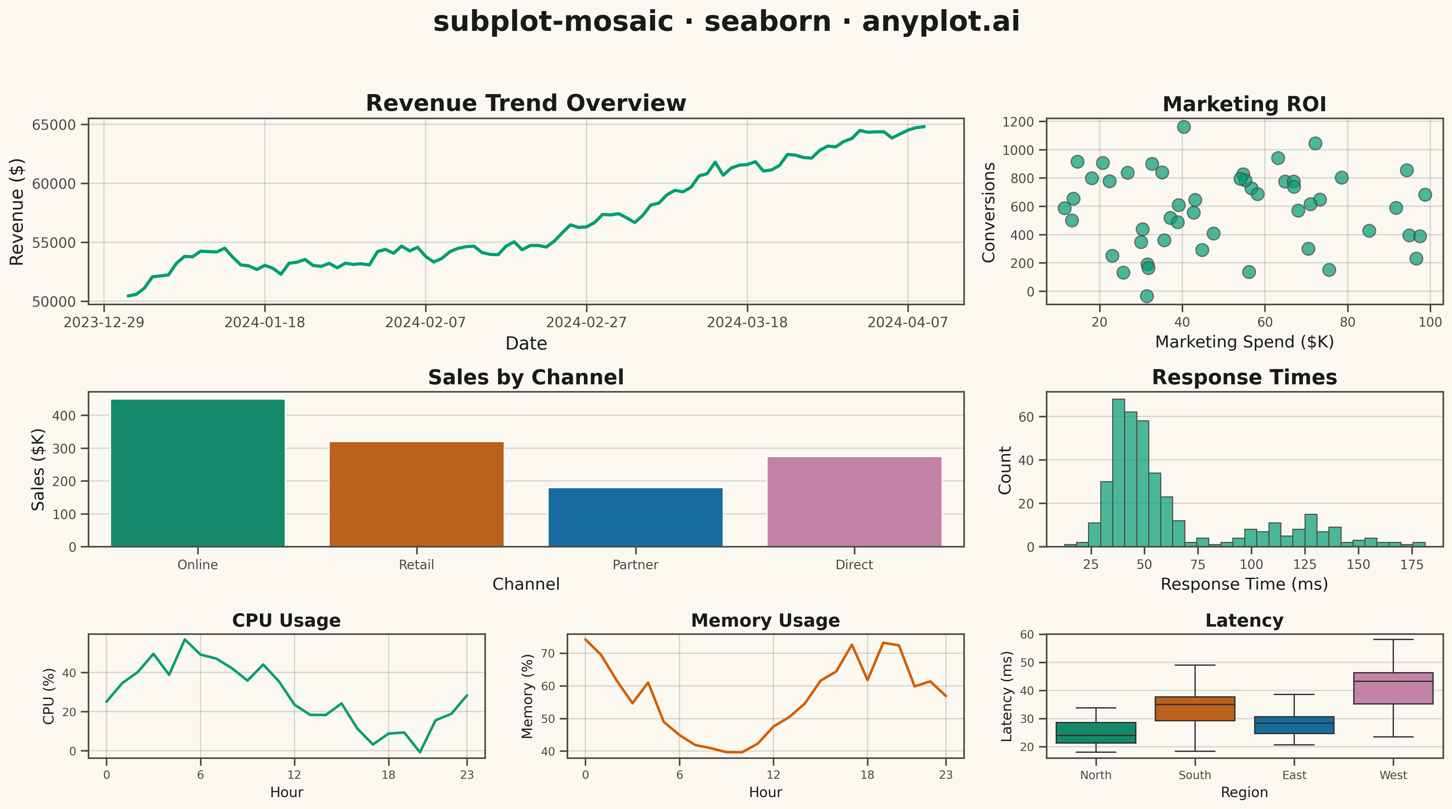
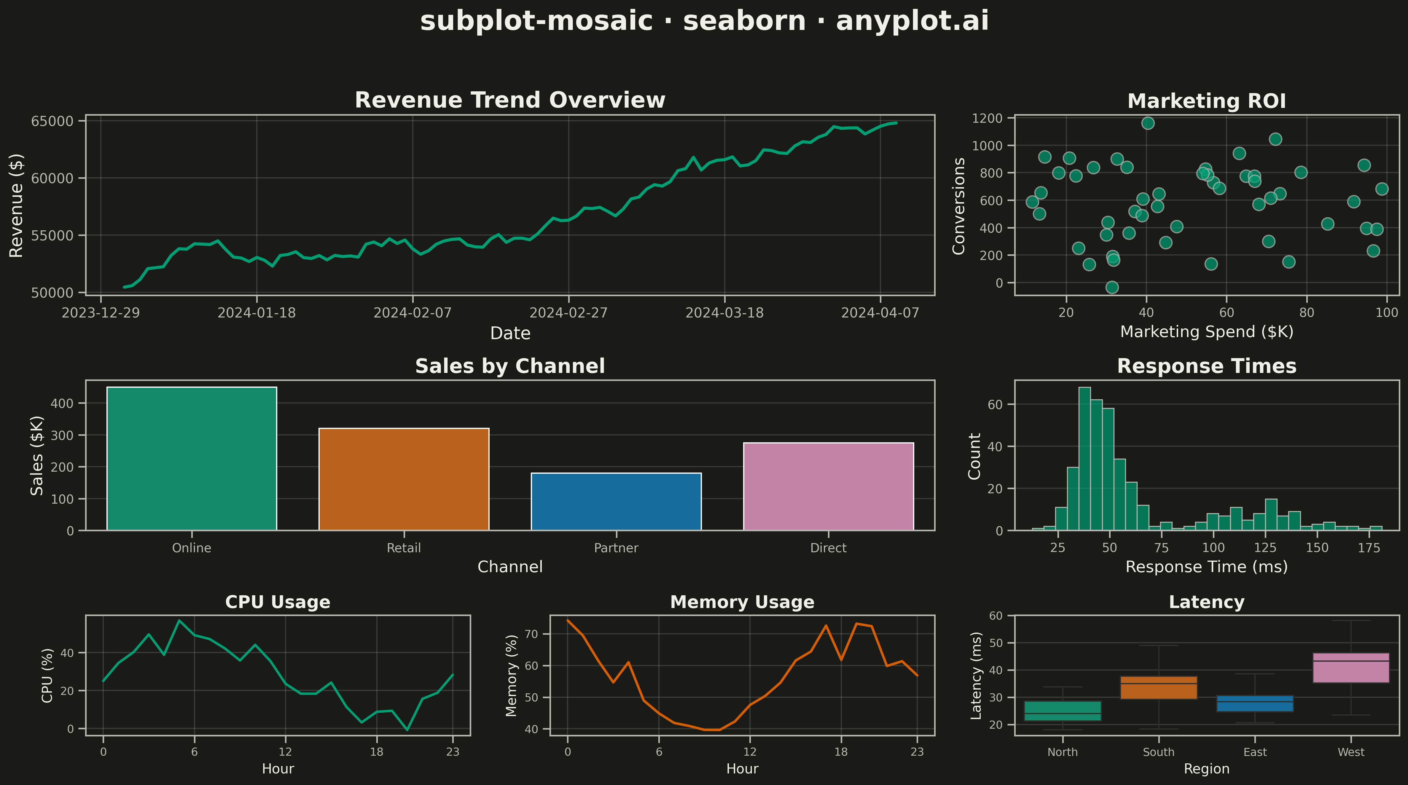
A complex subplot layout where different subplots can have varying sizes and arrangements using intuitive ASCII-art style string definitions. Unlike GridSpec approaches that require explicit row/column spanning, mosaic layouts allow defining layouts through visual string patterns (e.g., "AB;CC" creates A and B on top, C spanning below), making complex configurations more readable and maintainable.
""" anyplot.ai
subplot-mosaic: Mosaic Subplot Layout with Varying Sizes
Library: seaborn 0.13.2 | Python 3.13.13
Quality: 73/100 | Updated: 2026-05-14
"""

import matplotlib.pyplot as plt
import numpy as np
import pandas as pd
import seaborn as sns


# Data
np.random.seed(42)

# Time series data for main overview (Panel A - wide)
dates = pd.date_range("2024-01-01", periods=100, freq="D")
revenue = np.cumsum(np.random.randn(100) * 500 + 200) + 50000
df_overview = pd.DataFrame({"Date": dates, "Revenue ($)": revenue})

# Scatter data for panel B (top right)
df_scatter = pd.DataFrame(
    {
        "Marketing Spend ($K)": np.random.uniform(10, 100, 50),
        "Conversions": np.random.uniform(100, 1000, 50) + np.random.randn(50) * 100,
    }
)

# Bar data for panel C (middle left detail)
categories = ["Online", "Retail", "Partner", "Direct"]
df_bar = pd.DataFrame({"Channel": categories, "Sales ($K)": [450, 320, 180, 275]})

# Histogram data for panel D (middle right detail)
response_times = np.concatenate([np.random.normal(45, 10, 300), np.random.normal(120, 25, 100)])
df_hist = pd.DataFrame({"Response Time (ms)": response_times})

# Line data for panel E (bottom left metric)
hours = np.arange(24)
cpu_usage = 30 + 20 * np.sin(hours * np.pi / 12) + np.random.randn(24) * 5
df_cpu = pd.DataFrame({"Hour": hours, "CPU Usage (%)": cpu_usage})

# Line data for panel F (bottom center metric)
memory_usage = 55 + 15 * np.sin(hours * np.pi / 10 + 2) + np.random.randn(24) * 3
df_memory = pd.DataFrame({"Hour": hours, "Memory Usage (%)": memory_usage})

# Box data for panel G (bottom right metric)
regions = ["North", "South", "East", "West"]
df_box = pd.DataFrame(
    {
        "Region": np.repeat(regions, 30),
        "Latency (ms)": np.concatenate(
            [
                np.random.normal(25, 5, 30),
                np.random.normal(35, 8, 30),
                np.random.normal(28, 4, 30),
                np.random.normal(40, 10, 30),
            ]
        ),
    }
)

# Create mosaic layout: "AAB;CCD;EFG" pattern
# A spans 2 cols (wide overview), B is 1 col (scatter)
# C spans 2 cols (bar chart middle), D is 1 col (histogram)
# E, F, G each 1 col (three small metrics)
fig, axes = plt.subplot_mosaic(
    [["A", "A", "B"], ["C", "C", "D"], ["E", "F", "G"]], figsize=(16, 9), height_ratios=[1.2, 1, 0.8]
)

# Panel A: Revenue Overview (Line plot - wide)
sns.lineplot(data=df_overview, x="Date", y="Revenue ($)", ax=axes["A"], color="#306998", linewidth=2.5)
axes["A"].set_title("Revenue Trend Overview", fontsize=18, fontweight="bold")
axes["A"].set_xlabel("Date", fontsize=14)
axes["A"].set_ylabel("Revenue ($)", fontsize=14)
axes["A"].tick_params(axis="both", labelsize=11)
axes["A"].xaxis.set_major_locator(plt.MaxNLocator(6))
axes["A"].grid(True, alpha=0.3, linestyle="--")

# Panel B: Marketing vs Conversions (Scatter)
sns.scatterplot(
    data=df_scatter,
    x="Marketing Spend ($K)",
    y="Conversions",
    ax=axes["B"],
    color="#FFD43B",
    s=100,
    alpha=0.7,
    edgecolor="#306998",
    linewidth=1,
)
axes["B"].set_title("Marketing ROI", fontsize=16, fontweight="bold")
axes["B"].set_xlabel("Marketing Spend ($K)", fontsize=13)
axes["B"].set_ylabel("Conversions", fontsize=13)
axes["B"].tick_params(axis="both", labelsize=10)
axes["B"].grid(True, alpha=0.3, linestyle="--")

# Panel C: Sales by Channel (Bar - wide)
sns.barplot(
    data=df_bar,
    x="Channel",
    y="Sales ($K)",
    ax=axes["C"],
    hue="Channel",
    palette=["#306998", "#FFD43B", "#4B8BBE", "#FFE873"],
    legend=False,
)
axes["C"].set_title("Sales by Channel", fontsize=16, fontweight="bold")
axes["C"].set_xlabel("Channel", fontsize=13)
axes["C"].set_ylabel("Sales ($K)", fontsize=13)
axes["C"].tick_params(axis="both", labelsize=10)
axes["C"].grid(True, axis="y", alpha=0.3, linestyle="--")

# Panel D: Response Time Distribution (Histogram)
sns.histplot(data=df_hist, x="Response Time (ms)", ax=axes["D"], bins=30, color="#306998", alpha=0.7, edgecolor="white")
axes["D"].set_title("Response Times", fontsize=16, fontweight="bold")
axes["D"].set_xlabel("Response Time (ms)", fontsize=13)
axes["D"].set_ylabel("Count", fontsize=13)
axes["D"].tick_params(axis="both", labelsize=10)
axes["D"].grid(True, axis="y", alpha=0.3, linestyle="--")

# Panel E: CPU Usage (Small line)
sns.lineplot(data=df_cpu, x="Hour", y="CPU Usage (%)", ax=axes["E"], color="#306998", linewidth=2)
axes["E"].set_title("CPU Usage", fontsize=14, fontweight="bold")
axes["E"].set_xlabel("Hour", fontsize=11)
axes["E"].set_ylabel("CPU (%)", fontsize=11)
axes["E"].tick_params(axis="both", labelsize=9)
axes["E"].set_xticks([0, 6, 12, 18, 23])
axes["E"].grid(True, alpha=0.3, linestyle="--")

# Panel F: Memory Usage (Small line)
sns.lineplot(data=df_memory, x="Hour", y="Memory Usage (%)", ax=axes["F"], color="#FFD43B", linewidth=2)
axes["F"].set_title("Memory Usage", fontsize=14, fontweight="bold")
axes["F"].set_xlabel("Hour", fontsize=11)
axes["F"].set_ylabel("Memory (%)", fontsize=11)
axes["F"].tick_params(axis="both", labelsize=9)
axes["F"].set_xticks([0, 6, 12, 18, 23])
axes["F"].grid(True, alpha=0.3, linestyle="--")

# Panel G: Latency by Region (Small box)
sns.boxplot(
    data=df_box,
    x="Region",
    y="Latency (ms)",
    ax=axes["G"],
    hue="Region",
    palette=["#306998", "#FFD43B", "#4B8BBE", "#FFE873"],
    legend=False,
)
axes["G"].set_title("Latency", fontsize=14, fontweight="bold")
axes["G"].set_xlabel("Region", fontsize=11)
axes["G"].set_ylabel("Latency (ms)", fontsize=11)
axes["G"].tick_params(axis="both", labelsize=9)
axes["G"].grid(True, axis="y", alpha=0.3, linestyle="--")

# Main title
fig.suptitle("subplot-mosaic · seaborn · pyplots.ai", fontsize=22, fontweight="bold", y=0.98)

plt.tight_layout(rect=[0, 0, 1, 0.95])
plt.savefig("plot.png", dpi=300, bbox_inches="tight")
Runnable source as JSON, for any HTTP client: https://api.anyplot.ai/specs/subplot-mosaic/seaborn/code. Any spec id and library id listed in llms-full.txt fit the same URL shape; every URL below is complete and callable.
{
  "spec_id": "subplot-mosaic",
  "language": "python",
  "library": "seaborn",
  "page": "https://anyplot.ai/subplot-mosaic/python/seaborn",
  "hub": "https://anyplot.ai/subplot-mosaic",
  "code_json": "https://api.anyplot.ai/specs/subplot-mosaic/seaborn/code",
  "spec_json": "https://api.anyplot.ai/specs/subplot-mosaic",
  "render_light_png": "https://storage.googleapis.com/anyplot-images/plots/subplot-mosaic/python/seaborn/plot-light.png",
  "render_dark_png": "https://storage.googleapis.com/anyplot-images/plots/subplot-mosaic/python/seaborn/plot-dark.png",
  "quality_score": 73.0,
  "license": "MIT",
  "guide": "https://anyplot.ai/llms.txt"
}
Part of Mosaic Subplot Layout with Varying Sizes on anyplot.ai.