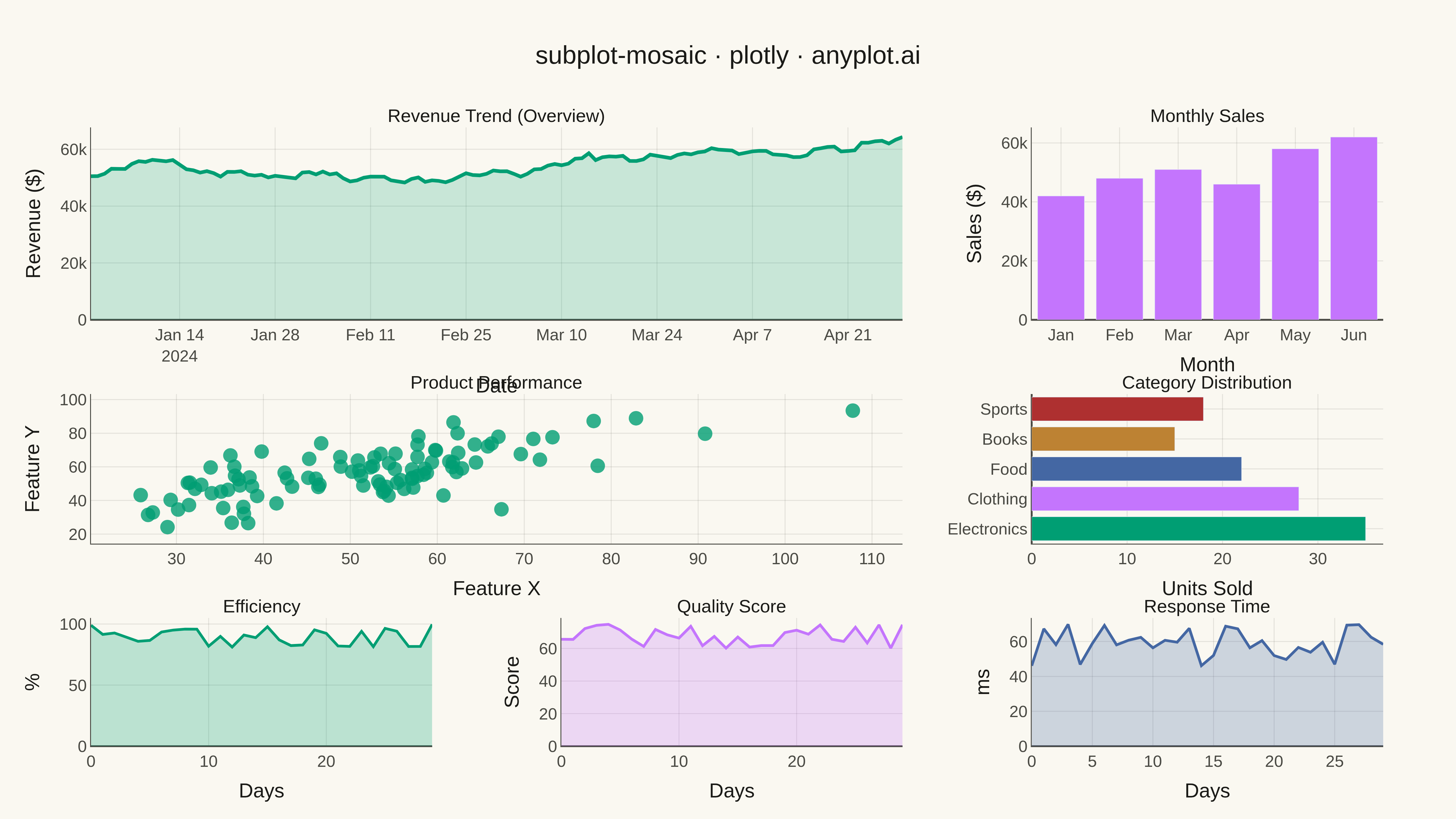
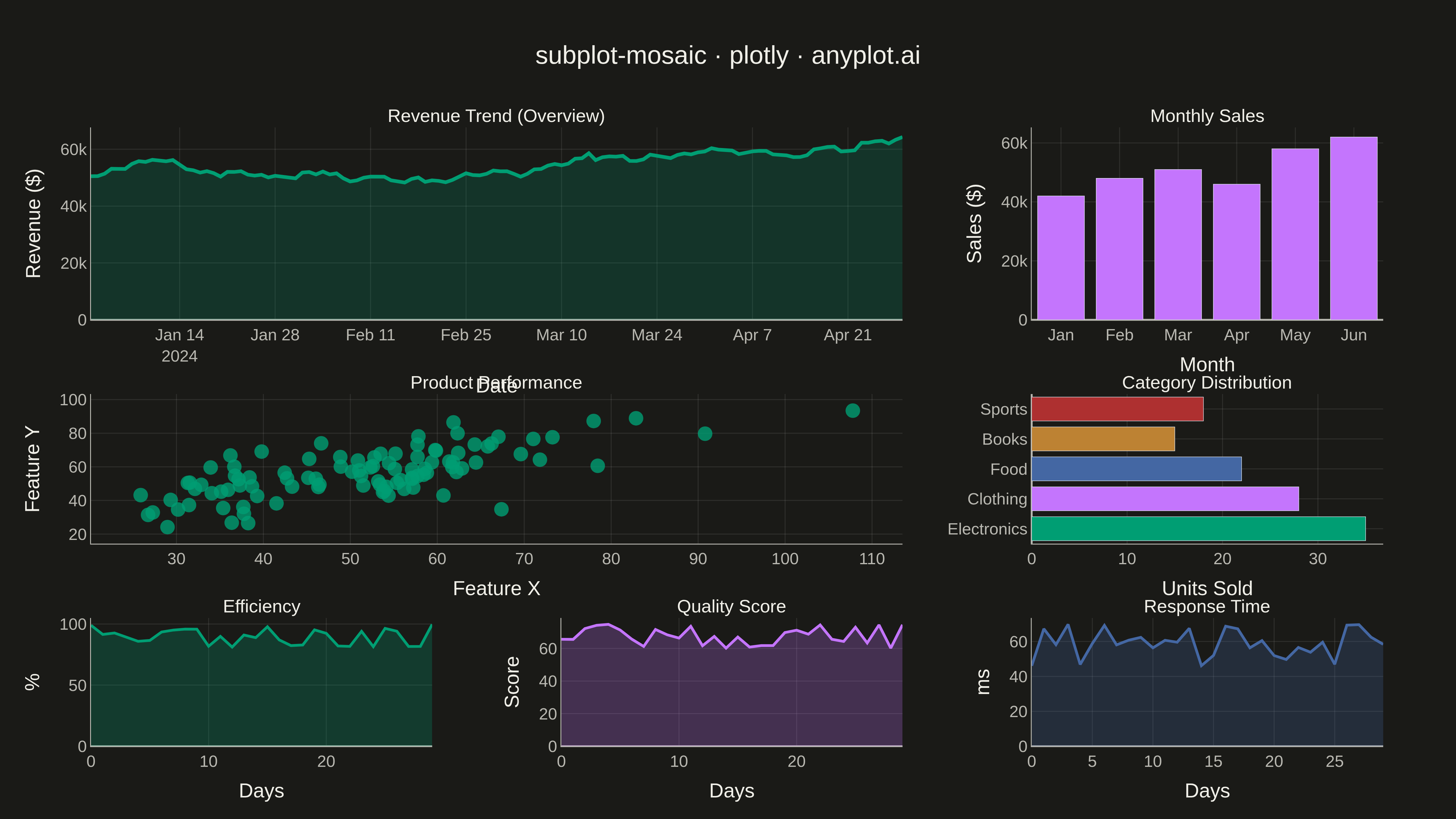
A complex subplot layout where different subplots can have varying sizes and arrangements using intuitive ASCII-art style string definitions. Unlike GridSpec approaches that require explicit row/column spanning, mosaic layouts allow defining layouts through visual string patterns (e.g., "AB;CC" creates A and B on top, C spanning below), making complex configurations more readable and maintainable.
""" anyplot.ai
subplot-mosaic: Mosaic Subplot Layout with Varying Sizes
Library: plotly 6.7.0 | Python 3.13.13
Quality: 91/100 | Updated: 2026-05-14
"""

import os

import numpy as np
import pandas as pd
import plotly.graph_objects as go
from plotly.subplots import make_subplots


# Theme tokens
THEME = os.getenv("ANYPLOT_THEME", "light")
PAGE_BG = "#FAF8F1" if THEME == "light" else "#1A1A17"
ELEVATED_BG = "#FFFDF6" if THEME == "light" else "#242420"
INK = "#1A1A17" if THEME == "light" else "#F0EFE8"
INK_SOFT = "#4A4A44" if THEME == "light" else "#B8B7B0"
GRID = "rgba(26,26,23,0.10)" if THEME == "light" else "rgba(240,239,232,0.10)"

# Okabe-Ito palette
IMPRINT = [
    "#009E73",  # brand — first series
    "#C475FD",
    "#4467A3",
    "#BD8233",
    "#AE3030",
    "#2ABCCD",
    "#954477",
]

# Data
np.random.seed(42)

# Time series data for the wide overview chart (A - spans top row)
dates = pd.date_range("2024-01-01", periods=120, freq="D")
revenue = 50000 + np.cumsum(np.random.randn(120) * 1000) + np.arange(120) * 200
revenue = np.maximum(revenue, 30000)

# Monthly breakdown for bar chart (B - top right)
months = ["Jan", "Feb", "Mar", "Apr", "May", "Jun"]
monthly_sales = [42000, 48000, 51000, 46000, 58000, 62000]

# Scatter data for distribution view (C - middle spanning)
product_x = np.random.randn(100) * 15 + 50
product_y = product_x * 0.7 + np.random.randn(100) * 10 + 20

# Category comparison (D - middle right)
categories = ["Electronics", "Clothing", "Food", "Books", "Sports"]
cat_values = [35, 28, 22, 15, 18]

# Metric panel data (E, F, G - bottom row)
metric_1_history = np.random.rand(30) * 20 + 80
metric_2_history = np.random.rand(30) * 15 + 60
metric_3_history = np.random.rand(30) * 25 + 45

# Create mosaic layout: "AAB;CCD;EFG"
# Row 1: A spans 2 cols, B takes 1 col
# Row 2: C spans 2 cols, D takes 1 col
# Row 3: E, F, G each take 1 col

fig = make_subplots(
    rows=3,
    cols=3,
    specs=[[{"colspan": 2}, None, {}], [{"colspan": 2}, None, {}], [{}, {}, {}]],
    row_heights=[0.45, 0.35, 0.30],
    column_widths=[0.33, 0.33, 0.34],
    subplot_titles=[
        "Revenue Trend (Overview)",
        "Monthly Sales",
        "Product Performance",
        "Category Distribution",
        "Efficiency",
        "Quality Score",
        "Response Time",
    ],
    vertical_spacing=0.12,
    horizontal_spacing=0.10,
)

# A: Revenue trend line (top spanning)
fig.add_trace(
    go.Scatter(
        x=dates,
        y=revenue,
        mode="lines",
        line={"color": IMPRINT[0], "width": 4},
        fill="tozeroy",
        fillcolor=f"rgba({int(IMPRINT[0][1:3], 16)}, {int(IMPRINT[0][3:5], 16)}, {int(IMPRINT[0][5:7], 16)}, 0.2)",
        name="Revenue",
    ),
    row=1,
    col=1,
)

# B: Monthly sales bar (top right)
fig.add_trace(go.Bar(x=months, y=monthly_sales, marker_color=IMPRINT[1], name="Monthly"), row=1, col=3)

# C: Product scatter (middle spanning) — INCREASED marker size
fig.add_trace(
    go.Scatter(
        x=product_x,
        y=product_y,
        mode="markers",
        marker={"size": 16, "color": IMPRINT[0], "opacity": 0.8},
        name="Products",
    ),
    row=2,
    col=1,
)

# D: Category horizontal bar (middle right)
fig.add_trace(
    go.Bar(
        y=categories,
        x=cat_values,
        orientation="h",
        marker_color=[IMPRINT[0], IMPRINT[1], IMPRINT[2], IMPRINT[3], IMPRINT[4]],
        name="Categories",
    ),
    row=2,
    col=3,
)

# E: Efficiency metric (bottom left)
fig.add_trace(
    go.Scatter(
        x=list(range(30)),
        y=metric_1_history,
        mode="lines",
        line={"color": IMPRINT[0], "width": 3},
        fill="tozeroy",
        fillcolor=f"rgba({int(IMPRINT[0][1:3], 16)}, {int(IMPRINT[0][3:5], 16)}, {int(IMPRINT[0][5:7], 16)}, 0.25)",
        name="Efficiency",
    ),
    row=3,
    col=1,
)

# F: Quality score metric (bottom middle)
fig.add_trace(
    go.Scatter(
        x=list(range(30)),
        y=metric_2_history,
        mode="lines",
        line={"color": IMPRINT[1], "width": 3},
        fill="tozeroy",
        fillcolor=f"rgba({int(IMPRINT[1][1:3], 16)}, {int(IMPRINT[1][3:5], 16)}, {int(IMPRINT[1][5:7], 16)}, 0.25)",
        name="Quality",
    ),
    row=3,
    col=2,
)

# G: Response time metric (bottom right)
fig.add_trace(
    go.Scatter(
        x=list(range(30)),
        y=metric_3_history,
        mode="lines",
        line={"color": IMPRINT[2], "width": 3},
        fill="tozeroy",
        fillcolor=f"rgba({int(IMPRINT[2][1:3], 16)}, {int(IMPRINT[2][3:5], 16)}, {int(IMPRINT[2][5:7], 16)}, 0.25)",
        name="Response",
    ),
    row=3,
    col=3,
)

# Update layout with theme-adaptive colors
fig.update_layout(
    title={
        "text": "subplot-mosaic · plotly · anyplot.ai",
        "font": {"size": 28, "color": INK},
        "x": 0.5,
        "xanchor": "center",
    },
    paper_bgcolor=PAGE_BG,
    plot_bgcolor=PAGE_BG,
    font={"color": INK},
    showlegend=False,
    margin={"l": 100, "r": 80, "t": 140, "b": 80},
    hovermode="closest",
)

# Update axes with theme-adaptive colors
fig.update_xaxes(
    tickfont={"size": 18, "color": INK_SOFT},
    title_font={"size": 22, "color": INK},
    gridcolor=GRID,
    linecolor=INK_SOFT,
    zerolinecolor=INK_SOFT,
)

fig.update_yaxes(
    tickfont={"size": 18, "color": INK_SOFT},
    title_font={"size": 22, "color": INK},
    gridcolor=GRID,
    linecolor=INK_SOFT,
    zerolinecolor=INK_SOFT,
)

# Axis labels
fig.update_xaxes(title_text="Date", row=1, col=1)
fig.update_yaxes(title_text="Revenue ($)", row=1, col=1)
fig.update_xaxes(title_text="Month", row=1, col=3)
fig.update_yaxes(title_text="Sales ($)", row=1, col=3)
fig.update_xaxes(title_text="Feature X", row=2, col=1)
fig.update_yaxes(title_text="Feature Y", row=2, col=1)
fig.update_xaxes(title_text="Units Sold", row=2, col=3)
fig.update_xaxes(title_text="Days", row=3, col=1)
fig.update_yaxes(title_text="%", row=3, col=1)
fig.update_xaxes(title_text="Days", row=3, col=2)
fig.update_yaxes(title_text="Score", row=3, col=2)
fig.update_xaxes(title_text="Days", row=3, col=3)
fig.update_yaxes(title_text="ms", row=3, col=3)

# Update subplot titles font size and color
fig.update_annotations(font_size=20, font_color=INK)

# Save as PNG and HTML
fig.write_image(f"plot-{THEME}.png", width=1600, height=900, scale=3)
fig.write_html(f"plot-{THEME}.html", include_plotlyjs="cdn")
Runnable source as JSON, for any HTTP client: https://api.anyplot.ai/specs/subplot-mosaic/plotly/code. Any spec id and library id listed in llms-full.txt fit the same URL shape; every URL below is complete and callable.
{
  "spec_id": "subplot-mosaic",
  "language": "python",
  "library": "plotly",
  "page": "https://anyplot.ai/subplot-mosaic/python/plotly",
  "hub": "https://anyplot.ai/subplot-mosaic",
  "code_json": "https://api.anyplot.ai/specs/subplot-mosaic/plotly/code",
  "spec_json": "https://api.anyplot.ai/specs/subplot-mosaic",
  "render_light_png": "https://storage.googleapis.com/anyplot-images/plots/subplot-mosaic/python/plotly/plot-light.png",
  "render_dark_png": "https://storage.googleapis.com/anyplot-images/plots/subplot-mosaic/python/plotly/plot-dark.png",
  "interactive_light_html": "https://storage.googleapis.com/anyplot-images/plots/subplot-mosaic/python/plotly/plot-light.html",
  "interactive_dark_html": "https://storage.googleapis.com/anyplot-images/plots/subplot-mosaic/python/plotly/plot-dark.html",
  "quality_score": 91.0,
  "license": "MIT",
  "guide": "https://anyplot.ai/llms.txt"
}
Part of Mosaic Subplot Layout with Varying Sizes on anyplot.ai.