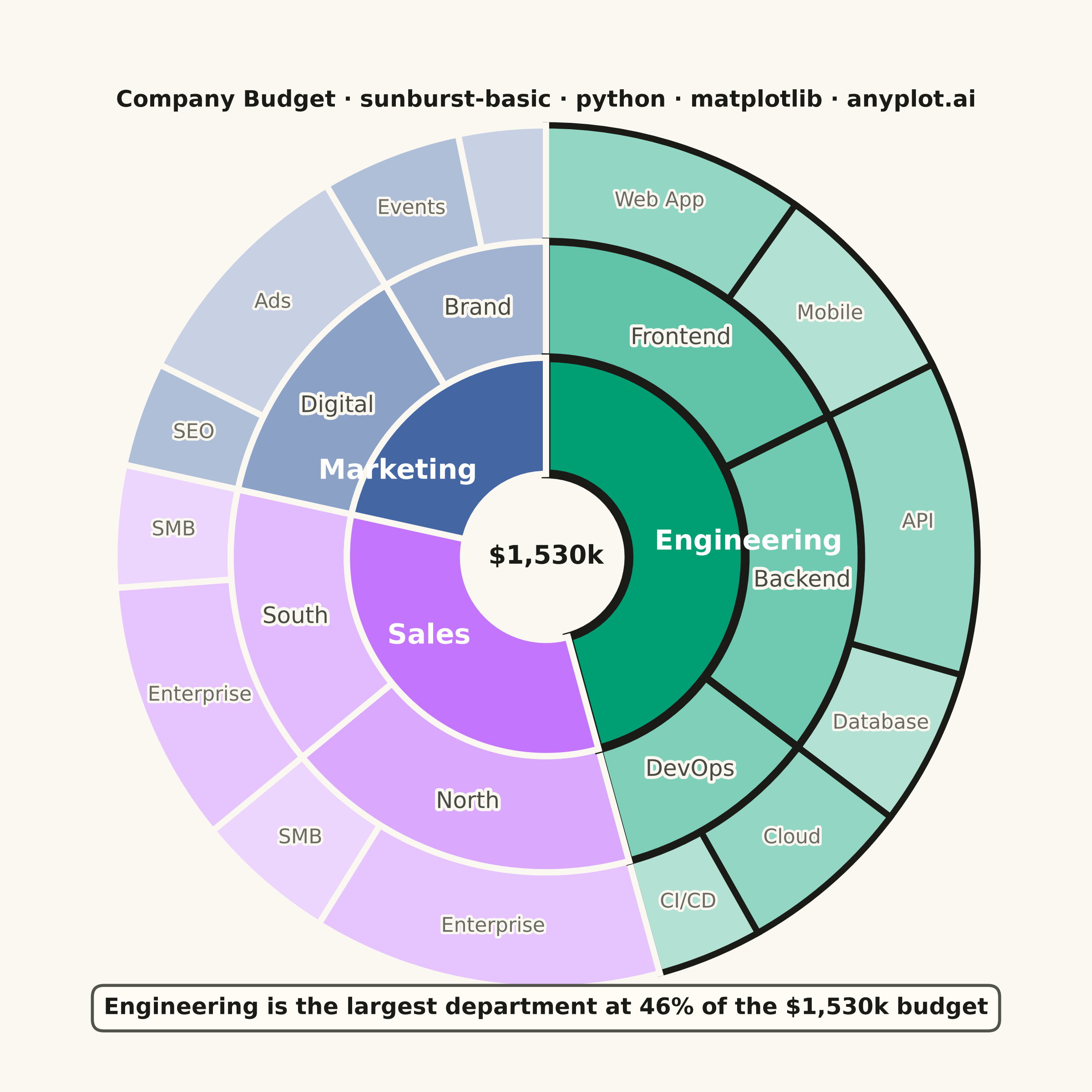
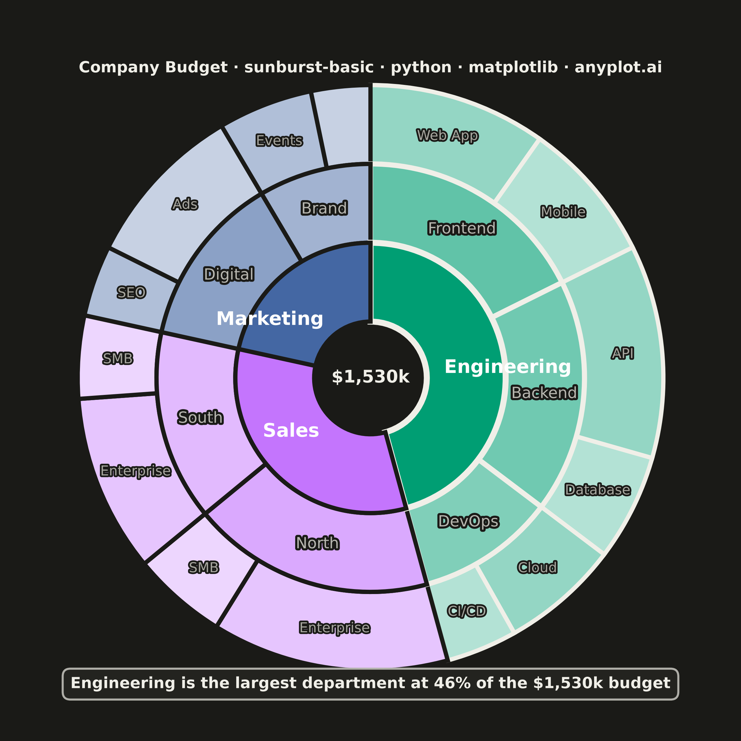
A sunburst chart displays hierarchical data as concentric rings, where each ring represents a level in the hierarchy. Inner rings show parent categories while outer rings show their children, with segment angles proportional to values. This radial visualization excels at revealing hierarchical structures and part-to-whole relationships across multiple levels simultaneously.
""" anyplot.ai
sunburst-basic: Basic Sunburst Chart
Library: matplotlib 3.11.1 | Python 3.13.14
Quality: 94/100 | Updated: 2026-07-26
"""

import os

import matplotlib.patheffects as pe
import matplotlib.pyplot as plt
import numpy as np


# Theme-adaptive chrome tokens (Imprint)
THEME = os.getenv("ANYPLOT_THEME", "light")
PAGE_BG = "#FAF8F1" if THEME == "light" else "#1A1A17"
ELEVATED_BG = "#FFFDF6" if THEME == "light" else "#242420"
INK = "#1A1A17" if THEME == "light" else "#F0EFE8"
INK_SOFT = "#4A4A44" if THEME == "light" else "#B8B7B0"
INK_MUTED = "#6B6A63" if THEME == "light" else "#A8A79F"

# Imprint palette base colors for level-1 departments (positions 1-3)
IMPRINT = ["#009E73", "#C475FD", "#4467A3"]
IMPRINT_RGB = [tuple(int(c[j : j + 2], 16) / 255 for j in (1, 3, 5)) for c in IMPRINT]

# Data: Company budget breakdown ($thousands)
data = {
    "Engineering": {
        "Frontend": {"Web App": 150, "Mobile": 120},
        "Backend": {"API": 180, "Database": 90},
        "DevOps": {"Cloud": 100, "CI/CD": 60},
    },
    "Sales": {"North": {"Enterprise": 200, "SMB": 80}, "South": {"Enterprise": 150, "SMB": 70}},
    "Marketing": {"Digital": {"SEO": 60, "Ads": 140}, "Brand": {"Events": 80, "Content": 50}},
}

# Build flat lists per ring, tracking which department each slice belongs to
level1_names, level1_values, level1_colors = [], [], []
level2_names, level2_values, level2_colors, level2_dept = [], [], [], []
level3_names, level3_values, level3_colors, level3_dept = [], [], [], []

for i, (dept, teams) in enumerate(data.items()):
    dept_total = sum(sum(projs.values()) for projs in teams.values())
    level1_names.append(dept)
    level1_values.append(dept_total)
    level1_colors.append(IMPRINT[i])

    r, g, b = IMPRINT_RGB[i]
    team_items = list(teams.items())
    n_teams = len(team_items)
    for j, (team, projects) in enumerate(team_items):
        team_total = sum(projects.values())
        level2_names.append(team)
        level2_values.append(team_total)
        level2_dept.append(i)
        f2 = 0.38 + 0.12 * j / max(n_teams - 1, 1)
        level2_colors.append((min(1, r + (1 - r) * f2), min(1, g + (1 - g) * f2), min(1, b + (1 - b) * f2)))

        proj_items = list(projects.items())
        n_projs = len(proj_items)
        for k, (proj, value) in enumerate(proj_items):
            level3_names.append(proj)
            level3_values.append(value)
            level3_dept.append(i)
            f3 = 0.58 + 0.12 * k / max(n_projs - 1, 1)
            level3_colors.append((min(1, r + (1 - r) * f3), min(1, g + (1 - g) * f3), min(1, b + (1 - b) * f3)))

# Focal point: the department that takes the largest share of the budget
total_budget = sum(level1_values)
top_idx = int(np.argmax(level1_values))
top_share = level1_values[top_idx] / total_budget

# Plot — square canvas for radial chart
fig, ax = plt.subplots(figsize=(6, 6), dpi=400, facecolor=PAGE_BG)
ax.set_facecolor(PAGE_BG)

ring_width = 0.35
inner_radius = 0.25
outer_radius = inner_radius + 3 * ring_width

# Level 3 (outermost ring)
wedges3, _ = ax.pie(
    level3_values,
    radius=outer_radius,
    colors=level3_colors,
    startangle=90,
    counterclock=False,
    wedgeprops={"width": ring_width, "edgecolor": PAGE_BG, "linewidth": 2.5},
)

# Level 2 (middle ring)
wedges2, _ = ax.pie(
    level2_values,
    radius=inner_radius + 2 * ring_width,
    colors=level2_colors,
    startangle=90,
    counterclock=False,
    wedgeprops={"width": ring_width, "edgecolor": PAGE_BG, "linewidth": 2.5},
)

# Level 1 (innermost ring) with department labels inside wedges
wedges1, texts1 = ax.pie(
    level1_values,
    radius=inner_radius + ring_width,
    colors=level1_colors,
    labels=level1_names,
    labeldistance=0.55,
    startangle=90,
    counterclock=False,
    wedgeprops={"width": ring_width, "edgecolor": PAGE_BG, "linewidth": 2.5},
    textprops={"fontsize": 11, "fontweight": "bold", "color": "white"},
)

# Emphasize the largest department across all three rings — the chart's focal point
wedges1[top_idx].set_edgecolor(INK)
wedges1[top_idx].set_linewidth(3.5)
for i, wedge in enumerate(wedges2):
    if level2_dept[i] == top_idx:
        wedge.set_edgecolor(INK)
        wedge.set_linewidth(3)
for i, wedge in enumerate(wedges3):
    if level3_dept[i] == top_idx:
        wedge.set_edgecolor(INK)
        wedge.set_linewidth(2.5)

# Level 2 segment labels (positioned at ring midpoint) — stroke halo keeps
# theme-adaptive ink legible against the (theme-constant) tinted ring fill
for i, wedge in enumerate(wedges2):
    ang = (wedge.theta2 + wedge.theta1) / 2
    r_mid = inner_radius + 1.5 * ring_width
    x = r_mid * np.cos(np.radians(ang))
    y = r_mid * np.sin(np.radians(ang))
    if (wedge.theta2 - wedge.theta1) > 15:
        ax.text(
            x,
            y,
            level2_names[i],
            ha="center",
            va="center",
            fontsize=9,
            fontweight="medium",
            color=INK_SOFT,
            path_effects=[pe.withStroke(linewidth=2.5, foreground=PAGE_BG)],
        )

# Level 3 segment labels (outermost ring midpoint)
for i, wedge in enumerate(wedges3):
    ang = (wedge.theta2 + wedge.theta1) / 2
    r_mid = inner_radius + 2.5 * ring_width
    x = r_mid * np.cos(np.radians(ang))
    y = r_mid * np.sin(np.radians(ang))
    if (wedge.theta2 - wedge.theta1) > 12:
        ax.text(
            x,
            y,
            level3_names[i],
            ha="center",
            va="center",
            fontsize=8,
            color=INK_MUTED,
            path_effects=[pe.withStroke(linewidth=2, foreground=PAGE_BG)],
        )

# Center hole: total budget as a grounding reference figure
ax.text(0, 0, f"${total_budget:,}k", ha="center", va="center", fontsize=10, fontweight="bold", color=INK)

ax.set_aspect("equal")

# Key-insight caption (axes-fraction coords — independent of the pie's data
# limits, so it can never clip regardless of wedge geometry): the focal point
# the bold ink outline on the largest department draws the eye to.
ax.text(
    0.5,
    -0.03,
    f"{level1_names[top_idx]} is the largest department at {top_share:.0%} of the ${total_budget:,}k budget",
    transform=ax.transAxes,
    ha="center",
    va="top",
    fontsize=9,
    fontweight="bold",
    color=INK,
    bbox={
        "boxstyle": "round,pad=0.5",
        "facecolor": ELEVATED_BG,
        "edgecolor": INK_SOFT,
        "linewidth": 1.2,
        "alpha": 0.95,
    },
)

title = "Company Budget · sunburst-basic · python · matplotlib · anyplot.ai"
ax.set_title(title, fontsize=9, fontweight="bold", pad=14, color=INK)
fig.subplots_adjust(left=0.03, right=0.97, top=0.87, bottom=0.11)

# Save — bbox_inches MUST stay default (None) so figsize x dpi hits 2400x2400 exactly
plt.savefig(f"plot-{THEME}.png", dpi=400, facecolor=PAGE_BG)
Runnable source as JSON, for any HTTP client: https://api.anyplot.ai/specs/sunburst-basic/matplotlib/code. Any spec id and library id listed in llms-full.txt fit the same URL shape; every URL below is complete and callable.
{
  "spec_id": "sunburst-basic",
  "language": "python",
  "library": "matplotlib",
  "page": "https://anyplot.ai/sunburst-basic/python/matplotlib",
  "hub": "https://anyplot.ai/sunburst-basic",
  "code_json": "https://api.anyplot.ai/specs/sunburst-basic/matplotlib/code",
  "spec_json": "https://api.anyplot.ai/specs/sunburst-basic",
  "render_light_png": "https://storage.googleapis.com/anyplot-images/plots/sunburst-basic/python/matplotlib/plot-light.png",
  "render_dark_png": "https://storage.googleapis.com/anyplot-images/plots/sunburst-basic/python/matplotlib/plot-dark.png",
  "quality_score": 94.0,
  "license": "MIT",
  "guide": "https://anyplot.ai/llms.txt"
}
Part of Basic Sunburst Chart on anyplot.ai.