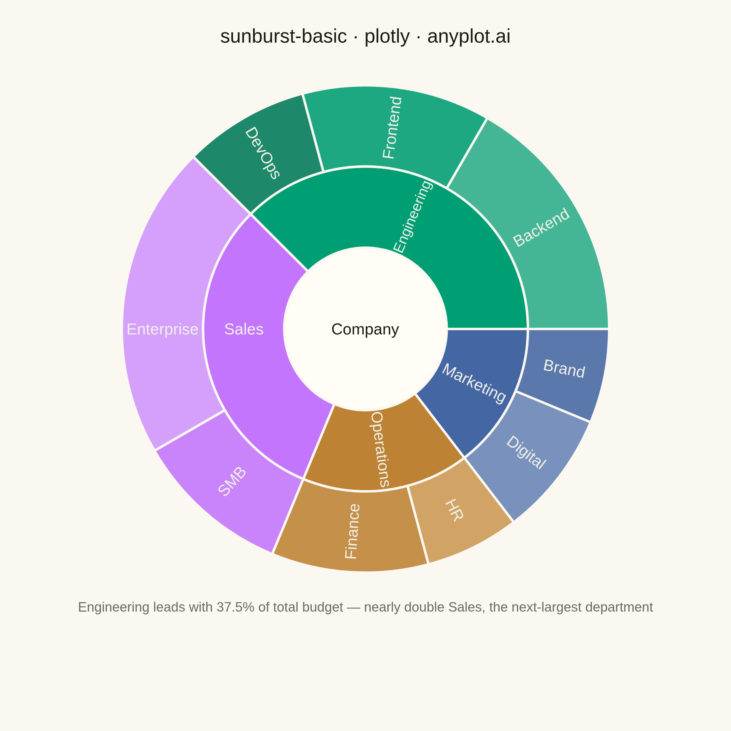
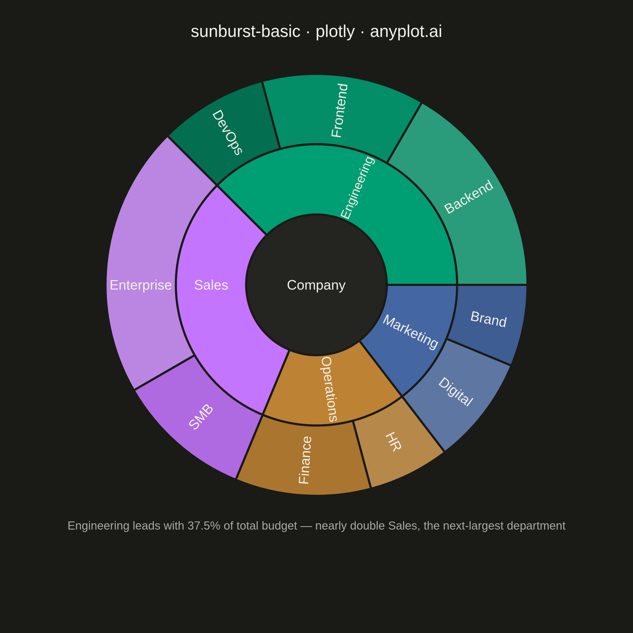
A sunburst chart displays hierarchical data as concentric rings, where each ring represents a level in the hierarchy. Inner rings show parent categories while outer rings show their children, with segment angles proportional to values. This radial visualization excels at revealing hierarchical structures and part-to-whole relationships across multiple levels simultaneously.
""" anyplot.ai
sunburst-basic: Basic Sunburst Chart
Library: plotly 6.9.0 | Python 3.13.14
Quality: 94/100 | Updated: 2026-07-26
"""

import os

import plotly.graph_objects as go


THEME = os.getenv("ANYPLOT_THEME", "light")
PAGE_BG = "#FAF8F1" if THEME == "light" else "#1A1A17"
ELEVATED_BG = "#FFFDF6" if THEME == "light" else "#242420"
INK = "#1A1A17" if THEME == "light" else "#F0EFE8"
INK_MUTED = "#6B6A63" if THEME == "light" else "#A8A79F"

# Off-black / off-white text tokens for on-segment labels — never pure #000/#FFF
DARK_TEXT = "#1A1A17"
LIGHT_TEXT = "#F0EFE8"


def _on_segment_text_color(hex_color):
    """WCAG relative luminance -> pick the off-black or off-white text token."""
    r, g, b = (int(hex_color.lstrip("#")[i : i + 2], 16) / 255 for i in (0, 2, 4))

    def _lin(c):
        return c / 12.92 if c <= 0.04045 else ((c + 0.055) / 1.055) ** 2.4

    luminance = 0.2126 * _lin(r) + 0.7152 * _lin(g) + 0.0722 * _lin(b)
    return DARK_TEXT if luminance > 0.45 else LIGHT_TEXT


labels = [
    "Company",
    "Engineering",
    "Sales",
    "Marketing",
    "Operations",
    "Backend",
    "Frontend",
    "DevOps",
    "Enterprise",
    "SMB",
    "Digital",
    "Brand",
    "HR",
    "Finance",
]

parents = [
    "",
    "Company",
    "Company",
    "Company",
    "Company",
    "Engineering",
    "Engineering",
    "Engineering",
    "Sales",
    "Sales",
    "Marketing",
    "Marketing",
    "Operations",
    "Operations",
]

# Values in $M — branchvalues="total" so each parent value equals sum of its children
values = [
    48,  # Company
    18,  # Engineering — dominant at 37.5% of total
    15,  # Sales
    7,  # Marketing
    8,  # Operations
    8,  # Backend
    6,  # Frontend
    4,  # DevOps
    10,  # Enterprise
    5,  # SMB
    4,  # Digital
    3,  # Brand
    3,  # HR
    5,  # Finance
]

# Okabe-Ito palette — departments get canonical positions 1-4,
# teams get lighter/darker variants to preserve family grouping
colors = [
    ELEVATED_BG,  # Company root — adapts cleanly to both light and dark themes
    "#009E73",  # Engineering — Okabe-Ito #1 (dominant: 37.5%)
    "#C475FD",  # Sales — Okabe-Ito #2
    "#4467A3",  # Marketing — Okabe-Ito #3
    "#BD8233",  # Operations — Okabe-Ito #4
    "#2DAE89",  # Backend — lighter green
    "#009E73",  # Frontend — base green
    "#007A58",  # DevOps — darker green
    "#D195FE",  # Enterprise — lighter lavender
    "#C475FD",  # SMB — base lavender
    "#6883B6",  # Digital — lighter blue
    "#4467A3",  # Brand — base blue
    "#CC9852",  # HR — lighter ochre
    "#BD8233",  # Finance — base ochre
]

# Explicit per-segment text color (WCAG luminance) instead of relying on
# Plotly's implicit auto-contrast — keeps legibility fully under our control.
text_colors = [_on_segment_text_color(c) for c in colors]

fig = go.Figure(
    go.Sunburst(
        labels=labels,
        parents=parents,
        values=values,
        branchvalues="total",
        marker={"colors": colors, "line": {"color": PAGE_BG, "width": 2}},
        textfont={"size": 13, "color": text_colors},
        insidetextorientation="radial",
        hovertemplate="<b>%{label}</b><br>Budget: $%{value}M<br>%{percentParent:.1%} of %{parent}<extra></extra>",
        leaf={"opacity": 0.88},
    )
)

fig.update_layout(
    title={
        "text": "sunburst-basic · plotly · anyplot.ai",
        "font": {"size": 16, "color": INK},
        "x": 0.5,
        "xanchor": "center",
    },
    autosize=False,
    paper_bgcolor=PAGE_BG,
    plot_bgcolor=PAGE_BG,
    font={"color": INK},
    margin={"t": 70, "l": 40, "r": 40, "b": 130},
)

# Insight annotation — surface Engineering's outsized 37.5% share
fig.add_annotation(
    text="Engineering leads with 37.5% of total budget — nearly double Sales, the next-largest department",
    xref="paper",
    yref="paper",
    x=0.5,
    y=-0.09,
    xanchor="center",
    yanchor="bottom",
    font={"size": 11, "color": INK_MUTED},
    showarrow=False,
)

# Square format — optimal for symmetric radial charts (2400x2400 via width=600 height=600 scale=4)
fig.write_image(f"plot-{THEME}.png", width=600, height=600, scale=4)
fig.write_html(f"plot-{THEME}.html", include_plotlyjs="cdn")
Runnable source as JSON, for any HTTP client: https://api.anyplot.ai/specs/sunburst-basic/plotly/code. Any spec id and library id listed in llms-full.txt fit the same URL shape; every URL below is complete and callable.
{
  "spec_id": "sunburst-basic",
  "language": "python",
  "library": "plotly",
  "page": "https://anyplot.ai/sunburst-basic/python/plotly",
  "hub": "https://anyplot.ai/sunburst-basic",
  "code_json": "https://api.anyplot.ai/specs/sunburst-basic/plotly/code",
  "spec_json": "https://api.anyplot.ai/specs/sunburst-basic",
  "render_light_png": "https://storage.googleapis.com/anyplot-images/plots/sunburst-basic/python/plotly/plot-light.png",
  "render_dark_png": "https://storage.googleapis.com/anyplot-images/plots/sunburst-basic/python/plotly/plot-dark.png",
  "interactive_light_html": "https://storage.googleapis.com/anyplot-images/plots/sunburst-basic/python/plotly/plot-light.html",
  "interactive_dark_html": "https://storage.googleapis.com/anyplot-images/plots/sunburst-basic/python/plotly/plot-dark.html",
  "quality_score": 94.0,
  "license": "MIT",
  "guide": "https://anyplot.ai/llms.txt"
}
Part of Basic Sunburst Chart on anyplot.ai.