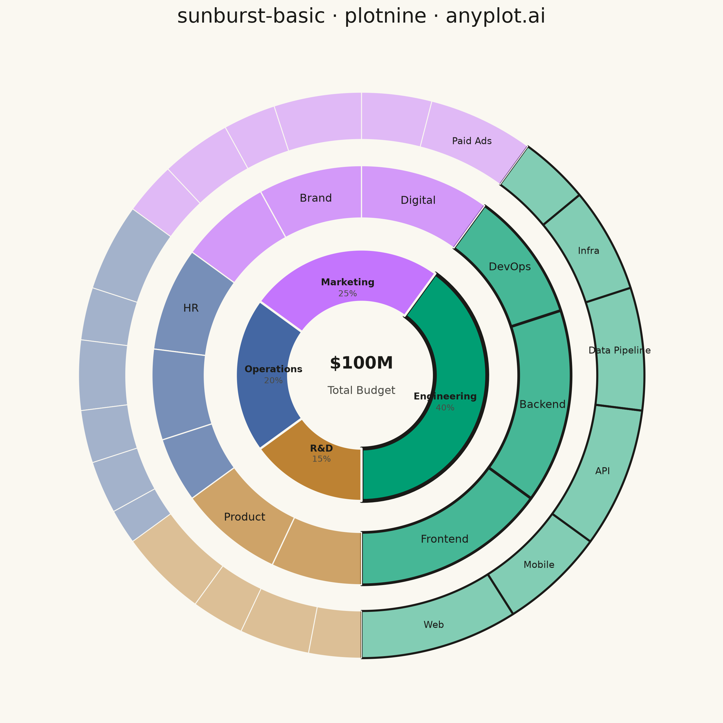
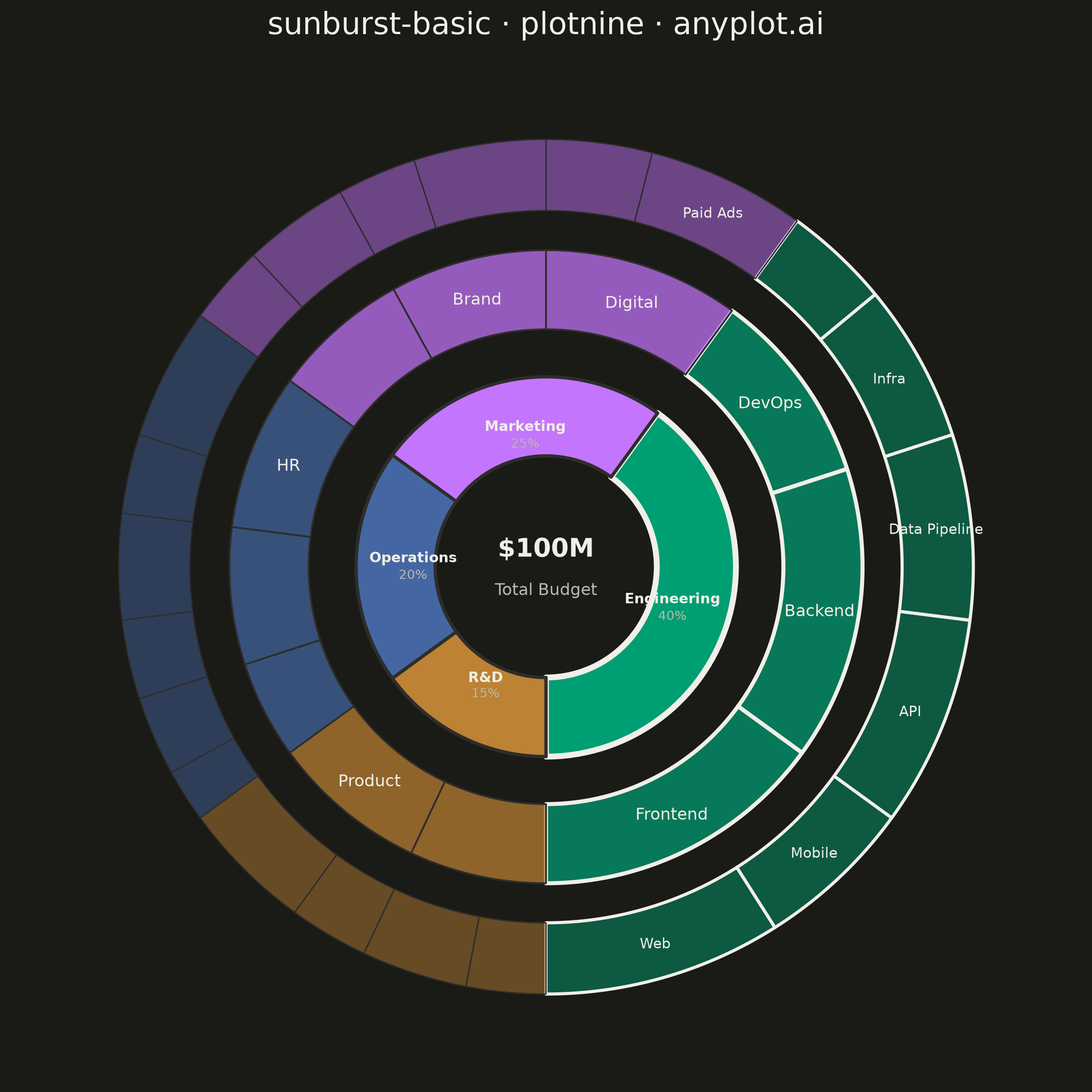
A sunburst chart displays hierarchical data as concentric rings, where each ring represents a level in the hierarchy. Inner rings show parent categories while outer rings show their children, with segment angles proportional to values. This radial visualization excels at revealing hierarchical structures and part-to-whole relationships across multiple levels simultaneously.
""" anyplot.ai
sunburst-basic: Basic Sunburst Chart
Library: plotnine 0.15.7 | Python 3.13.14
Quality: 87/100 | Updated: 2026-07-26
"""

import sys


sys.path.pop(0)  # prevent this file from shadowing the installed plotnine package

import os

import numpy as np
import pandas as pd
from plotnine import (
    aes,
    coord_equal,
    element_blank,
    element_rect,
    element_text,
    geom_polygon,
    geom_text,
    ggplot,
    labs,
    scale_color_manual,
    scale_fill_manual,
    scale_size_manual,
    scale_x_continuous,
    scale_y_continuous,
    theme,
)


# Theme tokens
THEME = os.getenv("ANYPLOT_THEME", "light")
PAGE_BG = "#FAF8F1" if THEME == "light" else "#1A1A17"
INK = "#1A1A17" if THEME == "light" else "#F0EFE8"
INK_SOFT = "#4A4A44" if THEME == "light" else "#B8B7B0"
# Slightly lighter than PAGE_BG in dark mode so ring boundaries remain visible
RING_SEP = PAGE_BG if THEME == "light" else "#2E2D2B"

IMPRINT = ["#009E73", "#C475FD", "#4467A3", "#BD8233"]

# Data: company annual budget by department -> team -> subproject ($M), 3 hierarchy levels
hierarchy = {
    "Engineering": {
        "Frontend": {"Web": 9, "Mobile": 6},
        "Backend": {"API": 8, "Data Pipeline": 7},
        "DevOps": {"Infra": 6, "CI/CD": 4},
    },
    "Marketing": {
        "Digital": {"Paid Ads": 6, "SEO": 4},
        "Brand": {"Design": 5, "Content": 3},
        "Events": {"Conferences": 4, "Webinars": 3},
    },
    "Operations": {
        "HR": {"Recruiting": 5, "Benefits": 3},
        "Finance": {"Accounting": 4, "Payroll": 3},
        "Legal": {"Contracts": 3, "Compliance": 2},
    },
    "R&D": {"Product": {"Roadmap": 5, "UX Research": 3}, "Data Science": {"ML": 4, "Analytics": 3}},
}

dept_colors = dict(zip(hierarchy, IMPRINT, strict=False))

dept_totals = {dept: sum(sum(sub.values()) for sub in teams.values()) for dept, teams in hierarchy.items()}
total = sum(dept_totals.values())
focal_dept = max(dept_totals, key=dept_totals.get)  # largest segment gets a focal-point accent

# Ring radii: 3 concentric bands (department -> team -> subproject). Generous gaps between
# bands (0.10-0.12) keep long horizontally-oriented labels (e.g. "Engineering" at a near-0deg
# mid-angle) from bleeding radially into the next ring's label.
R1_IN, R1_OUT = 0.28, 0.48
R2_IN, R2_OUT = 0.60, 0.80
R3_IN, R3_OUT = 0.90, 1.08
N_PTS = 60  # arc resolution

l1_rows, l2_rows, l3_rows, label_rows = [], [], [], []
cumsum = 0


def arc_polygon(a0, a1, r_in, r_out):
    t = np.linspace(a0, a1, N_PTS)
    xs = np.concatenate([r_in * np.cos(t), r_out * np.cos(t[::-1])])
    ys = np.concatenate([r_in * np.sin(t), r_out * np.sin(t[::-1])])
    return xs, ys


for dept, teams in hierarchy.items():
    dept_total = dept_totals[dept]
    pct = round(dept_total / total * 100)
    a0 = 2 * np.pi * cumsum / total - np.pi / 2
    a1 = 2 * np.pi * (cumsum + dept_total) / total - np.pi / 2
    is_focal = dept == focal_dept
    edge = "focal" if is_focal else "normal"

    # L1 arc polygon: inner arc -> outer arc (reversed) -> closed shape
    xs, ys = arc_polygon(a0, a1, R1_IN, R1_OUT)
    for xi, yi in zip(xs, ys, strict=False):
        l1_rows.append({"x": xi, "y": yi, "group": dept, "dept": dept, "edge": f"L1_{edge}"})

    # L1 department name + percentage: shared anchor at the ring's mid-radius, split into a
    # two-line stack via va="bottom"/"top" (screen-space, not radial) so the pair never collides
    # for sections whose mid-angle runs near-horizontal (radial offsetting alone would overlap there).
    a_mid = (a0 + a1) / 2
    r_label = R1_IN + 0.28 * (R1_OUT - R1_IN)
    lx, ly = r_label * np.cos(a_mid), r_label * np.sin(a_mid)
    label_rows.append({"x": lx, "y": ly, "label": dept, "level": 1})
    label_rows.append({"x": lx, "y": ly, "label": f"{pct}%", "level": 4})

    team_cumsum = cumsum
    for team, subprojects in teams.items():
        team_total = sum(subprojects.values())
        b0 = 2 * np.pi * team_cumsum / total - np.pi / 2
        b1 = 2 * np.pi * (team_cumsum + team_total) / total - np.pi / 2

        xs2, ys2 = arc_polygon(b0, b1, R2_IN, R2_OUT)
        grp2 = f"{dept}_{team}"
        for xi, yi in zip(xs2, ys2, strict=False):
            l2_rows.append({"x": xi, "y": yi, "group": grp2, "dept": dept, "edge": f"L2_{edge}"})

        if team_total / total >= 0.08:
            b_mid = (b0 + b1) / 2
            r_mid2 = (R2_IN + R2_OUT) / 2
            label_rows.append({"x": r_mid2 * np.cos(b_mid), "y": r_mid2 * np.sin(b_mid), "label": team, "level": 2})

        # L3 arc polygons (subprojects) — outermost ring
        sub_cumsum = team_cumsum
        for subproject, value in subprojects.items():
            c0 = 2 * np.pi * sub_cumsum / total - np.pi / 2
            c1 = 2 * np.pi * (sub_cumsum + value) / total - np.pi / 2

            xs3, ys3 = arc_polygon(c0, c1, R3_IN, R3_OUT)
            grp3 = f"{dept}_{team}_{subproject}"
            for xi, yi in zip(xs3, ys3, strict=False):
                l3_rows.append({"x": xi, "y": yi, "group": grp3, "dept": dept, "edge": f"L3_{edge}"})

            # Only label subprojects wide enough to hold text (>=6% share) to keep the fine
            # outer ring free of clutter — matches the spec's "label major segments" guidance.
            if value / total >= 0.06:
                c_mid = (c0 + c1) / 2
                r_mid3 = (R3_IN + R3_OUT) / 2
                label_rows.append(
                    {"x": r_mid3 * np.cos(c_mid), "y": r_mid3 * np.sin(c_mid), "label": subproject, "level": 3}
                )

            sub_cumsum += value
        team_cumsum += team_total
    cumsum += dept_total

df_l1 = pd.DataFrame(l1_rows)
df_l2 = pd.DataFrame(l2_rows)
df_l3 = pd.DataFrame(l3_rows)
df_labels = pd.DataFrame(label_rows)
df_l1_labels = df_labels[df_labels["level"] == 1]
df_l2_labels = df_labels[df_labels["level"] == 2]
df_l3_labels = df_labels[df_labels["level"] == 3]
df_pct_labels = df_labels[df_labels["level"] == 4]

# Center KPI label inside the donut hole — a focal anchor for the whole chart
df_center = pd.DataFrame(
    [
        {"x": 0, "y": 0.045, "label": f"${total}M", "level": "value"},
        {"x": 0, "y": -0.06, "label": "Total Budget", "level": "caption"},
    ]
)

# Stroke accents: the focal department (largest share) gets a bolder outline on every
# ring it touches, sharpening the visual hierarchy beyond wedge size + percentage alone.
EDGE_COLORS = {
    "L1_focal": INK,
    "L1_normal": RING_SEP,
    "L2_focal": INK,
    "L2_normal": RING_SEP,
    "L3_focal": INK,
    "L3_normal": RING_SEP,
}
EDGE_SIZES = {"L1_focal": 1.3, "L1_normal": 0.75, "L2_focal": 0.9, "L2_normal": 0.4, "L3_focal": 0.7, "L3_normal": 0.3}

# Plot
plot = (
    ggplot()
    + geom_polygon(data=df_l1, mapping=aes(x="x", y="y", group="group", fill="dept", color="edge", size="edge"))
    + geom_polygon(
        data=df_l2, mapping=aes(x="x", y="y", group="group", fill="dept", color="edge", size="edge"), alpha=0.72
    )
    + geom_polygon(
        data=df_l3, mapping=aes(x="x", y="y", group="group", fill="dept", color="edge", size="edge"), alpha=0.48
    )
    + geom_text(
        data=df_l1_labels,
        mapping=aes(x="x", y="y", label="label"),
        color=INK,
        size=5.5,
        fontweight="bold",
        ha="center",
        va="bottom",
    )
    + geom_text(
        data=df_pct_labels, mapping=aes(x="x", y="y", label="label"), color=INK_SOFT, size=5, ha="center", va="top"
    )
    + geom_text(
        data=df_l2_labels, mapping=aes(x="x", y="y", label="label"), color=INK, size=6.5, ha="center", va="center"
    )
    + geom_text(
        data=df_l3_labels, mapping=aes(x="x", y="y", label="label"), color=INK, size=5.5, ha="center", va="center"
    )
    + geom_text(
        data=df_center[df_center["level"] == "value"],
        mapping=aes(x="x", y="y", label="label"),
        color=INK,
        size=10,
        fontweight="bold",
        ha="center",
        va="center",
    )
    + geom_text(
        data=df_center[df_center["level"] == "caption"],
        mapping=aes(x="x", y="y", label="label"),
        color=INK_SOFT,
        size=6.5,
        ha="center",
        va="center",
    )
    + scale_fill_manual(values=dept_colors, guide=None)
    + scale_color_manual(values=EDGE_COLORS, guide=None)
    + scale_size_manual(values=EDGE_SIZES, guide=None)
    + coord_equal()
    + scale_x_continuous(limits=(-1.30, 1.30), breaks=[], expand=(0, 0))
    + scale_y_continuous(limits=(-1.30, 1.30), breaks=[], expand=(0, 0))
    + labs(title="sunburst-basic · plotnine · anyplot.ai")
    + theme(
        figure_size=(6, 6),
        plot_background=element_rect(fill=PAGE_BG, color=PAGE_BG),
        panel_background=element_rect(fill=PAGE_BG),
        panel_grid_major=element_blank(),
        panel_grid_minor=element_blank(),
        panel_border=element_blank(),
        axis_title=element_blank(),
        axis_text=element_blank(),
        axis_ticks_major_x=element_blank(),
        axis_ticks_major_y=element_blank(),
        axis_ticks_minor_x=element_blank(),
        axis_ticks_minor_y=element_blank(),
        legend_position="none",
        plot_title=element_text(color=INK, size=12, ha="center"),
    )
)

plot.save(f"plot-{THEME}.png", dpi=400, width=6, height=6, units="in", verbose=False)
Runnable source as JSON, for any HTTP client: https://api.anyplot.ai/specs/sunburst-basic/plotnine/code. Any spec id and library id listed in llms-full.txt fit the same URL shape; every URL below is complete and callable.
{
  "spec_id": "sunburst-basic",
  "language": "python",
  "library": "plotnine",
  "page": "https://anyplot.ai/sunburst-basic/python/plotnine",
  "hub": "https://anyplot.ai/sunburst-basic",
  "code_json": "https://api.anyplot.ai/specs/sunburst-basic/plotnine/code",
  "spec_json": "https://api.anyplot.ai/specs/sunburst-basic",
  "render_light_png": "https://storage.googleapis.com/anyplot-images/plots/sunburst-basic/python/plotnine/plot-light.png",
  "render_dark_png": "https://storage.googleapis.com/anyplot-images/plots/sunburst-basic/python/plotnine/plot-dark.png",
  "quality_score": 87.0,
  "license": "MIT",
  "guide": "https://anyplot.ai/llms.txt"
}
Part of Basic Sunburst Chart on anyplot.ai.