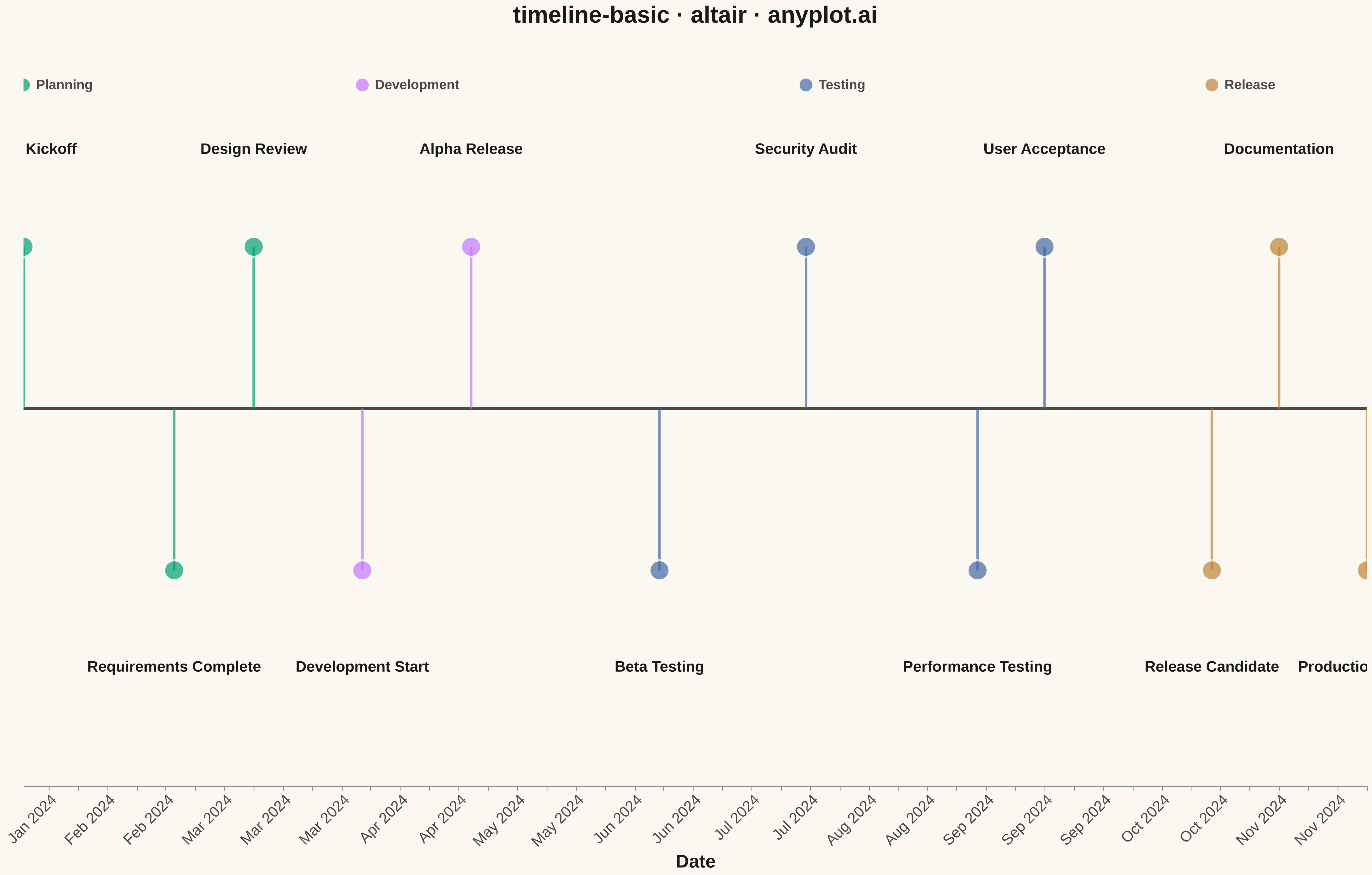
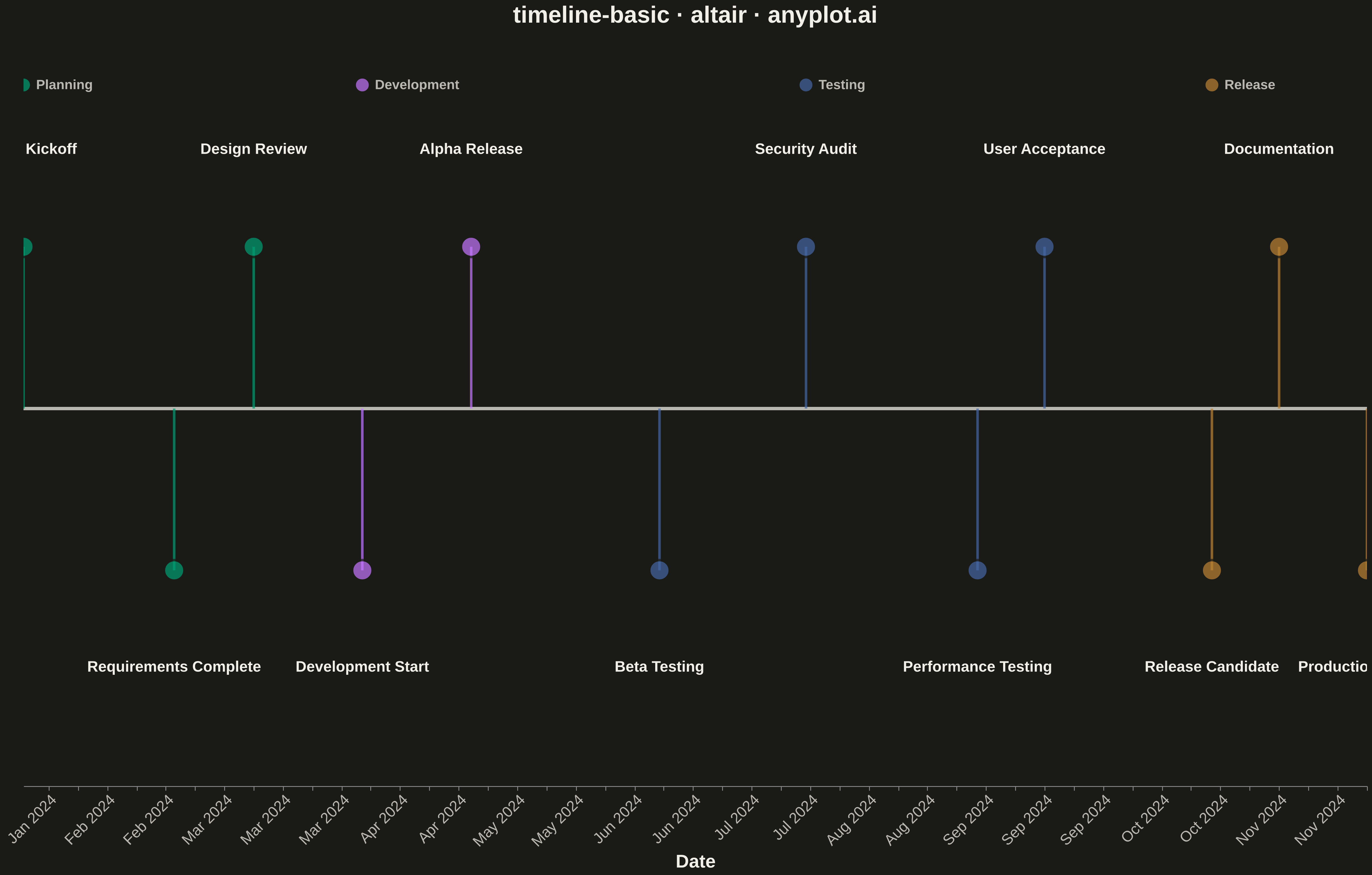
A timeline visualization that displays events and milestones along a temporal axis. Events are represented as points or markers with accompanying labels, making it easy to understand the sequence and timing of events. This plot type excels at showing chronological progressions and is particularly effective for communicating project phases, historical events, or any time-ordered sequence of occurrences.
""" anyplot.ai
timeline-basic: Event Timeline
Library: altair 6.1.0 | Python 3.13.13
Quality: 96/100 | Updated: 2026-05-11
"""

import os

import altair as alt
import pandas as pd


# Theme tokens
THEME = os.getenv("ANYPLOT_THEME", "light")
PAGE_BG = "#FAF8F1" if THEME == "light" else "#1A1A17"
ELEVATED_BG = "#FFFDF6" if THEME == "light" else "#242420"
INK = "#1A1A17" if THEME == "light" else "#F0EFE8"
INK_SOFT = "#4A4A44" if THEME == "light" else "#B8B7B0"

# Okabe-Ito palette for categories
IMPRINT = ["#009E73", "#C475FD", "#4467A3", "#BD8233"]

# Data: Software project milestones
data = pd.DataFrame(
    {
        "date": pd.to_datetime(
            [
                "2024-01-15",
                "2024-02-20",
                "2024-03-10",
                "2024-04-05",
                "2024-05-01",
                "2024-06-15",
                "2024-07-20",
                "2024-08-30",
                "2024-09-15",
                "2024-10-25",
                "2024-11-10",
                "2024-12-01",
            ]
        ),
        "event": [
            "Project Kickoff",
            "Requirements Complete",
            "Design Review",
            "Development Start",
            "Alpha Release",
            "Beta Testing",
            "Security Audit",
            "Performance Testing",
            "User Acceptance",
            "Release Candidate",
            "Documentation",
            "Production Launch",
        ],
        "category": [
            "Planning",
            "Planning",
            "Planning",
            "Development",
            "Development",
            "Testing",
            "Testing",
            "Testing",
            "Testing",
            "Release",
            "Release",
            "Release",
        ],
    }
)

# Alternate label positions to prevent overlap (above/below axis)
data["y_offset"] = [1.5 if i % 2 == 0 else -1.5 for i in range(len(data))]
data["y_zero"] = 0
data["y_label"] = [2.4 if i % 2 == 0 else -2.4 for i in range(len(data))]

# Color scale using Okabe-Ito palette
category_colors = {
    "Planning": IMPRINT[0],
    "Development": IMPRINT[1],
    "Testing": IMPRINT[2],
    "Release": IMPRINT[3],
}
color_scale = alt.Scale(domain=list(category_colors.keys()), range=list(category_colors.values()))

# Shared y scale
y_scale = alt.Scale(domain=[-3.5, 3.5])

# Vertical connector lines from axis to points
connectors = (
    alt.Chart(data)
    .mark_rule(strokeWidth=3, opacity=0.7)
    .encode(
        x="date:T",
        y=alt.Y("y_zero:Q", scale=y_scale),
        y2="y_offset:Q",
        color=alt.Color("category:N", scale=color_scale, legend=None),
    )
)

# Event markers on the timeline
points = (
    alt.Chart(data)
    .mark_circle(size=600, stroke=PAGE_BG, strokeWidth=3)
    .encode(
        x=alt.X(
            "date:T",
            axis=alt.Axis(
                title="Date",
                format="%b %Y",
                labelFontSize=18,
                titleFontSize=22,
                labelAngle=-45,
                grid=False,
                labelColor=INK_SOFT,
                titleColor=INK,
            ),
        ),
        y=alt.Y("y_offset:Q", scale=y_scale),
        color=alt.Color("category:N", scale=color_scale, legend=None),
        tooltip=[
            alt.Tooltip("date:T", title="Date", format="%B %d, %Y"),
            alt.Tooltip("event:N", title="Event"),
            alt.Tooltip("category:N", title="Phase"),
        ],
    )
)

# Central timeline axis line using rule from min to max date
timeline_line = alt.Chart(data).mark_rule(color=INK_SOFT, strokeWidth=4).encode(y=alt.Y("y_zero:Q", scale=y_scale))

# Event labels positioned above/below points
labels = (
    alt.Chart(data)
    .mark_text(align="center", fontSize=18, fontWeight="bold")
    .encode(x="date:T", y=alt.Y("y_label:Q", scale=y_scale), text="event:N", color=alt.value(INK))
)

# Create inline legend using text and point marks
legend_data = pd.DataFrame(
    {
        "category": list(category_colors.keys()),
        "x_pos": [
            pd.Timestamp("2024-01-15"),
            pd.Timestamp("2024-04-05"),
            pd.Timestamp("2024-07-20"),
            pd.Timestamp("2024-10-25"),
        ],
        "y_pos": [3.0, 3.0, 3.0, 3.0],
    }
)

legend_points = (
    alt.Chart(legend_data)
    .mark_circle(size=300, stroke=PAGE_BG, strokeWidth=2)
    .encode(
        x=alt.X("x_pos:T"),
        y=alt.Y("y_pos:Q", scale=y_scale),
        color=alt.Color("category:N", scale=color_scale, legend=None),
    )
)

legend_labels = (
    alt.Chart(legend_data)
    .mark_text(align="left", fontSize=16, fontWeight="bold", dx=15)
    .encode(x=alt.X("x_pos:T"), y=alt.Y("y_pos:Q", scale=y_scale), text="category:N", color=alt.value(INK_SOFT))
)

# Combine all layers
chart = (
    alt.layer(timeline_line, connectors, points, labels, legend_points, legend_labels)
    .properties(
        width=1600,
        height=900,
        background=PAGE_BG,
        title=alt.Title("timeline-basic · altair · anyplot.ai", fontSize=28, anchor="middle", color=INK),
    )
    .configure_view(strokeWidth=0, fill=PAGE_BG)
    .configure_axisY(disable=True)
    .interactive()
)

# Save outputs
chart.save(f"plot-{THEME}.png", scale_factor=3.0)
chart.save(f"plot-{THEME}.html")
Runnable source as JSON, for any HTTP client: https://api.anyplot.ai/specs/timeline-basic/altair/code. Any spec id and library id listed in llms-full.txt fit the same URL shape; every URL below is complete and callable.
{
  "spec_id": "timeline-basic",
  "language": "python",
  "library": "altair",
  "page": "https://anyplot.ai/timeline-basic/python/altair",
  "hub": "https://anyplot.ai/timeline-basic",
  "code_json": "https://api.anyplot.ai/specs/timeline-basic/altair/code",
  "spec_json": "https://api.anyplot.ai/specs/timeline-basic",
  "render_light_png": "https://storage.googleapis.com/anyplot-images/plots/timeline-basic/python/altair/plot-light.png",
  "render_dark_png": "https://storage.googleapis.com/anyplot-images/plots/timeline-basic/python/altair/plot-dark.png",
  "interactive_light_html": "https://storage.googleapis.com/anyplot-images/plots/timeline-basic/python/altair/plot-light.html",
  "interactive_dark_html": "https://storage.googleapis.com/anyplot-images/plots/timeline-basic/python/altair/plot-dark.html",
  "quality_score": 96.0,
  "license": "MIT",
  "guide": "https://anyplot.ai/llms.txt"
}
Part of Event Timeline on anyplot.ai.