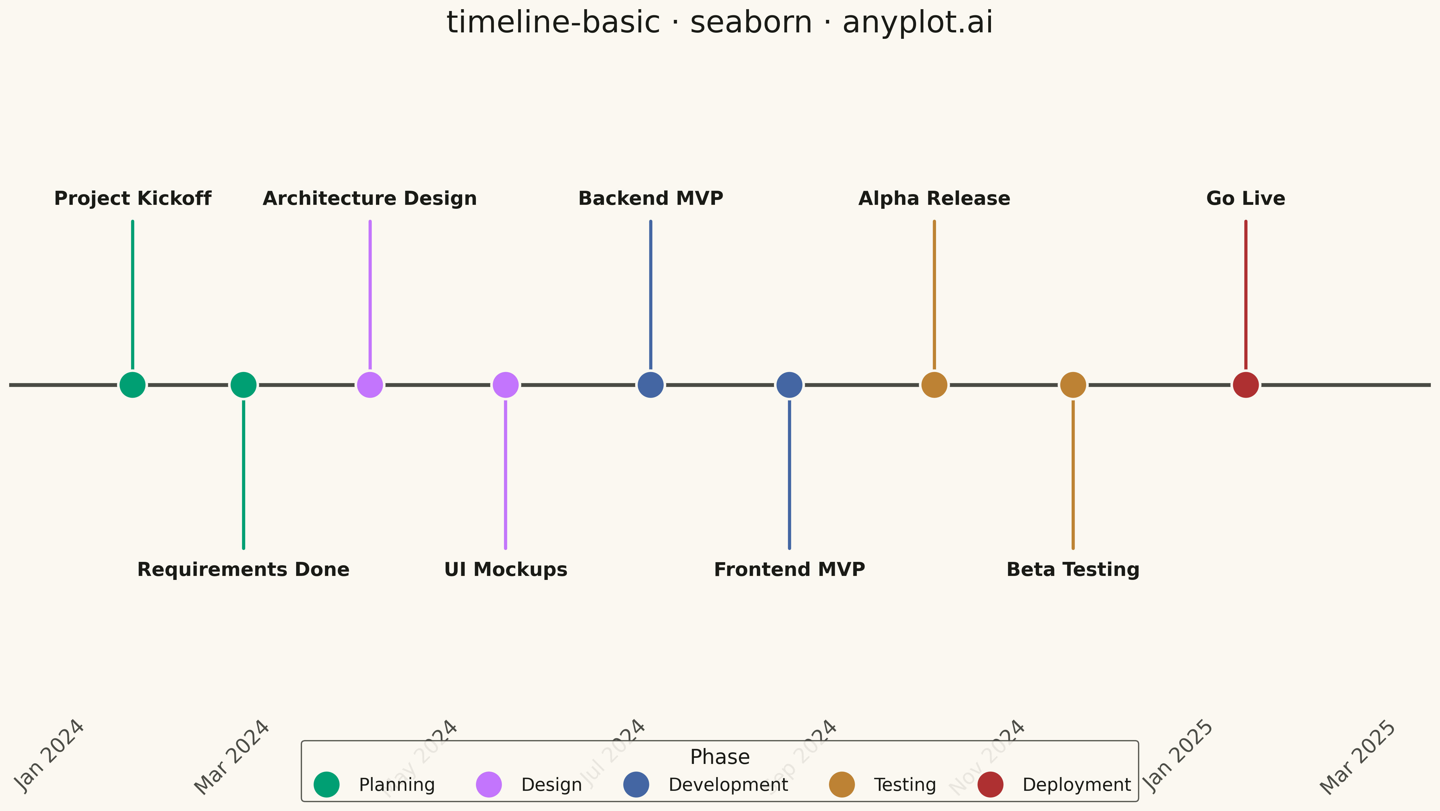
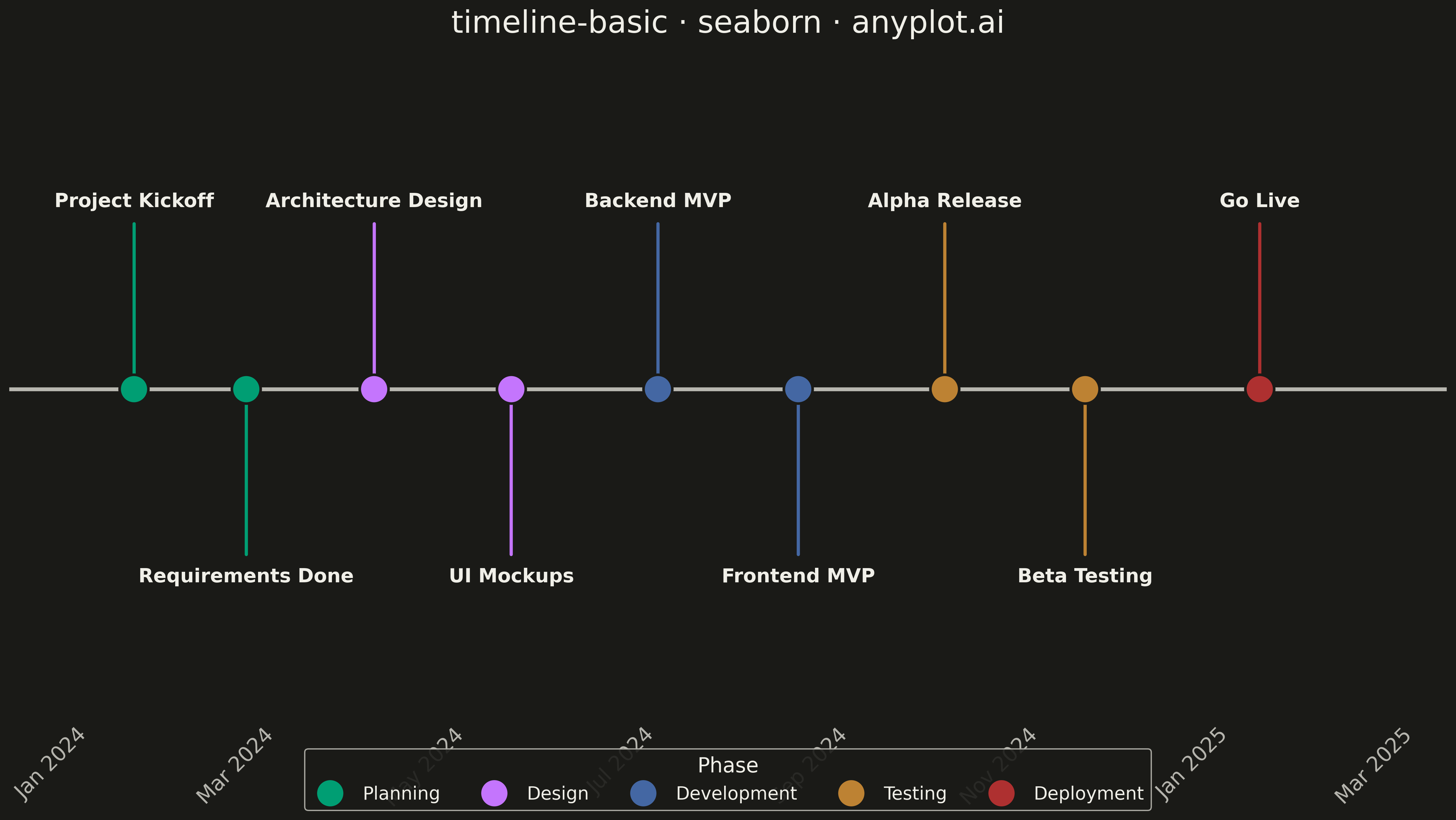
A timeline visualization that displays events and milestones along a temporal axis. Events are represented as points or markers with accompanying labels, making it easy to understand the sequence and timing of events. This plot type excels at showing chronological progressions and is particularly effective for communicating project phases, historical events, or any time-ordered sequence of occurrences.
""" anyplot.ai
timeline-basic: Event Timeline
Library: seaborn 0.13.2 | Python 3.13.13
Quality: 92/100 | Updated: 2026-05-11
"""

import os

import matplotlib.pyplot as plt
import pandas as pd
import seaborn as sns


# Theme tokens
THEME = os.getenv("ANYPLOT_THEME", "light")
PAGE_BG = "#FAF8F1" if THEME == "light" else "#1A1A17"
INK = "#1A1A17" if THEME == "light" else "#F0EFE8"
INK_SOFT = "#4A4A44" if THEME == "light" else "#B8B7B0"

# Okabe-Ito palette (canonical order)
IMPRINT = [
    "#009E73",  # brand green
    "#C475FD",  # vermillion
    "#4467A3",  # blue
    "#BD8233",  # reddish purple
    "#AE3030",  # orange
]

# Data - Software project milestones
events = [
    ("2024-01-15", "Project Kickoff", "Planning"),
    ("2024-02-20", "Requirements Done", "Planning"),
    ("2024-04-01", "Architecture Design", "Design"),
    ("2024-05-15", "UI Mockups", "Design"),
    ("2024-07-01", "Backend MVP", "Development"),
    ("2024-08-15", "Frontend MVP", "Development"),
    ("2024-10-01", "Alpha Release", "Testing"),
    ("2024-11-15", "Beta Testing", "Testing"),
    ("2025-01-10", "Go Live", "Deployment"),
]

df = pd.DataFrame(events, columns=["date", "event", "category"])
df["date"] = pd.to_datetime(df["date"])

# Create y-offset for alternating labels (above/below axis)
df["y_offset"] = [1 if i % 2 == 0 else -1 for i in range(len(df))]

# Map categories to Okabe-Ito colors
category_order = ["Planning", "Design", "Development", "Testing", "Deployment"]
palette = {
    "Planning": IMPRINT[0],  # green
    "Design": IMPRINT[1],  # vermillion
    "Development": IMPRINT[2],  # blue
    "Testing": IMPRINT[3],  # reddish purple
    "Deployment": IMPRINT[4],  # orange
}

# Set seaborn theme with theme-adaptive tokens
sns.set_theme(
    style="ticks",
    rc={
        "figure.facecolor": PAGE_BG,
        "axes.facecolor": PAGE_BG,
        "axes.edgecolor": INK_SOFT,
        "axes.labelcolor": INK,
        "text.color": INK,
        "xtick.color": INK_SOFT,
        "ytick.color": INK_SOFT,
        "grid.color": INK,
        "grid.alpha": 0.10,
        "legend.facecolor": PAGE_BG,
        "legend.edgecolor": INK_SOFT,
    },
)

# Create figure
fig, ax = plt.subplots(figsize=(16, 9), facecolor=PAGE_BG)
ax.set_facecolor(PAGE_BG)

# Draw the main timeline axis
ax.axhline(y=0, color=INK_SOFT, linewidth=3, zorder=1)

# Plot events using seaborn scatterplot
sns.scatterplot(
    data=df,
    x="date",
    y=[0] * len(df),
    hue="category",
    hue_order=category_order,
    palette=palette,
    s=500,
    zorder=3,
    ax=ax,
    legend=True,
    edgecolor=PAGE_BG,
    linewidth=2,
)

# Add vertical connector lines and event labels
for _idx, row in df.iterrows():
    y_end = row["y_offset"] * 0.55

    # Connector line
    ax.plot([row["date"], row["date"]], [0, y_end], color=palette[row["category"]], linewidth=2.5, zorder=2)

    # Event label
    va = "bottom" if row["y_offset"] > 0 else "top"
    ax.annotate(
        row["event"],
        xy=(row["date"], y_end),
        ha="center",
        va=va,
        fontsize=15,
        fontweight="bold",
        color=INK,
        xytext=(0, 10 * row["y_offset"]),
        textcoords="offset points",
    )

# Style the plot
ax.set_xlim(df["date"].min() - pd.Timedelta(days=40), df["date"].max() + pd.Timedelta(days=60))
ax.set_ylim(-1.1, 1.1)

# Remove y-axis and spines for clean timeline look
ax.set_yticks([])
ax.set_ylabel("")
ax.set_xlabel("")
ax.spines["left"].set_visible(False)
ax.spines["right"].set_visible(False)
ax.spines["top"].set_visible(False)
ax.spines["bottom"].set_visible(False)

# Format x-axis with monthly ticks
ax.tick_params(axis="x", labelsize=16, length=0, colors=INK_SOFT)
ax.xaxis.set_major_locator(plt.matplotlib.dates.MonthLocator(interval=2))
ax.xaxis.set_major_formatter(plt.matplotlib.dates.DateFormatter("%b %Y"))
plt.setp(ax.get_xticklabels(), rotation=45, ha="right", color=INK_SOFT)

# Title and legend
ax.set_title("timeline-basic · seaborn · anyplot.ai", fontsize=24, fontweight="medium", color=INK, pad=20)

# Place legend at bottom center, horizontal layout
ax.legend(
    title="Phase",
    title_fontsize=16,
    fontsize=14,
    loc="lower center",
    ncol=5,
    framealpha=0.9,
    edgecolor=INK_SOFT,
    facecolor=PAGE_BG,
    bbox_to_anchor=(0.5, -0.15),
)

plt.tight_layout()
plt.savefig(f"plot-{THEME}.png", dpi=300, bbox_inches="tight", facecolor=PAGE_BG)
Runnable source as JSON, for any HTTP client: https://api.anyplot.ai/specs/timeline-basic/seaborn/code. Any spec id and library id listed in llms-full.txt fit the same URL shape; every URL below is complete and callable.
{
  "spec_id": "timeline-basic",
  "language": "python",
  "library": "seaborn",
  "page": "https://anyplot.ai/timeline-basic/python/seaborn",
  "hub": "https://anyplot.ai/timeline-basic",
  "code_json": "https://api.anyplot.ai/specs/timeline-basic/seaborn/code",
  "spec_json": "https://api.anyplot.ai/specs/timeline-basic",
  "render_light_png": "https://storage.googleapis.com/anyplot-images/plots/timeline-basic/python/seaborn/plot-light.png",
  "render_dark_png": "https://storage.googleapis.com/anyplot-images/plots/timeline-basic/python/seaborn/plot-dark.png",
  "quality_score": 92.0,
  "license": "MIT",
  "guide": "https://anyplot.ai/llms.txt"
}
Part of Event Timeline on anyplot.ai.