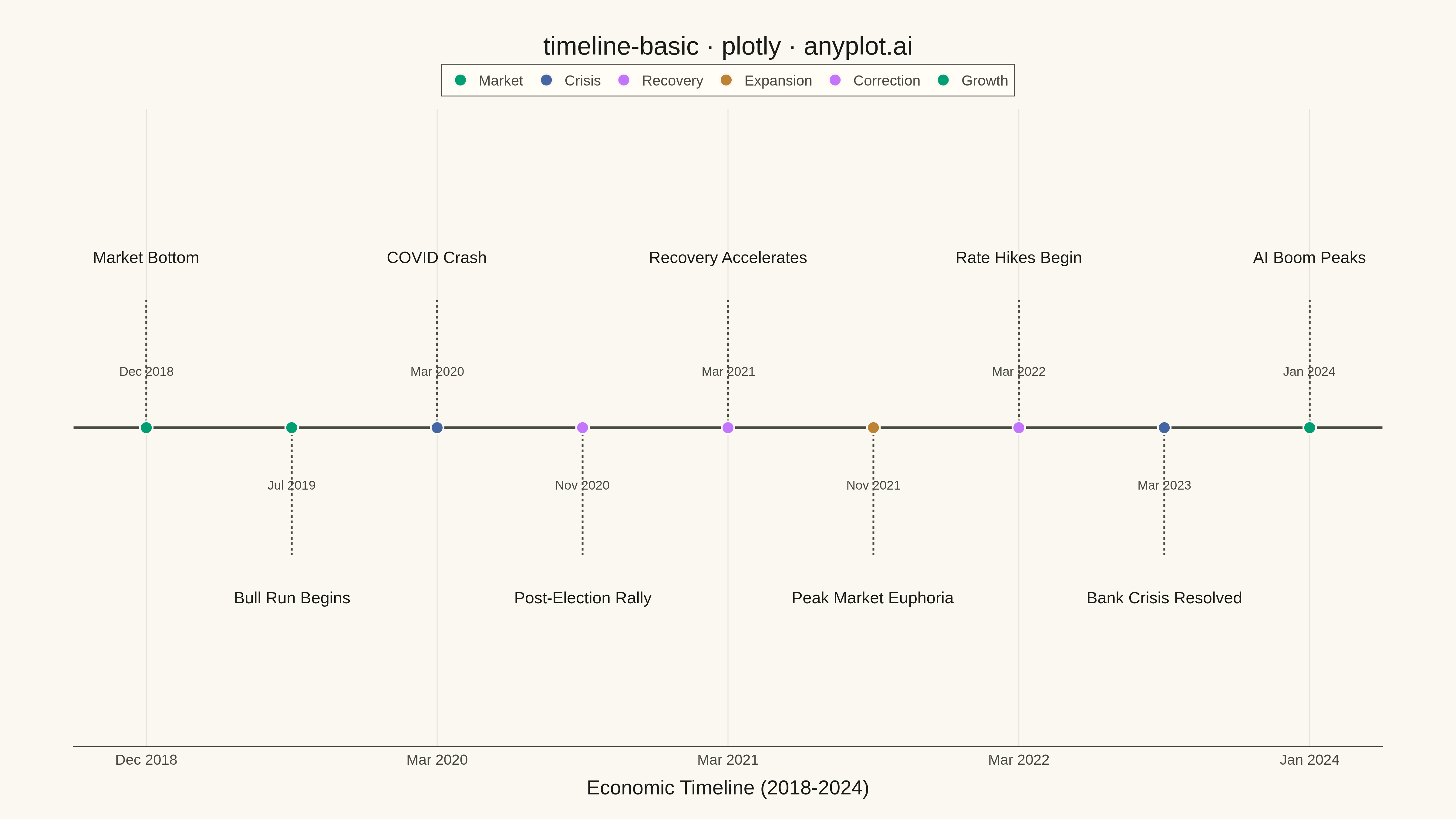
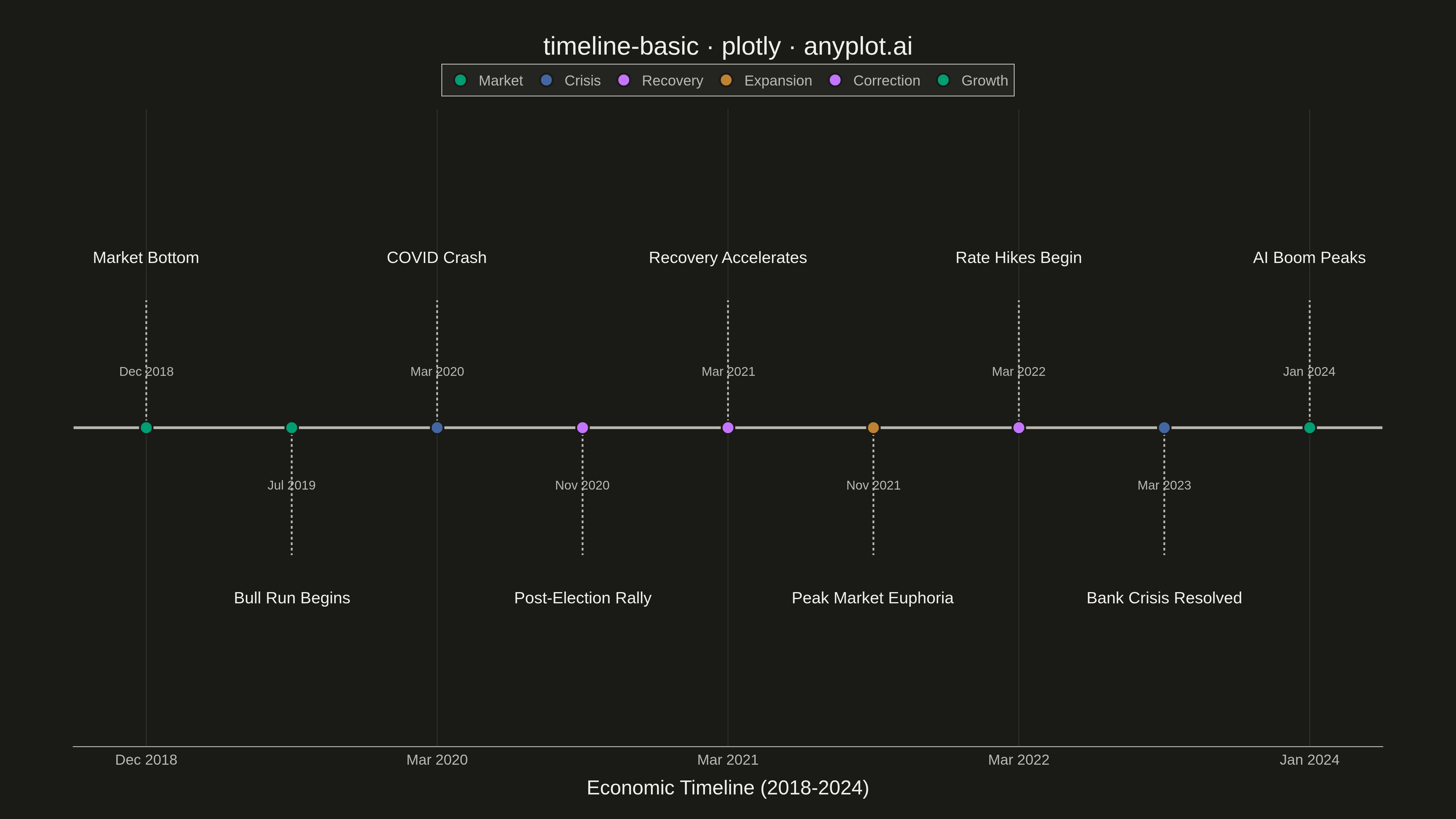
A timeline visualization that displays events and milestones along a temporal axis. Events are represented as points or markers with accompanying labels, making it easy to understand the sequence and timing of events. This plot type excels at showing chronological progressions and is particularly effective for communicating project phases, historical events, or any time-ordered sequence of occurrences.
""" anyplot.ai
timeline-basic: Event Timeline
Library: plotly 6.7.0 | Python 3.13.13
Quality: 92/100 | Updated: 2026-05-11
"""

import os

import pandas as pd
import plotly.graph_objects as go


# Theme tokens
THEME = os.getenv("ANYPLOT_THEME", "light")
PAGE_BG = "#FAF8F1" if THEME == "light" else "#1A1A17"
ELEVATED_BG = "#FFFDF6" if THEME == "light" else "#242420"
INK = "#1A1A17" if THEME == "light" else "#F0EFE8"
INK_SOFT = "#4A4A44" if THEME == "light" else "#B8B7B0"
GRID = "rgba(26,26,23,0.10)" if THEME == "light" else "rgba(240,239,232,0.10)"

# Okabe-Ito palette (first series always #009E73)
IMPRINT = [
    "#009E73",  # bluish green (brand)
    "#C475FD",  # vermillion
    "#4467A3",  # blue
    "#BD8233",  # reddish purple
]

# Data - Economic and stock market milestones (2018-2024)
data = {
    "date": [
        "2018-12-26",
        "2019-07-17",
        "2020-03-16",
        "2020-11-09",
        "2021-03-11",
        "2021-11-09",
        "2022-03-16",
        "2023-03-10",
        "2024-01-10",
    ],
    "event": [
        "Market Bottom",
        "Bull Run Begins",
        "COVID Crash",
        "Post-Election Rally",
        "Recovery Accelerates",
        "Peak Market Euphoria",
        "Rate Hikes Begin",
        "Bank Crisis Resolved",
        "AI Boom Peaks",
    ],
    "category": ["Market", "Market", "Crisis", "Recovery", "Recovery", "Expansion", "Correction", "Crisis", "Growth"],
}
df = pd.DataFrame(data)

# Color mapping for categories
colors = {
    "Market": IMPRINT[0],
    "Recovery": IMPRINT[1],
    "Crisis": IMPRINT[2],
    "Expansion": IMPRINT[3],
    "Growth": IMPRINT[0],
    "Correction": IMPRINT[1],
}

# Alternate positions to prevent label overlap
positions = [1, -1, 1, -1, 1, -1, 1, -1, 1]
df["position"] = positions
df["x_pos"] = range(len(df))

# Create figure
fig = go.Figure()

# Add the timeline axis line
fig.add_trace(
    go.Scatter(
        x=[-0.5, len(df) - 0.5],
        y=[0, 0],
        mode="lines",
        line=dict(color=INK_SOFT, width=3),
        hoverinfo="skip",
        showlegend=False,
    )
)

# Add vertical connector lines for each event
for idx, row in df.iterrows():
    fig.add_trace(
        go.Scatter(
            x=[row["x_pos"], row["x_pos"]],
            y=[0, row["position"] * 0.4],
            mode="lines",
            line=dict(color=INK_SOFT, width=2, dash="dot"),
            hoverinfo="skip",
            showlegend=False,
        )
    )

# Add event markers and labels by category
for category in df["category"].unique():
    cat_df = df[df["category"] == category].reset_index(drop=True)

    fig.add_trace(
        go.Scatter(
            x=cat_df["x_pos"],
            y=[0] * len(cat_df),
            mode="markers",
            marker=dict(size=14, color=colors[category], line=dict(color=PAGE_BG, width=2)),
            name=category,
            hovertemplate="<b>%{customdata[0]}</b><br>%{customdata[1]}<extra></extra>",
            customdata=list(
                zip(cat_df["event"].tolist(), [pd.to_datetime(d).strftime("%B %d, %Y") for d in cat_df["date"]])
            ),
        )
    )

# Add event labels
for idx, row in df.iterrows():
    y_offset = row["position"] * 0.5
    fig.add_annotation(
        x=row["x_pos"],
        y=y_offset,
        text=row["event"],
        showarrow=False,
        font=dict(size=18, color=INK),
        xanchor="center",
        yanchor="bottom" if row["position"] > 0 else "top",
    )

# Add date labels
for idx, row in df.iterrows():
    y_offset = row["position"] * 0.15
    date_str = pd.to_datetime(row["date"]).strftime("%b %Y")
    fig.add_annotation(
        x=row["x_pos"],
        y=y_offset,
        text=date_str,
        showarrow=False,
        font=dict(size=14, color=INK_SOFT),
        xanchor="center",
        yanchor="bottom" if row["position"] > 0 else "top",
    )

# Layout
fig.update_layout(
    title=dict(text="timeline-basic · plotly · anyplot.ai", font=dict(size=28, color=INK), x=0.5, xanchor="center"),
    xaxis=dict(
        title=dict(text="Economic Timeline (2018-2024)", font=dict(size=22, color=INK)),
        tickfont=dict(size=16, color=INK_SOFT),
        tickvals=[0, 2, 4, 6, 8],
        ticktext=["Dec 2018", "Mar 2020", "Mar 2021", "Mar 2022", "Jan 2024"],
        showgrid=True,
        gridcolor=GRID,
        gridwidth=1,
        zeroline=False,
        linecolor=INK_SOFT,
    ),
    yaxis=dict(visible=False, range=[-1, 1], fixedrange=True),
    template="plotly_white",
    paper_bgcolor=PAGE_BG,
    plot_bgcolor=PAGE_BG,
    showlegend=True,
    legend=dict(
        orientation="h",
        yanchor="bottom",
        y=1.02,
        xanchor="center",
        x=0.5,
        font=dict(size=16, color=INK_SOFT),
        bgcolor=ELEVATED_BG,
        bordercolor=INK_SOFT,
        borderwidth=1,
    ),
    margin=dict(l=80, r=80, t=120, b=80),
)

# Save as PNG and HTML
fig.write_image(f"plot-{THEME}.png", width=1600, height=900, scale=3)
fig.write_html(f"plot-{THEME}.html", include_plotlyjs="cdn")
Runnable source as JSON, for any HTTP client: https://api.anyplot.ai/specs/timeline-basic/plotly/code. Any spec id and library id listed in llms-full.txt fit the same URL shape; every URL below is complete and callable.
{
  "spec_id": "timeline-basic",
  "language": "python",
  "library": "plotly",
  "page": "https://anyplot.ai/timeline-basic/python/plotly",
  "hub": "https://anyplot.ai/timeline-basic",
  "code_json": "https://api.anyplot.ai/specs/timeline-basic/plotly/code",
  "spec_json": "https://api.anyplot.ai/specs/timeline-basic",
  "render_light_png": "https://storage.googleapis.com/anyplot-images/plots/timeline-basic/python/plotly/plot-light.png",
  "render_dark_png": "https://storage.googleapis.com/anyplot-images/plots/timeline-basic/python/plotly/plot-dark.png",
  "interactive_light_html": "https://storage.googleapis.com/anyplot-images/plots/timeline-basic/python/plotly/plot-light.html",
  "interactive_dark_html": "https://storage.googleapis.com/anyplot-images/plots/timeline-basic/python/plotly/plot-dark.html",
  "quality_score": 92.0,
  "license": "MIT",
  "guide": "https://anyplot.ai/llms.txt"
}
Part of Event Timeline on anyplot.ai.