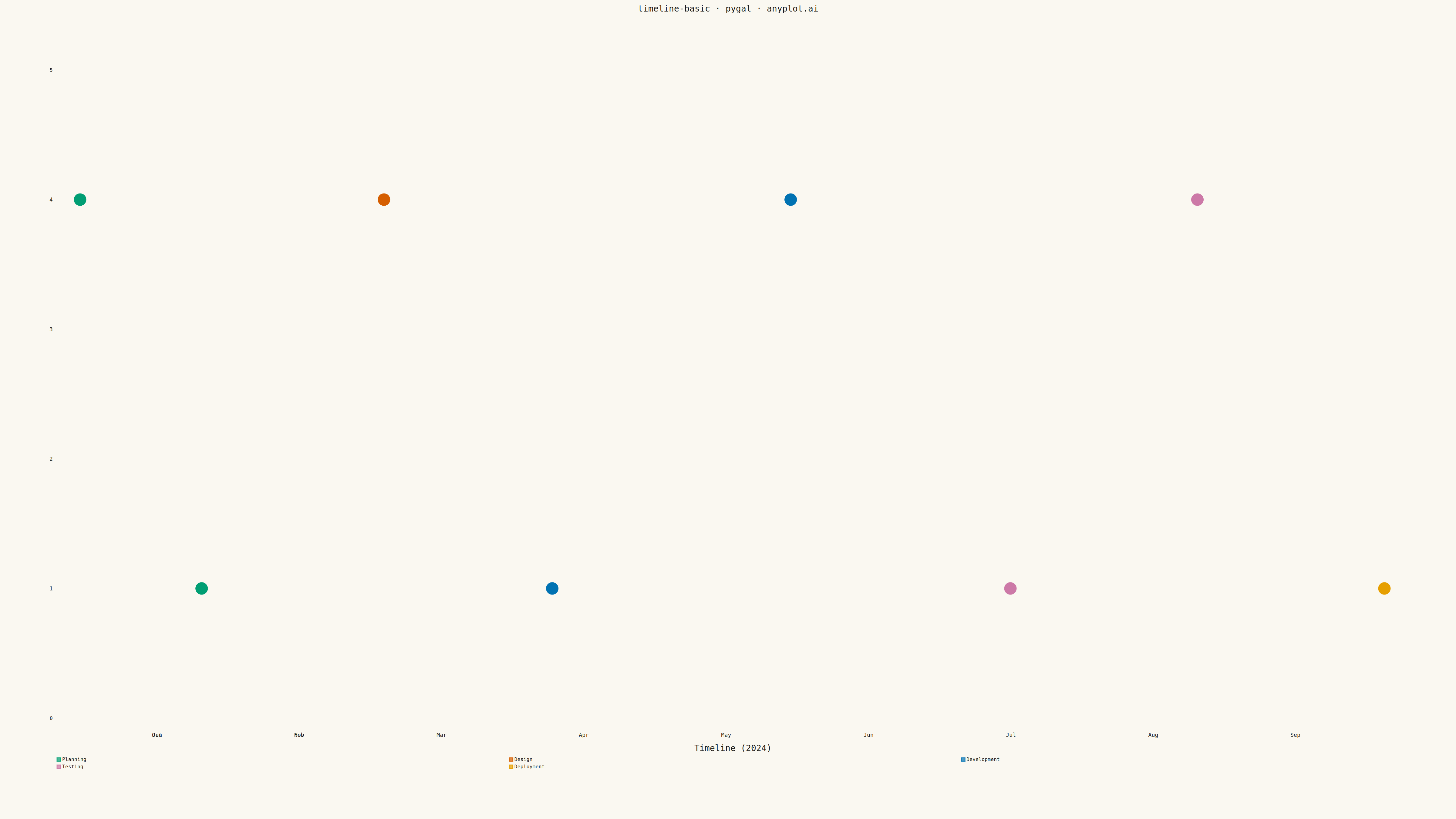
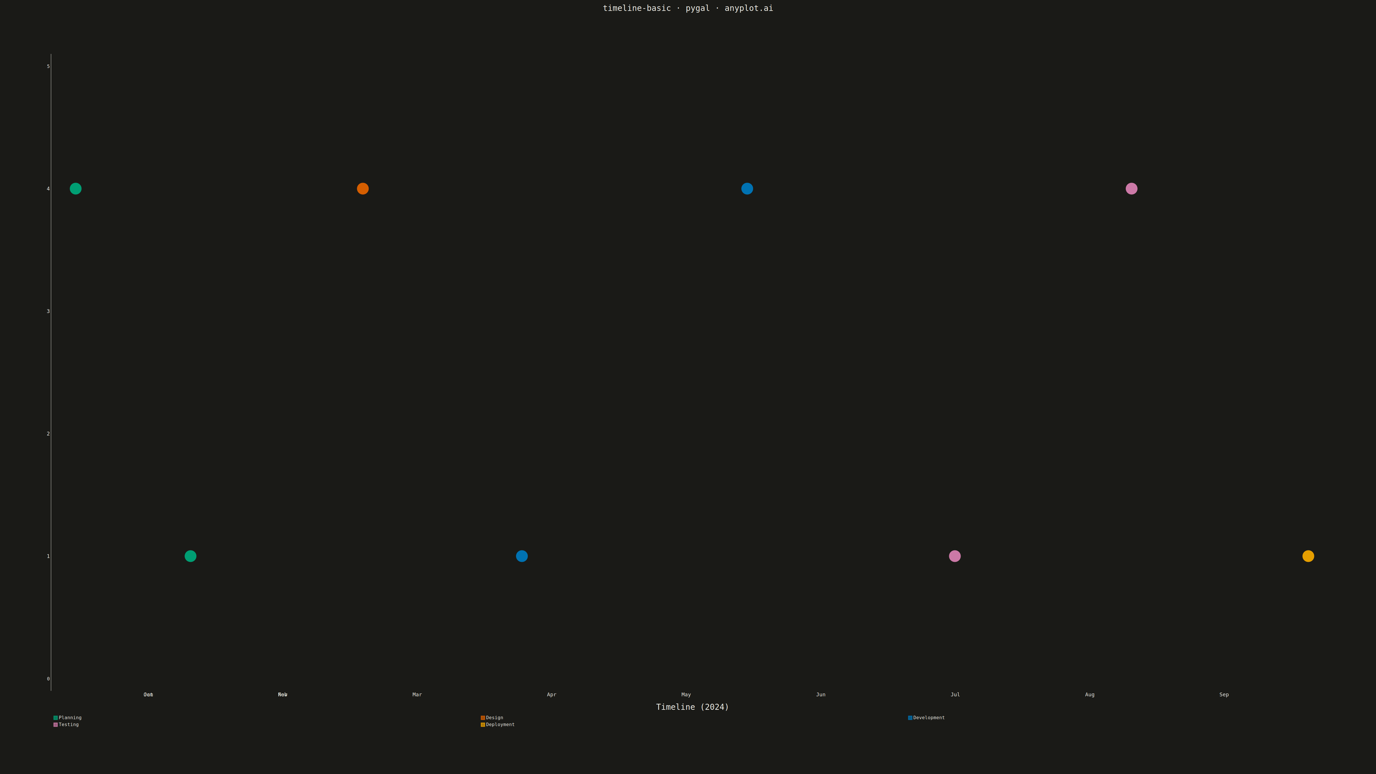
A timeline visualization that displays events and milestones along a temporal axis. Events are represented as points or markers with accompanying labels, making it easy to understand the sequence and timing of events. This plot type excels at showing chronological progressions and is particularly effective for communicating project phases, historical events, or any time-ordered sequence of occurrences.
""" anyplot.ai
timeline-basic: Event Timeline
Library: pygal 3.1.0 | Python 3.13.13
Quality: 91/100 | Updated: 2026-05-11
"""

from datetime import date

import cairosvg
import pygal
from pygal.style import Style


# Data - Software project milestones
events = [
    (date(2024, 1, 15), "Project Kickoff", "Planning"),
    (date(2024, 2, 10), "Requirements Complete", "Planning"),
    (date(2024, 3, 20), "Architecture Design", "Design"),
    (date(2024, 4, 25), "Development Start", "Development"),
    (date(2024, 6, 15), "Alpha Release", "Development"),
    (date(2024, 8, 1), "Beta Release", "Testing"),
    (date(2024, 9, 10), "User Acceptance", "Testing"),
    (date(2024, 10, 20), "Production Launch", "Deployment"),
]

# Sort events by date
events = sorted(events, key=lambda x: x[0])

# Category colors mapped to pygal color indices
categories = ["Planning", "Design", "Development", "Testing", "Deployment"]
category_colors = {
    "Planning": "#306998",
    "Design": "#FFD43B",
    "Development": "#4ECDC4",
    "Testing": "#FF6B6B",
    "Deployment": "#45B7D1",
}

# Custom style for large canvas (4800x2700)
custom_style = Style(
    background="white",
    plot_background="white",
    foreground="#333333",
    foreground_strong="#333333",
    foreground_subtle="#666666",
    colors=tuple(category_colors[c] for c in categories),
    title_font_size=60,
    label_font_size=32,
    major_label_font_size=32,
    legend_font_size=36,
    value_font_size=28,
    tooltip_font_size=28,
)

# Reference date for x-axis positioning
reference_date = date(2024, 1, 1)

# Create XY chart - using native pygal scatter capabilities
chart = pygal.XY(
    width=4800,
    height=2700,
    style=custom_style,
    title="Software Project Milestones · timeline-basic · pygal · pyplots.ai",
    show_legend=True,
    legend_at_bottom=False,
    legend_box_size=32,
    x_title="Month (2024)",
    y_title="Project Phase",
    show_dots=True,
    dots_size=18,
    stroke=False,
    show_x_guides=True,
    show_y_guides=True,
    margin=120,
    x_labels_major_every=1,
    truncate_legend=-1,
)

# Custom x-axis labels for months
chart.x_labels = ["Jan", "Feb", "Mar", "Apr", "May", "Jun", "Jul", "Aug", "Sep", "Oct", "Nov"]
chart.x_labels_major = chart.x_labels

# Y positions for alternating above/below layout - spread vertically to use more canvas
y_positions = {
    0: 4,  # Above
    1: 1,  # Below
    2: 4,  # Above
    3: 1,  # Below
    4: 4,  # Above
    5: 1,  # Below
    6: 4,  # Above
    7: 1,  # Below
}

# Group events by category for legend
category_data = {cat: [] for cat in categories}

for i, (event_date, event_name, category) in enumerate(events):
    # X position: days since Jan 1, scaled to month
    days = (event_date - reference_date).days
    x_val = days / 30.44  # Average days per month

    # Y position for alternating layout
    y_val = y_positions[i]

    # Add data point with label
    category_data[category].append({"value": (x_val, y_val), "label": f"{event_name}\n{event_date.strftime('%b %d')}"})

# Add each category as a series
for category in categories:
    if category_data[category]:
        chart.add(category, category_data[category])

# Set y range to maximize vertical usage (values 0-5 with padding)
chart.range = (0, 5)

# Render base SVG
svg_string = chart.render().decode("utf-8")

# Add a horizontal timeline axis in the middle (y=2.5) as visual anchor
# Calculate plot area based on pygal defaults with our margins
PLOT_LEFT = 400
PLOT_RIGHT = 4550
PLOT_TOP = 300
PLOT_BOTTOM = 2200
PLOT_HEIGHT = PLOT_BOTTOM - PLOT_TOP

# Timeline at y=2.5 (middle of 0-5 range)
timeline_y = PLOT_TOP + PLOT_HEIGHT * (1 - 2.5 / 5)  # Invert because SVG y goes down

# Create timeline axis elements
timeline_svg = f"""
<g class="timeline-axis">
  <line x1="{PLOT_LEFT}" y1="{timeline_y:.0f}" x2="{PLOT_RIGHT}" y2="{timeline_y:.0f}"
        stroke="#999999" stroke-width="4" stroke-dasharray="15,8"/>
  <text x="{PLOT_LEFT - 80}" y="{timeline_y + 10:.0f}" font-family="Consolas, sans-serif"
        font-size="28" fill="#666666" text-anchor="end">Timeline</text>
</g>
"""

# Inject timeline before </svg>
svg_output = svg_string.replace("</svg>", f"{timeline_svg}\n</svg>")

# Save outputs
with open("plot.html", "w") as f:
    f.write(svg_output)

cairosvg.svg2png(bytestring=svg_output.encode(), write_to="plot.png")
Runnable source as JSON, for any HTTP client: https://api.anyplot.ai/specs/timeline-basic/pygal/code. Any spec id and library id listed in llms-full.txt fit the same URL shape; every URL below is complete and callable.
{
  "spec_id": "timeline-basic",
  "language": "python",
  "library": "pygal",
  "page": "https://anyplot.ai/timeline-basic/python/pygal",
  "hub": "https://anyplot.ai/timeline-basic",
  "code_json": "https://api.anyplot.ai/specs/timeline-basic/pygal/code",
  "spec_json": "https://api.anyplot.ai/specs/timeline-basic",
  "render_light_png": "https://storage.googleapis.com/anyplot-images/plots/timeline-basic/python/pygal/plot-light.png",
  "render_dark_png": "https://storage.googleapis.com/anyplot-images/plots/timeline-basic/python/pygal/plot-dark.png",
  "interactive_light_html": "https://storage.googleapis.com/anyplot-images/plots/timeline-basic/python/pygal/plot-light.html",
  "interactive_dark_html": "https://storage.googleapis.com/anyplot-images/plots/timeline-basic/python/pygal/plot-dark.html",
  "quality_score": 91.0,
  "license": "MIT",
  "guide": "https://anyplot.ai/llms.txt"
}
Part of Event Timeline on anyplot.ai.