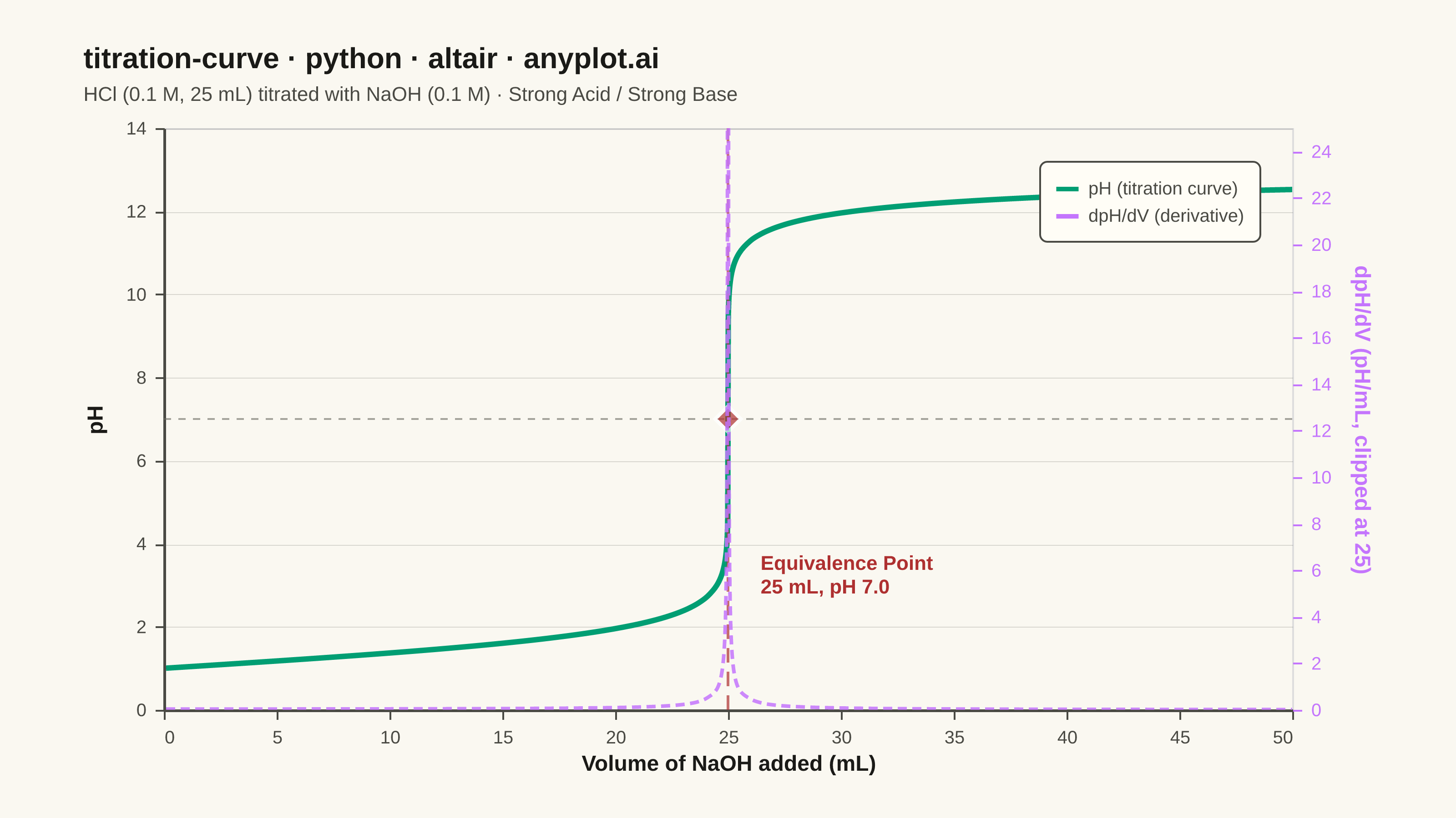
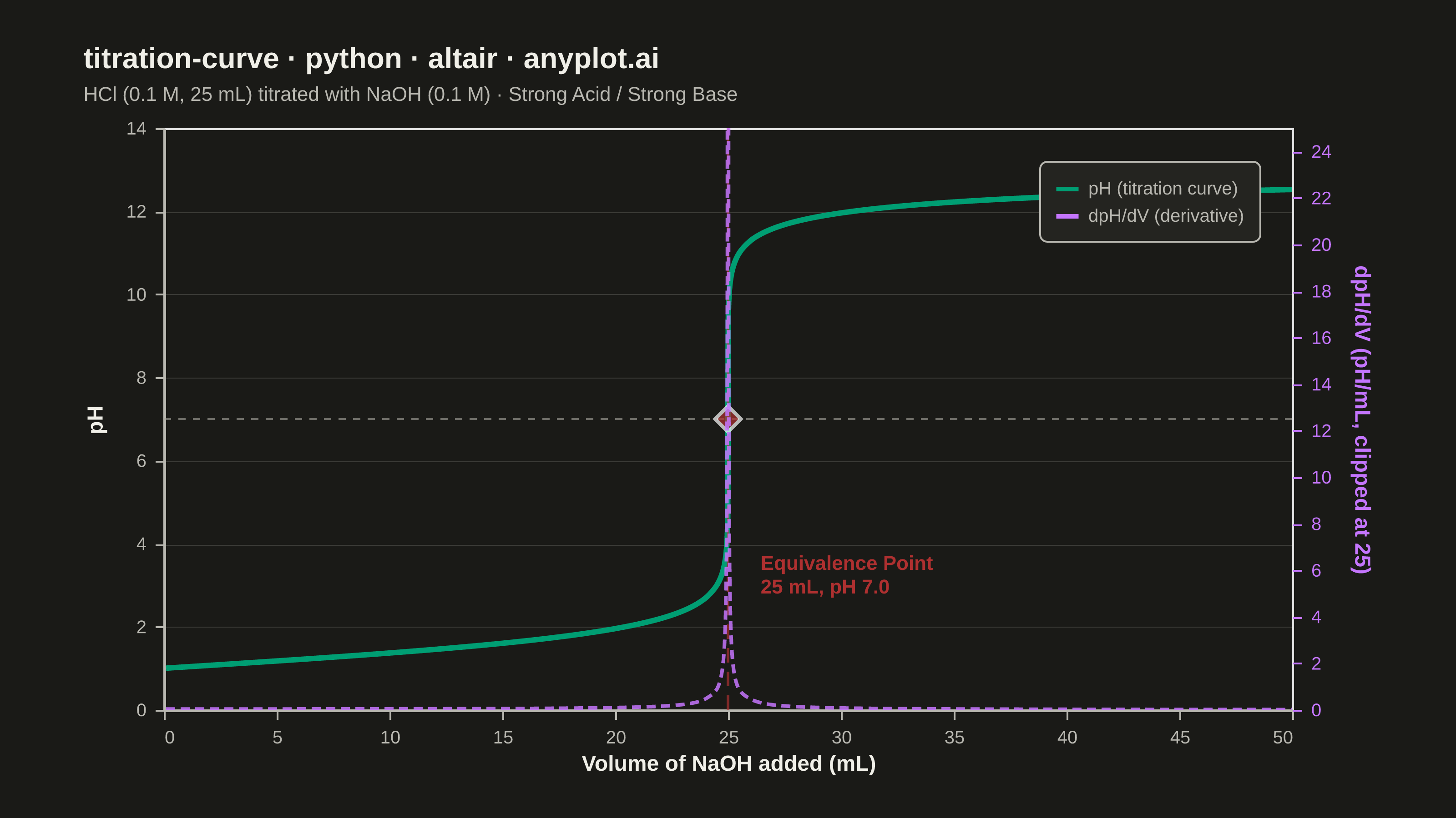
A titration curve plotting pH against volume of titrant added, producing the characteristic S-shaped (sigmoidal) curve used in analytical chemistry. The plot reveals buffer regions, equivalence points, and acid/base strength at a glance. Essential for chemistry education and laboratory analysis, it helps identify when a reaction reaches completion and which indicators are appropriate.
""" anyplot.ai
titration-curve: Acid-Base Titration Curve
Library: altair 6.2.2 | Python 3.13.14
Quality: 93/100 | Updated: 2026-06-24
"""

import os
import sys


# Remove the script's own directory from sys.path before importing altair;
# this file is named altair.py which otherwise shadows the installed library.
_this_dir = os.path.dirname(os.path.abspath(__file__))
sys.path = [p for p in sys.path if os.path.abspath(p) != _this_dir]

import altair as alt
import numpy as np
import pandas as pd
from PIL import Image


THEME = os.getenv("ANYPLOT_THEME", "light")

# Theme-adaptive chrome — Imprint palette
PAGE_BG = "#FAF8F1" if THEME == "light" else "#1A1A17"
ELEVATED_BG = "#FFFDF6" if THEME == "light" else "#242420"
INK = "#1A1A17" if THEME == "light" else "#F0EFE8"
INK_SOFT = "#4A4A44" if THEME == "light" else "#B8B7B0"
INK_MUTED = "#6B6A63" if THEME == "light" else "#A8A79F"

# Imprint categorical palette (positions 1–8, theme-independent)
IMPRINT_PALETTE = ["#009E73", "#C475FD", "#4467A3", "#BD8233", "#AE3030", "#2ABCCD", "#954477", "#99B314"]

# Series colors — Imprint categorical order
CLR_CURVE = IMPRINT_PALETTE[0]  # #009E73 brand green — pH titration curve (first series)
CLR_DERIV = IMPRINT_PALETTE[1]  # #C475FD lavender — dpH/dV derivative (second series)
CLR_EQUIV = IMPRINT_PALETTE[4]  # #AE3030 matte red — equivalence point annotation (semantic)

# Strong acid/strong base: 25 mL of 0.1 M HCl titrated with 0.1 M NaOH
C_acid = 0.1
V_acid = 25.0
C_base = 0.1
V_equiv = C_acid * V_acid / C_base  # 25.0 mL

volume = np.unique(
    np.concatenate(
        [
            np.linspace(0.1, V_equiv - 0.5, 60),
            np.linspace(V_equiv - 0.5, V_equiv - 0.01, 30),
            np.linspace(V_equiv + 0.01, V_equiv + 0.5, 30),
            np.linspace(V_equiv + 0.5, 50.0, 50),
        ]
    )
)

ph = np.zeros_like(volume)
for i, v in enumerate(volume):
    total_vol = V_acid + v
    moles_acid = C_acid * V_acid - C_base * v
    if moles_acid > 1e-10:
        ph[i] = -np.log10(moles_acid / total_vol)
    elif moles_acid < -1e-10:
        moles_base_excess = -moles_acid
        ph[i] = 14.0 + np.log10(moles_base_excess / total_vol)
    else:
        ph[i] = 7.0

# Insert the exact equivalence point
equiv_idx = np.searchsorted(volume, V_equiv)
volume = np.insert(volume, equiv_idx, V_equiv)
ph = np.insert(ph, equiv_idx, 7.0)

# Derivative (dpH/dV) using central differences
dph_dv = np.gradient(ph, volume)
dph_dv = np.nan_to_num(dph_dv, nan=0.0, posinf=0.0, neginf=0.0)

df = pd.DataFrame({"volume_ml": volume, "ph": ph, "dph_dv": dph_dv})

# Annotation data
equiv_pt = pd.DataFrame({"volume_ml": [V_equiv], "ph": [7.0]})
equiv_line = pd.DataFrame({"volume_ml": [V_equiv, V_equiv], "ph": [0, 14]})
equiv_label = pd.DataFrame(
    {"volume_ml": [V_equiv + 0.8], "ph": [3.5], "label": [f"Equivalence Point\n{V_equiv:.0f} mL, pH 7.0"]}
)
ref_line_df = pd.DataFrame({"volume_ml": [0, 50], "ph": [7, 7]})

# Scale definitions
x_scale = alt.Scale(domain=[0, 50])
y_scale = alt.Scale(domain=[0, 14])
# Cap the derivative axis so regional gradients remain visible
# (the equivalence-point spike exceeds 100 pH/mL; clipping reveals the pre/post-EP trend)
DERIV_DISPLAY_MAX = 25.0
deriv_scale = alt.Scale(domain=[0, DERIV_DISPLAY_MAX])

# Shared base axis styling using theme-adaptive tokens
axis_props_base = {
    "labelFontSize": 10,
    "titleFontSize": 12,
    "titleFontWeight": "bold",
    "titleColor": INK,
    "labelColor": INK_SOFT,
    "domainColor": INK_SOFT,
    "domainWidth": 1.5,
    "tickColor": INK_SOFT,
    "tickSize": 5,
    "labelPadding": 5,
}
# Y-axis: include subtle horizontal grid; X-axis: no grid (reduces visual noise)
y_axis_props = {**axis_props_base, "gridOpacity": 0.15, "gridWidth": 0.5, "gridColor": INK}
x_axis_props = {**axis_props_base, "gridOpacity": 0}

# pH 7 horizontal reference line
ref_line = (
    alt.Chart(ref_line_df)
    .mark_line(strokeWidth=1, strokeDash=[4, 4], color=INK_MUTED, opacity=0.6)
    .encode(x=alt.X("volume_ml:Q", scale=x_scale), y=alt.Y("ph:Q", scale=y_scale))
)

# Equivalence point: vertical dashed line
equiv_vline = (
    alt.Chart(equiv_line)
    .mark_line(strokeWidth=1.5, strokeDash=[8, 5], color=CLR_EQUIV, opacity=0.7)
    .encode(x=alt.X("volume_ml:Q", scale=x_scale), y=alt.Y("ph:Q", scale=y_scale))
)

# Equivalence point: diamond marker at pH 7
equiv_marker = (
    alt.Chart(equiv_pt)
    .mark_point(size=200, shape="diamond", filled=True, color=CLR_EQUIV, stroke="white", strokeWidth=2.0)
    .encode(x=alt.X("volume_ml:Q", scale=x_scale), y=alt.Y("ph:Q", scale=y_scale))
)

# Equivalence point: text annotation
equiv_annotation = (
    alt.Chart(equiv_label)
    .mark_text(fontSize=11, fontWeight="bold", color=CLR_EQUIV, align="left", dx=8, lineBreak="\n")
    .encode(x=alt.X("volume_ml:Q", scale=x_scale), y=alt.Y("ph:Q", scale=y_scale), text="label:N")
)

# Primary titration curve (pH, left y-axis)
titration_line = (
    alt.Chart(df)
    .mark_line(strokeWidth=3, interpolate="monotone")
    .encode(
        x=alt.X(
            "volume_ml:Q", scale=x_scale, title="Volume of NaOH added (mL)", axis=alt.Axis(tickCount=10, **x_axis_props)
        ),
        y=alt.Y("ph:Q", scale=y_scale, title="pH", axis=alt.Axis(titlePadding=10, **y_axis_props)),
        color=alt.value(CLR_CURVE),
        tooltip=[
            alt.Tooltip("volume_ml:Q", title="Volume (mL)", format=".1f"),
            alt.Tooltip("ph:Q", title="pH", format=".2f"),
        ],
    )
)

# mark_line legend: line swatches rendered at ph=-100 (outside [0,14] domain, clipped out)
legend_df = pd.DataFrame(
    {
        "volume_ml": [0, 50, 0, 50],
        "ph": [-100.0, -100.0, -100.0, -100.0],
        "label": ["pH (titration curve)", "pH (titration curve)", "dpH/dV (derivative)", "dpH/dV (derivative)"],
    }
)

legend_chart = (
    alt.Chart(legend_df)
    .mark_line(clip=True)
    .encode(
        x=alt.X("volume_ml:Q", scale=x_scale),
        y=alt.Y("ph:Q", scale=y_scale),
        color=alt.Color(
            "label:N",
            scale=alt.Scale(domain=["pH (titration curve)", "dpH/dV (derivative)"], range=[CLR_CURVE, CLR_DERIV]),
            legend=alt.Legend(
                title=None,
                orient="top-right",
                labelFontSize=10,
                symbolSize=150,
                symbolStrokeWidth=2.5,
                padding=8,
                cornerRadius=4,
                fillColor=ELEVATED_BG,
                strokeColor=INK_SOFT,
                labelColor=INK_SOFT,
            ),
        ),
    )
)

# Primary layer (left pH axis)
primary_layer = ref_line + titration_line + equiv_vline + equiv_marker + equiv_annotation + legend_chart

# Derivative curve (dpH/dV, right y-axis) — clipped at DERIV_DISPLAY_MAX to surface regional gradients
deriv_line = (
    alt.Chart(df)
    .mark_line(strokeWidth=2, strokeDash=[5, 3], interpolate="monotone", opacity=0.85, clip=True)
    .encode(
        x=alt.X("volume_ml:Q", scale=x_scale),
        y=alt.Y(
            "dph_dv:Q",
            title="dpH/dV (pH/mL, clipped at 25)",
            scale=deriv_scale,
            axis=alt.Axis(
                domain=False,
                titleColor=CLR_DERIV,
                labelColor=CLR_DERIV,
                titleFontSize=12,
                titleFontWeight="bold",
                labelFontSize=10,
                gridOpacity=0,
                tickColor=CLR_DERIV,
                tickSize=5,
                labelPadding=5,
                titlePadding=10,
            ),
        ),
        color=alt.value(CLR_DERIV),
        tooltip=[
            alt.Tooltip("volume_ml:Q", title="Volume (mL)", format=".1f"),
            alt.Tooltip("dph_dv:Q", title="dpH/dV", format=".2f"),
        ],
    )
)

# Dual y-axis chart via resolve_scale
TITLE = "titration-curve · python · altair · anyplot.ai"
chart = (
    alt.layer(primary_layer, deriv_line)
    .resolve_scale(y="independent")
    .properties(
        width=620,
        height=320,
        title=alt.Title(
            TITLE,
            fontSize=16,
            fontWeight="bold",
            color=INK,
            subtitle="HCl (0.1 M, 25 mL) titrated with NaOH (0.1 M)  ·  Strong Acid / Strong Base",
            subtitleFontSize=11,
            subtitleColor=INK_SOFT,
            subtitlePadding=6,
            anchor="start",
            offset=8,
        ),
    )
    .configure_view(strokeWidth=0, strokeOpacity=0, fill=PAGE_BG)
    .configure(background=PAGE_BG, padding={"left": 15, "right": 15, "top": 8, "bottom": 8})
    .interactive()
)

# Save PNG — pad canvas to exactly 3200×1800 (landscape target)
TW, TH = 3200, 1800
chart.save(f"plot-{THEME}.png", scale_factor=4.0)

_img = Image.open(f"plot-{THEME}.png").convert("RGB")
_w, _h = _img.size
if _w > TW or _h > TH:
    raise SystemExit(
        f"altair vl-convert produced {_w}×{_h}, exceeds target {TW}×{TH}. "
        f"Shrink chart .properties(width=, height=) values and re-render."
    )
if _w < TW or _h < TH:
    _canvas = Image.new("RGB", (TW, TH), PAGE_BG)
    _canvas.paste(_img, ((TW - _w) // 2, (TH - _h) // 2))
    _canvas.save(f"plot-{THEME}.png")

chart.save(f"plot-{THEME}.html")
Runnable source as JSON, for any HTTP client: https://api.anyplot.ai/specs/titration-curve/altair/code. Any spec id and library id listed in llms-full.txt fit the same URL shape; every URL below is complete and callable.
{
  "spec_id": "titration-curve",
  "language": "python",
  "library": "altair",
  "page": "https://anyplot.ai/titration-curve/python/altair",
  "hub": "https://anyplot.ai/titration-curve",
  "code_json": "https://api.anyplot.ai/specs/titration-curve/altair/code",
  "spec_json": "https://api.anyplot.ai/specs/titration-curve",
  "render_light_png": "https://storage.googleapis.com/anyplot-images/plots/titration-curve/python/altair/plot-light.png",
  "render_dark_png": "https://storage.googleapis.com/anyplot-images/plots/titration-curve/python/altair/plot-dark.png",
  "interactive_light_html": "https://storage.googleapis.com/anyplot-images/plots/titration-curve/python/altair/plot-light.html",
  "interactive_dark_html": "https://storage.googleapis.com/anyplot-images/plots/titration-curve/python/altair/plot-dark.html",
  "quality_score": 93.0,
  "license": "MIT",
  "guide": "https://anyplot.ai/llms.txt"
}
Part of Acid-Base Titration Curve on anyplot.ai.