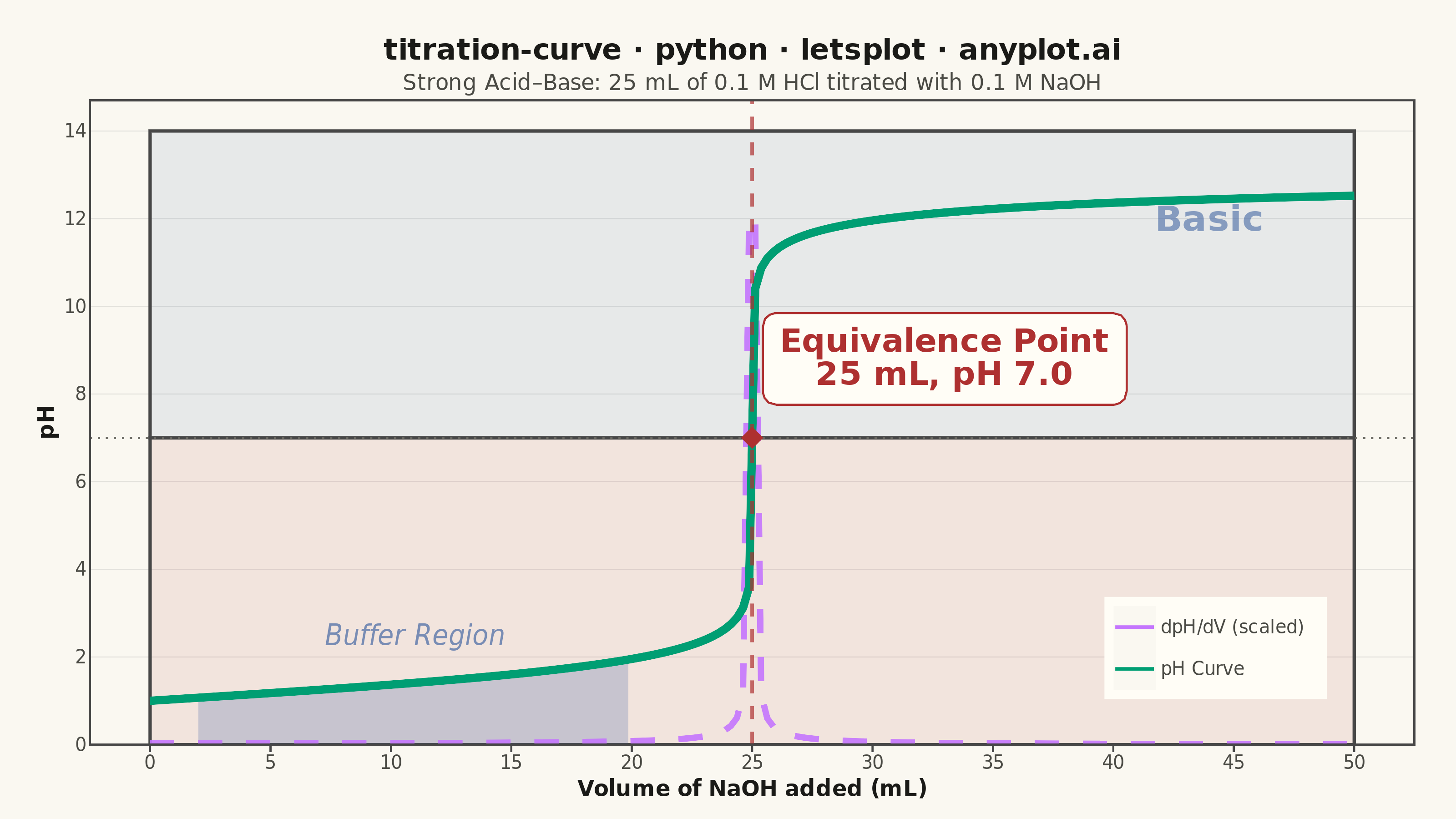
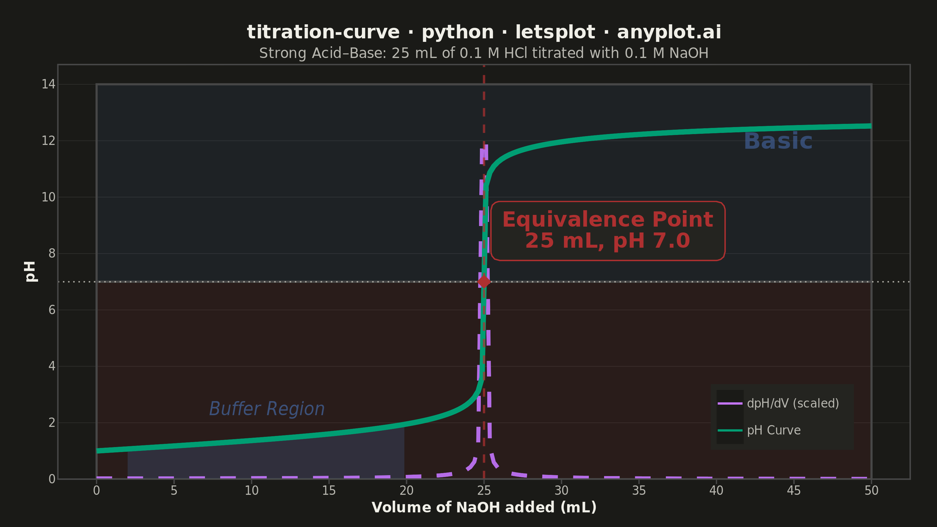
A titration curve plotting pH against volume of titrant added, producing the characteristic S-shaped (sigmoidal) curve used in analytical chemistry. The plot reveals buffer regions, equivalence points, and acid/base strength at a glance. Essential for chemistry education and laboratory analysis, it helps identify when a reaction reaches completion and which indicators are appropriate.
""" anyplot.ai
titration-curve: Acid-Base Titration Curve
Library: letsplot 4.10.1 | Python 3.13.14
Quality: 85/100 | Updated: 2026-06-24
"""

import os

import numpy as np
import pandas as pd
from lets_plot import *
from lets_plot import ggsave


LetsPlot.setup_html()

# Theme tokens — Imprint palette, theme-adaptive chrome
THEME = os.getenv("ANYPLOT_THEME", "light")
PAGE_BG = "#FAF8F1" if THEME == "light" else "#1A1A17"
ELEVATED_BG = "#FFFDF6" if THEME == "light" else "#242420"
INK = "#1A1A17" if THEME == "light" else "#F0EFE8"
INK_SOFT = "#4A4A44" if THEME == "light" else "#B8B7B0"
INK_MUTED = "#6B6A63" if THEME == "light" else "#A8A79F"
RULE = "#E0DFDA" if THEME == "light" else "#2E2E2B"

# Imprint categorical palette — theme-independent data colors
BRAND = "#009E73"  # position 1: pH curve (first series, always brand green)
COLOR_DERIV = "#C475FD"  # position 2: derivative curve (lavender)
COLOR_EQUIV = "#AE3030"  # position 5: equivalence point (matte red — semantic: critical marker)
COLOR_BUFFER = "#4467A3"  # position 3: buffer region (blue — water/chemistry context)

# Data — Strong acid/strong base: 25 mL of 0.1 M HCl titrated with 0.1 M NaOH
concentration_acid = 0.1
volume_acid = 25.0
concentration_base = 0.1

volume_naoh = np.linspace(0, 50, 200)
ph = np.zeros_like(volume_naoh)

for i, v in enumerate(volume_naoh):
    moles_acid = concentration_acid * volume_acid / 1000
    moles_base = concentration_base * v / 1000
    total_volume = (volume_acid + v) / 1000

    if moles_base < moles_acid:
        excess_h = (moles_acid - moles_base) / total_volume
        ph[i] = -np.log10(excess_h)
    elif np.isclose(moles_base, moles_acid, atol=1e-8):
        ph[i] = 7.0
    else:
        excess_oh = (moles_base - moles_acid) / total_volume
        poh = -np.log10(excess_oh)
        ph[i] = 14.0 - poh

# Derivative (dpH/dV) — scaled to pH axis range for same-axis overlay
dpH = np.gradient(ph, volume_naoh)
dpH_max = np.max(dpH)
dpH_scaled = dpH / dpH_max * 12.0

# Equivalence point (strong acid/strong base → pH 7.0)
equiv_volume = volume_acid * concentration_acid / concentration_base
equiv_ph = 7.0

# Buffer region: pre-equivalence low-slope area (~2–20 mL for this titration)
buffer_mask = (volume_naoh >= 2) & (volume_naoh <= 20)
df_buffer = pd.DataFrame({"volume_ml": volume_naoh[buffer_mask], "ph": ph[buffer_mask]})

# Series data — color mapped by series name (alphabetical: "dpH/dV…" before "pH Curve")
df_ph = pd.DataFrame({"volume_ml": volume_naoh, "y": ph, "series": "pH Curve"})
df_deriv = pd.DataFrame({"volume_ml": volume_naoh, "y": dpH_scaled, "series": "dpH/dV (scaled)"})

equiv_point = pd.DataFrame(
    {
        "volume_ml": [equiv_volume],
        "ph": [equiv_ph],
        "label": [f"Equivalence Point\n{equiv_volume:.0f} mL, pH {equiv_ph:.1f}"],
    }
)

# Theme-adaptive chrome — see default-style-guide.md "Theme-adaptive Chrome"
anyplot_theme = theme(
    plot_background=element_rect(fill=PAGE_BG, color=PAGE_BG),
    panel_background=element_rect(fill=PAGE_BG),
    panel_grid_major_y=element_line(color=RULE, size=0.5),
    panel_grid_major_x=element_blank(),
    panel_grid_minor=element_blank(),
    panel_border=element_blank(),
    axis_line=element_blank(),
    axis_title=element_text(color=INK, size=12, face="bold"),
    axis_text=element_text(color=INK_SOFT, size=10),
    plot_title=element_text(color=INK, size=16, hjust=0.5, face="bold"),
    plot_subtitle=element_text(color=INK_SOFT, size=12, hjust=0.5),
    legend_text=element_text(color=INK_SOFT, size=10),
    legend_title=element_text(color=INK),
    legend_background=element_rect(fill=ELEVATED_BG),
    legend_position=[0.85, 0.15],
    legend_justification=[0.5, 0.5],
    plot_margin=[20, 20, 10, 20],
)

# Plot
plot = (
    ggplot()
    # Acidic region background (pH 0–7): subtle red tint
    + geom_rect(
        aes(xmin="xmin", xmax="xmax", ymin="ymin", ymax="ymax"),
        data=pd.DataFrame({"xmin": [0], "xmax": [50], "ymin": [0], "ymax": [7]}),
        fill=COLOR_EQUIV,
        alpha=0.10,
        tooltips="none",
    )
    # Basic region background (pH 7–14): subtle blue tint
    + geom_rect(
        aes(xmin="xmin", xmax="xmax", ymin="ymin", ymax="ymax"),
        data=pd.DataFrame({"xmin": [0], "xmax": [50], "ymin": [7], "ymax": [14]}),
        fill=COLOR_BUFFER,
        alpha=0.10,
        tooltips="none",
    )
    # pH 7 neutral divider line
    + geom_hline(yintercept=7.0, color=INK_MUTED, size=0.5, linetype="dotted")
    # Buffer region shading — alpha raised from 0.1 to 0.25 for clear visibility
    + geom_area(
        aes(x="volume_ml", y="ph"),
        data=df_buffer,
        fill=COLOR_BUFFER,
        alpha=0.25,
        tooltips="none",
    )
    # Region labels
    + geom_text(
        aes(x="x", y="y", label="label"),
        data=pd.DataFrame({"x": [44], "y": [2.5], "label": ["Acidic"]}),
        size=10,
        color=COLOR_EQUIV,
        fontface="bold",
        alpha=0.6,
    )
    + geom_text(
        aes(x="x", y="y", label="label"),
        data=pd.DataFrame({"x": [44], "y": [12.0], "label": ["Basic"]}),
        size=10,
        color=COLOR_BUFFER,
        fontface="bold",
        alpha=0.6,
    )
    + geom_text(
        aes(x="x", y="y", label="label"),
        data=pd.DataFrame({"x": [11], "y": [2.5], "label": ["Buffer Region"]}),
        size=8,
        color=COLOR_BUFFER,
        fontface="italic",
        alpha=0.7,
    )
    # Derivative curve (dashed — secondary series on same axis)
    + geom_line(
        aes(x="volume_ml", y="y", color="series"),
        data=df_deriv,
        size=1.5,
        linetype="dashed",
        alpha=0.9,
        tooltips=layer_tooltips().line("dpH/dV (scaled)"),
    )
    # Main pH titration curve
    + geom_line(
        aes(x="volume_ml", y="y", color="series"),
        data=df_ph,
        size=2.0,
        tooltips=layer_tooltips()
        .title("pH Curve")
        .format("volume_ml", ".1f")
        .format("y", ".2f")
        .line("Volume: @volume_ml mL")
        .line("pH: @y"),
    )
    # Equivalence point vertical marker and diamond
    + geom_vline(xintercept=equiv_volume, color=COLOR_EQUIV, size=0.8, linetype="dashed", alpha=0.7)
    + geom_point(
        aes(x="volume_ml", y="ph"),
        data=equiv_point,
        color=COLOR_EQUIV,
        size=8,
        shape=18,
    )
    + geom_label(
        aes(x="volume_ml", y="ph", label="label"),
        data=equiv_point,
        size=9,
        color=COLOR_EQUIV,
        fill=ELEVATED_BG,
        label_padding=0.4,
        label_r=0.15,
        fontface="bold",
        nudge_x=8,
        nudge_y=1.8,
    )
    # Color scale: alphabetical order → "dpH/dV (scaled)" → lavender, "pH Curve" → brand green
    + scale_color_manual(values=["#C475FD", "#009E73"], name="")
    + scale_x_continuous(limits=[0, 50], breaks=list(range(0, 55, 5)))
    + scale_y_continuous(limits=[0, 14], breaks=list(range(0, 15, 2)))
    + labs(
        x="Volume of NaOH added (mL)",
        y="pH",
        title="titration-curve · python · letsplot · anyplot.ai",
        subtitle="Strong Acid–Base: 25 mL of 0.1 M HCl titrated with 0.1 M NaOH",
    )
    + anyplot_theme
    + ggsize(800, 450)
)

# Save — PNG (scale=4 → 3200×1800) and HTML (interactive)
ggsave(plot, f"plot-{THEME}.png", path=".", scale=4)
ggsave(plot, f"plot-{THEME}.html", path=".")
Runnable source as JSON, for any HTTP client: https://api.anyplot.ai/specs/titration-curve/letsplot/code. Any spec id and library id listed in llms-full.txt fit the same URL shape; every URL below is complete and callable.
{
  "spec_id": "titration-curve",
  "language": "python",
  "library": "letsplot",
  "page": "https://anyplot.ai/titration-curve/python/letsplot",
  "hub": "https://anyplot.ai/titration-curve",
  "code_json": "https://api.anyplot.ai/specs/titration-curve/letsplot/code",
  "spec_json": "https://api.anyplot.ai/specs/titration-curve",
  "render_light_png": "https://storage.googleapis.com/anyplot-images/plots/titration-curve/python/letsplot/plot-light.png",
  "render_dark_png": "https://storage.googleapis.com/anyplot-images/plots/titration-curve/python/letsplot/plot-dark.png",
  "interactive_light_html": "https://storage.googleapis.com/anyplot-images/plots/titration-curve/python/letsplot/plot-light.html",
  "interactive_dark_html": "https://storage.googleapis.com/anyplot-images/plots/titration-curve/python/letsplot/plot-dark.html",
  "quality_score": 85.0,
  "license": "MIT",
  "guide": "https://anyplot.ai/llms.txt"
}
Part of Acid-Base Titration Curve on anyplot.ai.