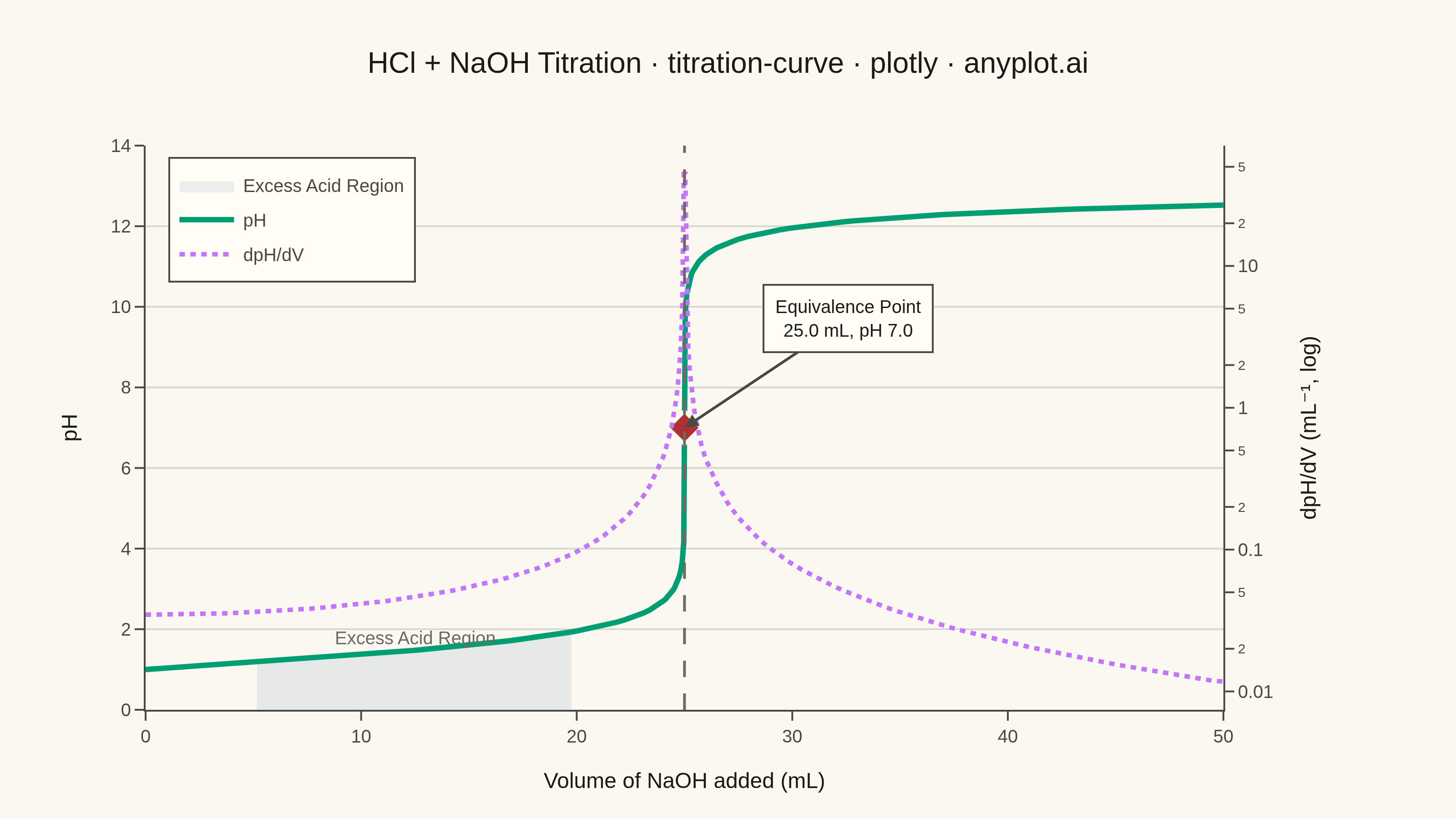
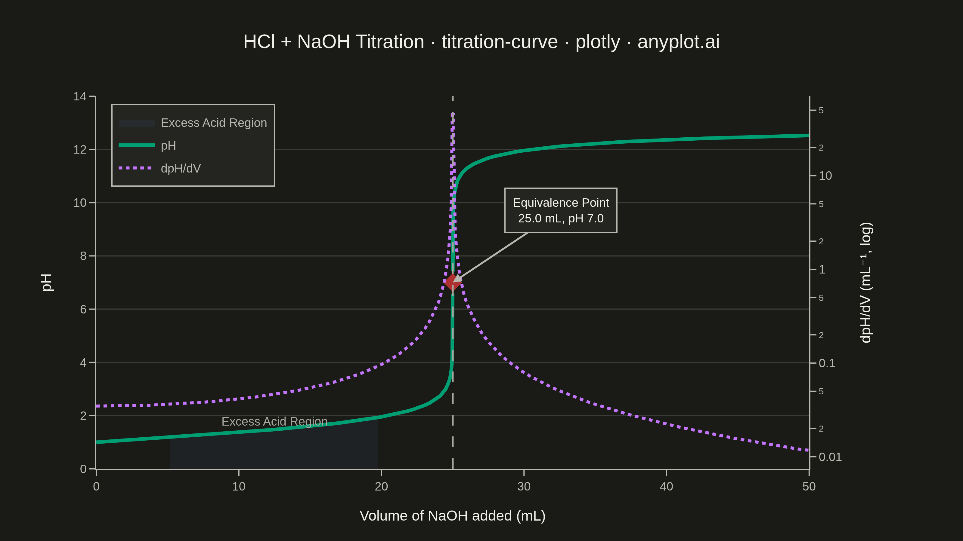
A titration curve plotting pH against volume of titrant added, producing the characteristic S-shaped (sigmoidal) curve used in analytical chemistry. The plot reveals buffer regions, equivalence points, and acid/base strength at a glance. Essential for chemistry education and laboratory analysis, it helps identify when a reaction reaches completion and which indicators are appropriate.
""" anyplot.ai
titration-curve: Acid-Base Titration Curve
Library: plotly 6.8.0 | Python 3.13.14
Quality: 91/100 | Updated: 2026-06-24
"""

import os
import sys


# Prioritize venv's site-packages over current directory
if sys.prefix not in sys.path:
    import site

    site_packages = site.getsitepackages()
    if isinstance(site_packages, list):
        sys.path = site_packages + sys.path
    else:
        sys.path.insert(0, site_packages)

import numpy as np
import plotly.graph_objects as go
from plotly.subplots import make_subplots


# Theme — Imprint palette chrome tokens
THEME = os.getenv("ANYPLOT_THEME", "light")
PAGE_BG = "#FAF8F1" if THEME == "light" else "#1A1A17"
ELEVATED_BG = "#FFFDF6" if THEME == "light" else "#242420"
INK = "#1A1A17" if THEME == "light" else "#F0EFE8"
INK_SOFT = "#4A4A44" if THEME == "light" else "#B8B7B0"
INK_MUTED = "#6B6A63" if THEME == "light" else "#A8A79F"
GRID = "rgba(26,26,23,0.15)" if THEME == "light" else "rgba(240,239,232,0.15)"

# Imprint categorical palette — 8 hues, theme-independent
IMPRINT = ["#009E73", "#C475FD", "#4467A3", "#BD8233", "#AE3030", "#2ABCCD", "#954477", "#99B314"]

# Data — 25 mL of 0.1 M HCl titrated with 0.1 M NaOH
c_acid = 0.1
v_acid = 25.0
c_base = 0.1
volume_ml = np.unique(
    np.concatenate([np.linspace(0.0, 24.0, 80), np.linspace(24.0, 26.0, 30), np.linspace(26.0, 50.0, 50)])
)

ph = np.zeros_like(volume_ml)
for i, v in enumerate(volume_ml):
    total_vol = (v_acid + v) / 1000.0
    moles_acid = c_acid * v_acid / 1000.0
    moles_base = c_base * v / 1000.0
    diff = moles_acid - moles_base
    if diff > 1e-10:
        ph[i] = -np.log10(diff / total_vol)
    elif diff < -1e-10:
        ph[i] = 14.0 + np.log10(-diff / total_vol)
    else:
        ph[i] = 7.0

ph = np.clip(ph, 0, 14)

# Derivative — log-scaled on secondary axis to reveal both the spike and subtle
# pre/post-equivalence variation (linear scale compressed everything to near zero)
dph_dv = np.gradient(ph, volume_ml)
dph_dv_log = np.clip(dph_dv, 1e-4, None)

# Equivalence point (strong acid/base: pH 7 at 25 mL)
eq_volume = 25.0
eq_ph = 7.0

# Excess acid region — gradual pH change zone before the steep transition
# Renamed from "Buffer Region": strong acid-base titrations have no true buffer capacity
ea_start, ea_end = 5.0, 20.0
ea_mask = (volume_ml >= ea_start) & (volume_ml <= ea_end)

# Figure
fig = make_subplots(specs=[[{"secondary_y": True}]])

# Excess acid region shading
ea_v = volume_ml[ea_mask]
ea_p = ph[ea_mask]
fig.add_trace(
    go.Scatter(
        x=np.concatenate([ea_v, ea_v[::-1]]),
        y=np.concatenate([ea_p, np.zeros(len(ea_p))]),
        fill="toself",
        fillcolor="rgba(68,103,163,0.10)",
        line={"width": 0},
        name="Excess Acid Region",
        hoverinfo="skip",
    ),
    secondary_y=False,
)

# pH curve — Imprint pos 1 (brand green), always first series
fig.add_trace(
    go.Scatter(
        x=volume_ml,
        y=ph,
        mode="lines",
        name="pH",
        line={"color": IMPRINT[0], "width": 3.0},
        hovertemplate="Volume: %{x:.1f} mL<br>pH: %{y:.2f}<extra></extra>",
    ),
    secondary_y=False,
)

# Derivative curve — Imprint pos 2 (lavender), log scale reveals shape throughout
fig.add_trace(
    go.Scatter(
        x=volume_ml,
        y=dph_dv_log,
        mode="lines",
        name="dpH/dV",
        line={"color": IMPRINT[1], "width": 2.5, "dash": "dot"},
        hovertemplate="Volume: %{x:.1f} mL<br>dpH/dV: %{y:.3f} mL⁻¹<extra></extra>",
    ),
    secondary_y=True,
)

# Equivalence point marker + vertical reference + annotation
fig.add_vline(x=eq_volume, line_dash="dash", line_color=INK_MUTED, line_width=1.5)
fig.add_trace(
    go.Scatter(
        x=[eq_volume],
        y=[eq_ph],
        mode="markers",
        name="Equivalence Point",
        marker={"size": 14, "color": IMPRINT[4], "symbol": "diamond", "line": {"width": 2, "color": PAGE_BG}},
        showlegend=False,
        hovertemplate="Equivalence Point<br>%{x:.1f} mL, pH %{y:.1f}<extra></extra>",
    ),
    secondary_y=False,
)
fig.add_annotation(
    x=eq_volume,
    y=eq_ph,
    text=f"Equivalence Point<br>{eq_volume:.1f} mL, pH {eq_ph:.1f}",
    showarrow=True,
    arrowhead=2,
    arrowwidth=1.5,
    arrowcolor=INK_SOFT,
    ax=90,
    ay=-60,
    font={"size": 10, "color": INK, "family": "Arial"},
    bgcolor=ELEVATED_BG,
    bordercolor=INK_SOFT,
    borderwidth=1,
    borderpad=6,
)

# Region label
fig.add_annotation(
    x=(ea_start + ea_end) / 2,
    y=1.8,
    text="Excess Acid Region",
    showarrow=False,
    font={"size": 10, "color": INK_MUTED, "family": "Arial"},
)

# Layout — canvas: width=800 height=450 scale=4 → 3200×1800 px
fig.update_layout(
    autosize=False,
    title={
        "text": "HCl + NaOH Titration · titration-curve · plotly · anyplot.ai",
        "font": {"size": 16, "family": "Arial", "color": INK},
        "x": 0.5,
        "xanchor": "center",
    },
    paper_bgcolor=PAGE_BG,
    plot_bgcolor=PAGE_BG,
    font={"color": INK, "family": "Arial"},
    legend={
        "font": {"size": 10, "family": "Arial", "color": INK_SOFT},
        "x": 0.02,
        "y": 0.98,
        "bgcolor": ELEVATED_BG,
        "bordercolor": INK_SOFT,
        "borderwidth": 1,
    },
    margin={"l": 80, "r": 90, "t": 80, "b": 60},
    hovermode="x unified",
)

fig.update_xaxes(
    title={"text": "Volume of NaOH added (mL)", "font": {"size": 12, "family": "Arial", "color": INK}},
    tickfont={"size": 10, "family": "Arial", "color": INK_SOFT},
    showgrid=False,
    showline=True,
    linewidth=1,
    linecolor=INK_SOFT,
    zeroline=False,
    ticks="outside",
    ticklen=5,
    tickcolor=INK_SOFT,
)

fig.update_yaxes(
    title={"text": "pH", "font": {"size": 12, "family": "Arial", "color": INK}},
    tickfont={"size": 10, "family": "Arial", "color": INK_SOFT},
    range=[0, 14],
    dtick=2,
    showgrid=True,
    gridwidth=1,
    gridcolor=GRID,
    showline=True,
    linewidth=1,
    linecolor=INK_SOFT,
    zeroline=False,
    ticks="outside",
    ticklen=5,
    tickcolor=INK_SOFT,
    secondary_y=False,
)

fig.update_yaxes(
    title={"text": "dpH/dV (mL⁻¹, log)", "font": {"size": 12, "family": "Arial", "color": INK}},
    tickfont={"size": 10, "family": "Arial", "color": INK_SOFT},
    type="log",
    showgrid=False,
    showline=True,
    linewidth=1,
    linecolor=INK_SOFT,
    zeroline=False,
    ticks="outside",
    ticklen=5,
    tickcolor=INK_SOFT,
    secondary_y=True,
)

# Save
fig.write_image(f"plot-{THEME}.png", width=800, height=450, scale=4)
fig.write_html(f"plot-{THEME}.html", include_plotlyjs="cdn")
Runnable source as JSON, for any HTTP client: https://api.anyplot.ai/specs/titration-curve/plotly/code. Any spec id and library id listed in llms-full.txt fit the same URL shape; every URL below is complete and callable.
{
  "spec_id": "titration-curve",
  "language": "python",
  "library": "plotly",
  "page": "https://anyplot.ai/titration-curve/python/plotly",
  "hub": "https://anyplot.ai/titration-curve",
  "code_json": "https://api.anyplot.ai/specs/titration-curve/plotly/code",
  "spec_json": "https://api.anyplot.ai/specs/titration-curve",
  "render_light_png": "https://storage.googleapis.com/anyplot-images/plots/titration-curve/python/plotly/plot-light.png",
  "render_dark_png": "https://storage.googleapis.com/anyplot-images/plots/titration-curve/python/plotly/plot-dark.png",
  "interactive_light_html": "https://storage.googleapis.com/anyplot-images/plots/titration-curve/python/plotly/plot-light.html",
  "interactive_dark_html": "https://storage.googleapis.com/anyplot-images/plots/titration-curve/python/plotly/plot-dark.html",
  "quality_score": 91.0,
  "license": "MIT",
  "guide": "https://anyplot.ai/llms.txt"
}
Part of Acid-Base Titration Curve on anyplot.ai.