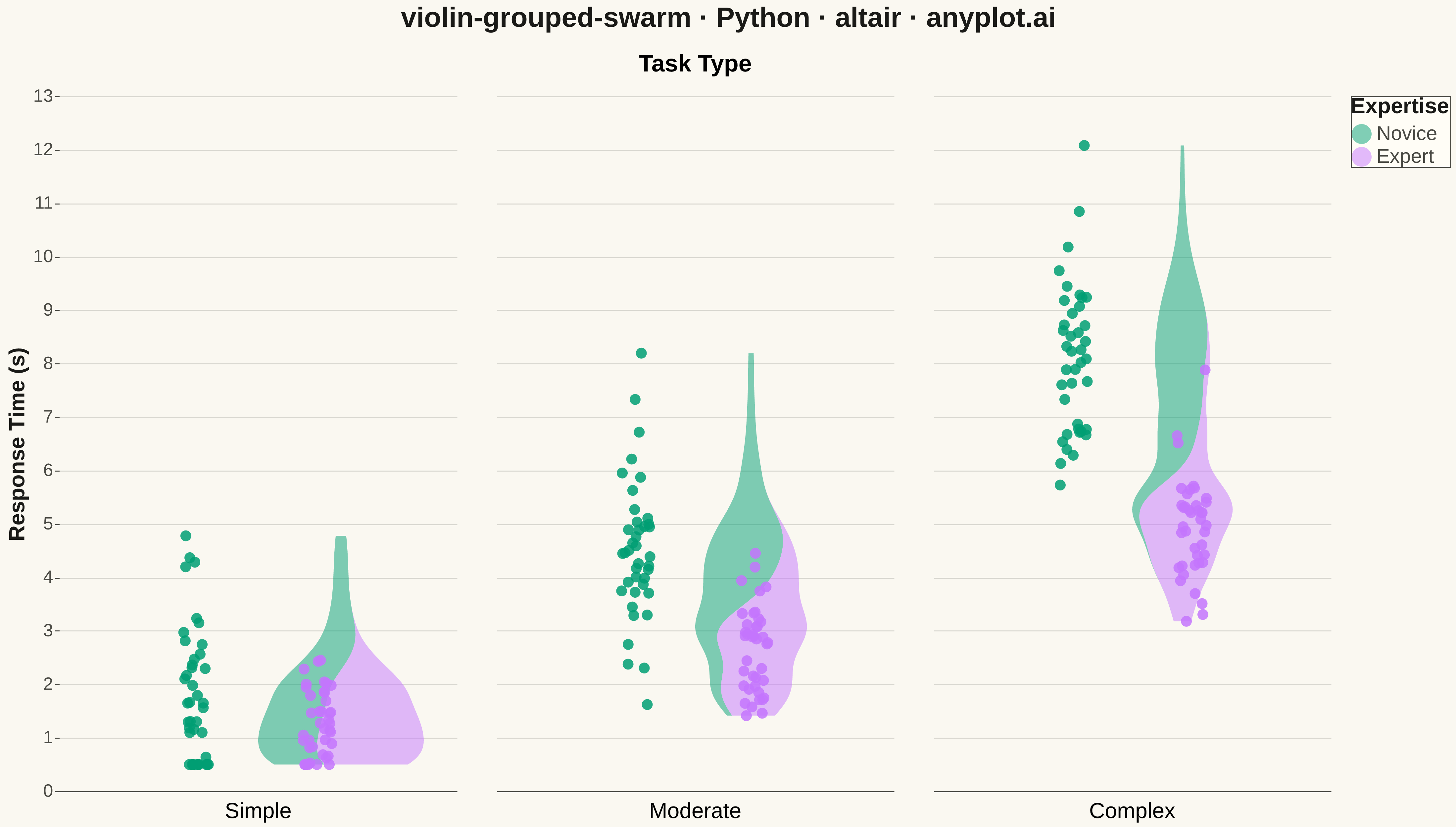
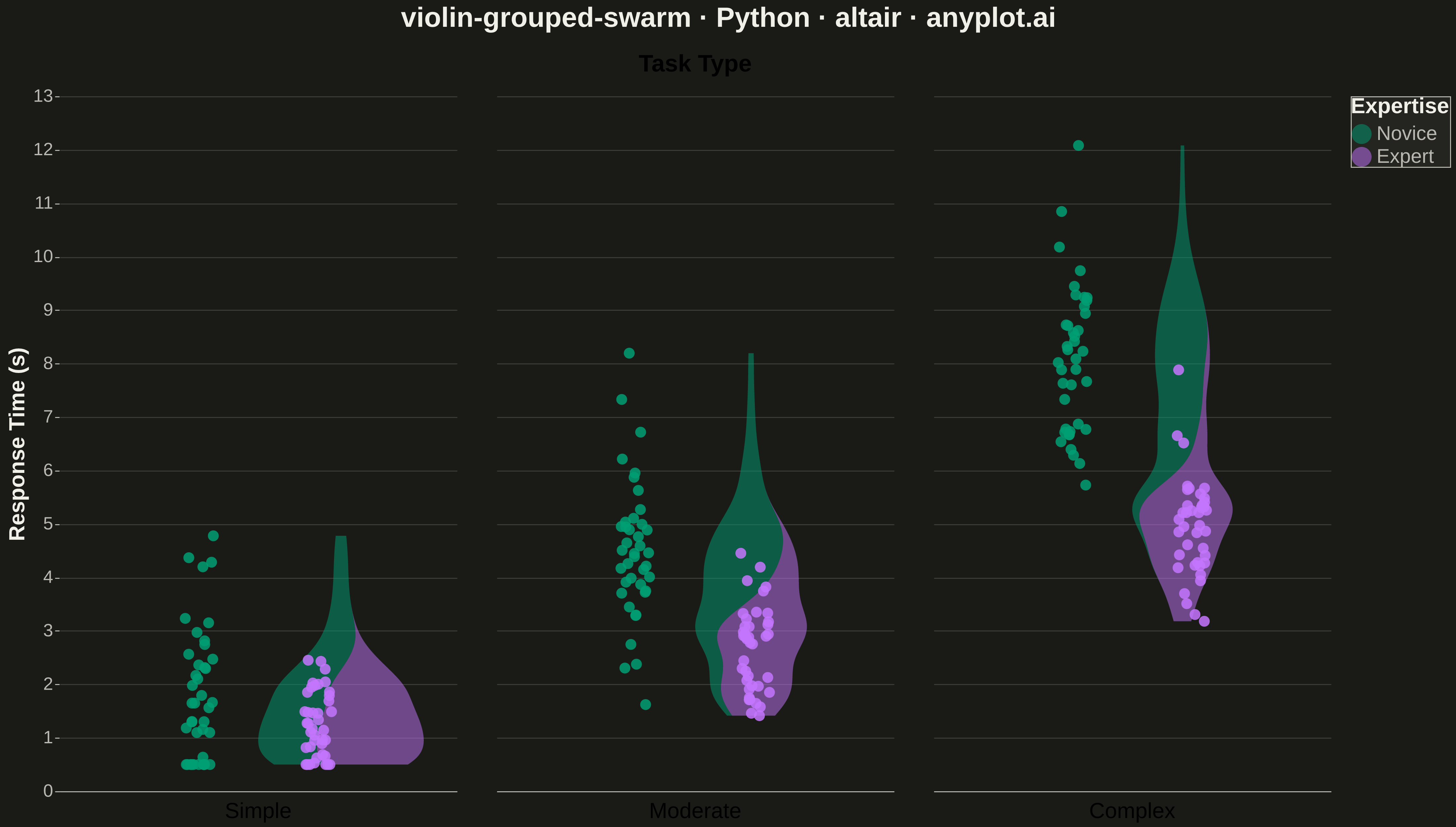
A grouped violin plot with individual data points overlaid as swarm points, showing distributions across two categorical dimensions simultaneously. Multiple violin plots are arranged by category on the x-axis and grouped by a secondary variable using color/hue, with swarm points revealing the underlying raw data. This visualization combines distribution shape visualization with complete data transparency, ideal for comparing how distributions differ across multiple factors.
""" anyplot.ai
violin-grouped-swarm: Grouped Violin Plot with Swarm Overlay
Library: altair 6.1.0 | Python 3.13.13
Quality: 92/100 | Updated: 2026-05-18
"""

import os
import sys
from importlib.machinery import SourceFileLoader

import numpy as np
import pandas as pd


venv_path = sys.executable
site_packages = os.path.join(os.path.dirname(venv_path), "..", "lib", "python3.13", "site-packages")
altair_init = os.path.join(site_packages, "altair", "__init__.py")

loader = SourceFileLoader("altair", altair_init)
alt = loader.load_module()

# Theme tokens
THEME = os.getenv("ANYPLOT_THEME", "light")
PAGE_BG = "#FAF8F1" if THEME == "light" else "#1A1A17"
ELEVATED_BG = "#FFFDF6" if THEME == "light" else "#242420"
INK = "#1A1A17" if THEME == "light" else "#F0EFE8"
INK_SOFT = "#4A4A44" if THEME == "light" else "#B8B7B0"
IMPRINT = ["#009E73", "#C475FD", "#4467A3", "#BD8233", "#AE3030"]

# Data - Response times across task types and expertise levels
np.random.seed(42)

categories = ["Simple", "Moderate", "Complex"]
groups = ["Novice", "Expert"]
n_per_group = 40

data = []
for cat in categories:
    for grp in groups:
        base = {"Simple": 2.0, "Moderate": 4.5, "Complex": 8.0}[cat]
        if grp == "Expert":
            base *= 0.6
            spread = 0.8
        else:
            spread = 1.5

        values = np.random.normal(base, spread, n_per_group)
        values = np.clip(values, 0.5, 15)

        for v in values:
            data.append({"Task Type": cat, "Expertise": grp, "Response Time (s)": v})

df = pd.DataFrame(data)

# Create base chart with Okabe-Ito colors
base = alt.Chart(df).encode(
    color=alt.Color(
        "Expertise:N",
        scale=alt.Scale(domain=["Novice", "Expert"], range=IMPRINT[:2]),
        legend=alt.Legend(
            title="Expertise", titleFontSize=22, labelFontSize=20, orient="right", symbolSize=400, offset=20
        ),
    )
)

# Violin plot using density transform
violin = (
    base.transform_density(
        "Response Time (s)", as_=["Response Time (s)", "density"], groupby=["Task Type", "Expertise"]
    )
    .mark_area(orient="horizontal", opacity=0.5)
    .encode(
        x=alt.X(
            "density:Q",
            stack="center",
            impute=None,
            title=None,
            axis=alt.Axis(labels=False, values=[0], grid=False, ticks=False),
        ),
        y=alt.Y("Response Time (s):Q", title="Response Time (s)", axis=alt.Axis(grid=True, gridOpacity=0.15)),
    )
)

# Swarm points with jitter
swarm = (
    base.mark_circle(opacity=0.85, size=120)
    .encode(
        x=alt.X(
            "jitter:Q",
            title=None,
            axis=alt.Axis(labels=False, values=[0], grid=False, ticks=False),
            scale=alt.Scale(domain=[-1, 1]),
        ),
        y=alt.Y("Response Time (s):Q"),
        color=alt.Color("Expertise:N", scale=alt.Scale(domain=["Novice", "Expert"], range=IMPRINT[:2]), legend=None),
    )
    .transform_calculate(jitter='(random() - 0.5) * 0.15 + (datum.Expertise === "Novice" ? -0.3 : 0.3)')
)

# Layer and facet
chart = (
    alt.layer(violin, swarm)
    .facet(
        column=alt.Column(
            "Task Type:N",
            sort=categories,
            header=alt.Header(title="Task Type", titleFontSize=24, labelFontSize=22, labelOrient="bottom"),
        )
    )
    .resolve_scale(x="independent")
    .properties(
        title=alt.Title(
            "violin-grouped-swarm · Python · altair · anyplot.ai", fontSize=28, anchor="middle", offset=20, color=INK
        ),
        background=PAGE_BG,
    )
    .configure_axis(
        labelFontSize=18,
        titleFontSize=22,
        labelColor=INK_SOFT,
        titleColor=INK,
        domainColor=INK_SOFT,
        tickColor=INK_SOFT,
        gridColor=INK,
        gridOpacity=0.10,
    )
    .configure_view(fill=PAGE_BG, strokeWidth=0, continuousWidth=400, continuousHeight=700)
    .configure_facet(spacing=40)
    .configure_legend(fillColor=ELEVATED_BG, strokeColor=INK_SOFT, labelColor=INK_SOFT, titleColor=INK)
)

# Save PNG and HTML with theme-suffixed filenames
chart.save(f"plot-{THEME}.png", scale_factor=3.0)
chart.save(f"plot-{THEME}.html")
Runnable source as JSON, for any HTTP client: https://api.anyplot.ai/specs/violin-grouped-swarm/altair/code. Any spec id and library id listed in llms-full.txt fit the same URL shape; every URL below is complete and callable.
{
  "spec_id": "violin-grouped-swarm",
  "language": "python",
  "library": "altair",
  "page": "https://anyplot.ai/violin-grouped-swarm/python/altair",
  "hub": "https://anyplot.ai/violin-grouped-swarm",
  "code_json": "https://api.anyplot.ai/specs/violin-grouped-swarm/altair/code",
  "spec_json": "https://api.anyplot.ai/specs/violin-grouped-swarm",
  "render_light_png": "https://storage.googleapis.com/anyplot-images/plots/violin-grouped-swarm/python/altair/plot-light.png",
  "render_dark_png": "https://storage.googleapis.com/anyplot-images/plots/violin-grouped-swarm/python/altair/plot-dark.png",
  "interactive_light_html": "https://storage.googleapis.com/anyplot-images/plots/violin-grouped-swarm/python/altair/plot-light.html",
  "interactive_dark_html": "https://storage.googleapis.com/anyplot-images/plots/violin-grouped-swarm/python/altair/plot-dark.html",
  "quality_score": 92.0,
  "license": "MIT",
  "guide": "https://anyplot.ai/llms.txt"
}
Part of Grouped Violin Plot with Swarm Overlay on anyplot.ai.