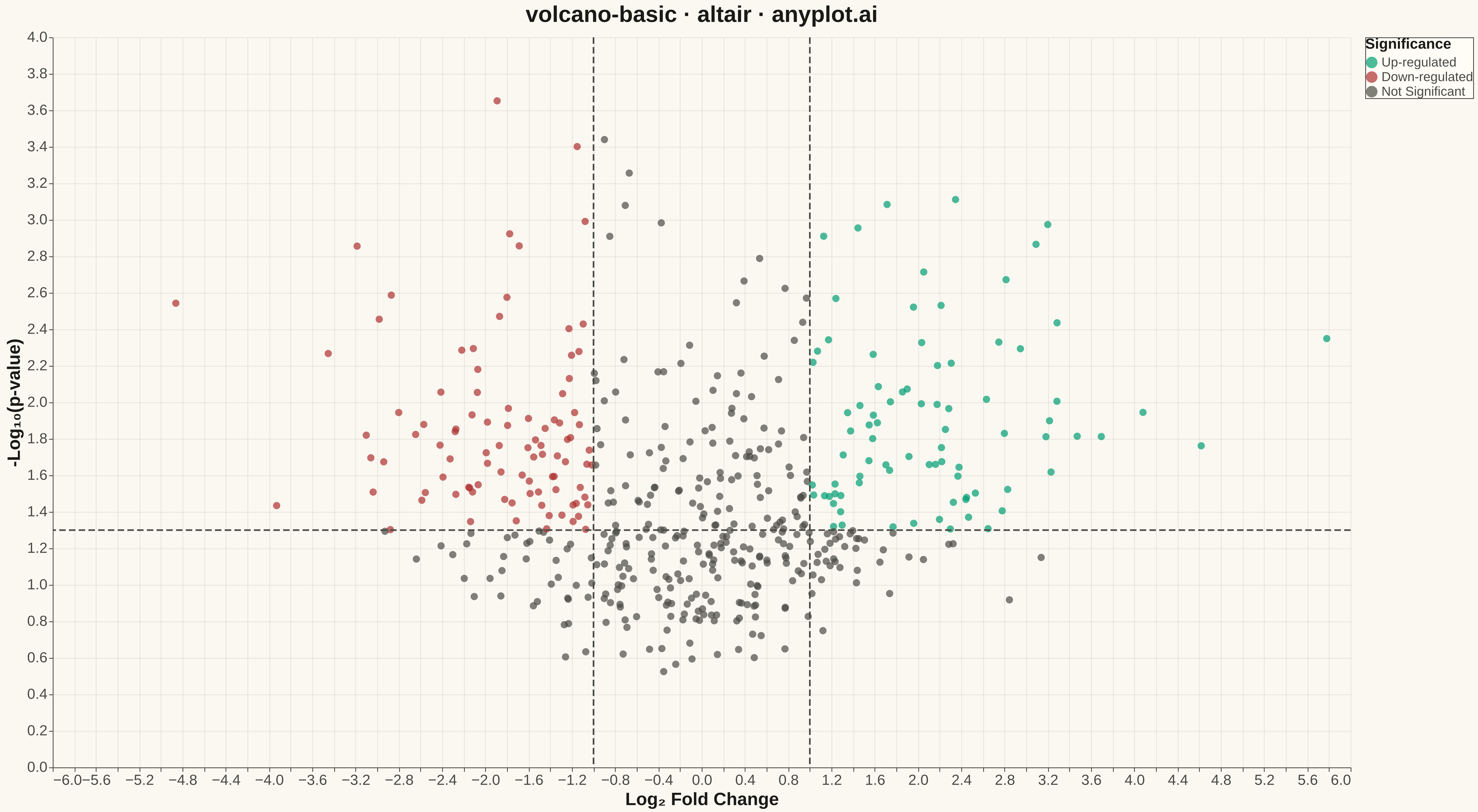
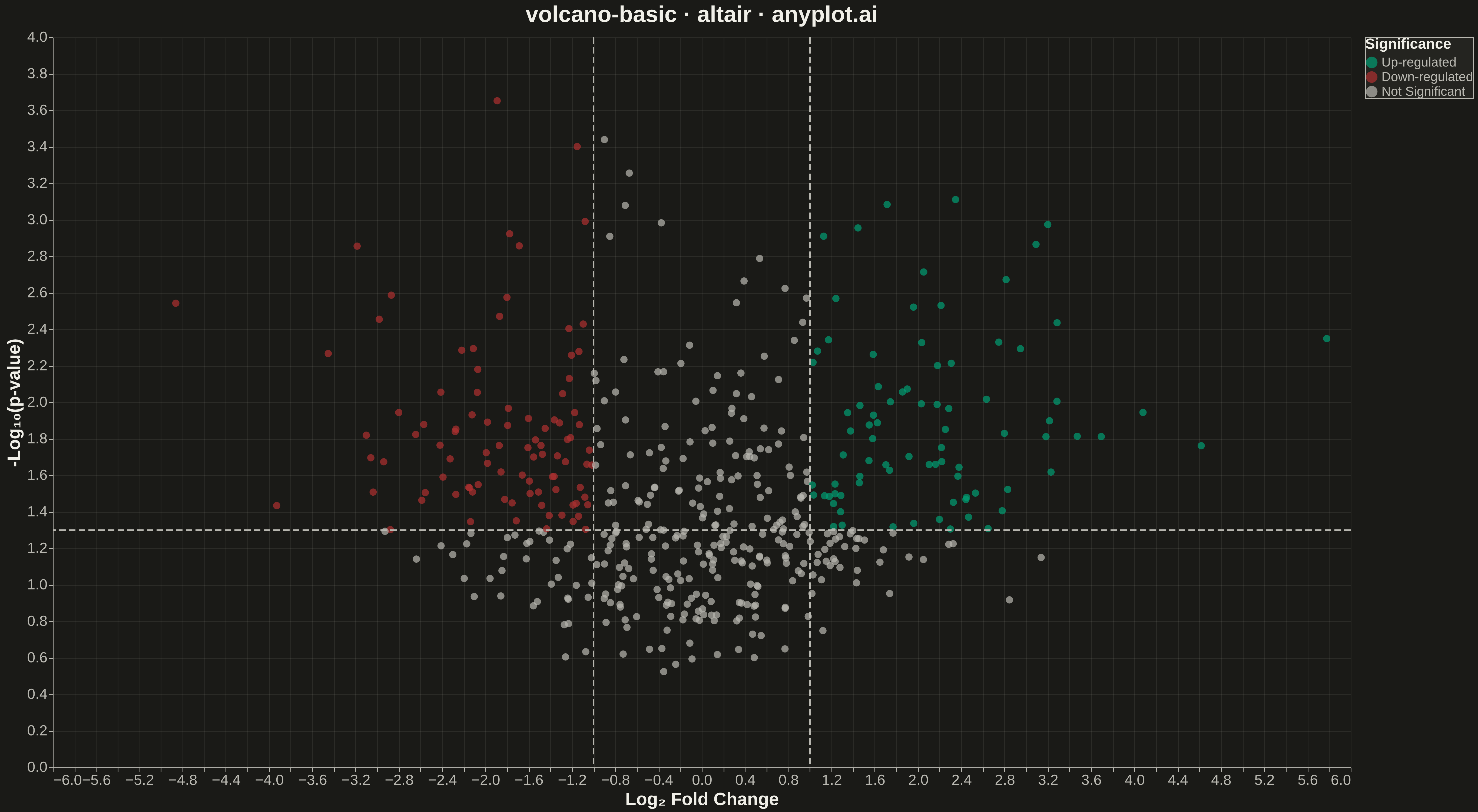
A volcano plot displays statistical significance (-log10 p-value) on the y-axis versus effect size (log2 fold change) on the x-axis. Points are typically color-coded to highlight features that are both statistically significant and have large effect sizes. This visualization is essential for quickly identifying the most important changes in differential expression, proteomics, and genomics studies.
""" anyplot.ai
volcano-basic: Volcano Plot for Statistical Significance
Library: altair 6.1.0 | Python 3.13.13
Quality: 85/100 | Updated: 2026-05-14
"""

import os

import altair as alt
import numpy as np
import pandas as pd


# Theme tokens
THEME = os.getenv("ANYPLOT_THEME", "light")
PAGE_BG = "#FAF8F1" if THEME == "light" else "#1A1A17"
ELEVATED_BG = "#FFFDF6" if THEME == "light" else "#242420"
INK = "#1A1A17" if THEME == "light" else "#F0EFE8"
INK_SOFT = "#4A4A44" if THEME == "light" else "#B8B7B0"

# Data - Simulated differential expression results
np.random.seed(42)
n_genes = 500

# Generate log2 fold changes (effect sizes)
log2_fc = np.random.normal(0, 1.5, n_genes)

# Generate p-values (most genes not significant)
base_pvalues = np.random.beta(1, 10, n_genes)  # Right-skewed toward 1

# Make genes with large fold changes more likely to be significant
significance_boost = np.exp(-np.abs(log2_fc) * 0.5)
pvalues = base_pvalues * significance_boost
pvalues = np.clip(pvalues, 1e-10, 1)

# Calculate -log10(p-value)
neg_log10_pvalue = -np.log10(pvalues)

# Determine significance categories
fc_threshold = 1.0  # log2(2) = 1, meaning 2-fold change
pval_threshold = 1.3  # -log10(0.05) ≈ 1.3

significant_up = (log2_fc >= fc_threshold) & (neg_log10_pvalue >= pval_threshold)
significant_down = (log2_fc <= -fc_threshold) & (neg_log10_pvalue >= pval_threshold)

category = np.where(significant_up, "Up-regulated", np.where(significant_down, "Down-regulated", "Not Significant"))

# Create dataframe
df = pd.DataFrame({"log2_fold_change": log2_fc, "neg_log10_pvalue": neg_log10_pvalue, "category": category})

# Threshold lines data
vline_data = pd.DataFrame({"x": [-fc_threshold, fc_threshold]})
hline_data = pd.DataFrame({"y": [pval_threshold]})

# Color mapping using Okabe-Ito palette
color_scale = alt.Scale(
    domain=["Up-regulated", "Down-regulated", "Not Significant"],
    range=["#009E73", "#AE3030", INK_SOFT],  # imprint green (up) / red (down) / adaptive gray (n.s.)
)

# Main scatter plot
scatter = (
    alt.Chart(df)
    .mark_circle(size=80, opacity=0.7)
    .encode(
        x=alt.X("log2_fold_change:Q", title="Log₂ Fold Change", scale=alt.Scale(domain=[-6, 6])),
        y=alt.Y("neg_log10_pvalue:Q", title="-Log₁₀(p-value)"),
        color=alt.Color("category:N", scale=color_scale, title="Significance"),
        tooltip=["log2_fold_change:Q", "neg_log10_pvalue:Q", "category:N"],
    )
)

# Vertical threshold lines
vlines = alt.Chart(vline_data).mark_rule(strokeDash=[8, 4], color=INK_SOFT, strokeWidth=2).encode(x="x:Q")

# Horizontal threshold line
hline = alt.Chart(hline_data).mark_rule(strokeDash=[8, 4], color=INK_SOFT, strokeWidth=2).encode(y="y:Q")

# Combine all layers
chart = (
    (scatter + vlines + hline)
    .properties(
        width=1600,
        height=900,
        title=alt.Title("volcano-basic · altair · anyplot.ai", fontSize=28, anchor="middle"),
        background=PAGE_BG,
    )
    .configure_view(fill=PAGE_BG, stroke=INK_SOFT, strokeWidth=0)
    .configure_axis(
        labelFontSize=18,
        titleFontSize=22,
        gridOpacity=0.10,
        domainColor=INK_SOFT,
        tickColor=INK_SOFT,
        gridColor=INK_SOFT,
        labelColor=INK_SOFT,
        titleColor=INK,
    )
    .configure_legend(
        titleFontSize=18,
        labelFontSize=16,
        symbolSize=200,
        fillColor=ELEVATED_BG,
        strokeColor=INK_SOFT,
        labelColor=INK_SOFT,
        titleColor=INK,
    )
    .configure_title(color=INK, fontSize=28)
)

# Save as PNG and HTML with theme-suffixed filenames
chart.save(f"plot-{THEME}.png", scale_factor=3.0)
chart.save(f"plot-{THEME}.html")
Runnable source as JSON, for any HTTP client: https://api.anyplot.ai/specs/volcano-basic/altair/code. Any spec id and library id listed in llms-full.txt fit the same URL shape; every URL below is complete and callable.
{
  "spec_id": "volcano-basic",
  "language": "python",
  "library": "altair",
  "page": "https://anyplot.ai/volcano-basic/python/altair",
  "hub": "https://anyplot.ai/volcano-basic",
  "code_json": "https://api.anyplot.ai/specs/volcano-basic/altair/code",
  "spec_json": "https://api.anyplot.ai/specs/volcano-basic",
  "render_light_png": "https://storage.googleapis.com/anyplot-images/plots/volcano-basic/python/altair/plot-light.png",
  "render_dark_png": "https://storage.googleapis.com/anyplot-images/plots/volcano-basic/python/altair/plot-dark.png",
  "interactive_light_html": "https://storage.googleapis.com/anyplot-images/plots/volcano-basic/python/altair/plot-light.html",
  "interactive_dark_html": "https://storage.googleapis.com/anyplot-images/plots/volcano-basic/python/altair/plot-dark.html",
  "quality_score": 85.0,
  "license": "MIT",
  "guide": "https://anyplot.ai/llms.txt"
}
Part of Volcano Plot for Statistical Significance on anyplot.ai.