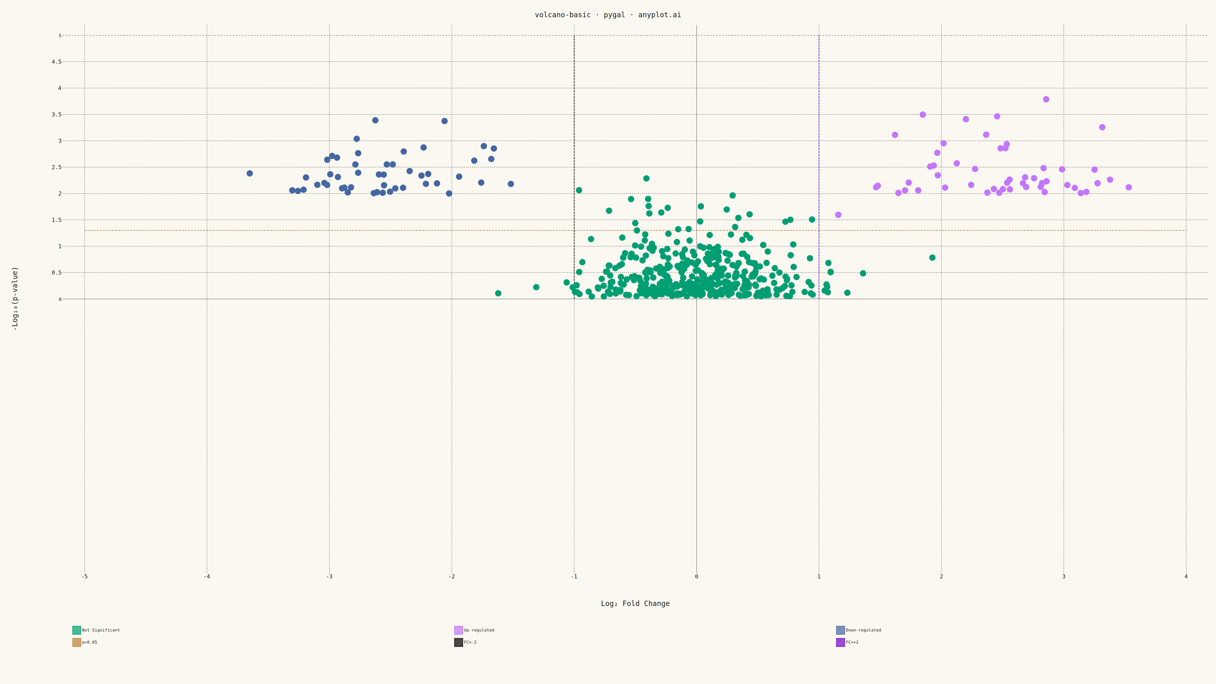
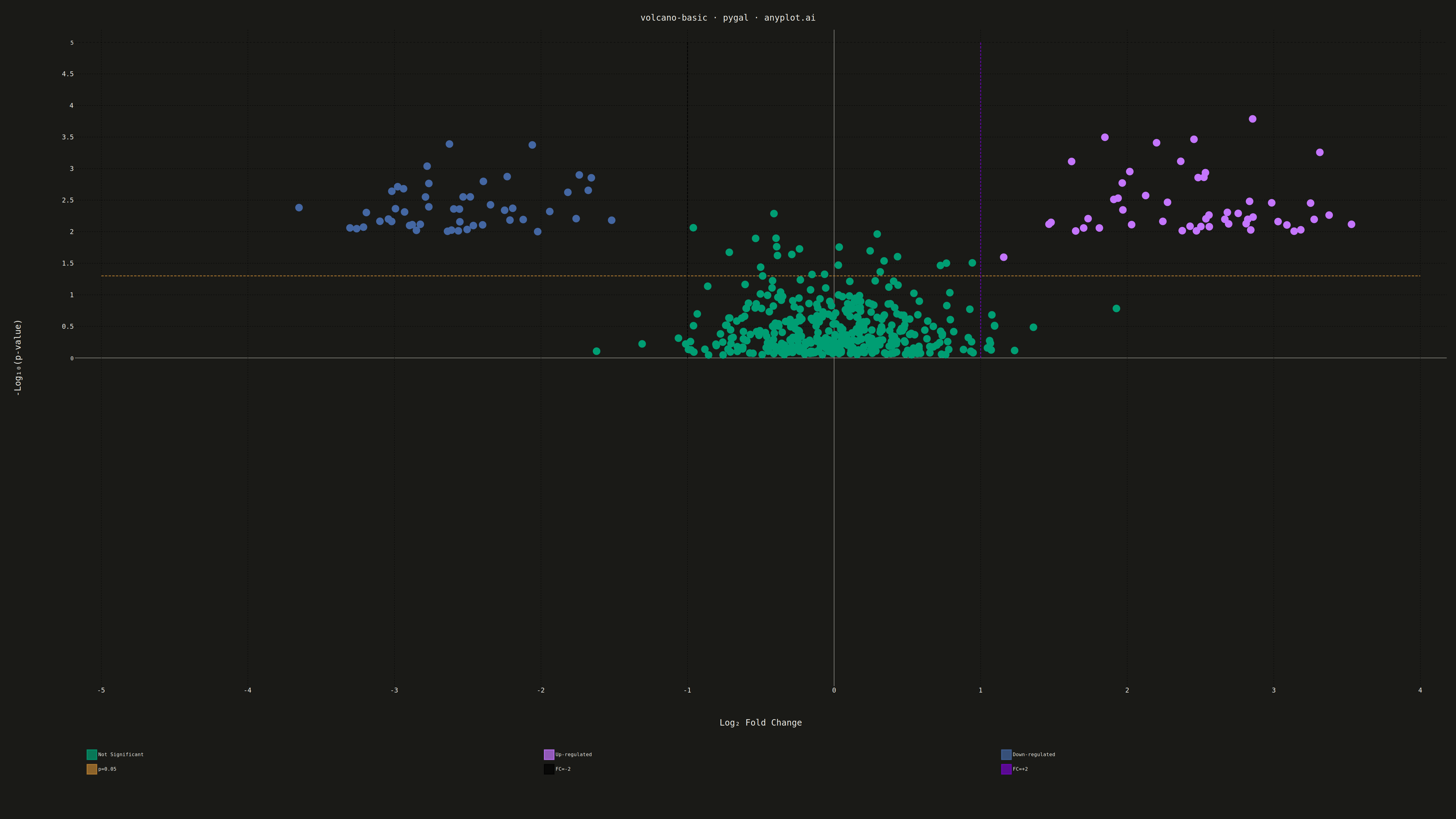
A volcano plot displays statistical significance (-log10 p-value) on the y-axis versus effect size (log2 fold change) on the x-axis. Points are typically color-coded to highlight features that are both statistically significant and have large effect sizes. This visualization is essential for quickly identifying the most important changes in differential expression, proteomics, and genomics studies.
""" anyplot.ai
volcano-basic: Volcano Plot for Statistical Significance
Library: pygal 3.1.0 | Python 3.13.13
Quality: 85/100 | Updated: 2026-05-14
"""

import os

import numpy as np
import pygal
from pygal.style import Style


THEME = os.getenv("ANYPLOT_THEME", "light")
PAGE_BG = "#FAF8F1" if THEME == "light" else "#1A1A17"
INK = "#1A1A17" if THEME == "light" else "#F0EFE8"
INK_MUTED = "#6B6A63" if THEME == "light" else "#A8A79F"

# Okabe-Ito palette (colorblind-safe)
IMPRINT = (
    "#009E73",  # position 1: green (brand)
    "#C475FD",  # position 2: vermillion (up-regulated)
    "#4467A3",  # position 3: blue (down-regulated)
    "#BD8233",  # position 4: reddish purple
)

custom_style = Style(
    background=PAGE_BG,
    plot_background=PAGE_BG,
    foreground=INK,
    foreground_strong=INK,
    foreground_subtle=INK_MUTED,
    colors=IMPRINT,
    title_font_size=28,
    label_font_size=22,
    major_label_font_size=18,
    legend_font_size=16,
    value_font_size=14,
    stroke_width=3,
)

# Data - Simulated differential gene expression results
np.random.seed(42)
n_genes = 500

# Generate fold changes (mostly near zero, some with larger effects)
log2_fc = np.concatenate(
    [
        np.random.normal(0, 0.5, 400),  # Non-significant genes
        np.random.normal(2.5, 0.5, 50),  # Up-regulated
        np.random.normal(-2.5, 0.5, 50),  # Down-regulated
    ]
)

# Generate p-values (correlated with effect size)
base_pval = np.random.uniform(0.001, 0.9, n_genes)
base_pval[400:] = np.random.uniform(0.0001, 0.01, 100)
neg_log10_pval = -np.log10(base_pval)

# Classification thresholds
fc_threshold = 1.0  # log2 fold change threshold (2-fold)
pval_threshold = 1.3  # -log10(0.05) ≈ 1.3

# Classify genes
up_regulated = (log2_fc > fc_threshold) & (neg_log10_pval > pval_threshold)
down_regulated = (log2_fc < -fc_threshold) & (neg_log10_pval > pval_threshold)
not_significant = ~(up_regulated | down_regulated)

# Calculate axis ranges based on actual data
y_max = float(np.ceil(max(neg_log10_pval) * 1.1))  # 10% padding
x_min = float(np.floor(min(log2_fc) * 1.1))
x_max = float(np.ceil(max(log2_fc) * 1.1))

# Generate y-axis labels from 0 to max
y_step = 0.5
y_labels = [i * y_step for i in range(int(y_max / y_step) + 1)]

# Create XY chart
chart = pygal.XY(
    width=4800,
    height=2700,
    style=custom_style,
    title="volcano-basic · pygal · anyplot.ai",
    x_title="Log₂ Fold Change",
    y_title="-Log₁₀(p-value)",
    show_legend=True,
    legend_at_bottom=True,
    legend_box_size=32,
    dots_size=12,
    stroke=False,
    show_x_guides=True,
    show_y_guides=True,
    x_label_rotation=0,
    include_x_axis=True,
    include_y_axis=True,
    explicit_size=True,
    truncate_legend=-1,
    spacing=40,
    margin=30,
    margin_bottom=140,
    margin_left=100,
    range=(x_min, x_max),
)

# Set y-axis labels
chart.y_labels = y_labels

# Prepare data points for each category with gene labels for tooltips
not_sig_points = [
    {"value": (float(log2_fc[i]), float(neg_log10_pval[i])), "label": f"Gene {i}"}
    for i in range(n_genes)
    if not_significant[i]
]
up_points = [
    {"value": (float(log2_fc[i]), float(neg_log10_pval[i])), "label": f"Gene {i}"}
    for i in range(n_genes)
    if up_regulated[i]
]
down_points = [
    {"value": (float(log2_fc[i]), float(neg_log10_pval[i])), "label": f"Gene {i}"}
    for i in range(n_genes)
    if down_regulated[i]
]

# Add data series (NOT in legend - these are reference lines)
# Gray for non-significant (neutral, not from Okabe-Ito)
chart.add("Not Significant", not_sig_points, color="#888888")
chart.add("Up-regulated", up_points, color="#AE3030")  # imprint red — up-regulated (semantic)
chart.add("Down-regulated", down_points, color="#4467A3")  # imprint blue — down-regulated

# Add threshold lines as separate series
# These won't appear in legend due to no hover text, but will render as lines
# Horizontal threshold line at p-value cutoff
h_line_points = [(x_min, pval_threshold), (x_max, pval_threshold)]
chart.add(
    "p=0.05",
    h_line_points,
    stroke=True,
    show_dots=False,
    color=INK_MUTED,
    stroke_style={"width": 3, "dasharray": "8, 4"},
)

# Vertical threshold lines at fold change cutoffs
v_line_neg_points = [(float(-fc_threshold), 0.0), (float(-fc_threshold), y_max)]
chart.add(
    "FC=-2",
    v_line_neg_points,
    stroke=True,
    show_dots=False,
    color=INK_MUTED,
    stroke_style={"width": 3, "dasharray": "8, 4"},
)

v_line_pos_points = [(float(fc_threshold), 0.0), (float(fc_threshold), y_max)]
chart.add(
    "FC=+2",
    v_line_pos_points,
    stroke=True,
    show_dots=False,
    color=INK_MUTED,
    stroke_style={"width": 3, "dasharray": "8, 4"},
)

# Save as PNG and HTML
chart.render_to_png(f"plot-{THEME}.png")
with open(f"plot-{THEME}.html", "wb") as f:
    f.write(chart.render())
Runnable source as JSON, for any HTTP client: https://api.anyplot.ai/specs/volcano-basic/pygal/code. Any spec id and library id listed in llms-full.txt fit the same URL shape; every URL below is complete and callable.
{
  "spec_id": "volcano-basic",
  "language": "python",
  "library": "pygal",
  "page": "https://anyplot.ai/volcano-basic/python/pygal",
  "hub": "https://anyplot.ai/volcano-basic",
  "code_json": "https://api.anyplot.ai/specs/volcano-basic/pygal/code",
  "spec_json": "https://api.anyplot.ai/specs/volcano-basic",
  "render_light_png": "https://storage.googleapis.com/anyplot-images/plots/volcano-basic/python/pygal/plot-light.png",
  "render_dark_png": "https://storage.googleapis.com/anyplot-images/plots/volcano-basic/python/pygal/plot-dark.png",
  "interactive_light_html": "https://storage.googleapis.com/anyplot-images/plots/volcano-basic/python/pygal/plot-light.html",
  "interactive_dark_html": "https://storage.googleapis.com/anyplot-images/plots/volcano-basic/python/pygal/plot-dark.html",
  "quality_score": 85.0,
  "license": "MIT",
  "guide": "https://anyplot.ai/llms.txt"
}
Part of Volcano Plot for Statistical Significance on anyplot.ai.