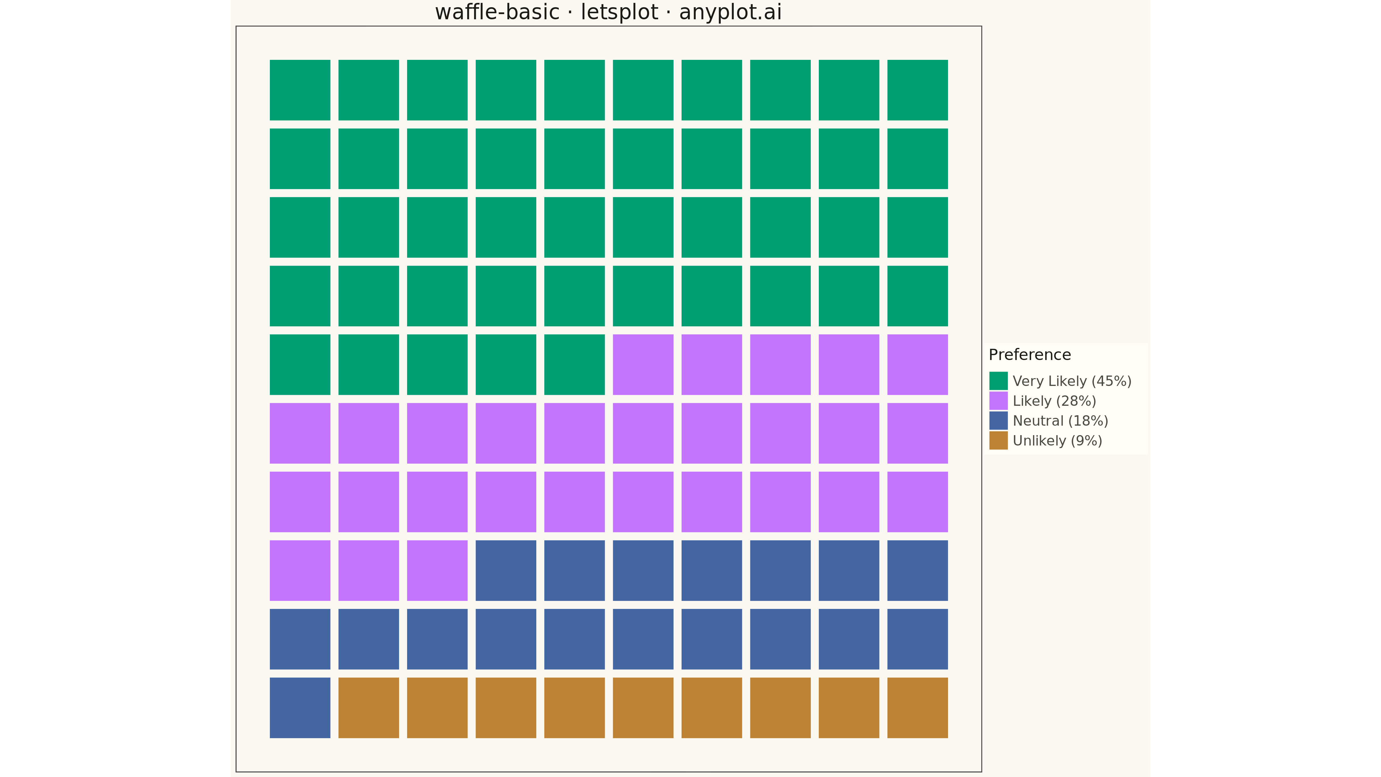
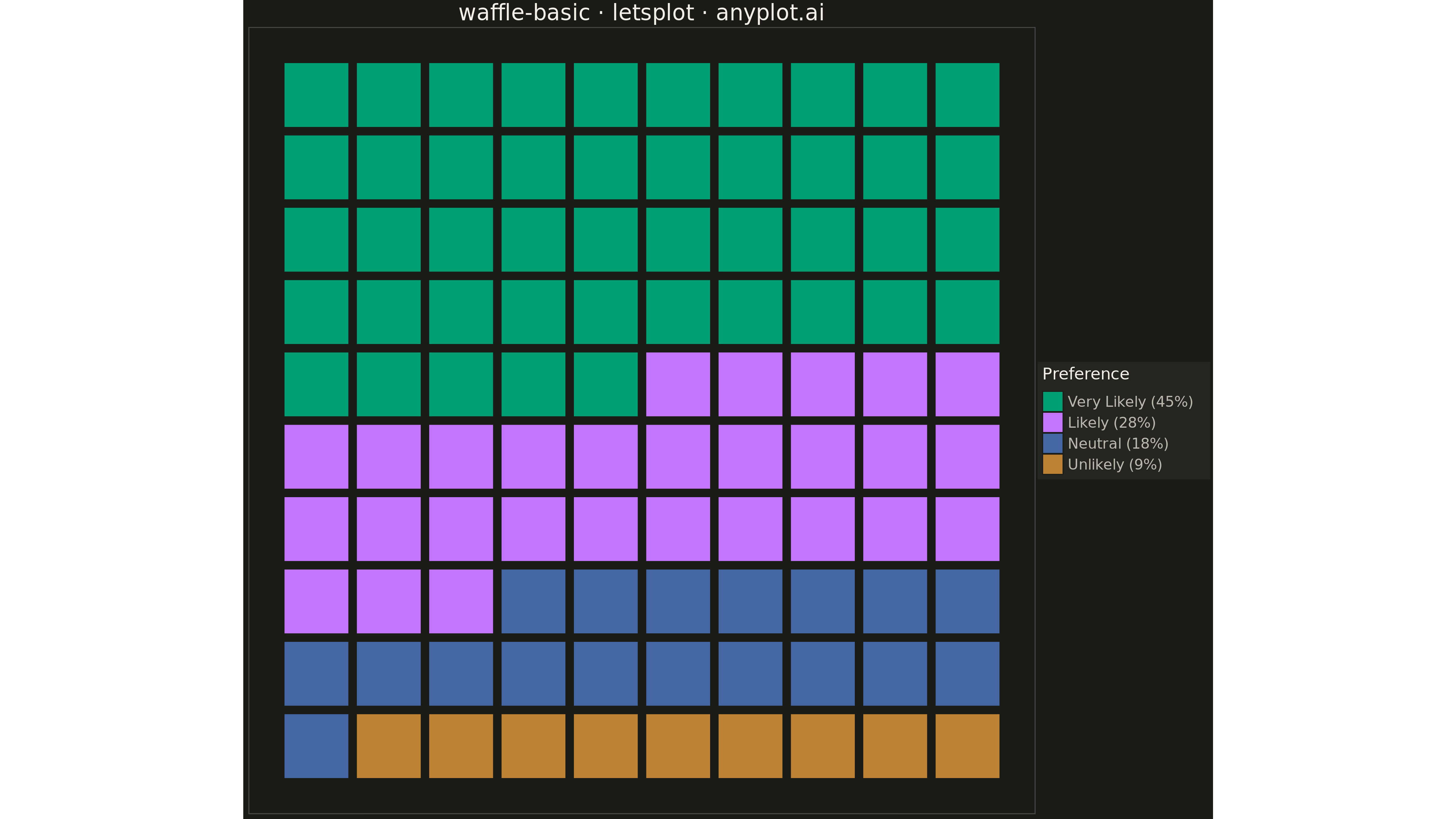
A waffle chart displays proportions using a grid of equal-sized squares where colored squares represent parts of a whole. Each square typically represents 1% of the total, making it easy to count and compare values visually. It provides an intuitive alternative to pie charts, offering more accurate perception of proportions.
Preview render from the lets-plot implementation.