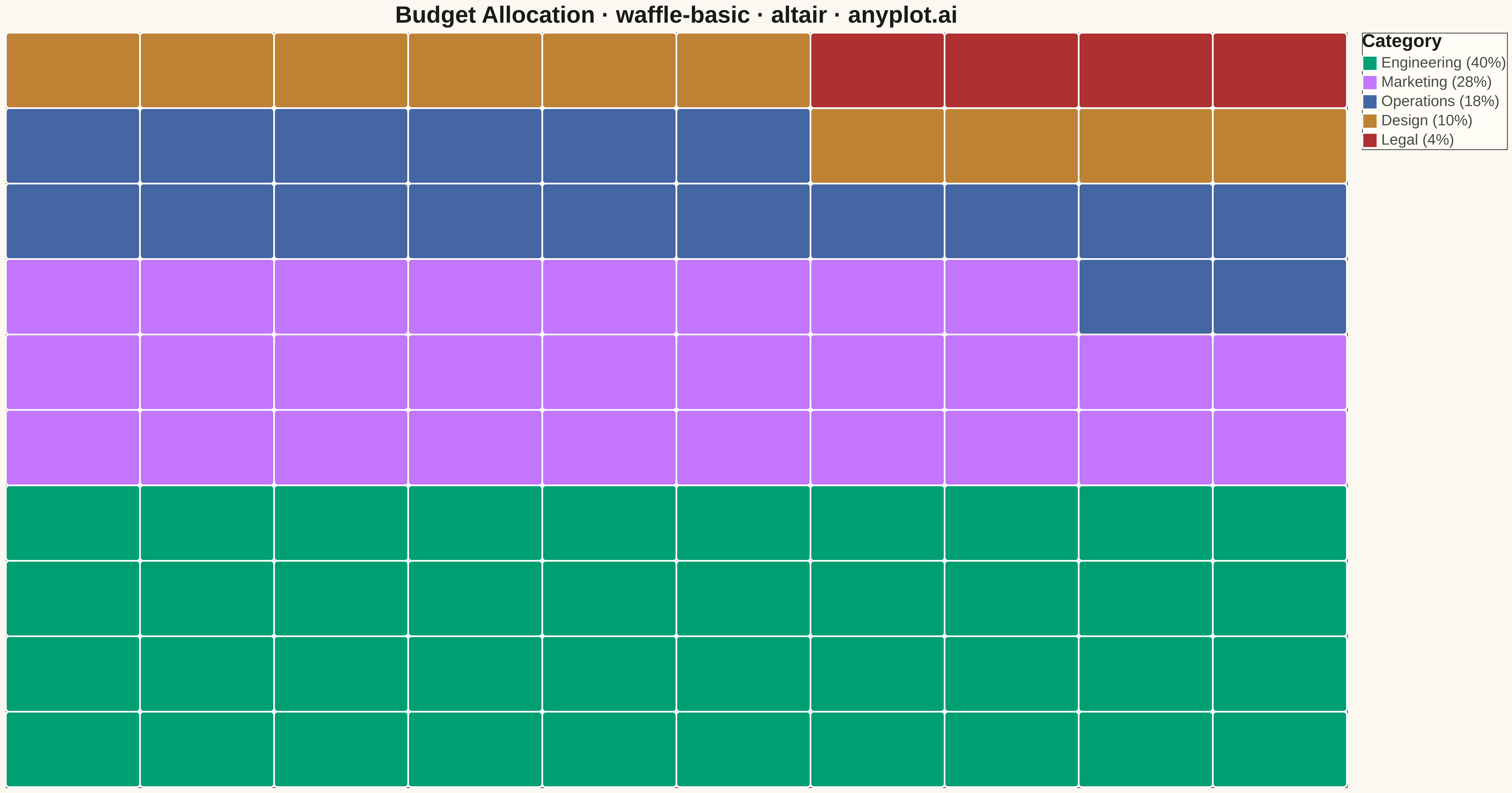
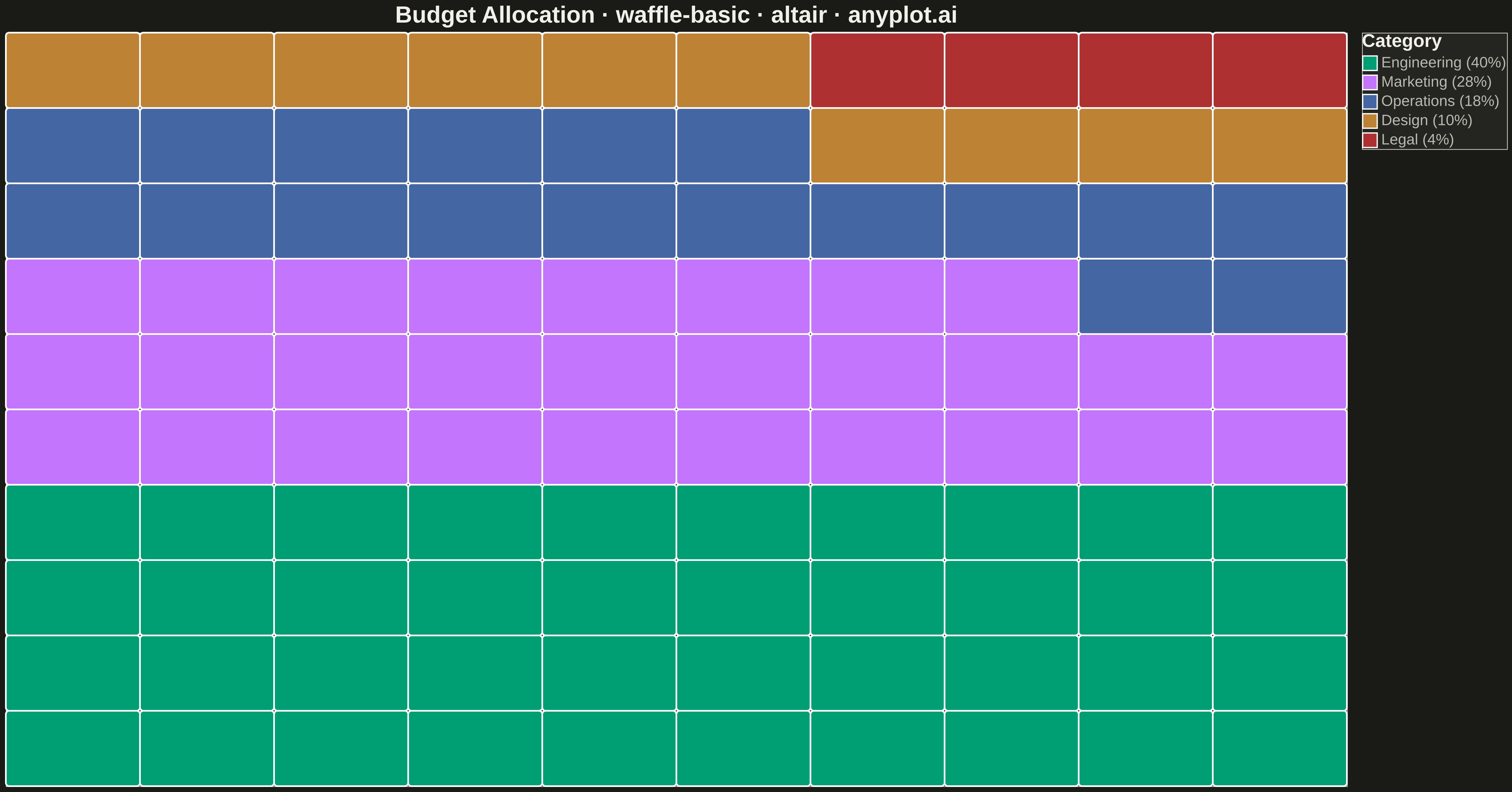
A waffle chart displays proportions using a grid of equal-sized squares where colored squares represent parts of a whole. Each square typically represents 1% of the total, making it easy to count and compare values visually. It provides an intuitive alternative to pie charts, offering more accurate perception of proportions.
""" anyplot.ai
waffle-basic: Basic Waffle Chart
Library: altair 6.1.0 | Python 3.13.13
Quality: 83/100 | Updated: 2026-05-05
"""

import os
import sys

import pandas as pd


# Fix import conflict: import from parent directory to avoid local module shadowing
original_path = sys.path[:]
sys.path = [p for p in sys.path if not p.endswith("python")]
try:
    import altair as alt
finally:
    sys.path = original_path


# Theme tokens
THEME = os.getenv("ANYPLOT_THEME", "light")
PAGE_BG = "#FAF8F1" if THEME == "light" else "#1A1A17"
ELEVATED_BG = "#FFFDF6" if THEME == "light" else "#242420"
INK = "#1A1A17" if THEME == "light" else "#F0EFE8"
INK_SOFT = "#4A4A44" if THEME == "light" else "#B8B7B0"

# Okabe-Ito palette (first series is #009E73)
IMPRINT = ["#009E73", "#C475FD", "#4467A3", "#BD8233", "#AE3030"]

# Data - Budget allocation with 5 categories including a small one
categories = ["Engineering", "Marketing", "Operations", "Design", "Legal"]
values = [40, 28, 18, 10, 4]  # Percentages (sum to 100)

# Build 10x10 grid (100 squares, each = 1%)
squares = []
square_idx = 0
for cat, val, color in zip(categories, values, IMPRINT, strict=True):
    for _ in range(val):
        row = square_idx // 10
        col = square_idx % 10
        squares.append({"category": cat, "row": row, "col": col, "color": color})
        square_idx += 1

df = pd.DataFrame(squares)

# Create waffle chart
chart = (
    alt.Chart(df)
    .mark_rect(stroke="white", strokeWidth=2, cornerRadius=4)
    .encode(
        x=alt.X("col:O", axis=None),
        y=alt.Y("row:O", axis=None, sort="descending"),
        color=alt.Color(
            "category:N",
            scale=alt.Scale(domain=categories, range=IMPRINT),
            legend=alt.Legend(
                title="Category",
                titleFontSize=22,
                labelFontSize=18,
                symbolSize=300,
                orient="right",
                labelExpr="datum.label + ' (' + {"
                + ", ".join([f"'{cat}': '{val}%'" for cat, val in zip(categories, values, strict=True)])
                + "}[datum.label] + ')'",
            ),
        ),
        tooltip=["category:N"],
    )
    .properties(
        width=1600,
        height=900,
        background=PAGE_BG,
        title=alt.Title(
            "Budget Allocation · waffle-basic · altair · anyplot.ai", fontSize=28, anchor="middle", color=INK
        ),
    )
    .configure_view(fill=PAGE_BG, stroke=INK_SOFT)
    .configure_axis(
        domainColor=INK_SOFT, tickColor=INK_SOFT, gridColor=INK, gridOpacity=0.10, labelColor=INK_SOFT, titleColor=INK
    )
    .configure_title(color=INK)
    .configure_legend(fillColor=ELEVATED_BG, strokeColor=INK_SOFT, labelColor=INK_SOFT, titleColor=INK)
)

# Save outputs
chart.save(f"plot-{THEME}.png", scale_factor=3.0)
chart.save(f"plot-{THEME}.html")
Runnable source as JSON, for any HTTP client: https://api.anyplot.ai/specs/waffle-basic/altair/code. Any spec id and library id listed in llms-full.txt fit the same URL shape; every URL below is complete and callable.
{
  "spec_id": "waffle-basic",
  "language": "python",
  "library": "altair",
  "page": "https://anyplot.ai/waffle-basic/python/altair",
  "hub": "https://anyplot.ai/waffle-basic",
  "code_json": "https://api.anyplot.ai/specs/waffle-basic/altair/code",
  "spec_json": "https://api.anyplot.ai/specs/waffle-basic",
  "render_light_png": "https://storage.googleapis.com/anyplot-images/plots/waffle-basic/python/altair/plot-light.png",
  "render_dark_png": "https://storage.googleapis.com/anyplot-images/plots/waffle-basic/python/altair/plot-dark.png",
  "interactive_light_html": "https://storage.googleapis.com/anyplot-images/plots/waffle-basic/python/altair/plot-light.html",
  "interactive_dark_html": "https://storage.googleapis.com/anyplot-images/plots/waffle-basic/python/altair/plot-dark.html",
  "quality_score": 83.0,
  "license": "MIT",
  "guide": "https://anyplot.ai/llms.txt"
}
Part of Basic Waffle Chart on anyplot.ai.