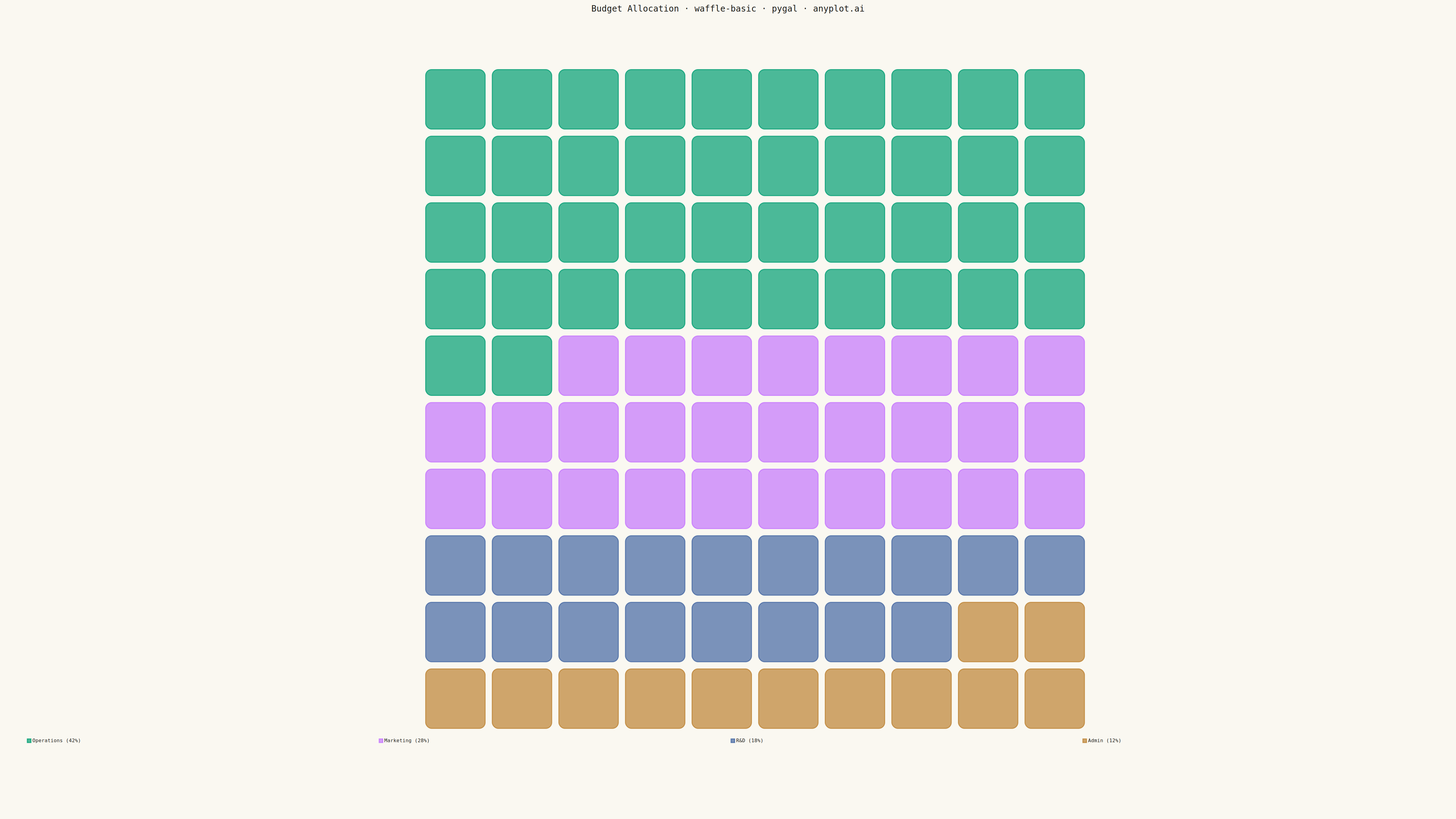
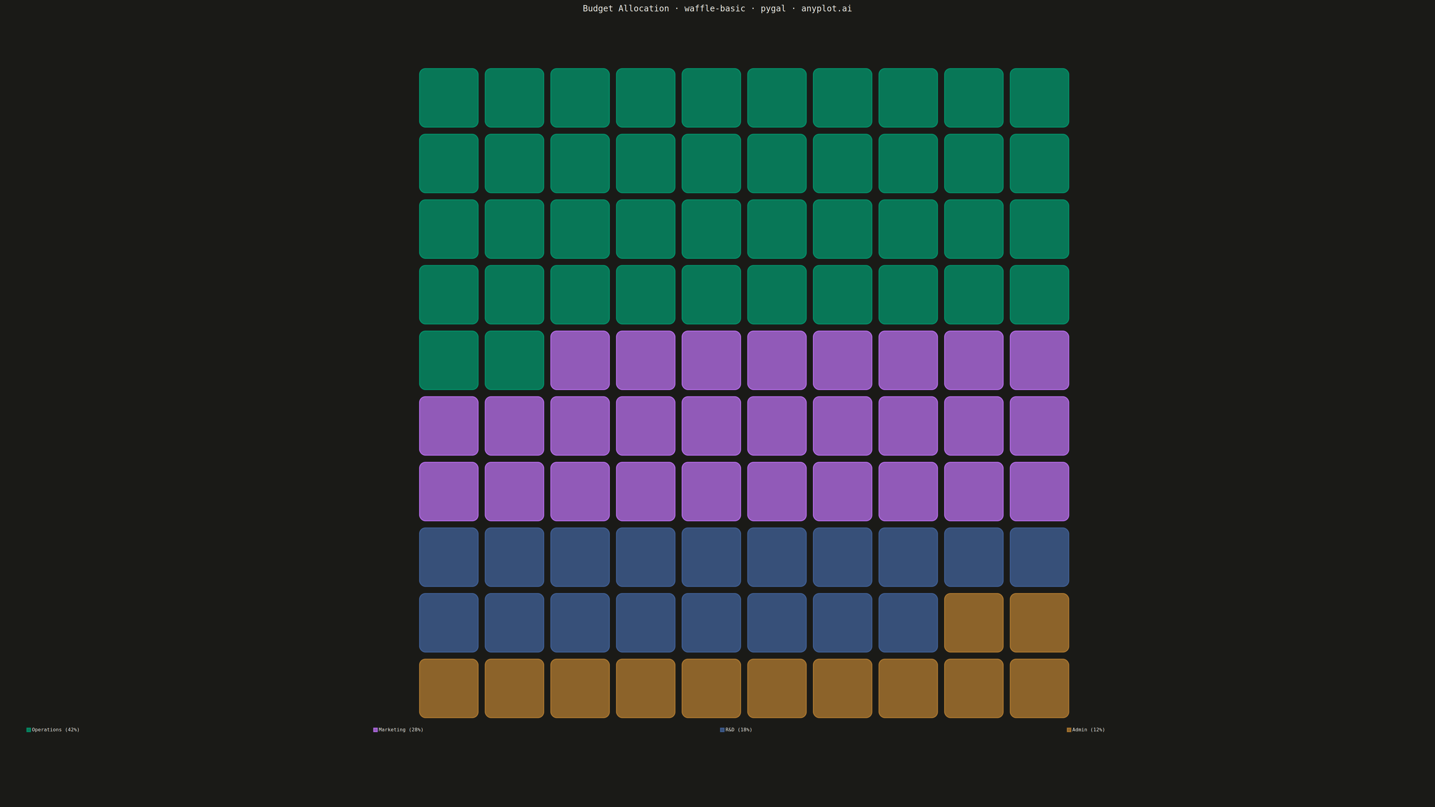
A waffle chart displays proportions using a grid of equal-sized squares where colored squares represent parts of a whole. Each square typically represents 1% of the total, making it easy to count and compare values visually. It provides an intuitive alternative to pie charts, offering more accurate perception of proportions.
""" anyplot.ai
waffle-basic: Basic Waffle Chart
Library: pygal 3.1.0 | Python 3.13.13
Quality: 91/100 | Updated: 2026-05-05
"""

import os
import sys


THEME = os.getenv("ANYPLOT_THEME", "light")
PAGE_BG = "#FAF8F1" if THEME == "light" else "#1A1A17"
INK = "#1A1A17" if THEME == "light" else "#F0EFE8"
INK_MUTED = "#6B6A63" if THEME == "light" else "#A8A79F"

IMPRINT = ("#009E73", "#C475FD", "#4467A3", "#BD8233", "#AE3030", "#2ABCCD", "#954477")

_cwd = sys.path[0] if sys.path[0] else "."
if _cwd in sys.path:
    sys.path.remove(_cwd)

from pygal.graph.graph import Graph
from pygal.style import Style


sys.path.insert(0, _cwd)


class Waffle(Graph):
    _serie_margin = 0

    def __init__(self, *args, **kwargs):
        self.rows = kwargs.pop("rows", 10)
        self.cols = kwargs.pop("cols", 10)
        super().__init__(*args, **kwargs)

    def _plot(self):
        total = sum(sum(v for v in serie.values if v is not None) for serie in self.series)
        if total == 0:
            return

        total_squares = self.rows * self.cols

        plot_width = self.view.width
        plot_height = self.view.height

        square_size = min(plot_width / self.cols, plot_height / self.rows) * 0.85
        gap = square_size * 0.12

        grid_width = self.cols * (square_size + gap) - gap
        grid_height = self.rows * (square_size + gap) - gap

        x_start = self.view.x(0)
        y_start = self.view.y(self.rows)

        x_offset = x_start + (plot_width - grid_width) / 2
        y_offset = y_start + (plot_height - grid_height) / 2

        plot_node = self.nodes["plot"]
        waffle_group = self.svg.node(plot_node, class_="waffle-chart")

        square_index = 0
        for serie_index, serie in enumerate(self.series):
            serie_value = sum(v for v in serie.values if v is not None)
            num_squares = round(serie_value / total * total_squares)

            color = self.style.colors[serie_index % len(self.style.colors)]

            serie_group = self.svg.node(waffle_group, class_="series serie-%d color-%d" % (serie_index, serie_index))

            for _ in range(num_squares):
                if square_index >= total_squares:
                    break

                row = square_index // self.cols
                col = square_index % self.cols

                x = x_offset + col * (square_size + gap)
                y = y_offset + row * (square_size + gap)

                self.svg.node(
                    serie_group,
                    "rect",
                    x=x,
                    y=y,
                    width=square_size,
                    height=square_size,
                    fill=color,
                    rx=square_size * 0.1,
                    ry=square_size * 0.1,
                    class_="waffle-square reactive",
                )

                square_index += 1

    def _compute(self):
        self._box.xmin = 0
        self._box.xmax = self.cols
        self._box.ymin = 0
        self._box.ymax = self.rows


custom_style = Style(
    background=PAGE_BG,
    plot_background=PAGE_BG,
    foreground=INK,
    foreground_strong=INK,
    foreground_subtle=INK_MUTED,
    colors=IMPRINT,
    title_font_size=28,
    label_font_size=22,
    major_label_font_size=18,
    legend_font_size=16,
    value_font_size=14,
    stroke_width=3,
)

categories = {"Operations": 42, "Marketing": 28, "R&D": 18, "Admin": 12}

chart = Waffle(
    width=4800,
    height=2700,
    rows=10,
    cols=10,
    style=custom_style,
    title="Budget Allocation · waffle-basic · pygal · anyplot.ai",
    show_legend=True,
    legend_at_bottom=True,
    legend_at_bottom_columns=4,
    margin=80,
    margin_bottom=250,
    show_x_labels=False,
    show_y_labels=False,
)

for category, value in categories.items():
    chart.add(f"{category} ({value}%)", [value])

chart.render_to_png(f"plot-{THEME}.png")

with open(f"plot-{THEME}.html", "wb") as f:
    f.write(chart.render())
Runnable source as JSON, for any HTTP client: https://api.anyplot.ai/specs/waffle-basic/pygal/code. Any spec id and library id listed in llms-full.txt fit the same URL shape; every URL below is complete and callable.
{
  "spec_id": "waffle-basic",
  "language": "python",
  "library": "pygal",
  "page": "https://anyplot.ai/waffle-basic/python/pygal",
  "hub": "https://anyplot.ai/waffle-basic",
  "code_json": "https://api.anyplot.ai/specs/waffle-basic/pygal/code",
  "spec_json": "https://api.anyplot.ai/specs/waffle-basic",
  "render_light_png": "https://storage.googleapis.com/anyplot-images/plots/waffle-basic/python/pygal/plot-light.png",
  "render_dark_png": "https://storage.googleapis.com/anyplot-images/plots/waffle-basic/python/pygal/plot-dark.png",
  "interactive_light_html": "https://storage.googleapis.com/anyplot-images/plots/waffle-basic/python/pygal/plot-light.html",
  "interactive_dark_html": "https://storage.googleapis.com/anyplot-images/plots/waffle-basic/python/pygal/plot-dark.html",
  "quality_score": 91.0,
  "license": "MIT",
  "guide": "https://anyplot.ai/llms.txt"
}
Part of Basic Waffle Chart on anyplot.ai.