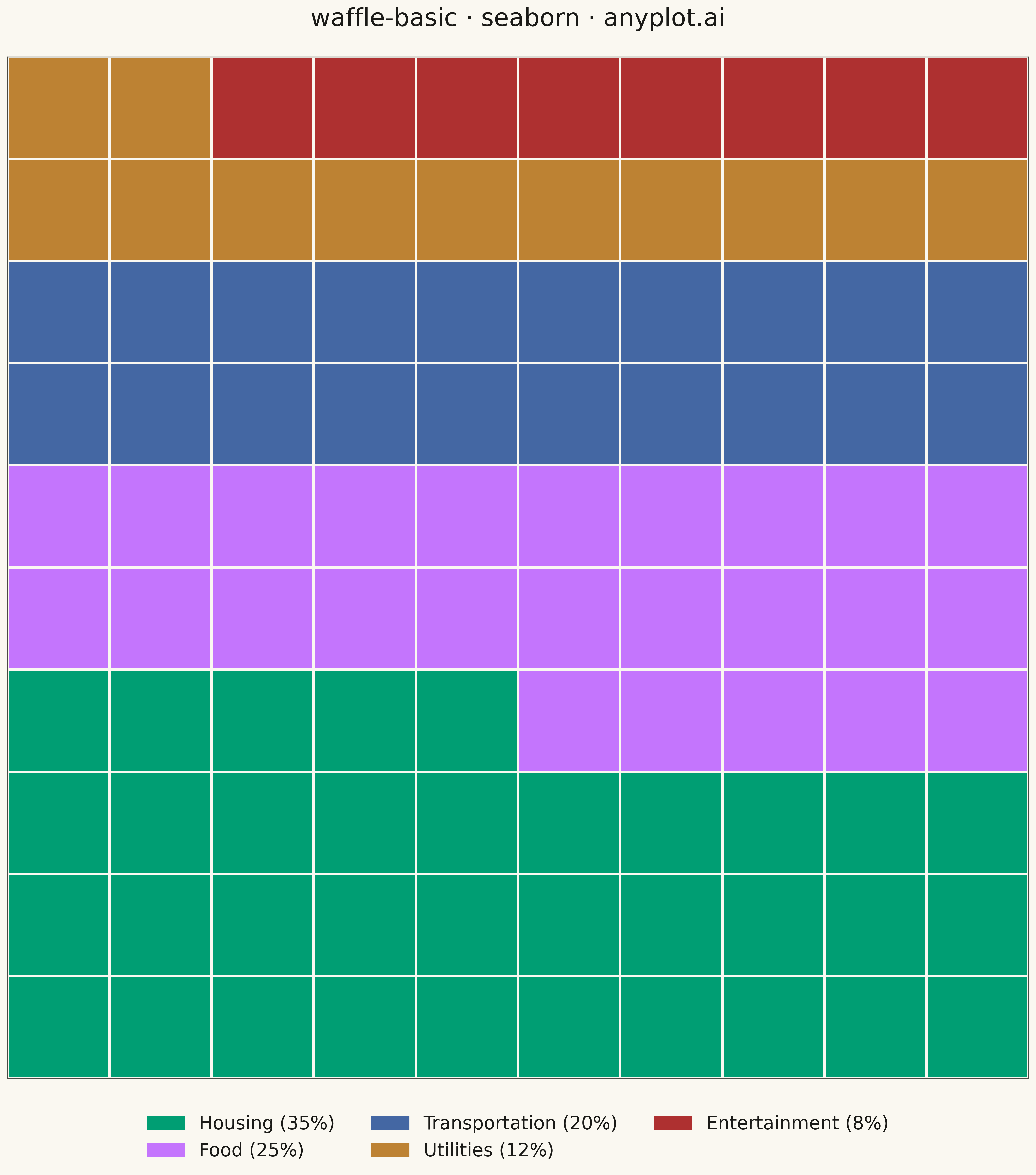
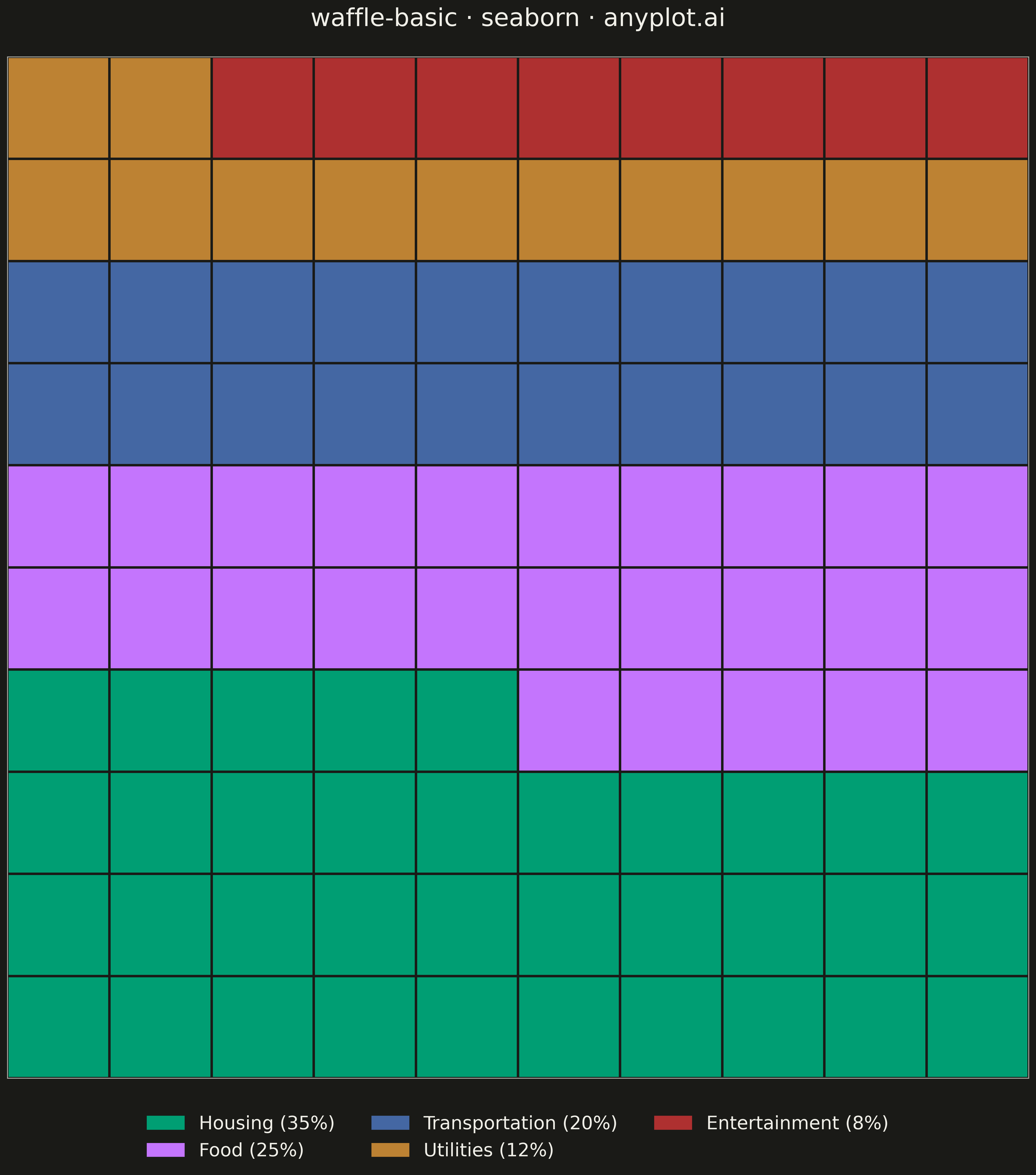
A waffle chart displays proportions using a grid of equal-sized squares where colored squares represent parts of a whole. Each square typically represents 1% of the total, making it easy to count and compare values visually. It provides an intuitive alternative to pie charts, offering more accurate perception of proportions.
""" anyplot.ai
waffle-basic: Basic Waffle Chart
Library: seaborn 0.13.2 | Python 3.13.13
Quality: 85/100 | Updated: 2026-05-05
"""

import os

import matplotlib.patches as mpatches
import matplotlib.pyplot as plt
import numpy as np
import pandas as pd
import seaborn as sns
from matplotlib.colors import ListedColormap


# Theme tokens
THEME = os.getenv("ANYPLOT_THEME", "light")
PAGE_BG = "#FAF8F1" if THEME == "light" else "#1A1A17"
ELEVATED_BG = "#FFFDF6" if THEME == "light" else "#242420"
INK = "#1A1A17" if THEME == "light" else "#F0EFE8"
INK_SOFT = "#4A4A44" if THEME == "light" else "#B8B7B0"

# Data - Budget allocation example
categories = ["Housing", "Food", "Transportation", "Utilities", "Entertainment"]
values = [35, 25, 20, 12, 8]  # Percentages, sum to 100

# Okabe-Ito palette - first series always #009E73 (brand)
okabe_ito = ["#009E73", "#C475FD", "#4467A3", "#BD8233", "#AE3030"]
colors = okabe_ito[: len(categories)]

# Grid dimensions (10x10 = 100 squares for percentage representation)
grid_size = 10
total_squares = grid_size * grid_size

# Create grid data - filling bottom-to-top (like filling a glass)
grid = np.zeros((grid_size, grid_size), dtype=int)
square_idx = 0

for cat_idx, value in enumerate(values):
    for _ in range(value):
        if square_idx < total_squares:
            # Fill from bottom-left, going right then up
            row = grid_size - 1 - (square_idx // grid_size)
            col = square_idx % grid_size
            grid[row, col] = cat_idx
            square_idx += 1

# Create DataFrame for seaborn heatmap
rows, cols = np.meshgrid(range(grid_size), range(grid_size), indexing="ij")
df = pd.DataFrame({"row": rows.flatten(), "col": cols.flatten(), "category": grid.flatten()})

# Create plot (square format better for waffle chart)
fig, ax = plt.subplots(figsize=(16, 16), facecolor=PAGE_BG)
ax.set_facecolor(PAGE_BG)

# Create a pivot table for the heatmap-style display
pivot_data = df.pivot(index="row", columns="col", values="category")

# Create custom colormap from Okabe-Ito colors
cmap = ListedColormap(colors)

# Plot using seaborn heatmap
sns.heatmap(
    pivot_data,
    cmap=cmap,
    vmin=0,
    vmax=len(categories) - 1,
    cbar=False,
    linewidths=2,
    linecolor=PAGE_BG,
    square=True,
    ax=ax,
)

# Remove axis labels and ticks
ax.set_xlabel("")
ax.set_ylabel("")
ax.set_xticks([])
ax.set_yticks([])

# Style the spines
for spine in ax.spines.values():
    spine.set_visible(True)
    spine.set_color(INK_SOFT)

# Title
ax.set_title("waffle-basic · seaborn · anyplot.ai", fontsize=24, fontweight="medium", color=INK, pad=30)

# Create legend with category names and percentages
legend_handles = [
    mpatches.Patch(color=colors[i], label=f"{categories[i]} ({values[i]}%)") for i in range(len(categories))
]
ax.legend(
    handles=legend_handles,
    loc="upper center",
    bbox_to_anchor=(0.5, -0.02),
    ncol=3,
    fontsize=18,
    frameon=False,
    facecolor=ELEVATED_BG,
    labelcolor=INK,
)

plt.tight_layout()
plt.savefig(f"plot-{THEME}.png", dpi=300, bbox_inches="tight", facecolor=PAGE_BG)
Runnable source as JSON, for any HTTP client: https://api.anyplot.ai/specs/waffle-basic/seaborn/code. Any spec id and library id listed in llms-full.txt fit the same URL shape; every URL below is complete and callable.
{
  "spec_id": "waffle-basic",
  "language": "python",
  "library": "seaborn",
  "page": "https://anyplot.ai/waffle-basic/python/seaborn",
  "hub": "https://anyplot.ai/waffle-basic",
  "code_json": "https://api.anyplot.ai/specs/waffle-basic/seaborn/code",
  "spec_json": "https://api.anyplot.ai/specs/waffle-basic",
  "render_light_png": "https://storage.googleapis.com/anyplot-images/plots/waffle-basic/python/seaborn/plot-light.png",
  "render_dark_png": "https://storage.googleapis.com/anyplot-images/plots/waffle-basic/python/seaborn/plot-dark.png",
  "quality_score": 85.0,
  "license": "MIT",
  "guide": "https://anyplot.ai/llms.txt"
}
Part of Basic Waffle Chart on anyplot.ai.